Getting Ready for NanDesuKan 3

Alright, so Sunday and yesterday I finished fixing, cleaning all the frames (and painted some). Now I just have to buy some masking tape so that I can affix some of the artwork (the one’s that don’t have glass) and also covering the back side with paper. Some of the frames also need a hanging attachment. It should be easy to do, but I will have to go and buy these parts. Tomorrow.

I am missing one frame, the Adventure Time piece. I had to repaint it, so it will be absent from the photos presented.

DSC01802 resize

For the Wind Rises piece I had to actually cut the top and bottom parts of the paper to make it fit. This was a good chance to bring out my cutting mat! It’s been a while since I bought it, and just now I had an excuse to take it out of it’s packaging.

DSC01803 resize

Although this frame did not have glass, this is my favorite. I really feel it fit the Totoro drawing.

DSC01805 resizeDSC01806 resizeDSC01810 resizeDSC01811 resizeDSC01812 resizeDSC01813 resizeDSC01814 resizeDSC01815 resizeDSC01816 resizeDSC01817 resizeDSC01818 resizeDSC01819 resizeDSC01820 resize

Hasta la próxima,

-Nube

CHANCE!

Getting Ready for NanDesuKan 2

This post will be a bit short in that I will only be showcasing the artwork and frames I will be taking and using.

You will notice that I am showing the Adventure time piece twice, that’s because I decide to trade the frame with another piece (the one shown at the end). This photos only show they artwork and frames, I’m still not finished positioning and framing them in the photos shown below (so please keep that in mind).

DSC01790 resizeDSC01791 resizeDSC01793 resizeDSC01795 resizeDSC01796 resizeDSC01797 resizeDSC01798 resizeDSC01799 resize

So these are the pieces and frames I will be using. Some of them I decided to just clean up and use as they are, while others I decided to paint up. For a couple of them I also had to create some backing paper so they looked a bit more presentable. I will show the end results tomorrow. It took me almost all day to finish them all, but I did it. (•̀o•́)ง

I will talk a bit more on my thought on the next post.

Hasta la próxima,

-Nube

CHANCE!

Getting Ready for NanDesuKan 1

So as I said in my last post, I will be taking some artwork to a local anime convention. One of the first steps I had to do first was choose the pieces of art I will be taking. Having decided to wait until I had a good amount of pieces I could showcase to the public I noticed my first hurdle, there are far too many to take… This meant I had to decide which ones to take this time around and which ones to leave behind.

Now, I was told that I would be provided enough space for all the artwork I decided to take, but I don’t wan’t to take too much space and monopolize the room! One other thing I need to keep in mind is frames. Rules state that they have to hang and can’t just be stuck to the wall (though I really wouldn’t do that in the first place). The most cost effective way to do it is to make my own frames. Wood would be to expensive and would cost almost as much as buying them new, so I did think of using paper frames. Although that wouldn’t be such a bad idea, I had two spare frames given to me. After seeing them framed I couldn’t help but like they way they looked, so I decided to frame them all.

This meant that I would have to buy some frames, a task that can get extremely expensive. So I did the only option I had, and that is to go to the thrift store. Luckily every Saturday they have sales which would really lighten the burden of the expenses. When I arrived it quickly became apparent that it would be so easy. I had to scavenge through the piles of frames out on display. I had to make sure they were the right size, or at the very least close to it. This took quite a while and two thrift stores. When I arrive home I found out that one of them was defective and broken (even though it was packaged in its original box and looks new) and another one was a great frame but would accommodate the pieces I currently have.

One thing to note is that I did have to cut a couple of pieces off from the original line up I had originally decided to take. After much thought I decided upon 16 pieces well 18 if I count the Keyblades, which thinking about it now is already a big number… I wonder if I will really be ok taking all this pieces? Only one way to find out I guess.

Choosing the pieces to take, check. Buying them frames, check. And I already went ahead and chose which artwork went with what frame. These were the hardest parts, but they are now finished. The next step is to clean them up, paint some of them and get them ready and packaged so that they are easy to move around.

Hasta la próxima,

-Nube

CHANCE!

Actual Lelouch final

So after taking a small break from the Lelouch drawing I decided to go at it again to make a couple of little tweaks. But before that, here is how the drawing looks without the original drawing:

Lelouch no drawing resize

It looks really funny.

But any way here is the actual final piece:

Blood stained gift for her future darker resize

I just eased the blood lighting, darkened some areas especially on Lelouch and I also added the Geass. I don’t really want to spend too much time on this so I will leave it as is. This was a good test of what is possible.

Hasta la proxima,

-XERO

Traditional X Digital (Color) IV II Final

It, took longer than I expected…

I really thought I would have been able to finish this one quite easily, but in the end as usual it took quite some time to go about modifying areas over and over as I went along. Luckily that doesn’t surprise me anymore and can work on that as I go along. Color theory is still a bit of a pain, but I feel like I am getting the hang of it. The great thing about coloring digitally is that I can make as many mistakes as I want and I can always go back and fix it. On top of that I don’t have to redo my whole work either, I can just change the hue of the layer and modify it so that it fits with the overall picture.

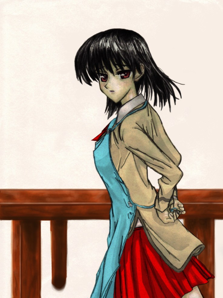
This one was quite technical. Digital art isn’t as straightforward as traditional (although traditional is harder and requires quite a bit of thinking beforehand, in essence it requires a lot of skill and concentration). With that in mind I made sure to use every technique I have picked up so far using digital color to acquire a good image. It is still lacking compared to the pro digital artist, but I feel like I have gotten one step closer. This image had numerous layers that allowed me to get the feel and effects I was imagining.

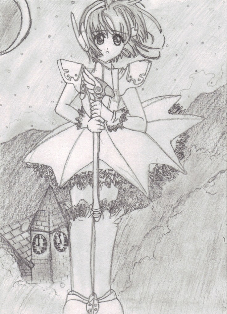
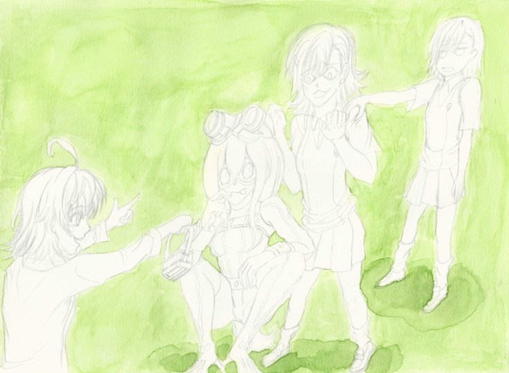
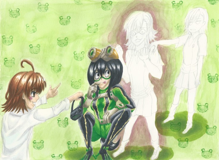
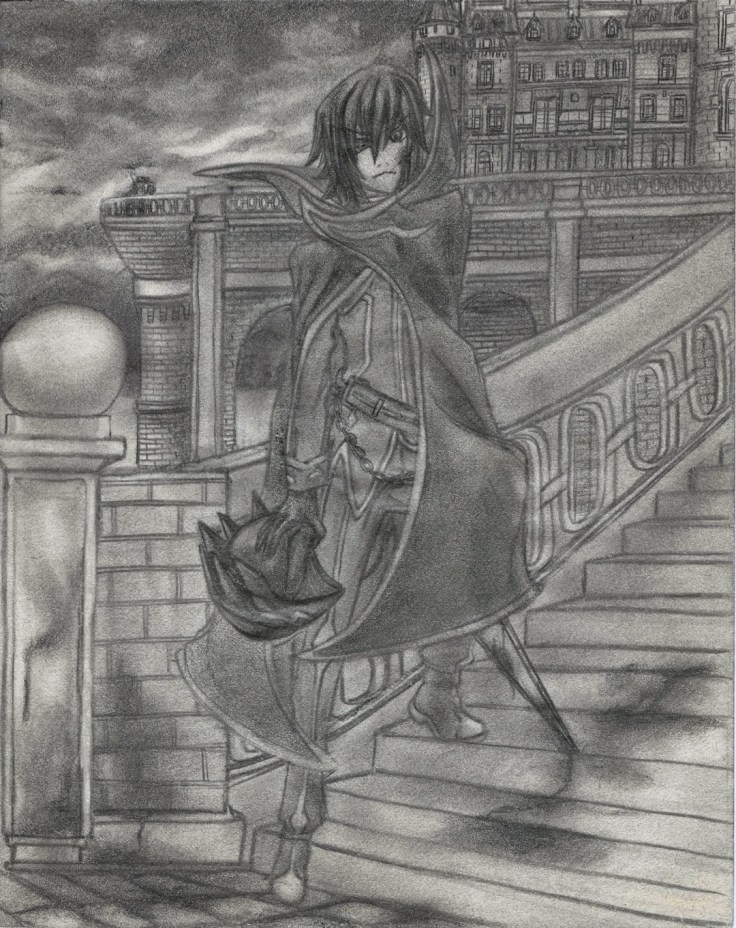
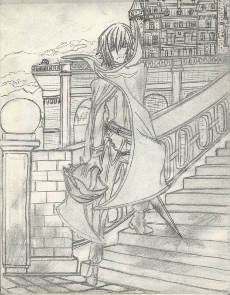
There is one revelation that became quite clear as I was working on this piece though, and it’s a really important one. Coloring pencil artwork might not be such a great idea. It’s quite tough when they actually have a background. Because there is only so much one can do to smooth things out and have as little areas that aren’t uniformly shaded, this create areas that are very… rough, uneven, grainy, etc. These defects get passed on to the digital artwork. And although I can probably use this to my advantage in some artwork, it won’t work for most of it. For this piece I spent quite a bit of time just trying to downplay the amount of grainyness from the pencil shading that gave it a “dirty” look when colored. This is quite disappointing…

Of course I have thought of other ways to use these same shadings to my advantage on some future projects, but as explained before, it won’t work with everything. It seems that this technique will work best with simple drawings with no background, but will work even better with using artwork that only focuses on the outlines for me to color in digitally.

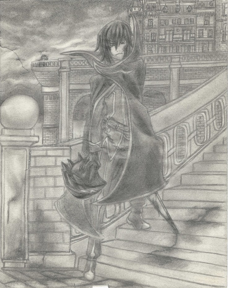
Hmmm…. I do have one more drawing I wan’t to try coloring though, it is also done with pencil but this one is done on a much higher quality paper that I managed to pour all of my skills onto (well, at least at the time). So I wan’t to see just how big the difference is.

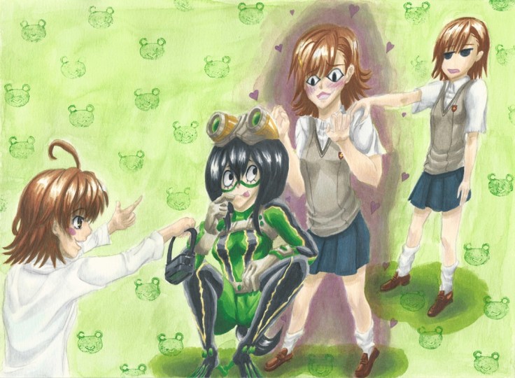
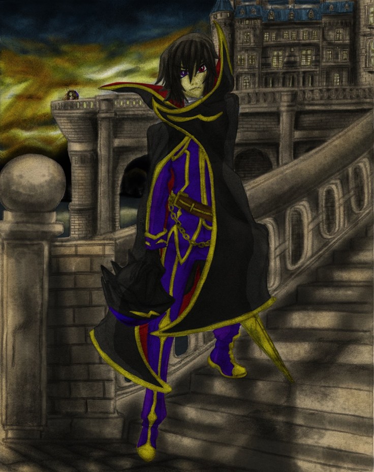
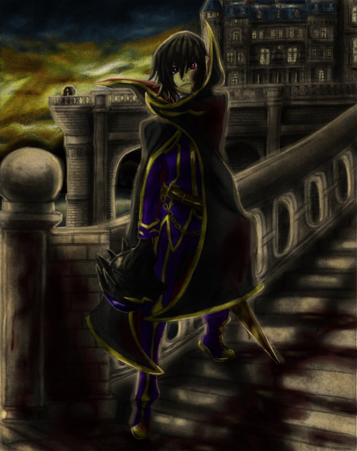
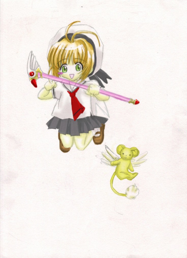
In any case I do want to finally show what I managed to make. Don’t know if I want to add it to the gallery though… What do you guys think? (for now here is the final piece, I’ll upload pictures showing the process tomorrow on this same post. It’s quite late right now and I really want to take a break and rest for a bit):

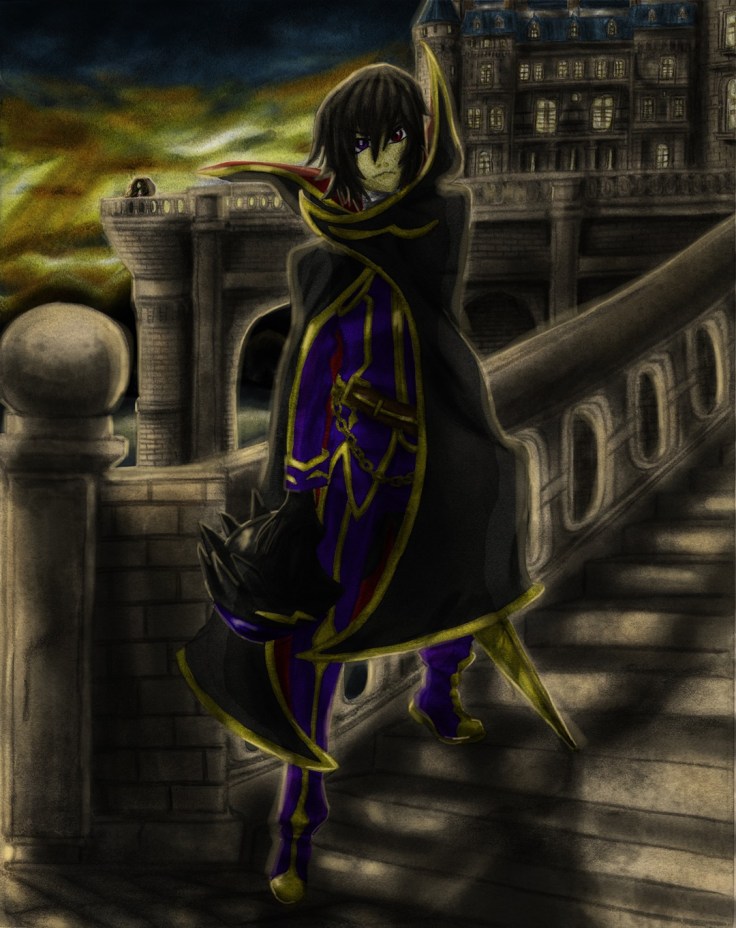
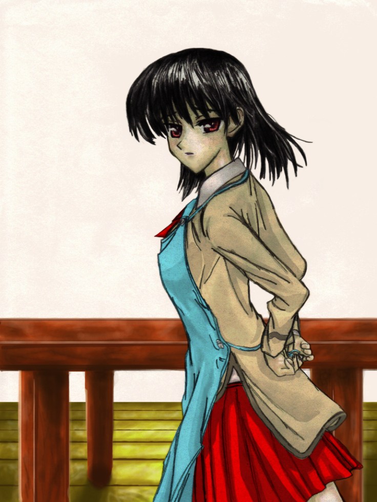
Here are some pictures of the process, will add the “whole” process later in video form (something new I want to try out):

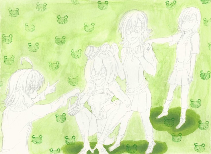
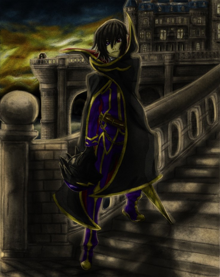
So from where we left off last time, here I went over it and shaded the drawing a bit closer to bring out more details. Doing that had some collateral damage though, now there are even more rips on the paper.

Lelouch III cropped resize

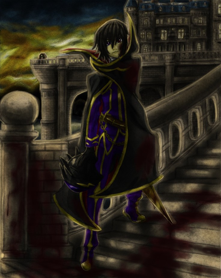
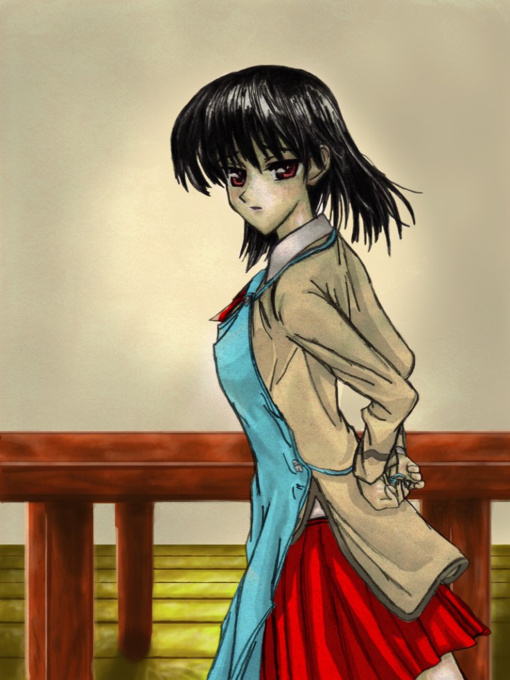
And as expected the longer I worked on it the worse the rips became, it was really annoying but luckily I have some experience dealing with rips.

Lelouch rips not fixed resize

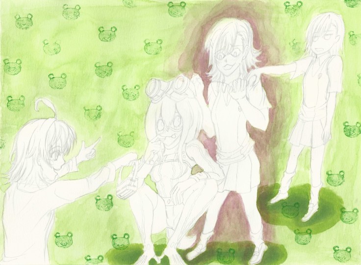
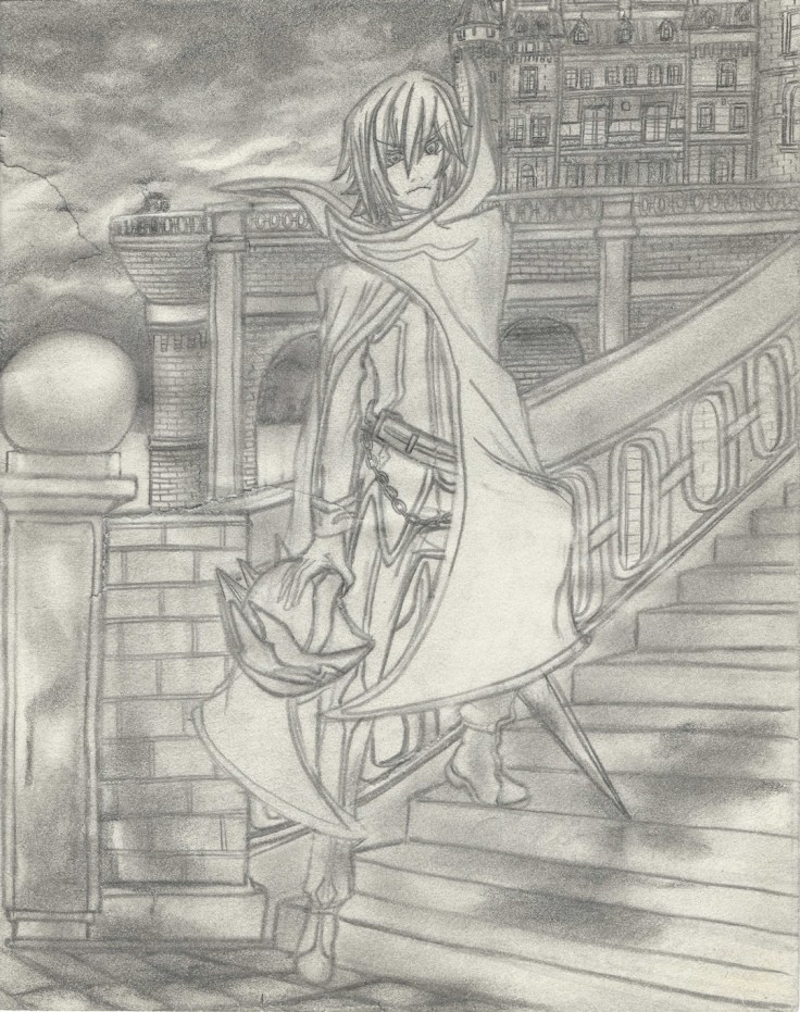
Rips fixed! I went ahead and started repairing it digitally using the clone tool which took me quite some time to understand… make sure to right click the area you want to clone as you hold the Alt button if you which to copy the right area instead of struggling to find out why the clone tool is painting something you don’t want. In the end I found that the best tool for the job was the healing brush tool since it blended in the area according to the surroundings. Of course it also had it’s quirks so you have to pay attention and do small areas as you go, but it’s quite easy to use and made repairing the rips quite easy.

Lelouch rips fixed resize.jpg

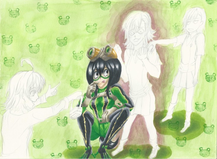
From here I just started to add color using the method mentioned on my other posts of Traditional X Digital.


Lelouch IV resizeLelouch V resizeLelouch VI resizeLelouch VII resizeLelouch VIII resizeLelouch X resizeLelouch XI resizeLelouch XII resizeLelouch XIII resize

Lelouch - Blood stained gift for her future resize

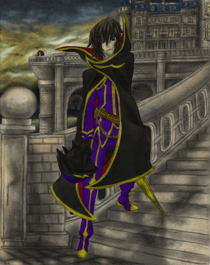
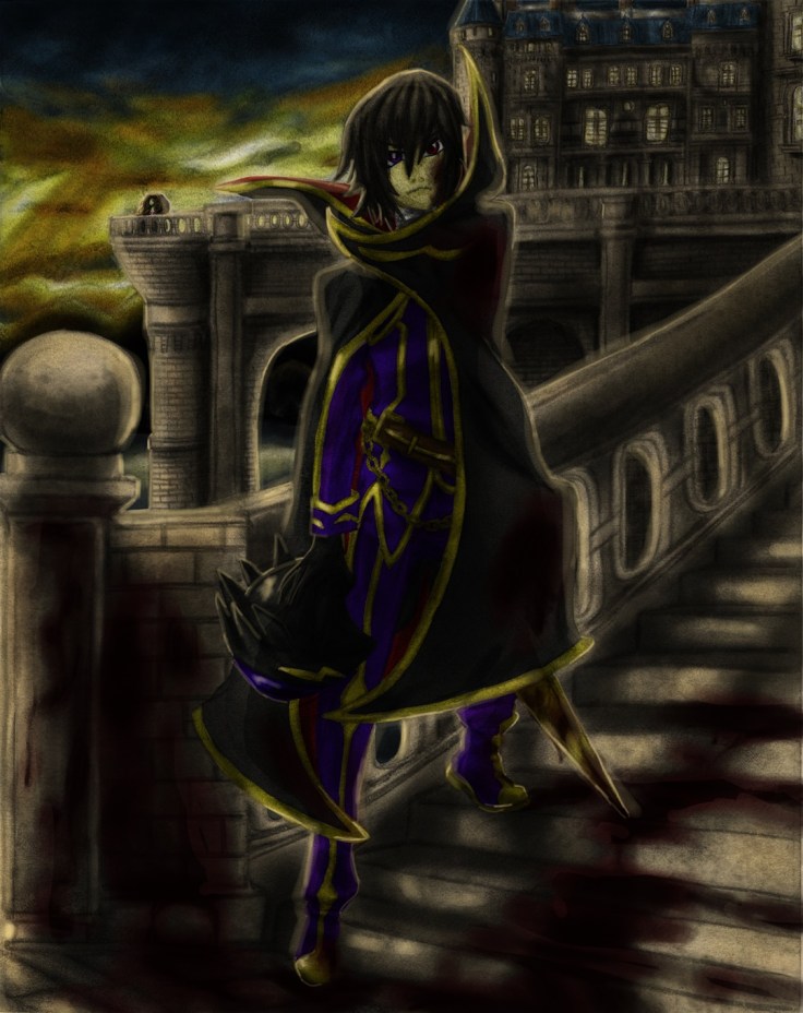
I did the best that I could digitally on this one. I have a ways to go, but I feel it look much better than it would have looked had I tried this even just a month ago. I’m no longer afraid of digital, I’ll make sure to understand it more as I continue to polish my skills in all areas!

That is all for now (Aside from adding that video I mentioned above).

Hasta la proxima,

-XERO

Traditional X Digital (Color) IV

Here is the next project for the Traditional X Digital series. This one is different in that it is a somewhat recent piece. I had it originally as a rough draft, but I guess at some point I forgot that and added way too many details to it. It was also originally going to be a drawing that I would make for a Youtube video as a request. But if I remember correctly I ended up drawing a simpler drawing with no background for that. I wonder if the requester even saw that video…

In any case, as I was working on some other work, I remembered I had this piece that just needed a couple of detailing and shading to bring it back to live so that I could color it digitally. This was specially important because the sketchbook I use is a really cheap one that has very sensitive paper. Since I only make rough drafts on it I don’t mind, but since it does contain this one piece that I don’t feel like redrawing since it looks quite good and has a lot of detail, I decided to just finish shading and polishing this piece.

Despite taking some care, as expected I did end up creating some rips all around the drawing. Which kinda sucks, but I should be able to revive it digitally. For now i should just focus on shading and finishing this piece. Since this one actually is an original piece I should be able to put it on my gallery (assuming it comes out great). So please look forward to that.

Here are some scans:

Lelouch I resize

If you look around the drawing you should be able to see the rips I sadly made on the paper as I was working on it.

Lelouch II resize

Well, that’s it for today. I will keep working on it, and hopefully will be done soon.

Hasta la proxima,

-XERO

Pokemon Quick artwork

My little brother likes making his own wallets, so this time he asked me if I could design him some Pokemon artwork. He didn’t really have any idea as to what Pokemon he wanted, so I went for the starter Pokemon Fushigidane (Bulbasaur), Zenigame (Squirtle), Hitokage (Charmander) and of course the ever so famous Pikachu.

I started and finished them all yesterday, so I’m actually quite amazed at how much I have improved. Of course these are all simple designs, but they look good despite being drawn and colored in a day.

I tried having them in habitats that they would most likely appear at. Though if I made more time to think and design I would try something a bit more tricky and have some sort of scenario for the artwork, but since I didn’t do that I guess the backgrounds are a bit generic.

Here are the designs:

Pokemon wallet designs resizePokemon wallet designs II resize

Aside from the Pokemon, I tried doing everything without reference and only relied on my mental images of what I think things and places may look like. I’d say it looks good, no? I guess aside from that, I did have to come up with poses for the Pokemon. They actually didn’t take much time at all to think up. Looking at them now, Fushigidane (Bulbasaur) is a bit generic compared to the others. Seeing as he is my favourite, maybe I should have drawn it differently… Oh well. I was thinking of going over it with pens to add more details, but since I have quite a bit of artwork I want to do, I will leave it as is.

Traditional X Digital (Color) III

This is the third try at coloring. This time I will be using an old piece from 2008. This one is from one of my top manga favourites School Rumble. The reference used for this recreation came from Vol. 1 Chapter b01.

Here is the original:

[Yanime] School Rumble b01-02

I remember the first time I saw this page I fell in love with the artwork so much that I just felt compelled to recreate it. I noticed that there isn’t much shading done on my attempt. I wonder if that is because I drew with pencils not much stronger than HB or because it is so old that the graphite has rubbed off? Or maybe this was back when I was still trying to master shading?

In any case here is the piece I used to practice my digital painting:

2008 Yakumo getting ready (768x1024)

I’d say i got rather close, although my lines are quite rough thus showing how much I was struggling making fine lines and making a clean recreation. On top of that the lack of shading does make coloring digitally more difficult. Despite all that, I am quite amazed at how it turned out.

As for my first attempt to color it, here it is:

2008 Yakumo getting ready (768x1024) Single layer

It doesn’t look all that much special does it? Take into account that I did do quite a bit of work on this piece. I also added quite a bit of details with countless layers to add more depth to the drawing, but in the end it still looked rather mediocre.

That’s when I remembered a technique I had been playing around with when I was painting the first Cardcaptor Sakura drawing. And that is to add a duplicate layer of the drawing (specially if the if it lacks shading) so that it can give it more depth and detail. So here’s how it looks after doing just that.

Remember I just duplicated the original drawing layer (the drawing layer is all on it’s own set above all layer, marked as Multiply):

2008 Yakumo getting ready (768x1024) Double layers

Doing something so simple gave it so much depth, and I really didn’t have to change any of the colors to achieve it. It’s quite wondrous how much the drawing and colors changed just by duplicating the original drawing. The hair alone was giving me problems, but this one technique gave me the color and feel I was looking for.

After this I tried adding some more details like a bit of blush and more details around her body:

2008 Yakumo getting ready (768x1024) (COLOR)

After this I just tried playing around to try and create a background from scratch just using my imagination and the tablet. I did ok, and would just need to add a bit more layers of detail on all aspects to truly bring it to life. But in the end I see no need for that since I can do that and more just by doing it traditionally first then applying color later.

In any case here are my unfinished attempts at creating a background:

2008 Yakumo getting ready (768x1024) table2008 Yakumo getting ready (768x1024) Table and Floor2008 Yakumo getting ready (768x1024) Table, Floor and wall

It looks quite out of place next to Yakumo, but making it all fit would require quite a bit of tweaking to make it all cohesive and look good. But I think I should just develop my own style for now and learn how to make art digitally that way and then eventually learn about making all digital work (at least for backgrounds) later on. Though I will just end up integrating those techniques to work along side mostly traditional artwork.

I will stop working on art for a bit so I can work on that Youtube video I mentioned before. I want to try and make something different and that’s also high quality, so that will probably take me a bit to make and edit. Hopefully not too long.

Hasta la proxima,

-XERO

Traditional X Digital (Color) II

Here is another go at coloring digitally. For this one I will be doing a much more simple drawing with no background. I wanted to use only about two different varieties of the same color to see how simple coloring would look on a drawing. This drawing is again of Cardcaptor Sakura and also from 2006. I know this is a reproduction, but I don’t know where I got the reference from. Most likely it is from one of the volumes of the manga, the things is I just don’t know which volume… So I apologize I can’t show you the original this time.

In any case here is the scanned drawing:

2006 chibi Sakura and Kero (744x1024)

It’s a bit rough, but it will do. It is a very simple drawing that I can just apply color to it.

2006 chibi Sakura and Kero (744x1024)

So for this drawing I tried to use some of my traditional techniques. On top of that I used some the few digital techniques I picked up so far.Not looking too closely, it almost looks like if I colored it using Copics. And that makes me ecstatic. Of course this is still a bit new to me, and I have much more to learn. The road seems to be a long one, but I really hope I can grow exponentially as I go along.

Here’s working towards the best!

Hasta la proxima,

-XERO

Traditional X Digital (Color) I

A few days ago I said that I was working on a new technique where I digitally colored an old drawing that I had archived and scanned. From there I plugged it into Photoshop and after converting it to a layer and setting it on multiply I placed every other color layer below the scanned picture. What is amazing about doing this is that I get to keep every single detail that I placed on that drawing once I color it in. This is great because I really suck at drawing on the tablet. I prefer traditional. I’ve gotten to the point that I can draw traditionally very good at a really good pace, but when it comes to adding color… I am still learning and that is where most of my time now goes. And since it takes so long, I don’t have time to practice digital art. Doing this will be the best of both worlds! (If you have been reading the past posts you may be wondering why I keep repeating all this. The reason is simple. I am super exited that I can do this and am really looking forward to when I get to master this technique.)

For the first piece I will use to try out this new technique (at least to me anyway), I will give the honor to a drawing of Sakura Kinomoto from Cardcaptor Sakura (one of my all time favourite animes, and a fond childhood memory). This was done at a time when I was still learning how to draw by mimicking my favorite artist (almost all my old drawings are reproductions of one thing or another). This is a drawing I tried to recreate from one of Cardcaptor Sakura artbooks.

This is the piece I’m talking about:

233

I still couldn’t let go of a lot of my habits from traditional drawing… I will have to try and develop some new ones. The best way is to learn from others that have already learned how use the digital medium, and luckily there is  alot of artists making Youtube videos showcasing their artwork and techniques so really it is just a matter of looking for it.

Anyway, here is the drawing I did when I was around 14 or 15 years old.

2006 Sakura (740x1024)

Now as to why the drawing is inverted is any ones guess (no seriously I really don’t know why, maybe the copy of the artbook I got was inverted because it was Japanese and  they decided to have it open like western books here in the States… thinking about it, that might not be far off.)

Now as for the first piece to go through my fledgling digital abilities, here it is. I will admit, it isn’t the best coloring job ever but I did the best I could with my current digital art level.

2006 Sakura (740x1024) Colored I

It may not look like much to you, but for some reason this did take me quite a few hours to do. Aside from painting it over I was also messing around with my tablet and learning keyboard shortcuts along the way. I actually learned quite a lot from this piece and also configure my tablet’s buttons to do all the shortcuts that I felt I would need the most to move in the most productive way possible. The original scanned drawing doesn’t have much detail or shading so I do wonder what kind of effect it would have on it when I add even the most simple of coloring techniques?

Well this was a quick update on the beginning of my quest to mastering the elusive Digital Artwork!

Hasta la proxima,

-XERO

Mikoto Misakas and Tsuyu Asui Final

Finally done. This piece was done with a combination of both watercolor and Copic markers.

I wanted to make a drawing with a simple background, which I have a really hard time doing. So I want to now focus on these for a while so that I know how to do them. I was annoyed by how much time it took to come up with something. Keep in mind a design like this is quite easy, so finishing it in one day should be absolutely no problem. And yet the amount of time it took me to come up with something is excruciatingly slow. So really, it’s more of my mental capability to make up backgrounds that will need to be strengthened so that I can not only make backgrounds that fit with the drawing but are also interesting to look at.

Since it is done traditionally I have to rely on just my brushes and my markers. This is where I can run into problems if I want to make identical patterns. I could do it the dumb way of drawing it one by one, but that will take too long, it also wont be perfect recreations and really it would be really annoying to do it that way. So the best options are either making stencils or better yet make a stamp. Which is what I ended up doing.

And here it is (it’s made of an old eraser that I cut into shape with an e-xacto knife, sadly the eraser was too soft so it gave me problems when applying tint on it, and to make matters worse it started breaking off in the end):

Gekota stamp

So in the end I came up with a really simple design that was brush painted in a light green. From there I decided to make the Gekota stamp to make reference towards Misaka’s adoration to anything Gekota so that way I can connect why she seems to be entranced by Tsuyu Asui, definitely one of my favorite characters from Boku no Hero Academia.

Now, why are there other Misakas? To be honest my original plan was something a bit different. And that had to do with having the background filled with Misaka imoutos (younger sister, aka Misaka clones). For that idea I was originally thinking of making a stencil with the figure of an imouto, then reproducing it on the background to give it a somewhat cute/creepy mood overall. In the end I opted against it and went for a much simple design which funnily enough took me more time to come up with…

Misaka's dream XI cropped edited resize

In any case along with that idea I wanted to have Last Order the smallest Misaka and Misaka 9982 (the most cheeky of all the Misaka sisters). I remembered Last Order having those goggles so I quickly came up with the scenario where she would have like to make a trade for Tsuyu’s goggles which look quite interesting and of course Misaka 9982 being the voice of reason when it comes to Misaka Mikoto’s obsession with anything Gekota. I also really loved the annoyed facial expression she makes so I really wanted to recreate it.

Now as for Misaka Mikoto I really wanted to capture this catlike expression she makes whenever her curiosity and infatuation comes into play. And of course not wanting to make the drawing too simplistic I also wanted to add some creepy/cute love aura around Misaka. I also thought making Tsuyu look a bit more worried would be a good idea, but I remember that she rarely changed her expression and going back through the manga I was right so I decided to keep this simple expression.

The drawing looking a bit too lonely on the left side I decided to add a speech bubble that emphasizes her worry about the situation. What do you guys think it says? (Hopefully I spelled it right)

Misaka's dream XII FINAL resize

Before I forget I should also give it a title. The title will be: “Misaka Mikoto’s PARADISE and Tsuyu Asui’s Confusion”

It will be up as a print in the gallery.

And that concludes this piece. What do you guys think?

Hasta la proxima,

-XERO

Create a website or blog at WordPress.com

Up ↑