XERO DRAWING – Sailor Moon Warrior from the Moon

Time spent: 7 hours 56 minutes
Materials used: Sakura 0.7 mechanical pencil, Faber Castell Perfection 7056 pencil eraser, eraser,
Sakura Pigma Micron set Sepia +Sakura Pigma Micron set Black, Sakura gellyroll White, Sakura Moonlight gellyroll: Yellow, light pink, Dark Pink,
Reeves Water Colours 18 set: Lemon Yellow, Medium Yellow, Ivory Black, Phthalo Blue, Violet, Ultramarine,
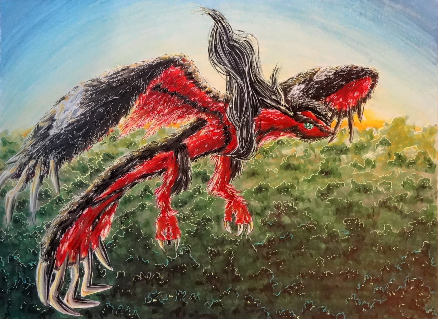
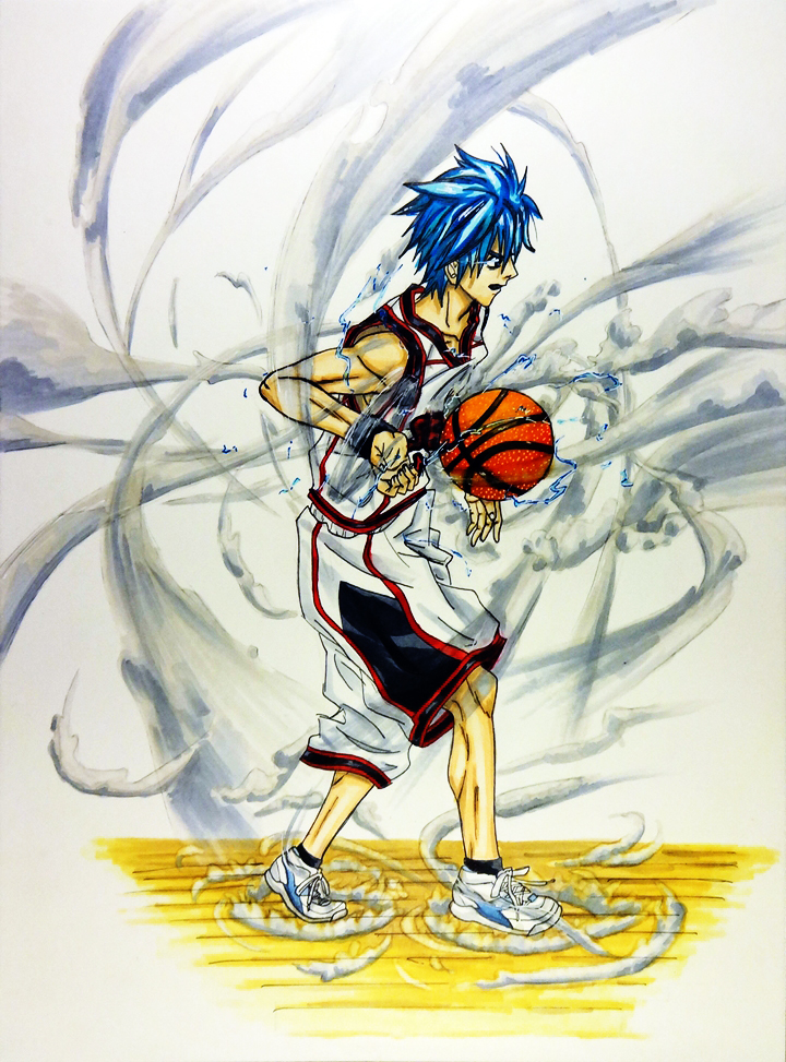
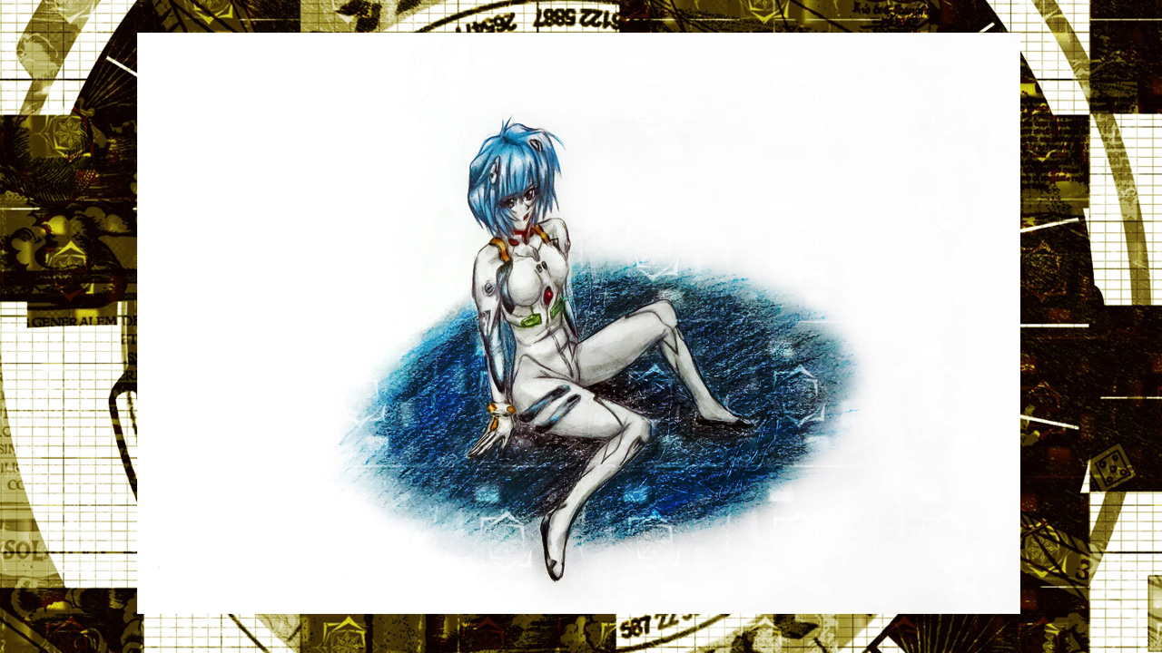
Copic Markers: R08, R27, R29, Y11, Y17, Y21, Y28, B01, B05, B34, B45, B97, C1, C3, W1, W2, V01, G21, G24, G28.

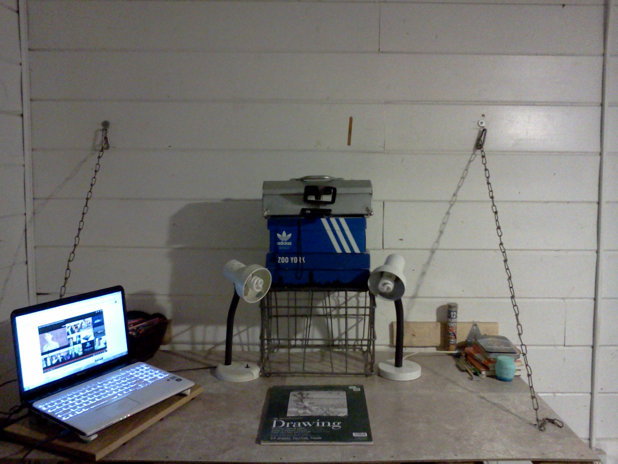
There was no video last week because I bought a new scanner, but it would not arrive till after a couple of days later after I usually upload a video. So I decided to hold it back and wait for the scanner to arrive. It is a large scanner that allows me to scan areas up to A3 (which is a scanner I have been looking for for quite some time). Now I can get a good quality copy of my artwork here at home.

In any case, for this weeks drawing, we will be doing Sailor Moon. I heard the new series would be broadcasted so I decided to give it a chance and see what it was about. I know I saw some episodes when I was younger but I only saw a few and don’t really remember much. So I said, what the heck, lets give it a chance. After all, I kept hearing good things from both females and males about it. My overall impressions at this point? Personally the old animation looks more appealing to me, but it definitely doesn’t look bad at all. I hear this series is following the manga better so I will see this through to the end to see how good it is. I gotta say, Usagi is rather dumb… But I guess that’s a common feature among Shoujo heroines (as well as Shonen heroes of course). We’ll see how this goes.

-XERO

Xero Drawing – Erza Scarlet Yūen no Koromo (COMMENTARY)

Time spent: 9h22m

Materials used: Mechanical pencil, ruler, eraser, Faber Castell eraser pencil
Colored Pencil: water color PrismaColor – peacock blue, ultramarine blue, french grey 20%, true blue, violet, black, crimsom red, lilac, white, blush pink
PrismaColor – ginger root, peach, beige, cream, sand, light peach, 20% french grey, lilac, parma violet, dark purple, mulberry, carmine red, pink, process red, yellowed orange, crimson lake, 50% warm grey, 70% cool grey, 70% warm grey, 50% gold Grey, White, Black
Crayola – pale rose, violet, brown, taupe, lemon yellow, jade green, harvest gold, magenta
Rose Art – violet, orchid
Verithin – dahlia purple
Ultra Color – purple


We have made it to the second video, this time the objective is Erza Scarlet from Fairy Tail. A good series (that relies on way too much fan service…). For this drawing I thought I would only use color pencils and nothing else. I figured I would try to show different techniques that can be implemented with different tools. The most common one that people can easily get their hands on are color pencils. They are rather versatile and can leave some really good effects, but only if used right. I’m mainly a pencil type of artist so I’m a bit shaky when it comes to coloring. But I have been practicing and coming up with new methods ever since I decided to go pro. I’ve actually been starting to understand how to fully utilize the full potential that color pencils possess. And that is what this video will be about.

Hope you guys enjoy the new format, and learn much more this way. Till next time.

-XERO


Kuroko Tetsuya

So this weeks artwork will be featuring Kuroko Tetsuya from the Kuroko no Baske (“the basketball Kuroko plays”), a series that is much like Captain Tsubasa (except instead of Football, they play basketball). This means that there will be young school players that have extraordinary techniques that makes one think of Dragon Ball (minus the fighting). It is an amazing series and has the type of characters I like as a protagonist (the main one anyway), a weak player in all areas except passing. This means that he has a lot to improve throughout the series. And sure enough, the series delivers. Despite his weaknesses, Kuroko uses his strengths to make his lack of abilities more than make up for it. I don’t want to delve too much into it, so if you have not seen it, make sure to do so as soon as you can.

I have decided to finally start working with my collection of Copic markers I bought a couple of years ago. The smoothness that I can achieve from them always leaves me amazed to no end (though I still need to work on not using too much ink on my artwork). I started with a simpler design, but eventually decided to add a dark background to it later (backgrounds are still my weakness). Looking at them side by side, I think the simpler “light” design is still my favorite. But the “dark” design doesn’t look bad either. What do you guys think?

Kuroko White background

Kuroko Dark Background

Unit 01 Beast Inside

Here is the drawing for this week, Unit 01 from Neon Genesis Evangelion. I was pretty much done with it yesterday, but there was something that kept bothering me about my drawings. The fact that they look so unrefined. I knew why that was of course. I did not blend the colors anymore. This happened because I decided to practice doing this so that I could increase my abilities without the need to blend them, that way once I decided to go back and put some good effort into my work I would be able to produce some amazing stuff. Sadly I got so used to doing this that I had almost forgotten the blending techniques I had developed. And because of it I have to start all over again. I gave it a try for this drawing which came out pretty well (though it looks unfinished without a background, I’ll have to do something about that from now on). Now that I have remembered a couple of my old techniques and about blending colors, I will try to bring out some better quality work from here on out.

Hope you look forward to it.

-XERO

Print Available
Print Available

As you can see, this week I do not have a video for this week. And that will most likely be the case from now on. More on that on Friday.

Rei Ayanami, the person that got me interested in Neon Genesis Evangelion (well her and the song “A Cruel Angel’s Thesis”) . Strangely enough, even though I wasn’t let down when I finally saw the series, Asuka stole my attention as soon as she appeared. I feel that in the remakes of Evangelion Rei seems to have more of a future (much like Asuka). I am really looking forward to see what happens in the last movie.

As for the drawing it self. Over all I was really pleased in how it came out. But while drawing this I made a lot of mistakes which led me to make a couple of changes that led me to create the blue shadow. I have always wanted to play around with these kinds of backgrounds but over all I think it brought down the quality of the drawing it self. I’ll have to work on that a bit more from now on. On the plus side, while adding the watermark it gave it a really cool effect.

Print Available
Print Available

RE-Initializing Weekly Videos

I got really busy getting all the preparations for the Online Store and for my debut as a pro artist, so I had to sacrifice a lot of things. Among them was the production of my drawing videos. Luckily though, now that I have taken care of most of my plans and obligations, I can finally begin recording again. I plan to make two definite posts every week (unless there is an inconvenience or a situation that does not allow me), Monday will feature a new video (I have already made a short timeline of the people/characters/themes I am going to cover). On Friday I will put a status on the Artist Project I started last Friday. Sometimes I will talk about other things, but it will be mainly focusing on the Artist Project.

So for the first drawing (of this new segment and of the year I believe), I will be drawing Asuka Shikinami Langley from the new Evangelion movies.

Hope you look forward to it

-XERO

XERO Drawing OPERATION – Misaka Mikoto ( Railgun )

I’m really surprised that this drawing took me so long to draw, but I guess it is expected since I decided to add some background this time around. The time accumulated for this drawing was … 19 hours and 10 minutes. In a way I find that astonishing, but believable since I was making up techniques as I drew. I’m surprised I didn’t get stuck and end up ruining the drawing. One thing I have learned though is that adding various colors to a certain object or objects will make it more believable and realistic so I made sure to go in with that type of mentality.

I’m sure many fans of the To Aru Majutsu no Index and To Aru Kagaku no Railgun know that a new series is being aired at this moment, it seems to be focusing on Misaka and her involvement with her sisters/clones. And I have to say, it is absolutely amazing. Both the story and the animation. I seriously wish more anime’s put in that much effort at least into the animation. In any case, this drawing is inspired by the fight between Misaka and Mugino Shizuri ( no. 4 as the strongest level 5, known as the “Meltdowner”). Their confrontation ended last week and it was awesome, plus it also left it open for some more “encounters of the level 5 kind” (yeah… I know, stupid joke).

Throughout the drawing I really did not know what I wanted to do yet. I just had a goal to draw her in a pose I haven’t seen before. So I just made things up as I went along. As I was drawing I decided to have her injured but still willing to fight, and I also liked the idea of having her fight outside (meaning I would have to draw a background as well). One thing I did want to include was her shorts. Usually I don’t like upskirts in anime/manga but because she always has shorts I find her to be a really awesome character that doesn’t feel the need to flash in order to be popular. I seriously feel that more female characters need to be like that. Plus her shorts are pretty much her trademark (well that and electricity, gekota, etc.). I did feel kind of bad making her bleed, but I feel that makes her look more vulnerable and human like. As well as making the situation look dire. If anything I feel the drawing only needs a bit of rubbing/blending in order to make it smoother (mostly in the sky).
What do you guys think?
Any Questions/Comments?

Hope you enjoy it,

– XERO

My setup for making videos.

About a month ago I was asked to make  a video of the setup I use to make my youtube drawing videos.  Sadly I was quite busy  until recently with school and some projects that will be incorporated into youtube and this page as well of course. I think it would be much easier to just do a quick guide here instead of making a video. The process isn’t really all that hard, and setting things up usually just needs the things lying around the house.

Anyway I’m sorry Caio Mitsukayro, I really wanted to make this sooner. Hopefully it will still be of use to you.

Here are some pictures so that you can get a feel of how it looks:

IMG_20130525_195446


My room seriously needs another paint job, but ignore that for now. Below is a closer shot:

IMG_20130525_195453


I don’t know if you can tell, but that is my camera up there in between the boxes. Currently I am using a Cybershot, I really don’t regret buying it.

IMG_20130525_195509


As you can tell, I have my laptop right next to me. It’s really helpful in case I need a couple of references or if I want to hear music as I draw. I won’t deny it, but most of the time I’m also watching something online as I draw (usually late night shows, well that’s a lie. I only watch Craig Ferguson if it’s a late night show…). In any case the desk was created by me at the end of last year. It’s nothing fancy but it does it’s work. It can actually fold up and become part of the wall to give me more room when I need it. It was chains so that I could ignore the legs, this makes it easier to move around when I need to step away from the desk, or I need to fold it up (I rarely do it though.).


IMG_20130525_195559


This is what I see when ever I draw. Truthfully all you need are some boxes and a small tripod or something that can hold the camera in place while it records. As you can see I use two lamps, this helps in the glare that might come from the graphite applied by the pencil and will minimize shadows. I used to do it by sunlight, but that would make the light in my videos inconsistent. Specially whenever nightfall came around and I had to change to a lamp. If you have ever seen some of my older videos you might be able to notice it (have I posted any of my old channel’s videos up?).

IMG_20130525_195609


As you can see I have setup a small mirror that’s attached to my toolbox. This is important because it allows me to see how the camera is doing (how much time I have left, how much charge I have, etc.) and it is also very useful when setting it up so that you know the sketchbook is in the frame. So if you happen to move it in the moment or by accident you can just adjust it mid recording. The set up is quite easy, and can be done in seconds. Now if you notice the video will come out upside down, but that can be easily edited on a video editing software (this feature is present in the free Windows Movie Maker), you just select all the video files and turn them upside down, giving you the appropriate view. I’d say that’s all that is needed. One can get elaborate and put an adjustable tripod on the wall (horizontally, facing down like in my set up) so that it hangs that way instead of using boxes.

I hope this is helpful to anyone who is also thinking of making videos.

-XERO

XERO Drawing OPERATION Gundam RX-78-2 II (COLOR)

This is the second time I have drawn the original Gundam. Truthfully the last time was in my opinion a failure. Despite that, it did amass a good amount of views. So I figured I owed it to my viewers to create a better version now that I can draw at any pace I feel like.

For some reason though I just kept getting problem after problem. The first attempt the video got messed up because of a new sketch book that I bought. Then I just couldn’t get the pose to come out just right in my head so I had to redraw the whole drawing over and over again. That of course takes time away from the camera that is recording. Which then leads to the batter draining out and take some more time to charge up. In the end it was a whole mess that took longer than it needed.

Even so I was pleased with the way it came out. A background would have looked nice but trying to incorporate space (as in outer space) with color pencils is quite hard because of the amount of color you have to put in. I developed a technique for this using markers/water color paints but the paper would most likely start to buckle. So… yeah.

In any case here it is. Now that I have uploaded a version that I am pleased with I can finally move on into other mobile suits late in the future.

What do you guys think?
Any Questions?

Hope you enjoy it,

– XERO

XERO Drawing OPERATION – Goku Super Saiyan God

In commemoration of the new Dragon ball movie that has just recently been released in theaters (sadly only in Japan), I present to you my rendition of the newest Super Saiyan form… Super Saiyan God. I really like it, specially because of it’s simplicity. I had seen many renditions on the internet, some had Goku with really really long hair (probably taking Super Saiyan 3 and Super Saiyan 4 as inpirations). I wouldn’t doubt it if Toriyama sensei saw any of these, and because he likes to go against others and be different I’m sure really wanted to make a really simple design but still make it different from anything done before. And so with that we get a form that’s between Goku in his normal form and when he becomes Super Saiyan with the big difference that his hair, aura and eyes all becom red. Because of all the expectations many fans had, many were of course dissapointed with this design. But again to each his own. Its just how some hate Goku’s Japanese voice (which seems strange to me) and others love it (I have had the pleasure to grow up with the Spanish English and last but not least the original Japanese voice, and despite all the hate I absolute love the Japanese version). I really hope I can get my hands a copy of the movie soon. I’m sure it’s going to be great.

What do you guys think?
Any Questions?

Hope you enjoy it,

– XERO


SPECIAL – A present to LinLin (Qian Lin)

Once again, I seem to be late in uploading this. It’s really starting to get pathetic… Sure this time it wasn’t a whole month, but still. In any case I seem to be posting this two days late, so I’m sorry about that.

As the title states, this time it is Linlin’s turn. The second of the only two Chinese members of Morning Musume. She was definitely one of the funniest, if not the funniest of the members. Her energy was always high, and her way of viewing the world was inspirational. I remember seeing an interview where she said that she would laugh in front of a mirror in the morning in order to get more energy. I found that to be an amazing habit.

I would most likely get along best with Linlin since she is crazy about anime and Japanese pop culture. Plus since were are both foreigners (to different countries of course) we would have a lot to talk about. And we are actually about the same age, she’s just a couple of months older than me.

It seems that she will also be debuting this year as a solo artist, which I am extremely happy to hear. After hearing the song that she composed and wrote the lyrics together with Ai chan, I know for certain it will be successful.

It also seems that she is continuing with cosplay, which brings me to why I decided to draw this drawing the way it is. Since anime and cosplaying seems to be a big part of her life, I find it only natural that I draw her as though she was an anime character. Which is why I chose to do a cute but cool outfit, reminiscent of what you usually see in an anime. I feel that a cute but kind of punk style would suit her well.

So far this has been the hardest drawing (of a Morning Musume member) that I have done. The reference that I chose was probably the culprit (since her left side of her face was darkened by shadows making it hard to apply the right amount of contrast). I guess I’m still not as good as I should be… Plus she look rather different these days, she is most likely using circle lens? I hear those things make your eyes look really big.

In any case.
If you happen to see this message:

お誕生日おめでとうございます.

Happy Birthday.

FELIZ CUMPLEAÑOS.
Hope you enjoy it,

– XERO

Create a website or blog at WordPress.com

Up ↑