
I believe it was back when I was in late middle school when I first came upon the series (Kaleido Star). By that point I had seen quite a couple of anime series and had started to develop my tastes. This was a series I couldn’t get enough of. The characters, animation, story, music, athmosphere and themes all pulled me in. It also helped that I was really into Cirque du Soleil at the time (I never went to an actual show, but I did rent the dvds to see the performances). It had that typical 2000s look to it, when animation was starting to move towards digital coloring which (those from that era) tend not to age well. But despite that, the series was stylized in a way that stands up even today. I want to talk more about it, but I will leave that for a later project. If anything I just wish to say, if you haven’t seen it yet, watch it. I highly recommend it.
This is the anime I’m talking about.

The main character Sora Naegino.

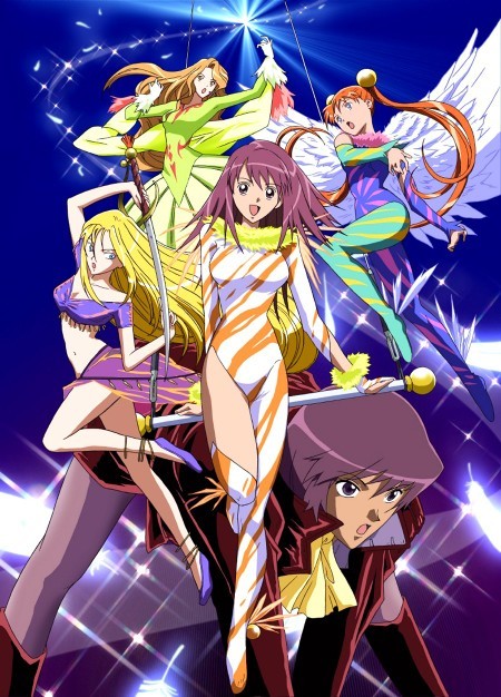
With that said, I hope it’s clear that this series holds a special place in my heart. So I hoped to make a piece based on it. After much thought I wanted to do a drawing of the “The Legendary Great Maneuver”. I won’t say too much for the sake of those who haven’t seen the series, but it is a moment that packs a punch of emotions.
I’m still trying out the digital and traditional blending of techniques where I do something traditionally and add to it digitally. This time though I am also using p.h. martins radiant water colors. They are quite amazing. But I have noticed that despite this, watercolors are still watercolors so if I don’t master the balance of color and light I won’t have a good picture if I were to do it completely traditionally.
My main problem is trying to do it exactly as I see it. It sound right in my head, but when I do it on paper… it just doesn’t work. I use too many colors and and it ends up looking, well dirty, muddled. In essence not good. Heck, too much work on it actually makes it look faded instead of vibrant which is what I’m aiming for. Having failed countless times, now that I see other’s work I see that they use the technique of fading the background and only adding more vibrant colors to the focal point (usually the character) on the page. This is even done on digital mediums.
I’m sorry, it seems I can’t embed the image here. I tried and it either doesn’t show the image or plain adds a 401 forbidden messege. So I will just leave the links for those who are still curious about what I’m talking about below, if not then just skip this short section.
Artist: YUU菊池(岩佐有祐)(can be found on pixiv)
Notice how the area surrounding the main focal point (the little witch) has more color and detail, while the surrounding areas don’t. Yet it all blend well together.
link to Image.
One of my biggest weaknesses are when backgrounds are dark or require other types of lighting other than a brightly lighted background (where the colors are basic and don’t require much thought on color variation and shadows).
Artist: Stu_dts (can be found on pixiv)
link to image:
This is a great example of what I mean. Notice how the colors on the subject changed in response to the background. Isolating the character would problably look weird in a white background but blends quite well here.
https://source.pixiv.net/source/embed.jsThe Sun Never Sets by Stu_dts on pixiv
So in the situation of doing it all traditionally, I wan’t a dark background but don’t want to add too much color either for fear of doing what I explained before. On top of that, when the athmosphere color changes, one’s subject has to change in turn as well so that it melds well together with the background. That’s where one of my weaknesses shows up, I’m afraid of changing skin colors. I’m so unused to it that it doesn’t feel natural when I notice that it’s supposed to be a shade of blue, red, orange, yellow etc. With that in mind i decided to try it out on this piece. I need to get over this weakness so that I can grow and draw/paint faster instead of doubting my eyes and overthinking things.
Luckily with digital I can try as many times as needed till I get it right. And try I did.
Now, before I continue. I’m adding a whole background on my current artwork, but many artists don’t even bother. Sometimes just adding a quick and undetailed or even unfinished background is enough. By doing this, the range of possible colors that the main focal point can achieve without looking out of place increases. But, I wan’t to understand how color works with each other and how that changes in respect to one another. Although it takes me a long time to do, I feel it will be best in the long run since I will be able to understand how color works in different situations. I do worry since I don’t have much time left.. but I think I can get to understand it soon. The further one goes ahead, the more one realizes how much one lacks and still has to learn. I’ve heard others say this growing up, and I’m really starting to understand that more and more these days.
I don’t want this to be too long, so I will divide it into parts (how many, I don’t know). But anyway here are the outlines of what I started with.
I actually wasn’t too sure how I wanted to go about things, till I saw this picture when looking for references. Once I saw it, I knew I had to do “The Legendary Great Maneuver”:
Starting with the roughs:
https://www.flickr.com/photos/darkcloudxero/34800182994/in/dateposted-public/
https://www.flickr.com/photos/darkcloudxero/35602060486/in/dateposted-public/
https://www.flickr.com/photos/darkcloudxero/34800182864/in/dateposted-public/
https://www.flickr.com/photos/darkcloudxero/35602060276/in/dateposted-public/
https://www.flickr.com/photos/darkcloudxero/35602060196/in/dateposted-public/
https://www.flickr.com/photos/darkcloudxero/34800182544/in/dateposted-public/
Background:
https://www.flickr.com/photos/darkcloudxero/35602064146/in/dateposted-public/
One more character:
https://www.flickr.com/photos/darkcloudxero/34800184794/in/dateposted-public/
That will be all for today.
Hasta la proxima,
-Nube

I see you don’t monetize your blog, don’t waste your traffic, you can earn extra cash every month because you’ve got high quality content.
If you want to know how to make extra $$$, search for:
Mrdalekjd methods for $$$