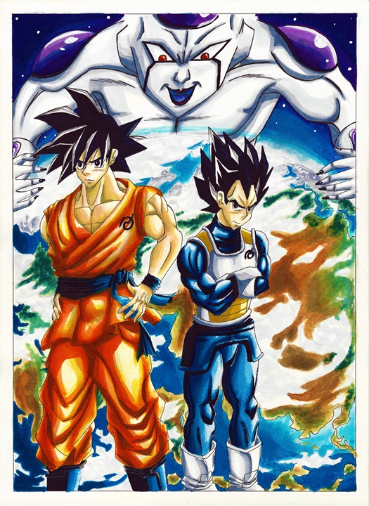
Dragon Ball Drawing

I have been working on this weeks drawing quite a bit. Wasn’t too shure how to go about coloring. At first I wanted to draw it like a manga page. Meaning black and white, using only my pens. But I decided to instead make it like a color page in the manga and actually color it in. I decided to only use watercolors and my copics (they are really running low right now). I had to think about every stroke so that I didn’t waste any ink. While waiting on the next moves I drew a couple of rough drafts for what may become the next artwork. But that is for another time.

I named the drawing “Goku, Vegeta and the return of F” in commemoration of the new movie that will be coming out soon. I am actually looking forward to it. Even more so than the first one. Hopefully this will be a lot better (seeing as the other one was more of a reintroduction to all the characters). In any case here are some scans of the artwork in the process and the final piece. Wasn’t too sure since I spent quite a bit of time on it, but in the end I decided not to add it to the gallery.

Goku Vegeta I resize Goku Vegeta II resize Goku Vegeta III resize Goku Vegeta IV resize

Print now available.

Hope you like it,

XERO.

New artwork and Disappearance Explained

Sorry, sorry. I was going to work on some Christmas and Winter stuff, but quite a couple of things piled on. Though this was my fault. I should have been working on some Christmas artwork a couple of weeks before anyway. So that is what will happen next year.

As for this drawing? Well one of the things I was working on last week was this piece for a client. The first official client after deciding to go pro. I got a couple of clients the years before, but again, this is the first official client. I will keep producing some more quality artwork to bring in more people interested in my services. For my first commission I have Katara from Avatar the Last Airbender. As stated before, I ran out of my Copics (well, at least the most important colors). So I used watercolors this time. After applying the color pencils on top I managed to make the drawing even more vibrant. As for Katara’s pose, I haven’t seen Avatar despite my brother and all my friends telling me to check it out. But since she is a waterbender and water is usually depicted as fluid, I’m guessing that they use a version of Tai Chi so I went with one of their forms. As for the water she is bending, I wanted there to be some contrast between Katara and the water. I wanted Katara to appear calm and collected, while the water was turbulent and fierce, ready to destroy anything in it’s path.

What do you guys think? (I’ll start working on the next artwork now)

-XERO

Katara Rough Draft resizeKatara No COLOR resizeKatara COLOR I resize

Katara COLOR IV edit resize
Print available soon.

Obscurus and Ame ‘Halloween’ + Update

I will be updating the website pretty soon, sorry I had to take care of some things on my end before I could come back to finish the construction of the website. I will be adding some more artwork to the “gallery” and updating the “prices“. So I hope you guys look forward to that.

Anyway I want to do something a bit different. I have a lot of old artwork that is actually pretty good, but I need to color it in better and polish it over all. So I will be doing that with a couple of drawings. We will start with the one below. Since it is October I felt it fitting for the season (more on the drawing later).

Hope you guys look forward to it.

-XERO

Obscurus and Ame Halloween

XERO DRAWING – Sailor Mars The Calm Flame Warrior

Time spent: hours 8 minutes 03
Materials used: Sakura 0.7 mechanical pencil, Faber Castell Perfection 7056 pencil eraser, eraser,
Sakura Pigma Micron set Black,
Uniball Sigmo White, Black
Sakura Moonlight gellyroll: Yellow, Red pink, Orange
Copic Markers: Y11, Y15, Y17, Y21, Y26, Y28, YR04, YR09, YR68, R08, R27, R29, C1, C3, C5, C7, W1, W3, W5, W7, G21, G28, BG18, V01, V15, V17, 0, E00, 100

So we are now on the third Sailor senshi, two more to go. From what I have seen so far, Rei Hino is definitely my favorite one. What is interesting is that they changed her personality a lot on the original anime from the one in the manga which I find a bit weird. But from what I have seen so far, this one seems to be more like the manga Rei which is more to my liking. Here powers are cooler too, specially since she already had spiritual powers to begin with.

Now for the drawing. I wanted to change things a bit more for this one. I wanted Rei to be a bit more like a Yamato Nadeshiko. So I made sure to not add much indication of eyelashes. And also change the shape of the eyes a bit. And truthfully, it worked out. She came out even better than I expected. One thing that I did sort of messed up are her eyes. I made them purple, but I was reading that they turned red when she was in her senshi form. But oh well. I really like her purple eyes. They blend really well with her long dark hair.

What do you guys think?

-XERO

XERO DRAWING – Sailor Mercury The Intellectual Warrior

Time spent: 8 hours 59 minutes
Materials used: Sakura 0.7 mechanical pencil, Faber Castell Perfection 7056 pencil eraser, eraser,
Sakura Pigma Micron set Black,
Sakura gellyroll White,
Sakura Moonlight gellyroll: Light green, Dark purple, Blue, Yellow
Reeves Water Colours 18 set: Viridian hue, Phthalo Blue, Ultramarine,
Copic Markers: 0, E00, C1 C3, C5, C7, W1, W3, W5, W7, YR00, Y11, Y17, Y28, V01, G21, G24, G28, BG10, BG78, B0000, B01, B05, B21, B24, B26, B28, B32, B34, B39, B45, B69, B97
Sharpie Oil Based PAINT White Fine Point

And so we continue with the Sailor Senshi series. This time it is the second member to be revealed in the series Sailor Mercury, real name Ami Mizuno. So far, I like her more than Sailor Moon. Though she hasn’t really made a strong impression on me either. On another note, I still don’t quite understand what Sailor Moon’s attacks are based on, most likely they are just random attacks that Naoko Takeuchi thought were cool. But for all other members, it seems like they have an elemental affinity tied to them. For Ami Mizuno it is water, so since the start I wanted to incorporate that. In the end I was thinking about it being either ripples or waves. I never really made up my mind before starting the drawing, but in the end I just combined them together. And surprisingly, it worked quite well together.

In any case, I hope you guys enjoy and learn from this video.

-XERO

XERO DRAWING – Sailor Moon Warrior from the Moon

Time spent: 7 hours 56 minutes
Materials used: Sakura 0.7 mechanical pencil, Faber Castell Perfection 7056 pencil eraser, eraser,
Sakura Pigma Micron set Sepia +Sakura Pigma Micron set Black, Sakura gellyroll White, Sakura Moonlight gellyroll: Yellow, light pink, Dark Pink,
Reeves Water Colours 18 set: Lemon Yellow, Medium Yellow, Ivory Black, Phthalo Blue, Violet, Ultramarine,
Copic Markers: R08, R27, R29, Y11, Y17, Y21, Y28, B01, B05, B34, B45, B97, C1, C3, W1, W2, V01, G21, G24, G28.

There was no video last week because I bought a new scanner, but it would not arrive till after a couple of days later after I usually upload a video. So I decided to hold it back and wait for the scanner to arrive. It is a large scanner that allows me to scan areas up to A3 (which is a scanner I have been looking for for quite some time). Now I can get a good quality copy of my artwork here at home.

In any case, for this weeks drawing, we will be doing Sailor Moon. I heard the new series would be broadcasted so I decided to give it a chance and see what it was about. I know I saw some episodes when I was younger but I only saw a few and don’t really remember much. So I said, what the heck, lets give it a chance. After all, I kept hearing good things from both females and males about it. My overall impressions at this point? Personally the old animation looks more appealing to me, but it definitely doesn’t look bad at all. I hear this series is following the manga better so I will see this through to the end to see how good it is. I gotta say, Usagi is rather dumb… But I guess that’s a common feature among Shoujo heroines (as well as Shonen heroes of course). We’ll see how this goes.

-XERO

Xero Drawing – Erza Scarlet Yūen no Koromo (COMMENTARY)

Time spent: 9h22m

Materials used: Mechanical pencil, ruler, eraser, Faber Castell eraser pencil
Colored Pencil: water color PrismaColor – peacock blue, ultramarine blue, french grey 20%, true blue, violet, black, crimsom red, lilac, white, blush pink
PrismaColor – ginger root, peach, beige, cream, sand, light peach, 20% french grey, lilac, parma violet, dark purple, mulberry, carmine red, pink, process red, yellowed orange, crimson lake, 50% warm grey, 70% cool grey, 70% warm grey, 50% gold Grey, White, Black
Crayola – pale rose, violet, brown, taupe, lemon yellow, jade green, harvest gold, magenta
Rose Art – violet, orchid
Verithin – dahlia purple
Ultra Color – purple


We have made it to the second video, this time the objective is Erza Scarlet from Fairy Tail. A good series (that relies on way too much fan service…). For this drawing I thought I would only use color pencils and nothing else. I figured I would try to show different techniques that can be implemented with different tools. The most common one that people can easily get their hands on are color pencils. They are rather versatile and can leave some really good effects, but only if used right. I’m mainly a pencil type of artist so I’m a bit shaky when it comes to coloring. But I have been practicing and coming up with new methods ever since I decided to go pro. I’ve actually been starting to understand how to fully utilize the full potential that color pencils possess. And that is what this video will be about.

Hope you guys enjoy the new format, and learn much more this way. Till next time.

-XERO


Artist Project Update 2/28/2014

I missed posting on Monday again. But just like last time I was working on another contest that appeared right after I had finished writing last Friday. This time the theme was for the new film The Wind Rises (Kaze Tachinu), which will be Hayao Miyazaki’s last film. It still requires that weird format, but this time I had last competition’s experience under my belt. This is what I assumed would happen if I kept joining contests since it forces one to produce quality artworks in a small amount of time that requires one to keep a deadline in mind at all times. I felt I could do even better, but this was a big leap from the last entry. With this format (2000 x 550) it was still a bit annoying but surprisingly I did better. I decided on a theme that touched upon the harsh past that flowed to a  brighter future because of their meeting each other (sadly judging by the trailers the woman protagonist will most likely die from tuberculosis). I could only come up with so much by seeing the trailers and reading the extremely short synopsis given by deviantart.

This time I decided to work with my small collection of Copic markers I bought a couple of years ago, I was hesitant in using them because of how expensive they were. As well as my struggling ability to work with color (though I have been getting much better). To my surprise, using them was extremely intuitive. Mixing, blending and just coloring was much faster and effortless than with color pencils, which require a lot of work to have the colors stay on the paper and meld with the picture it self. There is this new technique I have been thinking of using for quite some time now, and seeing just how much I can bring out of the markers and color pencil (though I still need to work more on the color pencils) I can see the vast possibilities I can bring to my work.

The drawing and design for this piece was definitely better than last times, sadly my camera was not able to capture all of it’s greatness. The end sides got distorted because they bend up, making the drawing and colors blur. I just might have to invest on a big scanner. It’s a pain but it will be worth it if it shows my work in it’s original intended form.

In any case this is my entry:

The Wind Rises - warm breeze


Until next time,

-XERO

Artist Project Update 2/21/2014

Sorry. It seems I disappeared again. Luckily it was only for about a week. The reason being that I was working on an artwork for the “Lightning Returns Deviant Art contest”. I only had five days, and the weird format it had to be in was rather tough for me. I struggled a bit working on it because of this. I’d say doing the background was what made me worry the most. I had to come up with something that melded well with the actual drawing/design, but also not overtake the attention from the actual focal point. I worked with a lot of background designs, till I finally decided to make it as simple as possible.

Seeing the other entries, my hopes of winning are slim. It seems that quite a couple of them have a bit of experience in these types of formats and situations. I soon realized just how much I have to improve in  a number of areas. On the plus side I did learn a couple of cool new trick on photoshop that I plan to use and perfect for future artwork. Again, my biggest weakness is coming up with backgrounds. So that will have to be the focus of my training regimen. In any case, competitions really help hone one’s skills and show one’s weaknesses. Having that in mind, I will try to enter a couple of more in the coming days and see how much I improve.


Here’s my entry.

Lightning Returns Ace Swordsman


Unit 01 Beast Inside

Here is the drawing for this week, Unit 01 from Neon Genesis Evangelion. I was pretty much done with it yesterday, but there was something that kept bothering me about my drawings. The fact that they look so unrefined. I knew why that was of course. I did not blend the colors anymore. This happened because I decided to practice doing this so that I could increase my abilities without the need to blend them, that way once I decided to go back and put some good effort into my work I would be able to produce some amazing stuff. Sadly I got so used to doing this that I had almost forgotten the blending techniques I had developed. And because of it I have to start all over again. I gave it a try for this drawing which came out pretty well (though it looks unfinished without a background, I’ll have to do something about that from now on). Now that I have remembered a couple of my old techniques and about blending colors, I will try to bring out some better quality work from here on out.

Hope you look forward to it.

-XERO

Print Available
Print Available

As you can see, this week I do not have a video for this week. And that will most likely be the case from now on. More on that on Friday.

Rei Ayanami, the person that got me interested in Neon Genesis Evangelion (well her and the song “A Cruel Angel’s Thesis”) . Strangely enough, even though I wasn’t let down when I finally saw the series, Asuka stole my attention as soon as she appeared. I feel that in the remakes of Evangelion Rei seems to have more of a future (much like Asuka). I am really looking forward to see what happens in the last movie.

As for the drawing it self. Over all I was really pleased in how it came out. But while drawing this I made a lot of mistakes which led me to make a couple of changes that led me to create the blue shadow. I have always wanted to play around with these kinds of backgrounds but over all I think it brought down the quality of the drawing it self. I’ll have to work on that a bit more from now on. On the plus side, while adding the watermark it gave it a really cool effect.

Print Available
Print Available

Create a website or blog at WordPress.com

Up ↑