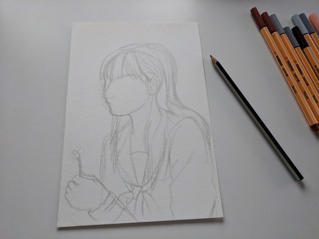
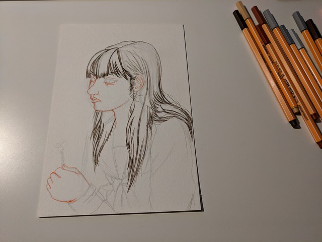
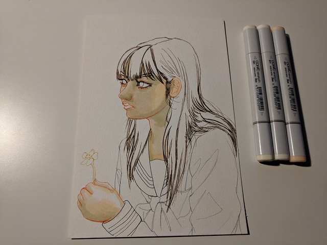
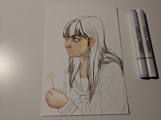
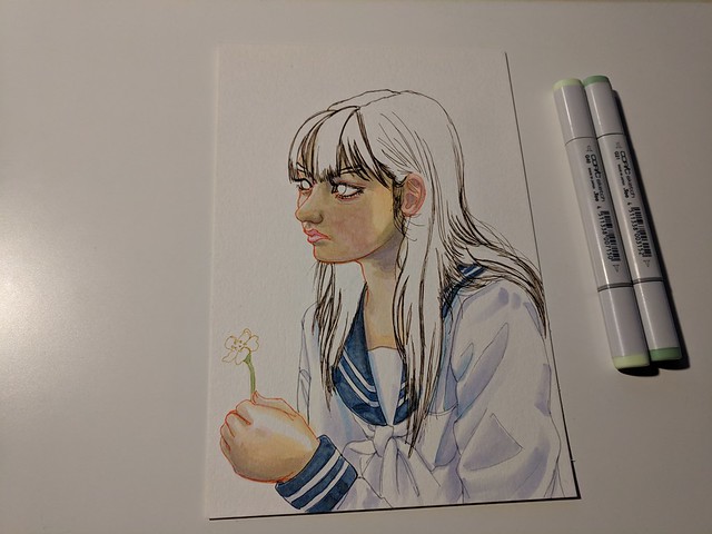
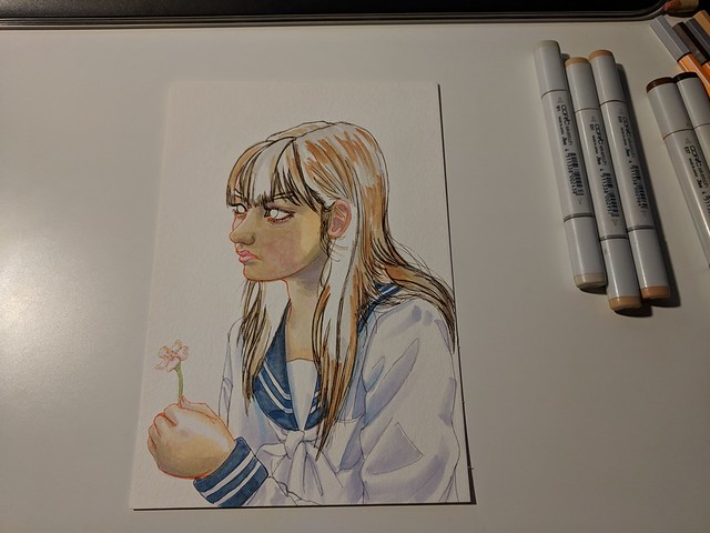
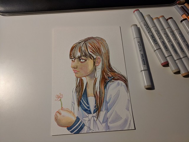
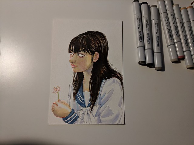
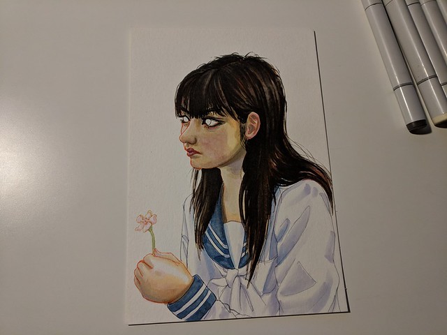
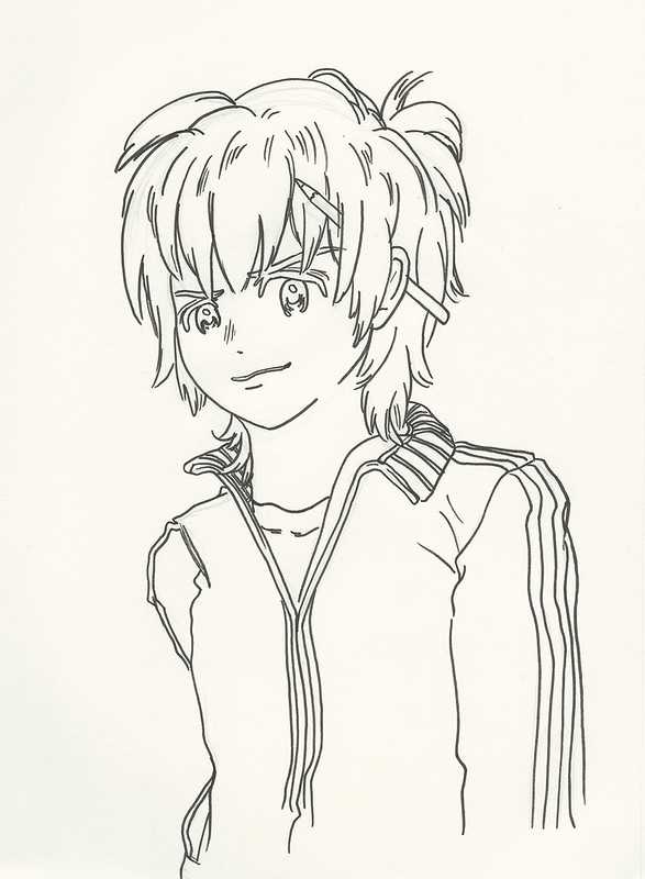
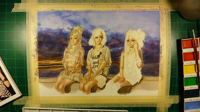
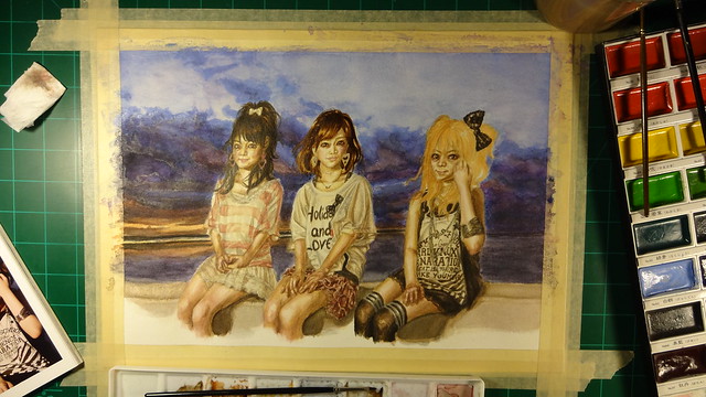
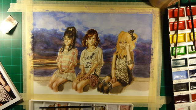
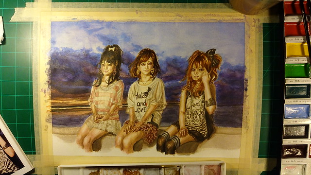
I recently bought some new pens when I went to a somewhat local art store. When I was browsing around I came upon some pens that I haven’t seen before named Stabilo pens. After looking at them I noticed that they were almost exactly what I was looking for. In the past Copics used to have multiliners that came in different colors which I would have loved to use as outlines for my artwork, but they got discontinued a good bit ago. Ever since I was trying to find a replacement I could try and use instead but I wasn’t too happy with the limited selection Prismacolor had so I haven’t really used them since I bought them a couple of years ago. But these Stabilo pens seem to have a rather robust color selection and they also offered different nib sizes (though for now I’m really only interested in the multiliner type). And when I saw their price being really cheap I thought what the heck, so I bought 10 (all of them either skin tones or grays). So since this was going to be my first try using them I decided to give the honor to Michishige Sayumi as the subject. Here’s what it looks like finished (done with my new Stabilo pens and Copics). Process below for those who are interested.
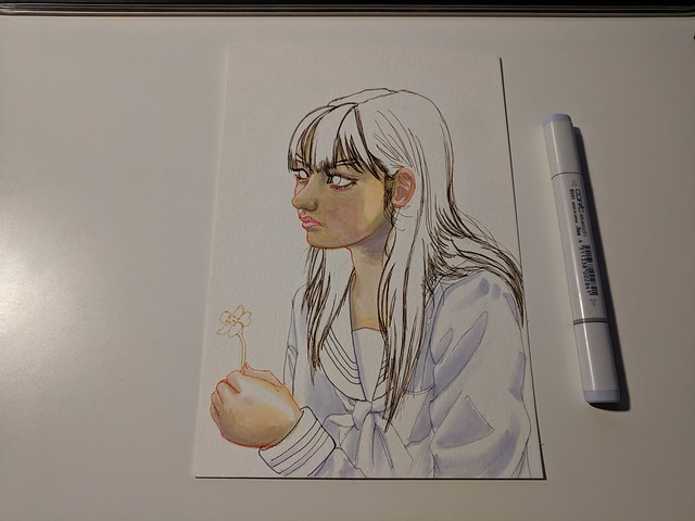
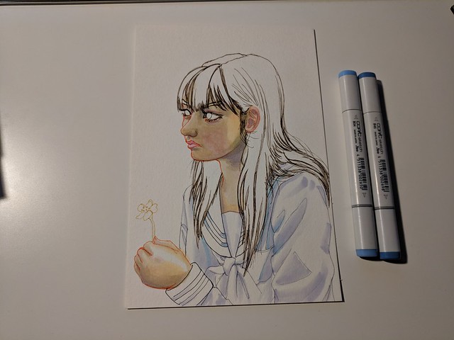
It’s been a while since I’ve done a piece traditionally so I was a bit worried, but it went rather smoothly and the whole portrait took me only a couple of hours.
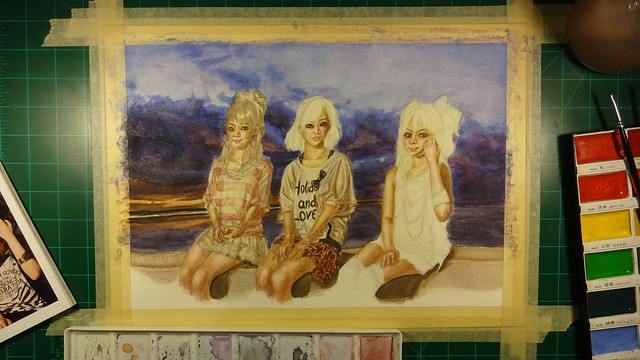
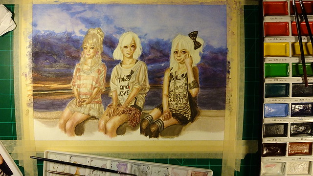
On the right are my new pens, these are the colors I have so far.
And as usual I start outlining using my 2H pencil.
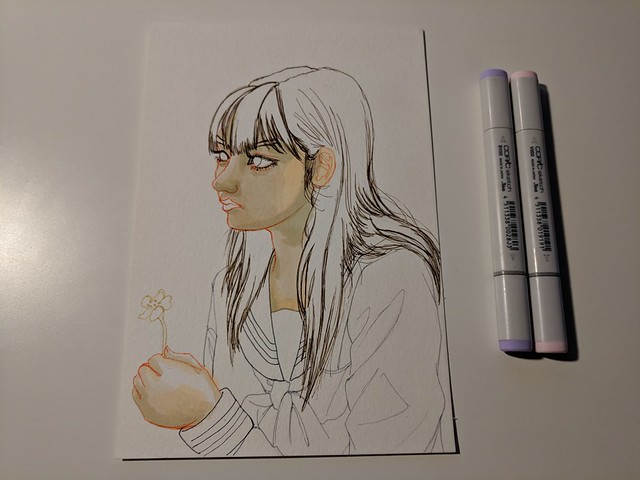
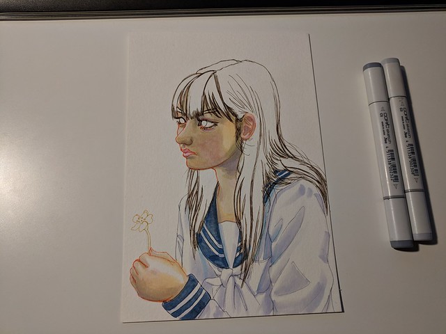
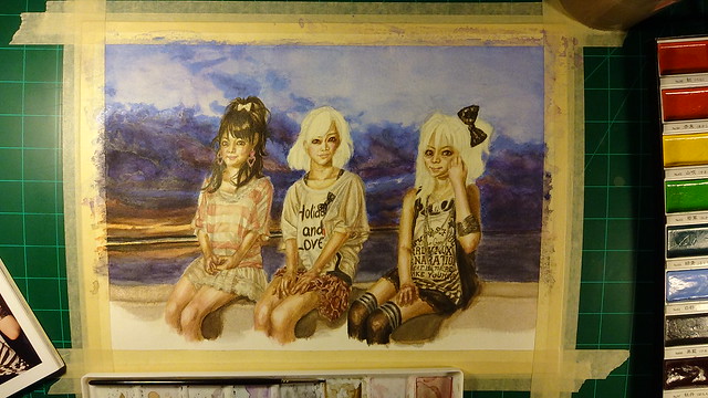
And that leads me to the finished piece (already shown at the beginning):
My thoughts on the Stabilo pens? So far I really love them. They leave beautiful marks and are resistant to my Copics too. Not only that but the color selection makes them quite useful for different applications. I’m definitely planning on upgrading my collection. The only downside is that they don’t seem to be refillable, but they’re not expensive so it’s not a big deal. Can’t wait to see what I can create with them.
-Bonus-
In any case, as I was writing this I had recently gotten off my other job and was happy to find a new video with members of Platinum Era Morning Musume, and that led me to another video that happened to give me a rather happy coincidence.
-By the way I use a dual monitor set up, left is my XP-Pen (that doubles as a monitor when not used for art) and my normal monitor on the right.
Anyway as I was watching this video I noticed that Sayu was looking right at them as they performed, I noticed this and found it funny and a coincidence as a certain number was happening. (I know I’m the only one finding pleasure and happiness in this but whatever).
On April 23 of this year I decided to take another plunge and buy an on screen graphics tablet. Of course one does have to be weary of anything that is cheap. So I was pondering first about buying a graphics tablet for a couple of years, then when I did have money saved up I began noticing the other options. At first I was thinking about getting the Wacom Cintiq 13HD, but I’m living in a time that new competitors are emerging in China. On top of that, they offer bigger sizes at around 1/3 of the price of Wacom’s 13 in. offering. I decided to wait it out till a good amount of reviews and tests were done on them. A number of reviews seemed to be positive but there were not that many of them. Then at some point it seems like these products were being given away to Youtube artist so that they could “review” them (many of them were just unboxings). On top of that, they were always compared to Wacom Cintiqs (which is ok) but they tended to focus on it way too much. In the end these reviews really didn’t give me much confidence. Specially since I hadn’t used any on screen graphics tablet before so many of the points they were making I couldn’t really connect to.
One piece of advice I did connect to was that a bigger screen would work much better since I would have more space to work and wouldn’t have to be squinting or enlarging the image as much. So despite the countless positives of owning a Cintiq, I decided to bite the bullet and buy an XP-PEN Artist 22E ( it’s a 22-inch display graphic monitor). It’s strange, it is quite an expensive device so I almost felt bad about buying it. I even didn’t use it for a week, it just laid by my desk covered by my jacket. But at some point I decided to give it a try. Since this was my first graphics display I struggled a bit setting it up. But it’s actually quite easy when you know what you are doing. A quick tip is to set it all up is using the pen program used for this tablet. If this is your only display than you shouldn’t have a problem, but if you have a two display set up make sure you choose the XP-PEN as the correct monitor and also make sure it isn’t chosen as the extended option (this was the only thing that gave me a hard time). If it seems to not be working, remember that you should restart your computer after you install the driver and program.
I didn’t really want to write anything about this display till I had used it for a good bit. So far it has been two months, so I will document my experiences so far (I will do so in the future as well, I’m quite interested if this tablet will last me a good while or if it will only last for a year of something).
So far I’m content with it. I know a bit more about digital art, so now that I have this on screen graphics display I can work much faster since I’m actually drawing and painting on the canvas itself. One can get used to the other tablet like the Bamboo Manga I used previously, but nothing beats working on the artwork directly. And with the two monitor system I can work on the XP-PEN and look at my reference picture/s and even some sort of entertainment on my second monitor. It works quite great. I used to use my laptop to work on artwork, but now I’m using my PC that my brother gave me which is much more powerful and can take quite a beating (with all the programs I use simultaneously).
The monitor itself works quite well and seems to be of a good quality. In the reviews they talked a lot of paralaxing, but since I’ve never used a better display or really see it as a problem, I really don’t notice it. If I want to draw or paint somewhere the paint applies my paint where I want it. The on frame buttons are also quite useful and have increased my workflow. It came with a stand included that worked great but it took a good amount of my desk real state. So with that in mind I decided to invest in a monitor arm. But I was also weary of buying a cheap one that would break easily or would not move the way I need it to. After much thought and research I decided to go for the Amazon basics arm (in fact another reviewer of this display bought this arm which prompted me to give it a try). Now with this arm and the display I can work much better, more comfortable and faster. Before I was contemplating buying a wireless keypad and converting the keys into hot keys for the art programs like Photoshop. But with this set up I can have the display above the keyboard and away from my arms when I’m drawing and is easily accessible when I need to make a command.
One thing that really freaked me out was that the pen was leaving scratches on the display. I couldn’t really find much about it online, but I guess this is normal… These scratches also leave behind a rainbow effect on the screen but if you clean it off a bit it the rainbowing effect disappears so it really isn’t a problem. I wonder if a softer stylus tip exists? Whatever the case, after a while you don’t really notice it. I guess it’s one of those things where you get a new item and you are always weary of scratching it or something.
As for what can be done with it, that just depends on one’s skills.
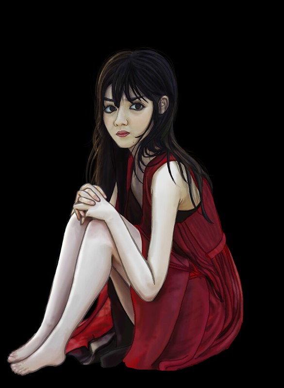
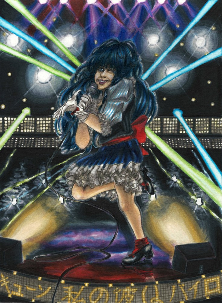
I chose Sayumi Michishige as my first model for my very first artwork on this tablet.
This is the reference picture I chose:
Here is what I managed to do with it, my first digital study:
This was done on May the 18th. Since then I have been working some more work which I will upload soon.
So far I really love my new XP-PEN, but time will tell if it was a solid investment and will last me a good couple of years or if it’s a cheap “imitation” that will break in the near future. I’m hoping it it does last.
As mentioned before I said I was going to be uploading some artwork that I’ve been working on as a bit of practice so here it is (sorry about the delay, like usual the workload has been a bit of a pain but I’m pushing forward – luckily this semester is almost finally over… though construction work seems to be looking to increase).
I got a Samsung tablet for my self at the end of last year and didn’t really use it all that much, but while in a dollar store I saw a tablet stylus and decided to try it out. I was surprised at the accuracy I could get with such a clunky pen, so I ended up purchasing an app to do some art on the tablet. Sadly the tablet is not that powerful so it stuttered way too much while I was working on it and it even crashed plenty of times but it did get me interested on the possibilities of drawing/painting digitally directly. Though one can get used to looking up at the monitor using a normal drawing tablet, there is no comparison to actually looking at what you are drawing/painting. Now I’m really craving a drawing monitor…
Anyway here are two tries I made while waiting for my class start;
On the traditional side of things I wanted to make some quick practice sketches with a pen. And not surprisingly the ink really made it standout and look cleaner than when using a pencil.
I wanted to try a conversion from a real person to an anime version so I decided on using this reference picture of Eri Kamei to try it out:
I decided to only do the main lines to test out how it all looks.
This time I used a pen from the brand LePen, I want to test out how a lighter pen combines with color so I used their Dark Grey color which leaves a much lighter mark that I hope combines much better when I add watercolor and copics to it.
After I did the outline I wanted to see what would happen if I added more detail and darker lines, but my skill are still… anyway I’ll figure it out by doing some more when I have the chance. For the thicker lines I used one of those ink pens from Hobby Lobby that are meant for calligraphy. Did not end up how I wanted it…
But despite all this it does give me a good opportunity to try out if I can conceal mistakes using my Knicker Poster Color white, it does work but I have to gauge the right amount so as to make it thick enough to cover but not thick enough to make a mess. What I do know is that the thinner lines looked much better, I’ll have to figure out how to ink and shadow properly.
I inked some sections and added some details but not much since I didn’t want to use too much time on it. I’ll practice some shading techniques on a blank paper to figure out what kind I should use and at what time.
It’s been a very tough time lately, it has been filled with a lot of work from all fronts (school even has me reading multiple books at once…). But the main time consuming thing is creating the new format for my Youtube videos. I will finally be making that comeback I mentioned, but I really want to up my game so I’m trying to create a strong new video format that I can feel proud of and that people will hopefully like and will also retain their interest. Time constraints are a bit rough right now though. I also have to make a presentation in a week about a book we have to read for class and that will require a good a bit of time. Haaaaa…….
I have made some new things just haven’t had the time to upload and whatnot. Let me get through this things and hopefully I will have some more time soon. We have a lot of things to catch up on, seriously.
For those of you who read these here is a sneak peak to the video:
I will be adding some “shading” later on but haven’t had the time to do so yet. I’m still not done with the ending quite yet, but the meat of the video shouldn’t be too hard to figure out. But I do worry about whether I should actually talk in the videos or not…
So, another year has passed. I put some goals for my self this year, and although I could have done better I did accomplish them. So I will continue to go forward. The future does seem quite shaky and uncertain. But that’s life… I won’t give up.
I guess my goals for this new year is to take things further and accomplish even more things this year. I also want to be more physically active and learn Japanese to a proficient level. I’ve put those guys in the back burner for far too long. It’s time I give them the time they need.
This is the drawing for this year. I was thinking of adding some Dia de los Muertos influences, but maybe next time. Today was quite a busy day so I wanted to make a quick drawing. I really like Yoshitoki Oima’s art style a lot (creator of “A Silent Voice”), so I decided to use her style for this drawing. I didn’t have much time for coloring either (I actually just drew it in about half an hour a couple of minutes before I started making this entry) so I will just do the line art like if it was from a manga panel. I was thinking of inking it as well but the day is almost over so I will leave it like this. Besides it looks quite clean this way.
Here’s to working towards a better future and accomplishing our goals!
After thinking all this year and trying to learn a much as I can about colors, it was now time to actually put it into action. The best way to learn is to learn from others. So that is what I am currently doing right now. One of the things I really want to be able to do is realistic paintings. This requires a good understanding of applying paints and mixing colors. I’ve mainly been watching three youtubers;
This channel is great because he teaches a lot of tehnical techniques and explains them in great clarity. On top of that he is very fun to listen to and his videos are very entertaining.
Actually saw his videos first, and through his videos I found the two channels above on the reccomended list on the side of youtube.
Anyway, years ago after I graduated from high school I bought some photobooks of Platinum Era Morning Musume with the idea of one day being good enough to paint them. Well, after taking a year (this year) to learn I felt it was finally time to give it a try. I was actually a bit aprehensive to start. Heck, I would even say I was actually a bit scared? But it is finally time to make my art finally grow and gain more experience.
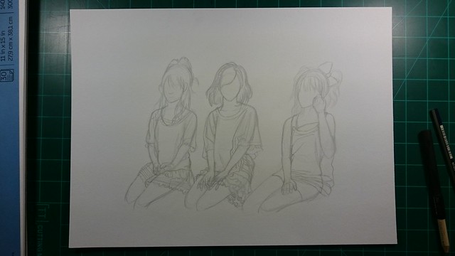
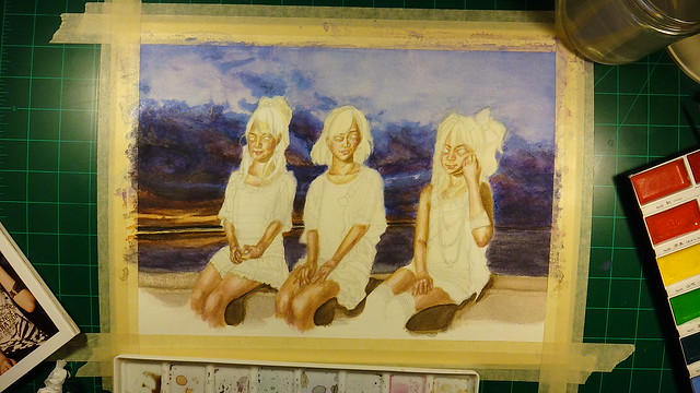
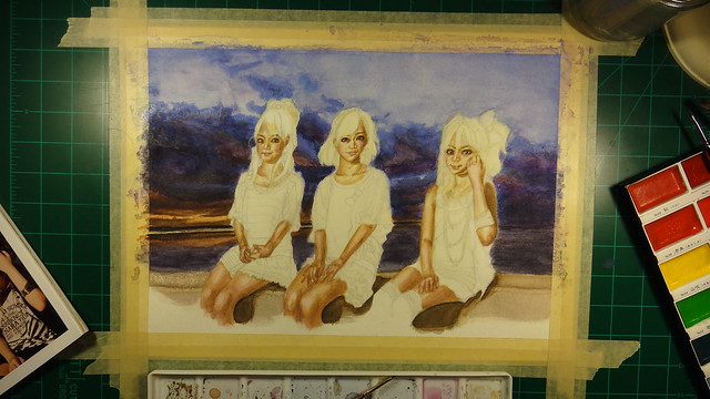
One other thing I want to learn is dealing with dark colors, so I chose this photo (the one on the bottom):
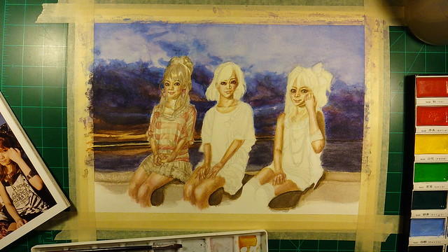
Maybe it was a bit reckless of me to choose one with three people instead of just one, but I wish to be able to do a background and deal with multiple focal points. One problem with my artwork is that I have been adding too much details to areas that are not the focal point. The problem with doing that is that one, the focal point is not clear, but more importantly, it just doesn’t look good. When I finally figured that out, I decided to pay attention to what I see and really think about what can bee seen on the sides of the focal point. What I mean is that I look at an object (whatever it is) and try to pay attention to the surroundings and learn just how much detail I am actually able to see when I focus on one point. Turns out, not much. I can see the outlines and main figures, but not any really fine details. So I’ll have to keep that in mind from now on.
Using photos as references can also be problematic since they can see things very differently than a human. So in that sense I will have to choose what requires details and what doesn’t. And then I have to learn just how much details are enough to convey the athmosphere while making it all meld well together.
I was also afraid of using the colors I saw because I had never used them before. Such as when I see yellows, pinks, browns, reds and blues etc (on skin colors). I tend to go with very generic colors instead due to my inexperience and fear of ruining what I have at that certain point. That in turn makes very flat artwork that doesn’t really exist in a realistic sense. It may look good with anime/manga characters but once I apply such colors to real life people, it just doesn’t look right.
One other thing to mention is that due to that fear I also end up making very muddled artwork that just ends up looking dirty. Copic Markers are great, but they do have their limitations and one has to know them otherwise one can mix colors that don’t combine well or one can also over work the colors to the point that they make very dirty colors. This of course does no good to the final picture. One good example of this is the Macross artwork I did a while back;
Print now available.
When you are working with something that requires alot of concentration, detail, colors and experience. It is easy to understand if one messes it up. For one I am assuming the colors and ignoring the ones I see in the actual reference pictures (as can be seen here);
After learning what not to do, I decided to actually give it a try and paint what I see instead what I think it should be.
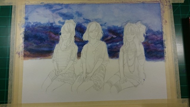
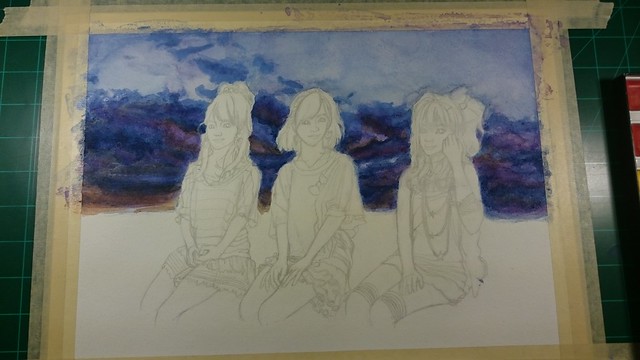
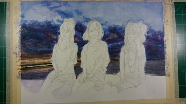
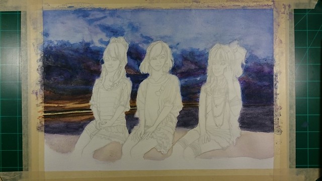
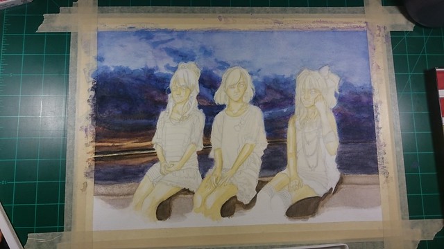
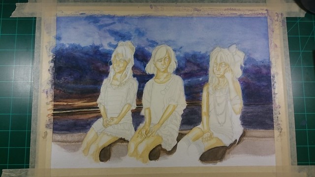
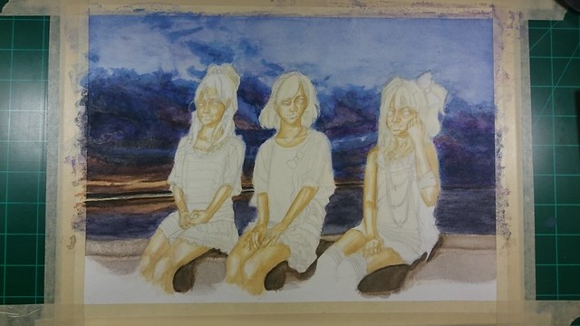
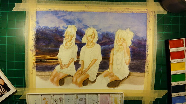
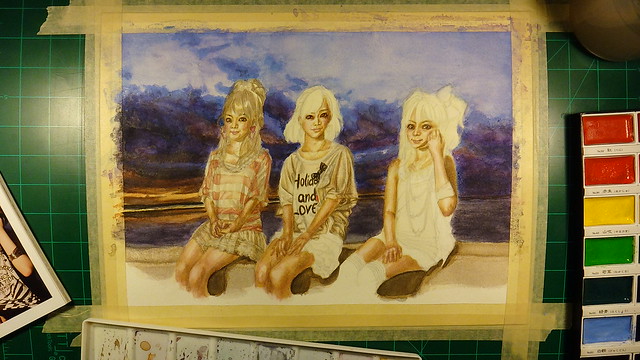
With all that said this is the finished piece:
And here is the process of how I drew and painted this new piece.
Let’s talk about the broken Camera.
Before I started recording this watercolor piece I had dropped my camera which sadly cracked my lens. That is noticeable on the first videos I recorded. So I had two options, buy a new camera or try and fix it. Hopoing I had not damaged the sensor I ordered a replecement lens. It took a while to arrive, so half of my recordings have that crack. When it arrived I was debating whether I should finish painting this piece first or if I should fix it before continuing. One concern was that if I messed it up and couldn’t fix it, I could very well end up with the camera in even worse condition.
After some thought I just decided to go for it. And that took a bit of time to get done, but since I have some experience from fixing some of my other electronics it didn’t take long for me to figure it out. It did take me three times to hook up the ribbon cables (which gave me problems that of course freaked me out a bit). Luckily it was all working well when I properly hooked them up and the rest of the videos did not have that crack.
As for the paints.
I decided to use some of the money I made from NanDesuKan and buy some paints that I have been interested for a couple of years. (I’ll talk a bit more on some of these things later.) Those paints are Nicker Poster Color. The way they can cover a whole area completely opaque but can also be thinned out really caught my attention. And the idea that I can paint on top of what I have already painted while still being completly opaque. I still haven’t tried them out yet, but if they work like I think they do it will be my dream medium.
Plans.
Fall is here, and October is here. So that means that I should make the effort to make some pieces with those themes. Since I am in October, I should make some Halloween themed paintings. I actually have one that is already drawn out since last year. I was planning on finishing it for last years Halloween, but decided to learn how to use colors first then come back to it so that I could do a much better job. Of course I could wait to get better, but I feel this could be a good learning experience now that I know a bit more. Hopefully I won’t mess it up, but I have to not be afraid to try new painting techniques.
Aside from that I do want to make maybe two more new ones. I just haven’t decided what character to choose or any ideas of what to do.
But those are my plans, I will have a midterm soon so I hope I won’t hit a snag.
This week has been full of tedious and time consuming obligations. I’m still not done but things have been progressing quite well. Of course I haven’t really stopped working and have some things to show you guys. One other thing to note is that last week was NanDesuKan so I’ll talk a bit about that.
Since I went to two conventions earlier this year I was having convention fatigue. I didn’t really feel like going but I did want to take some artwork for the Art Gallery section of the event. This time I decided to take only some prints so that I could sell them for a lower price in hopes that I could sell them this time. This year I took the piñatas That I made all throughout the end of last year and the beginning of this year. Some have actually sold already, such as the Popplio and Eevee and have been comissioned to make another one. So for NanDesuKan I was offering Pikachu, Rowlette, Litten, Mimikyu, Totoro, Jiji, and I made two new ones for this convention. Goku and Kuririn. I made them as kids wearing their attire from their training days under Muten Roshi (I even decided to make their turtle shells the day before the convention).
Just in case you forgot or haven’t seen them before, here are the piñatas that I took with me.
This was the piñata side of things. But I prefer drawing more, so of course I took some of the new 2d art that I have been working on this year. Thinking back I was learning more than creating this year. But I feel it was worth it (I still have a ways to go, but I’m starting to understand things a bit more now).
My original plan was to show these pieces on their own and before the convention so that those who take the time to visit this site would get a sneak peak as a sort of special “reward” for visiting the site. But I got really busy preparing for the convention that I didn’t have the time (those two weeks before the convention were also quite stressful). Luckily I did get not only the new piñatas finished, but I also had two new artworks done in those weeks prior.
I took 4 art pieces in total this year.
I made a new piece with the prints of the legendary Pokemon from X/Y.
I dumbly chose to do a Saber piece (from Fate Stay Night, I think). But that series can get rather complicated if you haven’t seen or played any of the games (which I haven’t). (There’s so many Sabers) So I really didn’t know what I was doing at all… This was one of the pieces I was doing right before the convention. Thinking back maybe I should have done something else, but oh well.
So these are the pieces I took this year. Now for the results. Out of all the piñatas, only Rowlette and Mimikyu were sold. And of the 2d art, all of them were sold except for the Saber piece. And out of all the pieces only one went to the live auction, that being the Pokemon X/Y piece.
On top of selling a good amount of them this year, I also won an award again this year.
Seems like I won the 3D category again this year. Plus I also won the Video Game Room Art Show award. Seems like the 3D award was for the piñatas, and the Video Game award was especifically for Rowlette. With that said, I assured another weekend pass for next year.
Not too bad.
Sorry I haven’t really been posting much, but it has gotten a bit stressful these days. And now the future is looking a bit shaky… Heck even the sun and moon were kind of ominous when the outcome of the future was put on jeapardy.
I believe it was back when I was in late middle school when I first came upon the series (Kaleido Star). By that point I had seen quite a couple of anime series and had started to develop my tastes. This was a series I couldn’t get enough of. The characters, animation, story, music, athmosphere and themes all pulled me in. It also helped that I was really into Cirque du Soleil at the time (I never went to an actual show, but I did rent the dvds to see the performances). It had that typical 2000s look to it, when animation was starting to move towards digital coloring which (those from that era) tend not to age well. But despite that, the series was stylized in a way that stands up even today. I want to talk more about it, but I will leave that for a later project. If anything I just wish to say, if you haven’t seen it yet, watch it. I highly recommend it.
This is the anime I’m talking about.
The main character Sora Naegino.
With that said, I hope it’s clear that this series holds a special place in my heart. So I hoped to make a piece based on it. After much thought I wanted to do a drawing of the “The Legendary Great Maneuver”. I won’t say too much for the sake of those who haven’t seen the series, but it is a moment that packs a punch of emotions.
I’m still trying out the digital and traditional blending of techniques where I do something traditionally and add to it digitally. This time though I am also using p.h. martins radiant water colors. They are quite amazing. But I have noticed that despite this, watercolors are still watercolors so if I don’t master the balance of color and light I won’t have a good picture if I were to do it completely traditionally.
My main problem is trying to do it exactly as I see it. It sound right in my head, but when I do it on paper… it just doesn’t work. I use too many colors and and it ends up looking, well dirty, muddled. In essence not good. Heck, too much work on it actually makes it look faded instead of vibrant which is what I’m aiming for. Having failed countless times, now that I see other’s work I see that they use the technique of fading the background and only adding more vibrant colors to the focal point (usually the character) on the page. This is even done on digital mediums.
I’m sorry, it seems I can’t embed the image here. I tried and it either doesn’t show the image or plain adds a 401 forbidden messege. So I will just leave the links for those who are still curious about what I’m talking about below, if not then just skip this short section.
Artist: YUU菊池(岩佐有祐)(can be found on pixiv)
Notice how the area surrounding the main focal point (the little witch) has more color and detail, while the surrounding areas don’t. Yet it all blend well together.
One of my biggest weaknesses are when backgrounds are dark or require other types of lighting other than a brightly lighted background (where the colors are basic and don’t require much thought on color variation and shadows).
This is a great example of what I mean. Notice how the colors on the subject changed in response to the background. Isolating the character would problably look weird in a white background but blends quite well here.
So in the situation of doing it all traditionally, I wan’t a dark background but don’t want to add too much color either for fear of doing what I explained before. On top of that, when the athmosphere color changes, one’s subject has to change in turn as well so that it melds well together with the background. That’s where one of my weaknesses shows up, I’m afraid of changing skin colors. I’m so unused to it that it doesn’t feel natural when I notice that it’s supposed to be a shade of blue, red, orange, yellow etc. With that in mind i decided to try it out on this piece. I need to get over this weakness so that I can grow and draw/paint faster instead of doubting my eyes and overthinking things.
Luckily with digital I can try as many times as needed till I get it right. And try I did.
Now, before I continue. I’m adding a whole background on my current artwork, but many artists don’t even bother. Sometimes just adding a quick and undetailed or even unfinished background is enough. By doing this, the range of possible colors that the main focal point can achieve without looking out of place increases. But, I wan’t to understand how color works with each other and how that changes in respect to one another. Although it takes me a long time to do, I feel it will be best in the long run since I will be able to understand how color works in different situations. I do worry since I don’t have much time left.. but I think I can get to understand it soon. The further one goes ahead, the more one realizes how much one lacks and still has to learn. I’ve heard others say this growing up, and I’m really starting to understand that more and more these days.
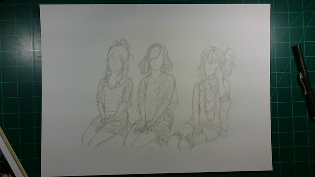
I don’t want this to be too long, so I will divide it into parts (how many, I don’t know). But anyway here are the outlines of what I started with.
I actually wasn’t too sure how I wanted to go about things, till I saw this picture when looking for references. Once I saw it, I knew I had to do “The Legendary Great Maneuver”:
Well after the last convention I started to see all my weaknesses and decided to go ahead and focus on getting my skills stronger and at a higher level. Although I feel like my drawing skills have reached a good level, in the end if I produce a poor coloring job it will ultimately bring down the quality of the work completely. Every potential of what that drawing could acheive will suddenly disappear. In the end, that coloring job could just completely destroy it all and end up a mediocre mess. Which is sadly what happened to my work (or at the very least most of it).
So on top of making my drawings better, I have to put a great emphasis on how color works as well as the utilization of light and darkness. Most of my earlier work had to do with black and white only. Of course I was influenced by manga and that type of artwork. I learned quite a lot doing that, but I completely neglected color. And now I am struggling to get a hold of it now… Not that I can really be surprised by it though, I saw art as just a hobby and only thought of it as something I would do for my self. The idea of doing it as a career was something I really didn’t see my self doing at all. The closest I ever got was thinking of being a photographer, and even then…
Well you reap what you sow. Now I have to pick up the slack and really focus my efforts into it. Fffhhhmmm… Looking back just a couple of years ago after high school when I began thinking of becoming an artist, not even then I put the effort to really take color seriously. I felt it would be something I would pick up quickly. But as time would soon let me know, that wasn’t the case. I tried developing new techniques but they all seemed to produce very rough and mediocre results. I also had my ego get the best of me. I forced my self not to see what others were doing in order to get the understanding of it all on my own. I wanted to be completely self-taught. That… was stupid. Time is precious and reinventing techniques that have already been invented is simply quite stupid. I don’t have time to wasted anymore. I have to push forward and prove to my self that my work is actually worth investing my time, efforts and future into. Because let’s face it, if I can’t sell my work then I should just find a new profession. As much as it is nice to say that I should be making art only for my sake, that doesn’t provide a chance to live in this type of world. I need to make it viable.
This year I’m really pushing forward trying to achieve my goals. I started my own business, I attended my first conventions (though they did end up in failure) and experimented on what kinds of things potential customers will want. The piñata was a total failure… The quality I fell was there, but the price and actual product kept people away. of What use is a piñata going to be to the average consumer? I was warned that I would fail for all the reasons that the people at the convention made very clear. So even though I did definitively learned that it wouldn’t work, it was at the cost of very precious time that I could have used to work on other activities like getting better with coloring and drawing.
One thing I learned at the conventions was that most of the anime I tend to gravitate towards doesn’t have a big following at these conventions, and if you do find someone they may not have any money to buy anything or not even find your work to be worth it. With that in mind I have to make sure to offer work that is popular but of course that I also like my self. I don’t like doing work (unless commissioned of course) of things I don’t know anything about since I like to make my work reflect on the series by adding a story to it that fits.
I guess, there lies another problem. My consists of a a story or theme that those who see it will perceive, but not everyone really cares for this. Many people sometimes only care about the character, the theme and background are all really not that important. Only the better artists (compared to me anyway) can pull what I’m trying to pull off right. Most art I see at conventions are quite simple and showcase the characters in either some inside joke, meme or of course fan-service… But I wan’t to be good enough to not rely on that (even though this is what customers want… so really what I’m doing is completely due to my selfishness). One thing to keep in mind is tha no background give one the chance to produce more works since doing a background takes a lot of time, especially if it’s done traditionally. But I feel I should keep doing backgrounds and get better at them even if I end up not using them later one because it will help with me getting better as an artist. So despite all the reasons against it I will continue forward with making them.
One of the first things I did when the convention ended was practice digital painting for about a month (one of the reasons I was absent here for so long). I wanted to finally sit down and learn how to use my bamboo tablet. It took a while but I started to get the hang of it and also picked up shortcuts on the keyboard along the way which sped up the workflow by a large margin. My painting style is still very much based on traditional techniques so I had a hard time. It’s doable but to make the transitions from one color to another is something I have to work on.
What I have developed is a traditional and digital approach where I do as much as I can traditional and then finish it up digitally. I have decided to cut as much of physical media away from what I will offer clients to make it easier and also more cost effective. This way I don’t have to worry the client with shipping fees and whatnot (physical copies will still be available for those interested and other physical items will aso be available as I produce them, it will become more clear what I’m talking about when I actually show you some other time). What I mean by this is selling digital copies of my work instead of physical prints. Don’t know if this will work, but time will tell.
I plan to produce Youtube videos again, but that will have me making them over the coming months and then posting them in a somewhat stable schedule. But I wan’t to make high quality content that also integrates other things to my format that I currently have. That with me actually producing quality artwork will take time. So when I will be uploading these videos is still unclear, but I hope it will be worth the wait.
On top of that I have also started drafting the book I have been planning to work on since I was in high school. I have enough ideas, notes and experiences to go ahead and start working on it. as I continue working on it I’m sure my drawing skills and storytelling skills willl increase alongside it. When I have enough good material I will make sure to update you guys on it.
Well those have been my activities and thoughts recently, I will upload some of the work I have worked on and have been working on at a later date so you guys get a tasted of what I’m currently developing. That’s quite a lot of projects I have going on huh? Some harsh times fast approach but it’s not something I will shy away from. I’ll continue pushing forward and make this all something I accomplish.
Sorry for the long post. (wonder if anyone will read it to it’s entirety?)
Well didn’t plan that absense but I got really busy again and also just wanted to focus on some growth as an artist that I was truthfully just putting on the backburner thinking it would be ok to continue in that way. Of course, that came and caught on to me which is why I had another failure when I attended the COAF (that second anime convention I attended a while a go now). It did bum me quite a bit, I won’t lie. But it was for the best. I was taking old work from a couple of years ago that I was really just experimenting on and really that had no place in a selling environment… So I will start again and try my best to produce top quality work. Though I don’t really plan on attending another artist alley. They are quite boring. It’s much more fun actually attending it and walking around. I’ve got a whole lot more respect for them (the artists that attend anime conventions) now.
Well, once that convention was all over I decided to rethink my strategy and change some things. I will make that clear soon. But what I can say is that I want to grow exponentially in skill. I have a ways to go, but now I have a stronger motivation to do so. I promised my self that I would accomplish my goals, and I will. No use in making excuses or analyzing everything. Let’s just get better and do. That’s something I have forgotten how to do since I got out of high school. It’s time I bring back that type of dicipline back in my life.
Man, this year went by quite fast… I can’t believe I’m already a year older. I feel like I have to do much more this year. Since I was in high school I had some plans set out for when I got to around this age. So now that I am a year away from that age, I have to make sure I accomplish those goals. One year to make this long Artist Project a complete and utter success. This year was a good one. I made a lot of great progress over all and was able to officially launch this site. I made a decent amount of sales, and got my name out there a bit more than before. Overall I guess I can’t complain over the progress I made this past year.
But that doesn’t mean I should slow down and feel that it is good enough. I still have much more work to do to make this a viable source of income that I can live off of completely. And for that I had some strategies that I had been working on over the last five years. I didn’t make use of them because of my lack of skill and money. But that has been steadily been getting better to the point that I am confident I can make it work properly now. Those plans will be completely revealed as I unleash them. But overall it has to do with offering my services locally, creating advertisements for my college, business cards and a couple of more things that will be disclosed shortly.
This year I hope to go all out and show what I am capable of, I want to prove to myself that this was the right decision. And that following your dreams should not be something to be afraid of pursuing. It takes a lot of work to make it a possibility, specially when one doesn’t know how to go about it. But with trial and error I managed to pick up quite a bit of knowledge on the matter. Now it is just a matter of executing it. I may fail, but I will learn from each time I fall and pick my self up and try it all again knowing what doesn’t work. It might take me five tries per strategy, but I will get it eventually. And what works I will be posting it up here so that those who wish to follow this path have something to guide them on their own journeys. It might not be the best guide, but at least it is something that could give them an idea of what to expect so that you guys who are also hopeless dream chasers like me can grasp a future where you are doing what you love.
Thank you all who have been following my progress and hopefully getting some help with my experiences.
(usually I do a drawing for my birthdays but I have a test and have been busy with other engagements so I won’t be able to do it this year)
Here’s hoping for another great and even better year!
So one more year of life has passed by again… this time I didn’t really make a drawing though… I guess I will instead use this yearly post for something else, to talk about, well, life. Not all of it, because I probably will not stop writing. No instead it’s about things that influenced me and thoughts about what I should have done differently.
For one, I have always liked drawing. I don’t really remember a time when I wasn’t drawing at least once a year. Sadly though I didn’t really like showing my artwork. Not because I wasn’t confident in my artwork but because I didn’t really like others to make remarks before I was done with the drawing. People always had some remark about what I needed to do. Although people might not know, I’m actually a really proud person (though others might just call it petty) so I didn’t want others to take credit for what I was about to do. For that reason I tended to draw when no one was present and hid the drawing when someone entered the room while I was drawing (this had some really bad repercussions , which I will touch upon later).
Despite my “shyness”, I actually did built a reputation at school for being good at art.