Inktober 2018 #8 Our dog

Today I wanted to draw my dog. I’ve had the idea of dressing him like a human, but that will be some other time (if I do do it, you’ll see what I mean). Now, because has hair all over I have to really think about where I place shading and where I leave it blank. I wanted to comment on this with Reina’s drawing but I feel like I have really gotten better at my control with the pen. I have a tendency to really press down hard when I draw and write, so hopefully all of this translates into my future projects.

This little guy has a tendency to show his cute face when he wants something. Whether it’s to get pet or if he wants to eat or drink some water. He lets us know by acting like he is eating something to say he wants to eat or he licks his tongue really loud to tell us he wants water. He’s such a funny guy.

Here is today’s Inktober drawing:


IMG_20181008_162105

And here is the reference picture:


My dog reference smudged resize

And the process:


IMG_20181008_115708


IMG_20181008_115908


IMG_20181008_120235


IMG_20181008_121501


IMG_20181008_122230


IMG_20181008_122431


IMG_20181008_122910


IMG_20181008_130114


IMG_20181008_130845


IMG_20181008_131840


IMG_20181008_132732


IMG_20181008_133819


IMG_20181008_134253


IMG_20181008_145250


IMG_20181008_145956


IMG_20181008_150438


IMG_20181008_153132


IMG_20181008_154556


IMG_20181008_155204


IMG_20181008_160506


IMG_20181008_161153


IMG_20181008_162105

Hasta la proxima,

-NUBE

Inktober 2018 #7 Tanaka Reina

Today is the 7th day so I decided to draw Tanaka Reina. It may seem strange since she is a 6th generation member but back in the day when she first joined Morning Musume she was given the nickname 07 by (I believe it was Iida Kaori). 0 is rei and 7 is nana, so rei+na = 07.

In any case Reina was definitely one of my favorite members in Morning Musume. She along with Ai were the main vocalist for Morning Musume back during the Platinum Era. She always had this tough demeanor, but if one saw Haromoni one could tell she was actually quite soft inside. She was the type who had doubts and was very self conscious but overcame it all with sheer will power and did her best to exude confidence. During the final years that the Platinum Era was still together, it seemed like she was opening up more and getting comfortable… Shame that all things must end.

After leaving and forming LoVendoЯ it seems like she mellowed out and is more comfortable with the people around her. I remember reading a blog post or something of the like where she wrote how she wished she had opened up more with some members when she had the chance. I like to think she was talking about her time with the Platinum Era members…

This time I tried to really control the shading on the face and skin. And this time I made sure to not make the eyes too dark, instead I gave it shades. I believe it looks much better this way.

IMG_20181007_124853

This is the reference picture used from Reina’s photobook RE (Return). I could’ve used any of them. Looking at them, I really get that sense of Fall.:

Re29

As usual, here is the process for those who are interested:

IMG_20181007_083139

IMG_20181007_085356

IMG_20181007_090433

IMG_20181007_091324

IMG_20181007_091643

IMG_20181007_092249

IMG_20181007_093103

IMG_20181007_093828

IMG_20181007_100242

IMG_20181007_100910

IMG_20181007_101828

IMG_20181007_120257

IMG_20181007_121417

IMG_20181007_124853

Hey, two days with no dumb mistakes. Not bad.

Hasta la proxima,

-NUBE


Inktober 2018 #6 Kamei Eri

It’s the 6th day so how about a sixth generation member of Morning Musume. I’ve been obsessed with Michishige Sayumi lately so this time I chose Kamei Eri, probably the funniest member in Morning Musume’s history. She’s just so funny and cute in a way that was entirely just Kamei Eri. It’s no wonder she is a fan favorite for many people. On top of that she gave it her all in the concerts. It’s really hard not to like her. One can really find her charm in any of her appearances in Haromoni or any of the dvd’s she appeared on. It’s a shame one doesn’t hear much from her anymore after her graduation. I hope she is doing great as a “normal” person.

One complaint on the drawing itself is that I made the eyes too dark. I should have given them a slightly lighter shade. But over all I really like the way she turned out.

This time I only used my G Pen (definitely much easier to control than the brush pens).


IMG_20181006_214546

Here is the reference picture I used from Eri’s photobook “Thanks” (her final photobook). I like this picture because it fits so well with Autumn.:


0057

And here is the process for those who are interested.


IMG_20181006_200048


IMG_20181006_200437

IMG_20181006_202038


IMG_20181006_202456


IMG_20181006_203327


IMG_20181006_203714


IMG_20181006_204449

IMG_20181006_205312


IMG_20181006_210449


IMG_20181006_212824


IMG_20181006_214546

That will be all for now.

Hasta la proxima,

-NUBE

Inktober #5 – Takahashi Ai

By now it’s obvious that I am a big fan of Morning Musume, specifically the Platinum Era (don’t really keep up with the new generations after my favorite members left). So since it was the 5th day of October I decided to choose a 5th generation member, and of course it would have to be Takahashi Ai who really made me want to learn more about Morning Musume. I was in high school when I came across this Japanese music video of a group of girls singing. I didn’t know who they were but they captured my interest right away. There voices were all different from each other and the music was really energetic. The girls themselves were incredibly cute but there was one member who just captured my attention. She had short hair, a beautiful smile and a voice that left me amazed and wanting more. I chose this drawing based on the scene that really stuck out and I had in my mind whenever I thought about Mikan.

Prior to this I wasn’t really interested in Idols, but this MV really changed my perspective and for a time really got me involved in the world of idols which made me see their struggles, work ethic, and triumphs. I’d say it had a big impact in my life. Whenever I went to a place like the summit of a mountain or of the tallest sand dune after the struggle to hike up it I had this urge to just play and listen to Mikan while I rested atop that accomplishment thinking, “I did it”.  (Does this even make sense?)

Sadly I was super busy so I started drawing this piece really late at night and ran out of time. That was a mistake because I decided to use some brush pens that I forgot I had for … well some years now I guess. They are the Koi Coloring brush pen set from Sakura. This set contains three different values of cool grey and three of warm grey. One thing I should have done was to choose to use either the cool or the warm but not both.

Seeing as I was low on time, maybe I should have left it like this. Or went with the hatching technique to add shadows.

https://www.flickr.com/photos/darkcloudxero/44216690015/in/dateposted-public/

But once I added these black areas the values changed dramatically so I had to continue. Plus I was intent on giving these brush pens a try.

https://www.flickr.com/photos/darkcloudxero/44216689935/in/dateposted-public/

It’s going alright but really rough and unfinished/ weird, I just had to keep pushing it even further.

https://www.flickr.com/photos/darkcloudxero/44216689915/in/dateposted-public/

So I added more shadows… But, well it’s just unfinished. I ran out of time, in a few minutes it would be the 6th of October and I had to go to sleep as well. So with that I had to call it quits and this is what I ended up with. It’s so close to being finished and looking right, and yet it isn’t. Because I added these shadows I changed the values quite a bit, thinking now I could fix it by adding darker values in other areas to lighten the shadows on Ai’s face. I will leave it like this since I believe it is in the spirit of this challenge to live with the difficulties and mistakes one makes along the way.

One other that could have helped was to make thicker lines in certain areas to make the areas that I wanted to appear lighter, well, lighter.

IMG_20181005_231452

Here is the reference I used. I took a screen grab from the MV Mikan:


Takahashi Ai Mikan Screenshot

Here is the process for those who are interested:

https://www.flickr.com/photos/darkcloudxero/44216690665/in/dateposted-public/


https://www.flickr.com/photos/darkcloudxero/44216690625/in/dateposted-public/


https://www.flickr.com/photos/darkcloudxero/44216690585/in/dateposted-public/


https://www.flickr.com/photos/darkcloudxero/44216690495/in/dateposted-public/


https://www.flickr.com/photos/darkcloudxero/44216690455/in/dateposted-public/

https://www.flickr.com/photos/darkcloudxero/44216690405/in/dateposted-public/


https://www.flickr.com/photos/darkcloudxero/44216690265/in/dateposted-public/

https://www.flickr.com/photos/darkcloudxero/44216690195/in/dateposted-public/


https://www.flickr.com/photos/darkcloudxero/44216690135/in/dateposted-public/


https://www.flickr.com/photos/darkcloudxero/44216690085/in/dateposted-public/

https://www.flickr.com/photos/darkcloudxero/44216690055/in/dateposted-public/

https://www.flickr.com/photos/darkcloudxero/44216690015/in/dateposted-public/

https://www.flickr.com/photos/darkcloudxero/44407756054/in/dateposted-public/

https://www.flickr.com/photos/darkcloudxero/44216689935/in/dateposted-public/

https://www.flickr.com/photos/darkcloudxero/44216689915/in/dateposted-public/

IMG_20181005_231452

That should be all for now.

Hasta la proxima,

-NUBE

Inktober 2018 #4 Double Feature – Asuka and Rei

I wasn’t really sure what to draw, but my brother let me know that October 4th is Evangelion’s 23rd anniversary which is why I decided to draw Asuka and Rei.

These are the final drawings. I was planning on only drawing Asuka, but decided to draw Rei as well. After all she was one of the reasons I first decided to watch Evangelion. More on that later.

I used three references for the Asuka drawing. Since it’s October and Fall I went with Asuka from the rebuilds since she wears that cool jacket and hat.


IMG_20181004_210713

As for the Rei drawing, back in the day when I didn’t have internet or even a dvd player I used to rent vhs tapes from my public library. Luckily they carried anime which I of course rented. One of my favorite things about those cassettes were the trailers since they were made like amvs. They used to show scenes from the anime and played (usually) the opening theme song which I loved watching either because of the animation, the song or both.

As for Evangelion, I forget what tape I played (though I believe it was probably Blue Seed), but there was a trailer for Evangelion. I had never seen nor heard of it before. But it blew my mind. This rendition of the trailer had the opening theme song (so far I have only found another version of the trailer online which uses the song  Ode to Joy) and it just blew me away. It was … beatiful … glorious… and captivating. I just wanted to see it.

One of the images that captivated me was when I saw a blue haired girl behind a window looking right at me with her beautiful red eyes. Such a great trailer.

As it turns out, after looking through my local library (I didn’t know how to really navigate the internet, much less their website), but it just so happened to carry the whole series of Evangelion. I was elated, but there was one problem. It was on DVD. I didn’t own one at that time. It was torture knowing it was so close and yet so far out of my reach.

Anyway, that is why I made this piece. I could have added some shading but it was too late by this point.


IMG_20181004_222429 straighthened

These are the references I used:


1370745318550


Asuka_Langley_Souryuu_Cosplay++b04-17-2012_52


shikinamiasukajacketver_01


0rei117

Here is the process for those who are interested:


IMG_20181004_182055

IMG_20181004_182624


IMG_20181004_183424

IMG_20181004_184207

IMG_20181004_184805

IMG_20181004_195231

IMG_20181004_195946


IMG_20181004_200732

IMG_20181004_202508

IMG_20181004_203405


IMG_20181004_210713

And this is the process for Rei:

IMG_20181004_211550

It was all going well until I made a mistake and once again ran my hand over Rei’s hair (that’s 4 mistakes in a row).

IMG_20181004_212638

IMG_20181004_213722

IMG_20181004_214938

IMG_20181004_215538

IMG_20181004_220140

IMG_20181004_220944

IMG_20181004_221406


IMG_20181004_222429 straighthened

That should be all for now.

Hasta la proxima,

-NUBE


Inktober 2018 #2 Black Cat

The second drawing for Inktober. This time I decided to draw a cat.


IMG_20181002_212601

Reference picture used:


17-reasons-you-should-never-adopt-a-black-cat-2-27158-1534168375-0_dblbig

Here is the process for those who are interested.

IMG_20181002_172810

Just like before, I messed up and pressed down in the wrong direction and the nib bounced back and splattered across the paper. That’s two mistakes in a row so far.


IMG_20181002_173231


IMG_20181002_203856


IMG_20181002_204827


IMG_20181002_211759


IMG_20181002_212601

Hasta la proxima,

-NUBE

October is finally here! Inktober 2018 #1

I first heard about Inktober last year. I wasn’t really planing on joining in this year but after thinking about it, it should be a good way to practice my drawing and inking techniques.

What I understood about Inktober is that one should not only draw only using ink and a pen, but that one should not use anything else. So no rough drafting, just drawing with the pen and working with the mistakes that happens as one goes along.

For the my first drawing I of course drew Sayumi Michishige. I seem to be able to draw rather fast… or at least it seemed fast, I feel that those countless hours I spend investing on my drawing skills have been paying off.


IMG_20181001_223411

This is the reference I used from her book “Sayu: Sayumi Michishige Personal Book”:


IMG_20181001_210550

This is the process for those who are interested.


IMG_20181001_210858


IMG_20181001_211436

If you look to the right at Sayu’s left elbow you can see a big blotch of ink. That was a careless mistake I made where I ran my hand over it while the ink was still wet. Nothing I can do except keep going.


IMG_20181001_211912

IMG_20181001_212444


IMG_20181001_213222


IMG_20181001_213500


IMG_20181001_214015


IMG_20181001_215534


IMG_20181001_220342

IMG_20181001_221441

IMG_20181001_221956


IMG_20181001_223411

Oh, before I forget. I used a brush pen and this other pen to ink the boots. Forgot to take a photo of them with the dip pen.

I’ll try to draw one drawing everyday for Halloween, and also do some of the other artwork… it’s going to be a rather busy month.

In any case, that should be all,

Hasta la proxima,

-NUBE

Shin Shell of Fury POSTER parody of “New Fist of Fury”

I have already done one parody poster before, so I wanted to do another one. This time I wanted to give it a try doing it digitally.

This is the poster in question. This was back in the day when Jackie Chan was marketed as the new Bruce Lee, this movie is a continuation of the original Fist of Fury. The poster is quite amazing, but it was a bit scary as a project since it had so many parts to it. Lacking the experience at the time it took quite a bit of time, but I learned a lot.

Jackie chan new fist of fury

This is the poster finished on July 23.

Shin Shell of Fury POSTER resize

And here is the process. I tried to get as much as the background as I could. For this pieces I used the actual colors from the poster by using the eyedropper tool in Photoshop.

Shin Shell of Fury I resize

One thing to note is that I actually made a round figure for the faces but erased around the hair for a reason I don’t quite remember.

Shin Shell of Fury II resize

Shin Shell of Fury III resize


Shin Shell of Fury IV resize


Shin Shell of Fury V resize


Shin Shell of Fury VI resize

Shin Shell of Fury VII resize


Shin Shell of Fury VIII resize


Shin Shell of Fury IX resize

Shin Shell of Fury X resize


Shin Shell of Fury XI resize


Shin Shell of Fury XII resize


Shin Shell of Fury XIII resize

After this I added the text to make it like the original poster.

In any case that should be all, what do you guys think?

Hasta la proxima,

-NUBE

First attempt at using Stabilo Pens – subject: Michishige Sayumi

I recently bought some new pens when I went to a somewhat local art store. When I was browsing around I came upon some pens that I haven’t seen before named Stabilo pens. After looking at them I noticed that they were almost exactly what I was looking for. In the past Copics used to have multiliners that came in different colors which I would have loved to use as outlines for my artwork, but they got discontinued a good bit ago. Ever since I was trying to find a replacement I could try and use instead but I wasn’t too happy with the limited selection Prismacolor had so I haven’t really used them since I bought them a couple of years ago. But these Stabilo pens seem to have a rather robust color selection  and they also offered different nib sizes (though for now I’m really only interested in the multiliner type). And when I saw their price being really cheap I thought what the heck, so I bought 10 (all of them either skin tones or grays). So since this was going to be my first try using them I decided to give the honor to Michishige Sayumi as the subject. Here’s what it looks like finished (done with my new Stabilo pens and Copics). Process below for those who are interested.

Sayumi Michishige 1st attempt Stabilo pens resize


It’s been a while since I’ve done a piece traditionally so I was a bit worried, but it went rather smoothly and the whole portrait took me only a couple of hours.

On the right are my new pens, these are the colors I have so far.

IMG_20180905_151147 resize

And as usual I start outlining using my 2H pencil.

IMG_20180905_151757 resize

IMG_20180905_152444 resize

IMG_20180905_153153 resize

IMG_20180905_154916 resize

IMG_20180905_155053 resize

IMG_20180905_160853 resize

IMG_20180905_162644 resize

IMG_20180905_162647 resize

IMG_20180905_165725 resize

IMG_20180905_170841 resize

IMG_20180905_172125 resize

IMG_20180905_172739 resize

IMG_20180905_173337 resize

IMG_20180905_173849 resize

IMG_20180905_173934 resize

IMG_20180905_174506 resize

IMG_20180905_174555 resize

IMG_20180905_175512 resize

IMG_20180905_175621 resize

IMG_20180905_180144 resize

IMG_20180905_180459 resize

IMG_20180905_181252 resize

IMG_20180905_181449 resize

IMG_20180905_181726 resize

IMG_20180905_182253 resize

IMG_20180905_182411 resize

IMG_20180905_182547 resize

IMG_20180905_182718 resize

IMG_20180905_182925 resize

IMG_20180905_183134 resize

IMG_20180905_183938 resize

IMG_20180905_184255 resize

IMG_20180905_184616 resize

IMG_20180905_184747 resize

IMG_20180905_185103 resize

IMG_20180905_185410 resize

IMG_20180905_191938 resize

IMG_20180905_191945 resize

IMG_20180905_192440 resize

IMG_20180905_204230 resize

IMG_20180905_205007 resize

IMG_20180905_210104 resize

IMG_20180905_211648 resize

IMG_20180905_212626 resize

IMG_20180905_212903 resize

IMG_20180905_213850 resize

IMG_20180905_214032 resize

And that leads me to the finished piece (already shown at the beginning):

Sayumi Michishige 1st attempt Stabilo pens resize

My thoughts on the Stabilo pens? So far I really love them. They leave beautiful marks and are resistant to my Copics too. Not only that but the color selection makes them quite useful for different applications. I’m definitely planning on upgrading my collection. The only downside is that they don’t seem to be refillable, but they’re not expensive so it’s not a big deal. Can’t wait to see what I can create with them.

-Bonus-

In any case, as I was writing this I had recently gotten off my other job and was happy to find a new video with members of Platinum Era Morning Musume, and that led me to another video that happened to give me a rather happy coincidence.

-By the way I use a dual monitor set up, left is my XP-Pen (that doubles as a monitor when not used for art) and my normal monitor on the right.

Anyway as I was watching this video I noticed that Sayu was looking right at them as they performed, I noticed this and found it funny and a coincidence as a certain number was happening. (I know I’m the only one finding pleasure and happiness in this but whatever).

Happy coincidence Sayu

Those who get it, get it.

Anyway, that’s this update.

Hasta la proxima,

-Nube


Painting Sayumi Michishige digitally with my new XP-PEN

On April 23 of this year I decided to take another plunge and buy an on screen graphics tablet. Of course one does have to be weary of anything that is cheap. So I was pondering first about buying a graphics tablet for a couple of years, then when I did have money saved up I began noticing the other options. At first I was thinking about getting the Wacom Cintiq 13HD, but I’m living in a time that new competitors are emerging in China. On top of that, they offer bigger sizes at around 1/3 of the price of Wacom’s 13 in. offering.  I decided to wait it out till a good amount of reviews and tests were done on them. A number of reviews seemed to be positive but there were not that many of them. Then at some point it seems like these products were being given away to Youtube artist so that they could “review” them (many of them were just unboxings). On top of that, they were always compared to Wacom Cintiqs (which is ok) but they tended to focus on it way too much. In the end these reviews really didn’t give me much confidence. Specially since I hadn’t used any on screen graphics tablet before so many of the points they were making I couldn’t really connect to.

One piece of advice I did connect to was that a bigger screen would work much better since I would have more space to work and wouldn’t have to be squinting or enlarging the image as much. So despite the countless positives of owning a Cintiq, I decided to bite the bullet and buy an XP-PEN Artist 22E ( it’s a 22-inch display graphic monitor). It’s strange, it is quite an expensive device so I almost felt bad about buying it. I even didn’t use it for a week, it just laid by my desk covered by my jacket. But at some point I decided to give it a try. Since this was my first graphics display I struggled a bit setting it up. But it’s actually quite easy when you know what you are doing. A quick tip is to set it all up is using the pen program used for this tablet. If this is your only display than you shouldn’t have a problem, but if you have a two display set up make sure you choose the XP-PEN as the correct monitor and also make sure it isn’t chosen as the extended option (this was the only thing that gave me a hard time). If it seems to not be working, remember that you should restart your computer after you install the driver and program.

I didn’t really want to write anything about this display till I had used it for a good bit. So far it has been two months, so I will document my experiences so far (I will do so in the future as well, I’m quite interested if this tablet will last me a good while or if it will only last for a year of something).

So far I’m content with it. I know a bit more about digital art, so now that I have this on screen graphics display I can work much faster since I’m actually drawing and painting on the canvas itself. One can get used to the other tablet like the Bamboo Manga I used previously, but nothing beats working on the artwork directly. And with the two monitor system I can work on the XP-PEN and look at my reference picture/s and even some sort of entertainment on my second monitor. It works quite great. I used to use my laptop to work on artwork, but now I’m using my PC that my brother gave me which is much more powerful and can take quite a beating (with all the programs I use simultaneously).

The monitor itself works quite well and seems to be of a good quality. In the reviews they talked a lot of paralaxing, but since I’ve never used a better display or really see it as a problem, I really don’t notice it. If I want to draw or paint somewhere the paint applies my paint where I want it. The on frame buttons are also quite useful and have increased my workflow. It came with a stand included that worked great but it took a good amount of my desk real state. So with that in mind I decided to invest in a monitor arm. But I was also weary of buying a cheap one that would break easily or would not move the way I need it to. After much thought and research I decided to go for the Amazon basics arm (in fact another reviewer of this display bought this arm which prompted me to give it a try). Now with this arm and the display I can work much better, more comfortable and faster. Before I was contemplating buying a wireless keypad and converting the keys into hot keys for the art programs like Photoshop. But with this set up I can have the display above the keyboard and away from my arms when I’m drawing and is easily accessible when I need to make a command.

One thing that really freaked me out was that the pen was leaving scratches on the display. I couldn’t really find much about it online, but I guess this is normal… These scratches also leave behind a rainbow effect on the screen but if you clean it off a bit it the rainbowing effect disappears so it really isn’t a problem. I wonder if a softer stylus tip exists? Whatever the case, after a while you don’t really notice it. I guess it’s one of those things where you get a new item and you are always weary of scratching it or something.

As for what can be done with it, that just depends on one’s skills.

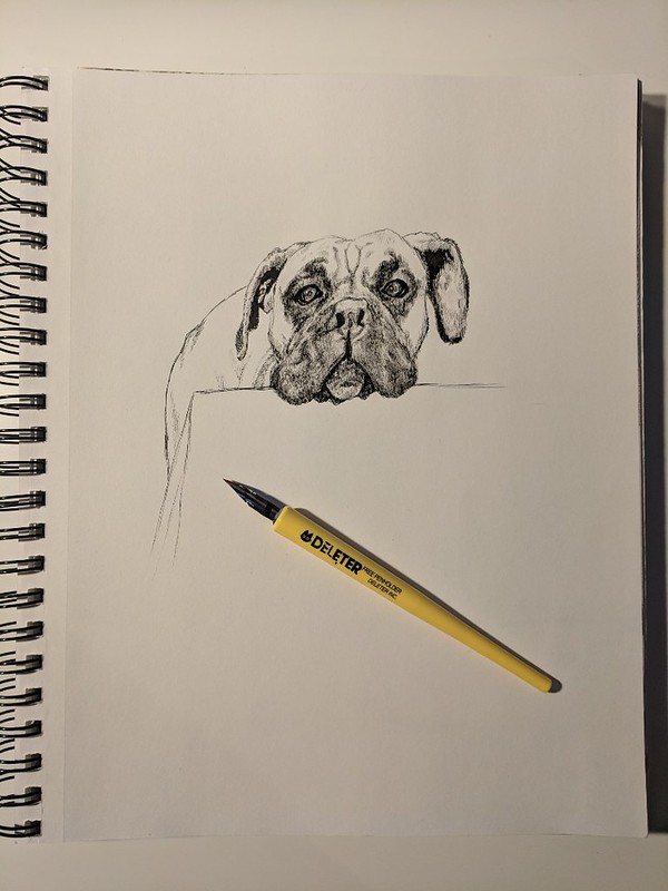
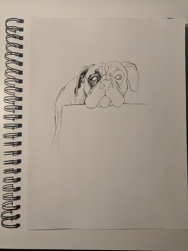
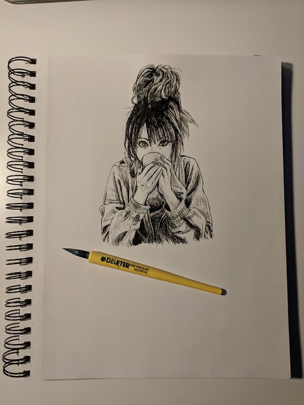
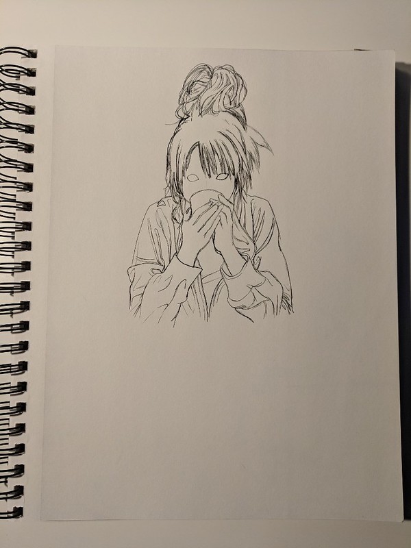
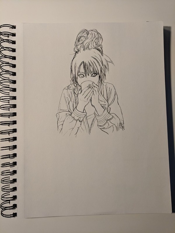
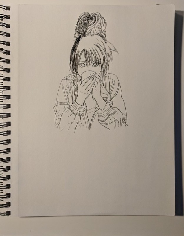
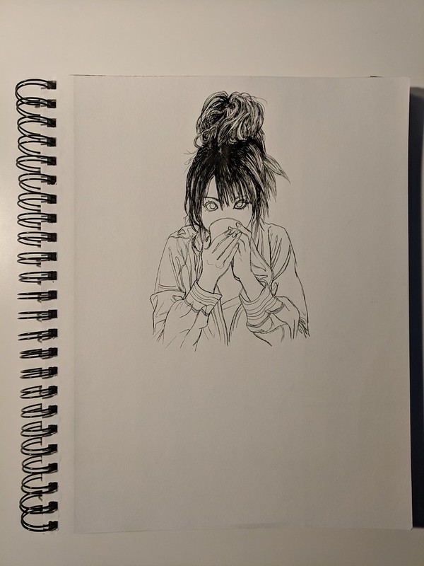
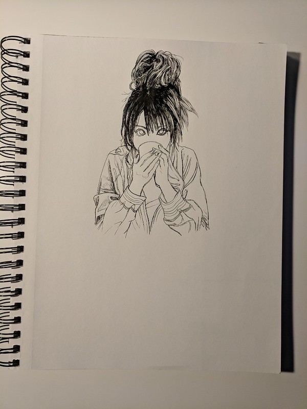
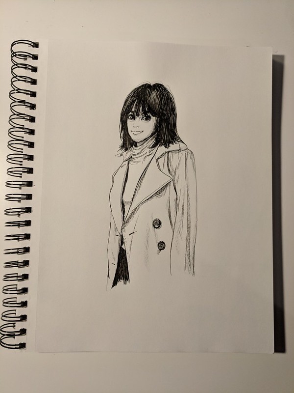
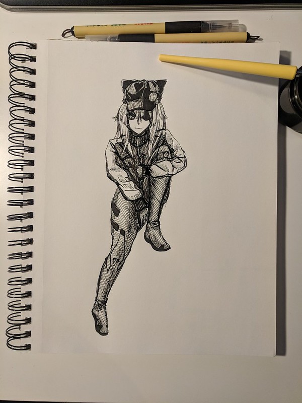
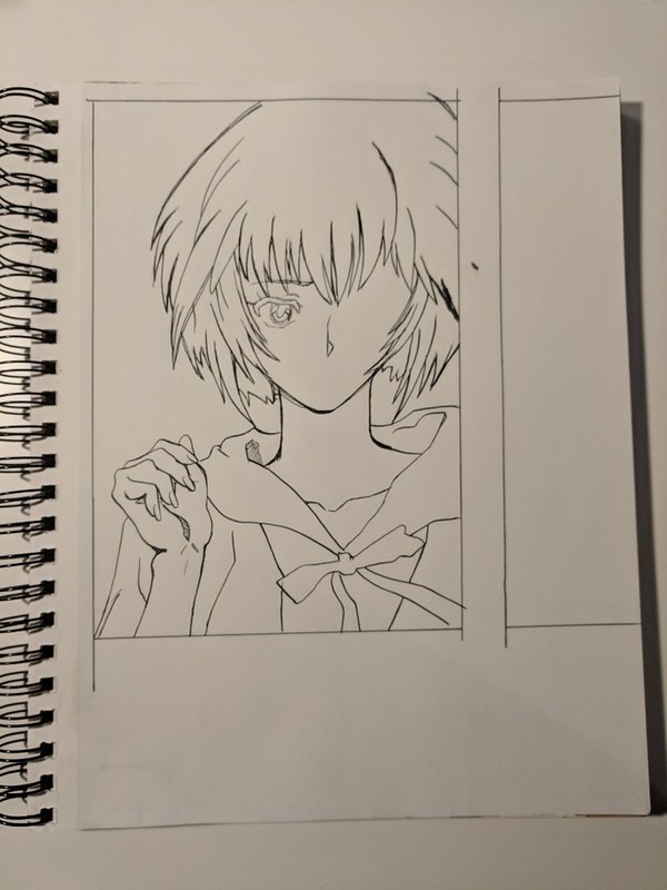
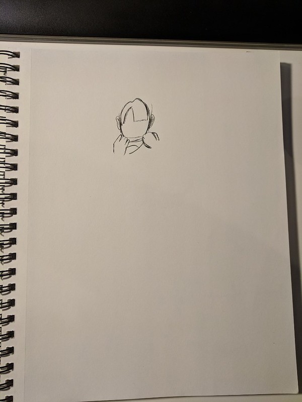
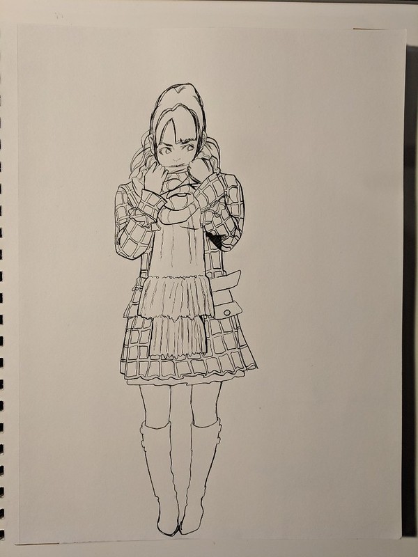
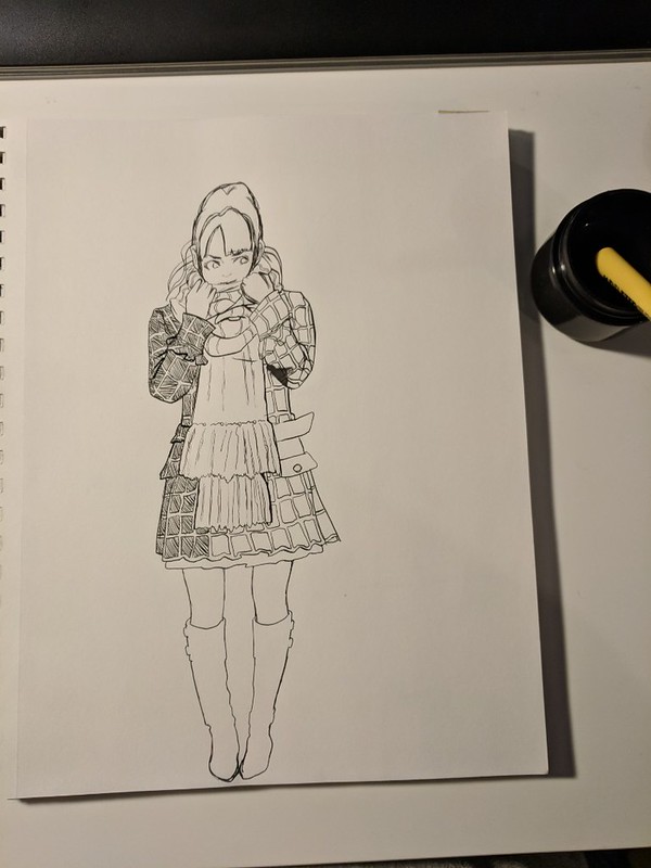
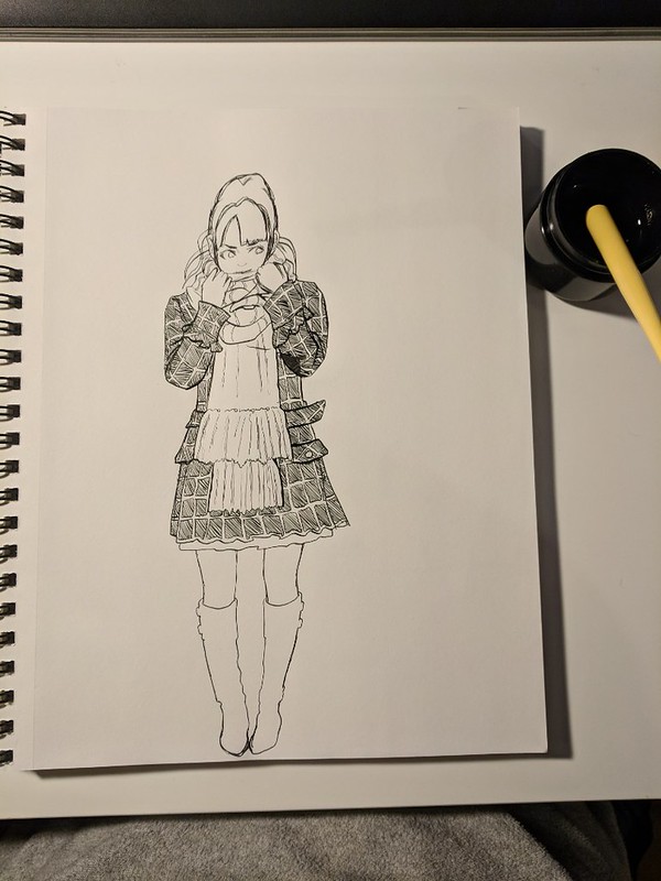
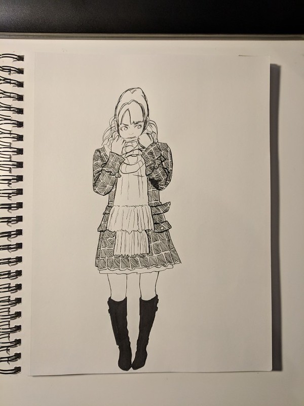
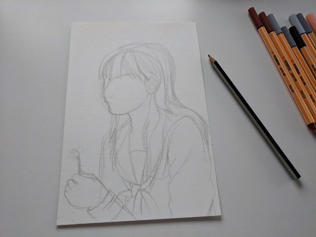
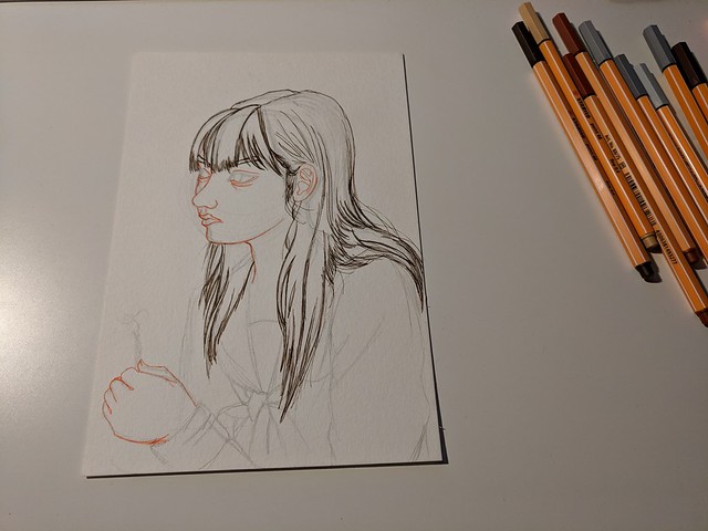
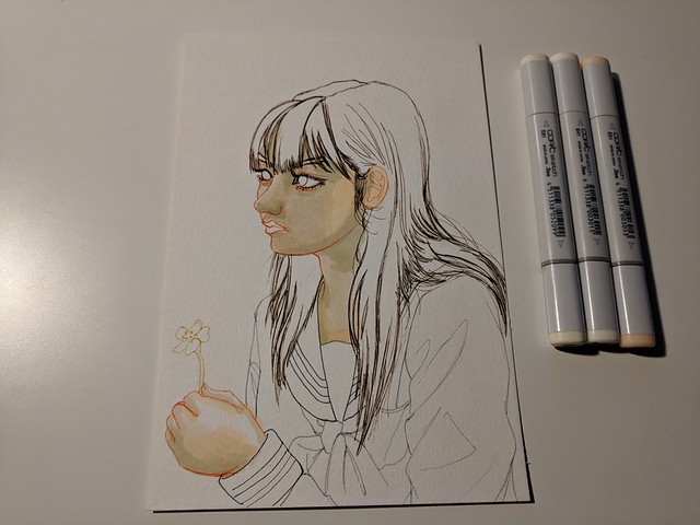
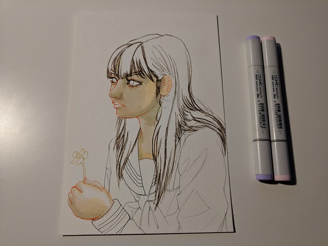
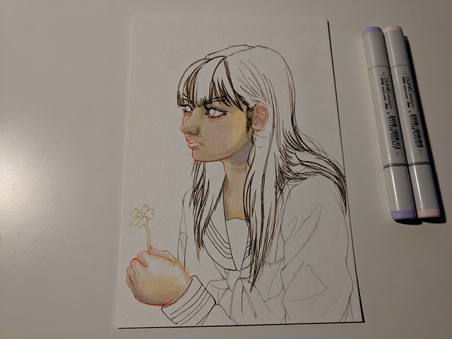
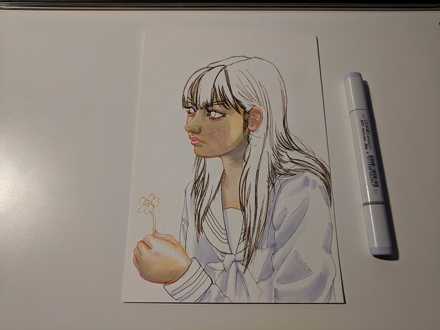
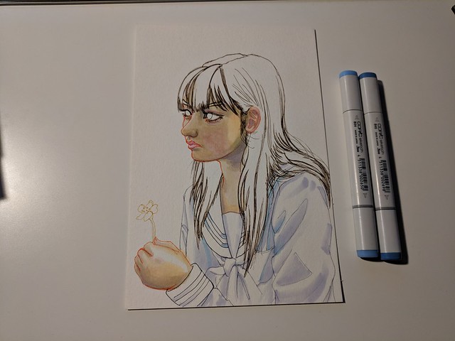
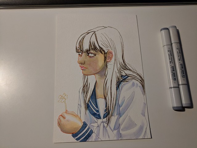
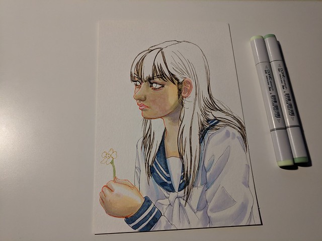
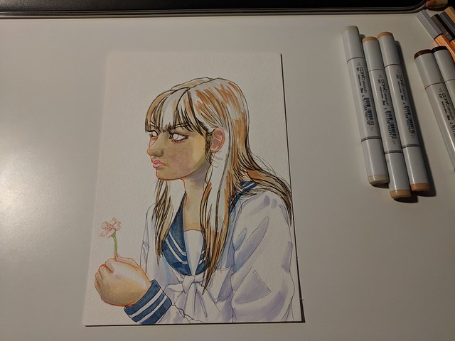
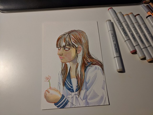
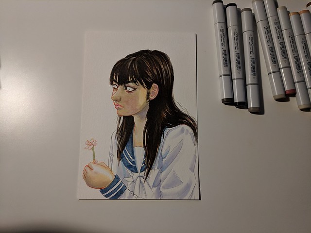
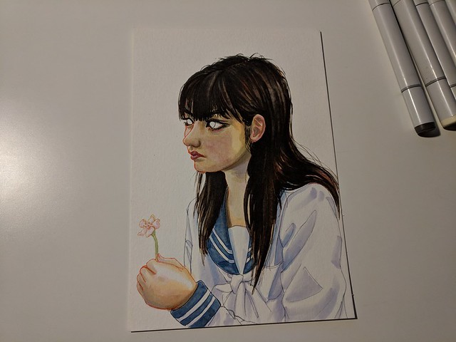
I chose Sayumi Michishige as my first model for my very first artwork on this tablet.

This is the reference picture I chose:

000096

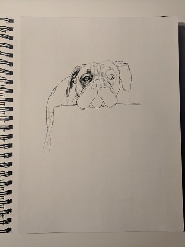
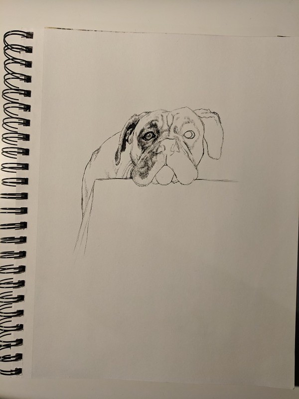
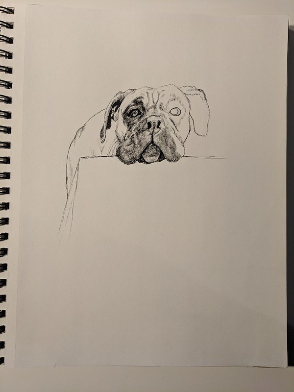
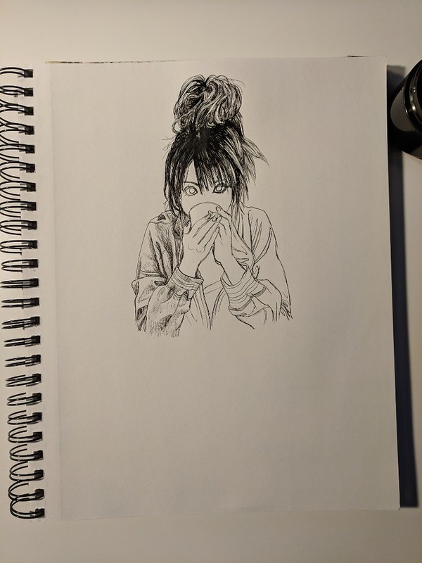
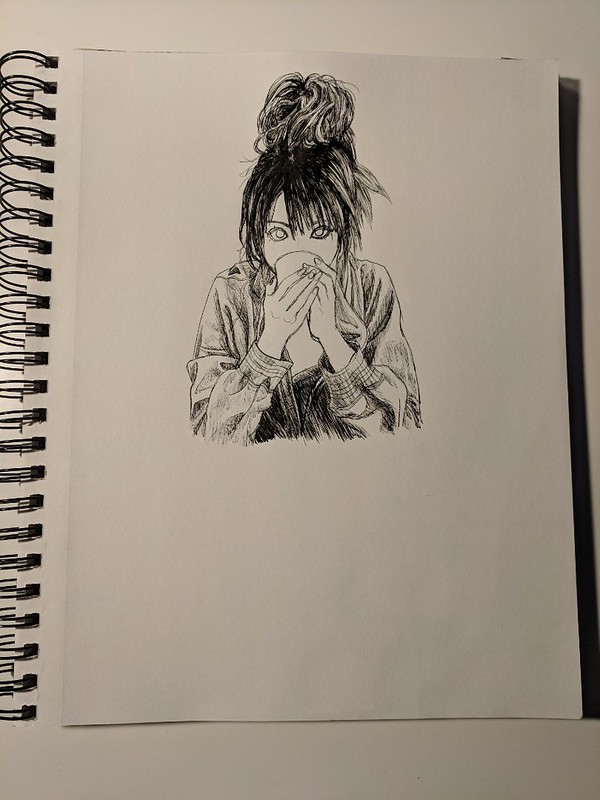
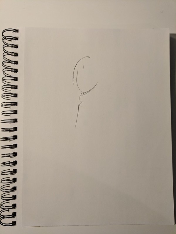
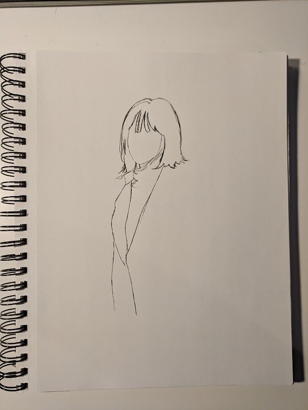
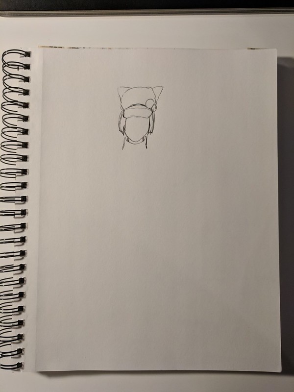
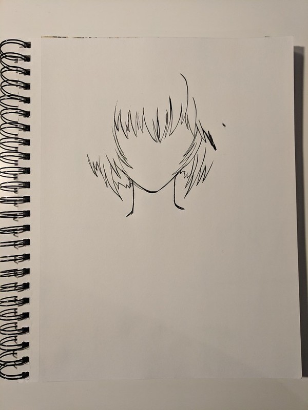
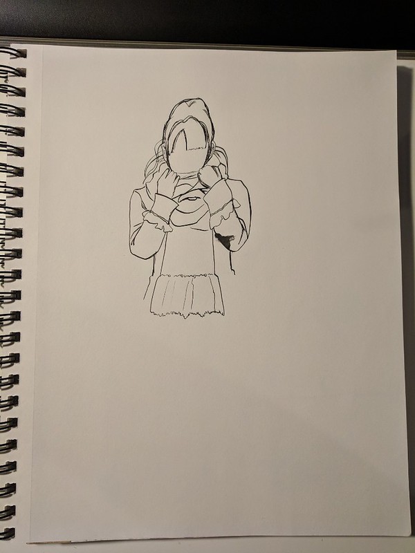
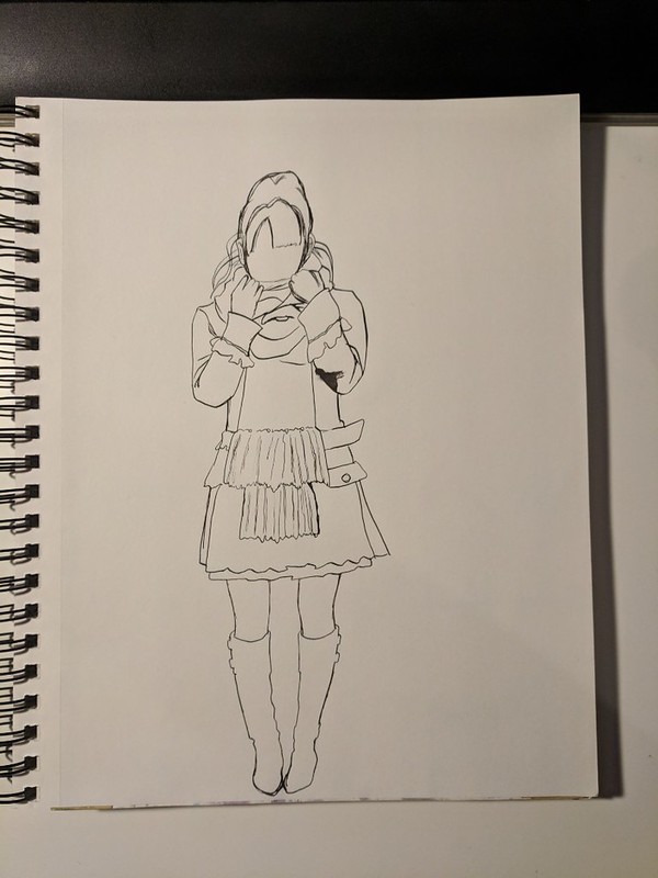
Here is what I managed to do with it, my first digital study:

Xp Pen Artist first artwork and try Sayumi Michishige with background resize

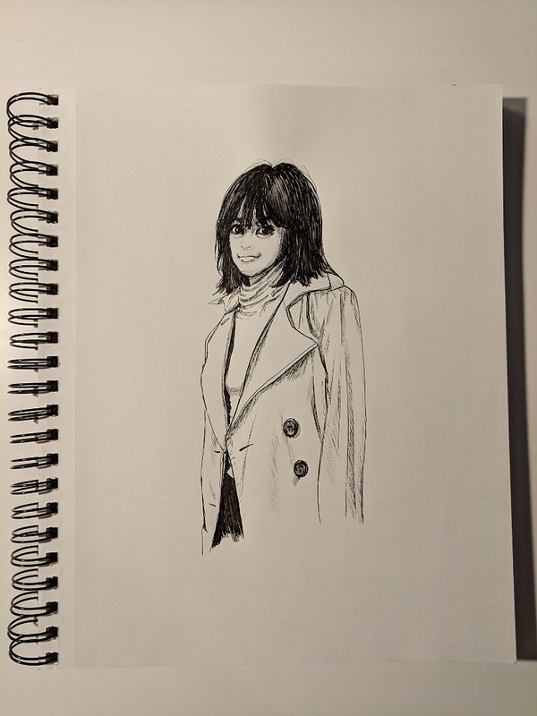
This was done on May the 18th. Since then I have been working some more work which I will upload soon.

So far I really love my new XP-PEN, but time will tell if it was a solid investment and will last me a good couple of years or if it’s a cheap “imitation” that will break in the near future. I’m hoping it it does last.

Hasta la proxima,

-NUBE

Cima Garahau 80s Shiseido like advertisement

Earlier this year I showed my youngest brother Gundam 0083 Stardust Memory (I also made sure he saw Top Gun first). After seeing it again I was really taken by Cima Garahau, she really is in my opinion the best part and most interesting character of the series (a shame things ended how they did).

One other thing I have really been into are Japanese 80s magazine ads. Over this year I was going crazy accumulating all the references I could acquire. Now my collection is around 1tb of pictures (this is going to be a pain to categorize…). But it is all worth it.

These are the references I used:

https://www.flickr.com/photos/darkcloudxero/41604180954/in/dateposted-public/

Sayoko Yamaguchi (pictured below):

https://www.flickr.com/photos/darkcloudxero/42326311871/in/dateposted-public/

https://www.flickr.com/photos/darkcloudxero/42279220572/in/dateposted-public/

https://www.flickr.com/photos/darkcloudxero/41424855725/in/dateposted-public/

Sayoko Yamaguchi (pictured below):

https://www.flickr.com/photos/darkcloudxero/42326322131/in/dateposted-public/

https://www.flickr.com/photos/darkcloudxero/40520064140/in/dateposted-public/

https://www.flickr.com/photos/darkcloudxero/27457481247/in/dateposted-public/

Up above are two pictures of Sayoko Yamaguchi who I came upon when finding reference pictures, I really feel that Cima looks a lot like her so of course I used her as part of the painting.

In any case, this piece was done both traditionally and digitally. First the painting of Cima. I wanted to emulate the painting style of the original anime and used my Knicker Poster Color paints to paint her but then used my Kuretake Gansai Tambi for the background. I wanted to loose details as I went further away from the focal point (which is Cima).

https://www.flickr.com/photos/darkcloudxero/28454114288/in/dateposted-public/

https://www.flickr.com/photos/darkcloudxero/40520424960/in/dateposted-public/

https://www.flickr.com/photos/darkcloudxero/28454114168/in/dateposted-public/

https://www.flickr.com/photos/darkcloudxero/40520424860/in/dateposted-public/

https://www.flickr.com/photos/darkcloudxero/28454114058/in/dateposted-public/

After finishing painting and scanning it I have to fix the colors since the scanning process dulls everything.

https://www.flickr.com/photos/darkcloudxero/41604614534/in/dateposted-public/

Once that is finished I then went ahead and started working on creating the ad. Since the main painting is done, now I had to paint the product. The hard part was coming up with what the ad would be promoting. After looking through Sayoko Yamaguchi’s reference pictures I noticed that she promoted Shiseido a good bit so after looking around a bit I decided to use their perfume line. And I painted it using Copics.

https://www.flickr.com/photos/darkcloudxero/40520848640/in/dateposted-public/

https://www.flickr.com/photos/darkcloudxero/40520848500/in/dateposted-public/

Once they were painted I then used my Gel Writer gel pens to write in the text and paint in the artwork. Thinking back I should have modified it more to make it more Gundam like, or at the very least modify it further.

https://www.flickr.com/photos/darkcloudxero/42327075091/in/dateposted-public/

https://www.flickr.com/photos/darkcloudxero/42327075241/in/dateposted-public/

After this I positioned them in place and modified them digitally by removing the modified Shiseido logo. I had to make a custom Cima Garahau text so that it would fit with the shiseido text style, and also modified their logo with a Zeon emblem that I also had to create by hand and modify digitally.

These are the original Shiseido text and emblem:

https://www.flickr.com/photos/darkcloudxero/41605114494/in/dateposted-public/

https://www.flickr.com/photos/darkcloudxero/42280250212/in/dateposted-public/

These are the ideas I had for the modifications I wanted to make:

https://www.flickr.com/photos/darkcloudxero/42327558171/in/dateposted-public/

https://www.flickr.com/photos/darkcloudxero/40521281620/in/dateposted-public/

Then I used this ad as inspiration to finish it all off (after modifying it of course).

https://www.flickr.com/photos/darkcloudxero/41605442824/in/dateposted-public/

And this is the final artwork.

Cima Garahau 80s Shiseido perfume ad resize


Hasta la proxima,

– NUBE

Nicker poster color 2nd attempt done in 1/15/18

School is just about done… it was quite a tough end of the month in April and the beginning of May, but I managed to power through. Now I should be a bit more free.


Quite a while ago I decided to buy a 24 color set of Nicker Poster Color paints. I read about how Ghibli uses them because they dry quickly, and I can confirm that. On top of that I can make the colors translucent or opaque depending on what the ratio of paint to water is. I haven’t had much time to practice much with them because of school and the construction work, but I did try some whenever I could. This one was done before I started school this semester, but wanted to talk about it a bit before posting it. I just didn’t think it would take about 5 months…

I would say that for a self taught artist, the best way to learn is to try and recreate other peoples work and try to understand their process and color choices. With that in mind, it shouldn’t be too surprising that I decided to recreate a background done by Kazuo Oga, the background artist for Studio Ghibli.

I decided to choose this image for my study                                                                              (it’s from “Only Yesterday”/”おもひでぽろぽろ”):

03-Only-Yesterday

I thought that I had documented the process, but thinking back I guess I was just focusing on painting.

As can be seen I didn’t really keep the proportions in place so I just focused on recreating the colors.

Ghibli Background Study 1st Attempt cropped resize

There’s an obvious difference in skill and color. But I was amazed at the versatility of the Nicker paints. I wonder just how far I can push them.

That will be all for now.

Hasta la proxima,

-NUBE

Create a website or blog at WordPress.com

Up ↑