I wanted to once again give the 90s anime aesthetic another try today. I painted Saki using Photoshop and the background with Corel Painter. For the texture that makes it look like it’s being shown in an old tv I used the Photoshop filter (I believe it was noise) which gave me just the right textured I wanted. I could have gotten away with it if I had muted the colors a bit more but this works even better.
Saki’s outfit and dance moves are quite amazing in this pv. I wonder if she would ever consider doing a solo career? I’m just glad she is still active online though, I really enjoy seeing her Kendama progress.
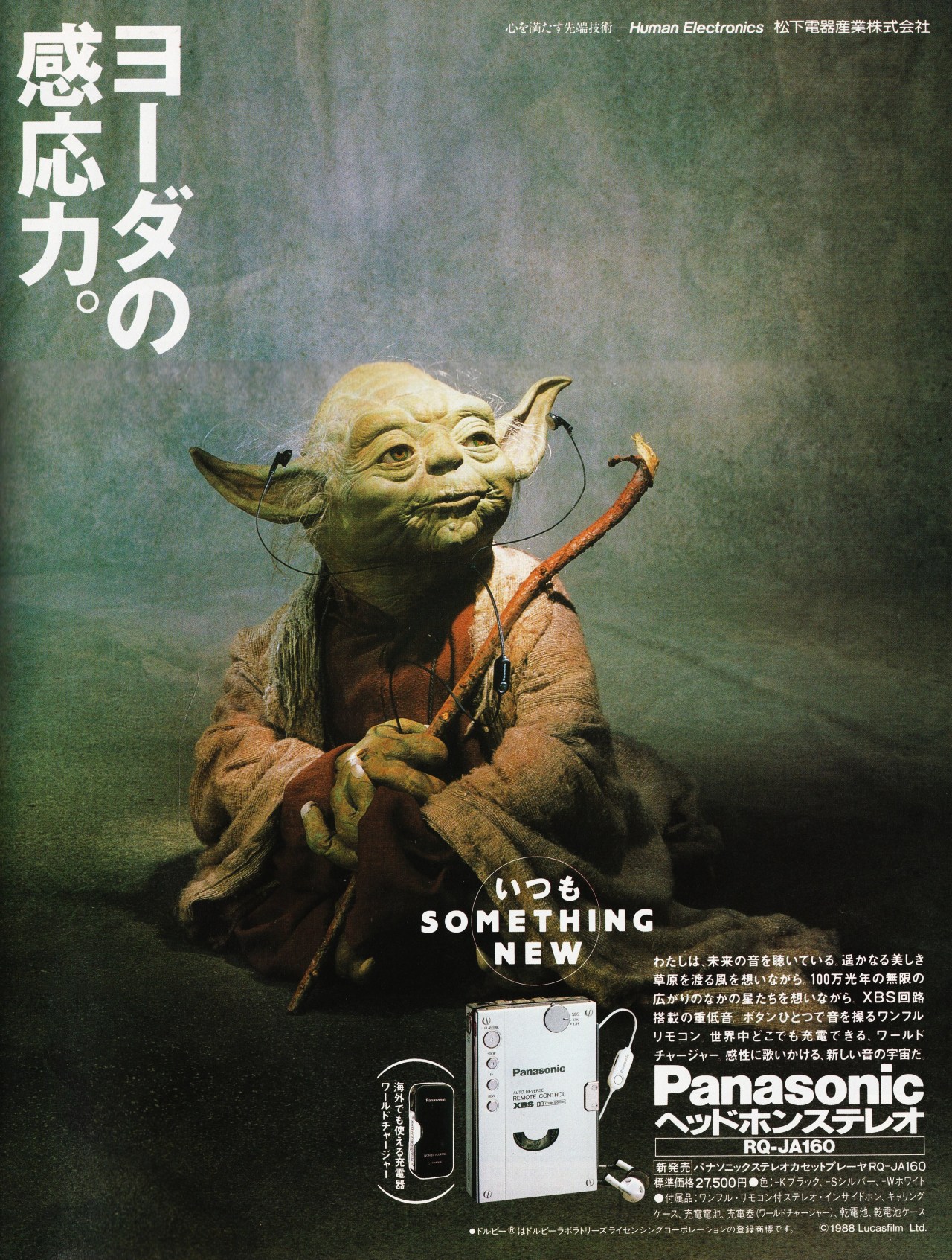
I finally got a chance to start watching the Mandalorian. And it’s just as good as everyone was saying. Of course Baby Yoda was just as adorable as people were saying as well. Actually, he is even more adorable than I could have imagined. Now I understand why so many people love him so much. While looking through some of my reference photos I came upon an ad for the Panasonic RQ-JA160 Cassette player that featured Yoda. This is the one: https://64.media.tumblr.com/987a43724700b0ccb0568355a3ab74ed/tumblr_ng9revXOCW1rknqk3o1_1280.jpg
I thought it would be a good parody. I’m not too far into the lore of the Mandalorian but surely they are still in the past if we use our timeline as the base mark right? So this is future technology that is being featured. I decided to use the white model since I prefer that color for my electronics. And I think this Cassette player really looks good in white. Perhaps when I get a chance I will revisit this painting and add some font to play around with the parody aspect more.
I finally got around to painting Simone from Nier Automata. It was much easier than I thought it would be, although it did take me about two days and change. Could have finished it yesterday but decided to take a break and start fresh today. All that was left to paint were the accessories corpses which were easy to do with a couple of steps but since the amount of them is 5 and a section of a sixth one, it did eat up a bit of time.
All the painting was done using Corel Painter although I did do a silhouette painting of Simone with Photoshop so that I wouldn’t have to worry about getting out of the lines. This really does increase the speed at which I can just paint and add details without worry of having to erase later. Although that method does also take a bit of time. Using the bucket tool would speed up the silhouette process a good bit but some of my linework has open areas. Though I guess I could make a copy of the linework layer and close them off using a digital brush. I’ll try that out on my next piece.
When I did finish painting, I used PhotohShop to play around with the values and saturation. First I decided to remove the line work from the curtains. Then playing around with the Layer Blending mode I moved the layer containing my line art from multiply to screen and it brightened the whole painting up in a very vibrant way. I really love the way the colors jump out. I should probably experiment more with the other Layer Blending modes.
I went for a color pallet that fit in with Diamond is Unbreakable’s. Once I had the layer base down I started playing around with shadows using the multiply tool. Looking at the anime I decided t add some aura around Chavo and Quico as well as their stands Doña Florinda and El Chapulin Colorado. From there I played around with the outer glow and used the linear burn option. On top of that, I placed a new layer to add some white coloration to emphasize where energy was going to be at it’s highest. I’m glad I waited two years to paint it.
I wanted to have a bit more of an anime painting style this time. When I was done, I wanted it to look a bit more textured. So I ended up using a rough paper overlay. I ended up using both Corel Painter and Photoshop. While looking through the Rurouni Kenshin anime, there was a scene where Shishio’s eyes are glowing purple (episode 60). Just for the heck of it I wanted to give it a try and it just fit so well that I decided to keep it that way.
Seeing as Kill la Kill was influenced by series like Sukeban Deka I wanted to make a painting depicting that connection. I also wanted to make as many summer paintings as I can before the season ends (finally). This is an homage to Yuki Saito’s photo. Which can be seen here.
Using references from the anime it self, I did have to make various changes to the body type and the hair a bit so that it would look more like Ryuko. Seriously, Ryuko has a tiny waist. As for the hair I wasn’t sure if I should have left it down or pull it up into a ponytail like in the reference photo. In the end I decided to try and figure out how it would look if Ryuko decided to put it up.
Today is the anniversary of when the first game in the Ace Combat series was released. I was working on an another painting that I couldn’t finish yesterday, but I was somehow able to paint this quite quickly as soon as I was done with the other painting. It’s not very refined but it gets the main idea out quite well. I would like to thank the Ace Combat team and community for allowing this series to still be alive and releasing more games which are definitely among my favorite games of all time. My favorites being 5 and Zero. The Berkut is my favorite jet in the game by the way.
Let’s start off by saying that I really love Buono! There was just something magical about this formation. Such a shame I will never get to see them live in concert. I’m really jelly of those who got to experience it. Thankfully the concerts are now being released on Youtube for more people to experience them. This premiere that happened last week was the closest I could get to experiencing one of their concerts live. A shame I couldn’t enjoy it all the way through since it started at 3 am in the morning where I live and I had to get ready for work. I couldn’t even get to enjoy Airi’s live video about Buono!… On the bright side this was done on Youtube so I can at least rest easy knowing that it won’t disappear and I can watch it as many times as I want. Man I really wanted to have this painting done on time last week. I actually own the concert but I’m glad it’s on Youtube so that more people can get to watch it and interact amongst fans.
I was working on this since the beginning of last week in the hopes that I would be able to finish it in time for Youtube’s premiere of the Buono! Pienezza! concert. But my other job has been extremely busy so I only managed to get the background and the main outlines and colors of Momochi, Miyabi and Airi. I don’t know if it was because I was tired from overworking or if I just had no idea of how to continue with the painting process but I got stuck and couldn’t continue working on it when I had some free hours to work on it. I finally managed to get some time to work on it again on Tuesday and started to use a new technique (for me) using Photoshop. Which basically just consists of putting in the base colors on one layer, adding a multiply layer for the outlines and another multiply layer for the shadows on them. It took me a while to come up with a system so that I could work faster and more efficiently (although it took me a whole two days to really know what I was doing).
Thank you for the music and fun all these years. It really warms my heart to know that they are still remembered and loved.
This is a repaint of the original color pencil drawing I did in 2018. This newer version was painted in June 2019. I really don’t know why I decided to wait this long to upload it though. Thinking about it, I still have some more I haven’t showcased yet.
The tagline I had in mind when I first created this piece was rebellious (yankii) son vs stern (military) father.
This was a piece I started last year around June of 2019. I gave up when I couldn’t work out the background. But after doing a couple of pieces using Ranma’s backgrounds for references, I felt more comfortable. There are still areas in the background that can be made better, and the muscles can be defined more with a mixture of hatching and painting but I wanted to give a simple painting style that can be seen in an old anime from the late 80s or 90s. At first was thinking of putting him in a neighborhood but decided to have him walking on a lone road towards South town. I limited myself to three colors for each section of Terry. I could add more details if I added one more color level but I really wanted to see how it would look if I limited myself to just three.
I had attempted to draw this and paint this for New Years but I didn’t really like the way it came out. So I attempted it again, but since I had already painted the original lineart I had no choice but to go at it digitally. I would say that the painting process isn’t taking that much time, but getting references does. I decided to use the coloring style from the movie Macross: Do you remember love. Aside from coloring it I also wanted to edit some other parts of the drawing it self. The first part was the mouth and lips. I decided to take out the linework of the upper and lower lip. I would form it wit color instead. Of course this and all the other changes were dictated by the references I got from the movie. For the mouth, I also resized it and made it smaller while also repositioning it. The Eyes were moved down a bit and I erased most of the eyelash strands. Eyelashes were also thined and shortened a bit. To my surprise, when I was screen capturing the final reference shots I came across a scene that is almost the same background like the Airi Suzuki picture that I’m using. I quite like the addition of the shadow. I feel like I could’ve added something on the left side of the painting. But this works. One thing I do know is that it looks quite good using a diluted ink linework so that the color influences it when applied.
Was working on this last week but didn’t get to finish the painting process till just now after work. The line work was done using my Stabilo pens. It’s been a while since I last used them. I wanted to see what kind of effect it would have when I underlaid it digital paint. It’s not a bad look, especially in the skin tones but, I think the blue is a little too well blue. I’m thinking using a grey pen on most parts except on the skin tones would work better. But at least now I know. It’s a shame they don’t really work well with watercolors (they smear and bleed). Well at least they work with copics. It’s a shame really because when it comes to traditional painting/coloring I now prefer to use watercolors. As for the digital painting process I tried to replicate the anime coloring style which I just absolutely love. Will definitely try doing it again. I’ll also do try doing this using my traditional paints.
Things have been getting rather hectic lately. Stay safe out there, and never give up.
