Hidden Turtle in Monkey’s Eyes


I don’t know if I have mentioned this before, but I am a big Martial Arts movie fan. More specifically Hong Kong Kung Fu movies from the 80s and 90s. Jackie Chan movies being my favorites. So I wanted to try out making an homage poster like artwork. Now one of the other things I really love is the original Dragon Ball (when he was a kid, I say this because people think I mean Dragon Ball Z which was just ok). I want to talk about these two loves of mine a bit more, but I will have to wait on that because I am planning on covering these topics on future videos.

With that out of the way Inspiration came from the gag character Jacky Chun and my love for old Hong Kong films. I chose one of the first movies where sparks of what Jackie Chan would later present to the world, Drunken Master. A 1978 classic Martial Arts film. And since Dragon Ball has many martial arts influences including Drunken Master it would fit perfectly.

There are many poster variations but I ended up picking this one (which I feel might be the original poster).

drunken-master-poster

I really like these old posters where they hand paint them and have really interesting themes and expressions.

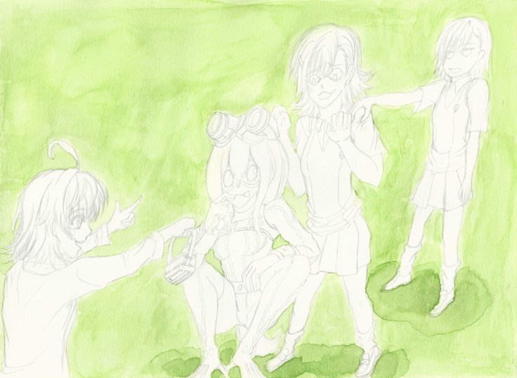
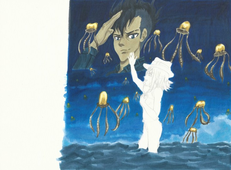
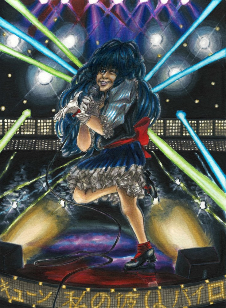
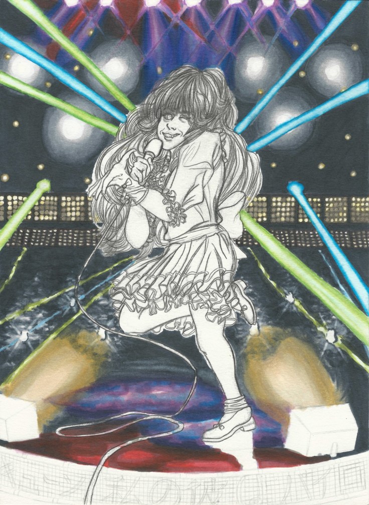
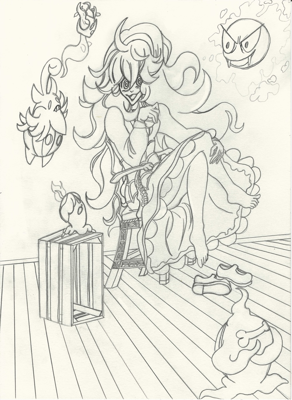
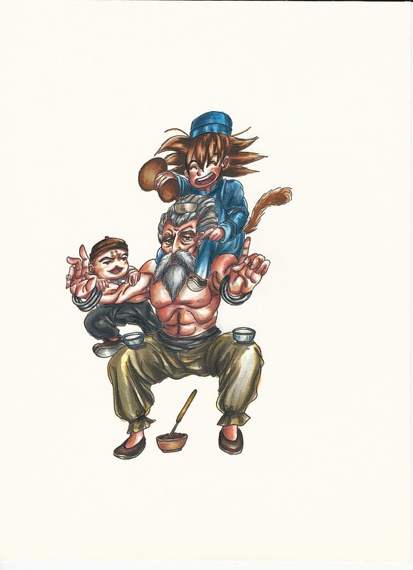
This is the rough draft that I originally made while at an anime convention.

Drunken Master rough draft resize

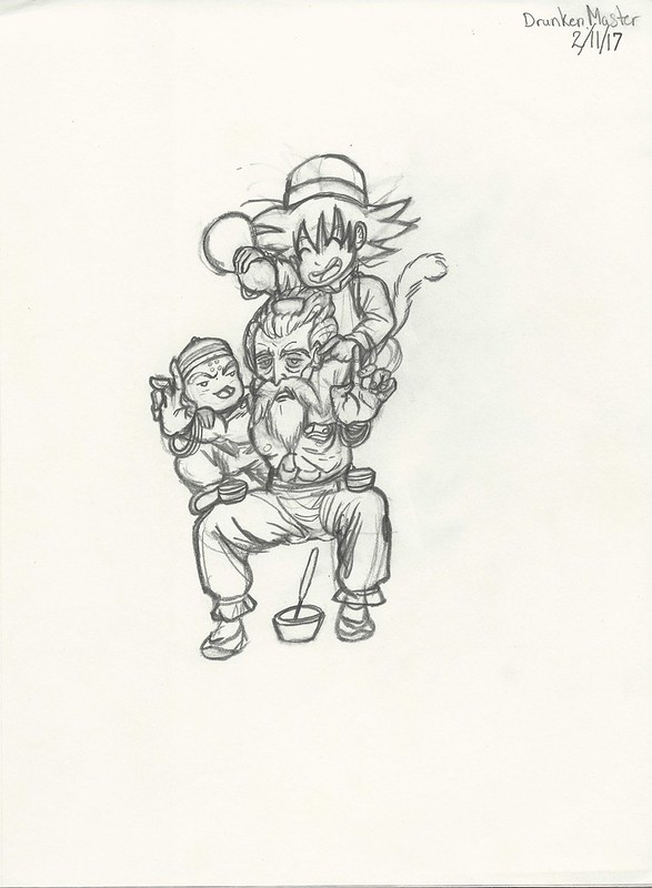
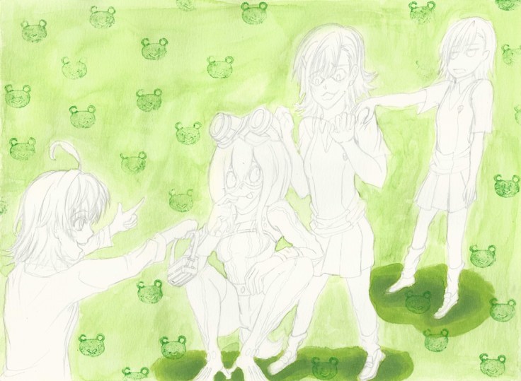
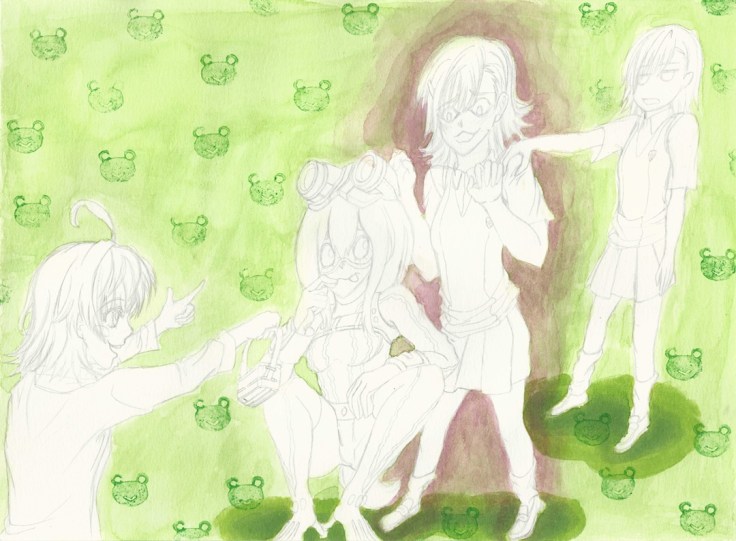
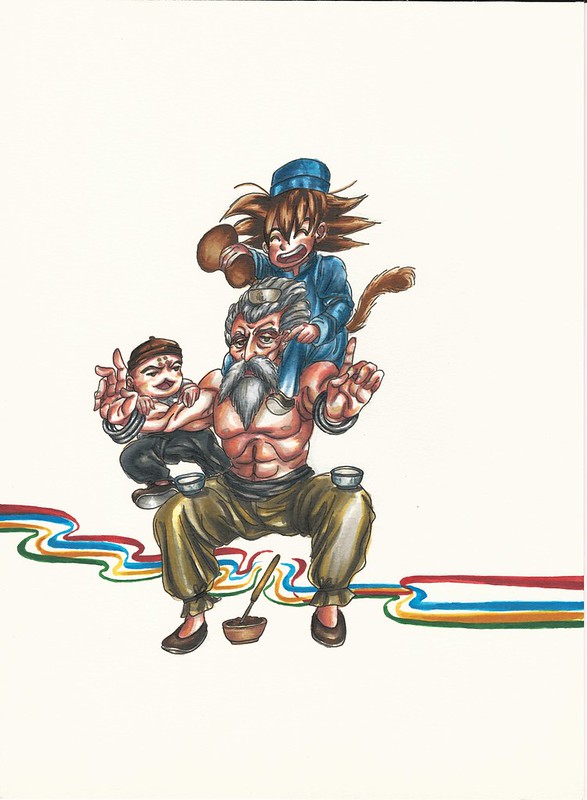
These two are the basis of what I am working with, and next is the process. First are the pictures I took with my phone.

https://www.flickr.com/photos/darkcloudxero/37311149092/in/dateposted-public/

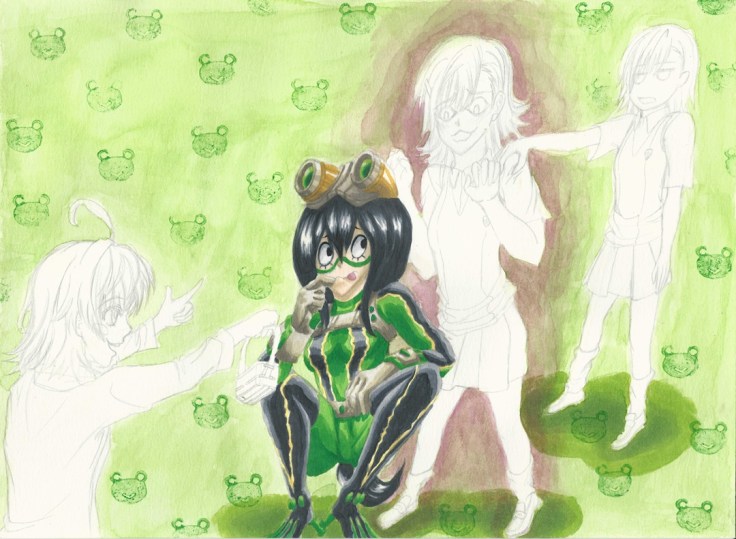
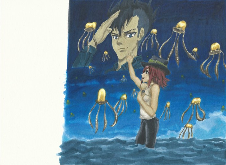
I used Copic Markers for coloring by the way.

https://www.flickr.com/photos/darkcloudxero/37311148792/in/dateposted-public/

https://www.flickr.com/photos/darkcloudxero/37311148482/in/dateposted-public/

https://www.flickr.com/photos/darkcloudxero/37311148292/in/dateposted-public/

https://www.flickr.com/photos/darkcloudxero/37311147582/in/dateposted-public/

https://www.flickr.com/photos/darkcloudxero/37293944066/in/dateposted-public/

https://www.flickr.com/photos/darkcloudxero/37311146852/in/dateposted-public/

https://www.flickr.com/photos/darkcloudxero/37311146422/in/dateposted-public/

https://www.flickr.com/photos/darkcloudxero/37311145752/in/dateposted-public/

https://www.flickr.com/photos/darkcloudxero/37293943226/in/dateposted-public/

https://www.flickr.com/photos/darkcloudxero/37340990021/in/dateposted-public/

https://www.flickr.com/photos/darkcloudxero/37293942896/in/dateposted-public/

https://www.flickr.com/photos/darkcloudxero/37340989371/in/dateposted-public/

https://www.flickr.com/photos/darkcloudxero/37340989051/in/dateposted-public/

https://www.flickr.com/photos/darkcloudxero/37293940916/in/dateposted-public/

https://www.flickr.com/photos/darkcloudxero/37340988661/in/dateposted-public/

https://www.flickr.com/photos/darkcloudxero/37293940466/in/dateposted-public/

https://www.flickr.com/photos/darkcloudxero/37340988351/in/dateposted-public/

https://www.flickr.com/photos/darkcloudxero/37293939806/in/dateposted-public/

https://www.flickr.com/photos/darkcloudxero/37340988011/in/dateposted-public/

https://www.flickr.com/photos/darkcloudxero/36631801324/in/dateposted-public/

https://www.flickr.com/photos/darkcloudxero/36631801324/in/dateposted-public/

https://www.flickr.com/photos/darkcloudxero/37340987681/in/dateposted-public/

https://www.flickr.com/photos/darkcloudxero/36631800874/in/dateposted-public/

https://www.flickr.com/photos/darkcloudxero/37340987411/in/dateposted-public/

https://www.flickr.com/photos/darkcloudxero/37340987081/in/dateposted-public/

https://www.flickr.com/photos/darkcloudxero/37311141932/in/dateposted-public/

https://www.flickr.com/photos/darkcloudxero/37340986821/in/dateposted-public/

https://www.flickr.com/photos/darkcloudxero/37340986821/in/dateposted-public/

https://www.flickr.com/photos/darkcloudxero/37311141632/in/dateposted-public/

The title of the movie poster is done with a brush, so I wanted to do it traditonally. I measured the center and spaced out three spaces for the characters.

https://www.flickr.com/photos/darkcloudxero/37340986531/in/dateposted-public/

I also tried to emulate brush strokes for the characters.

https://www.flickr.com/photos/darkcloudxero/37311141462/in/dateposted-public/

https://www.flickr.com/photos/darkcloudxero/37340986281/in/dateposted-public/

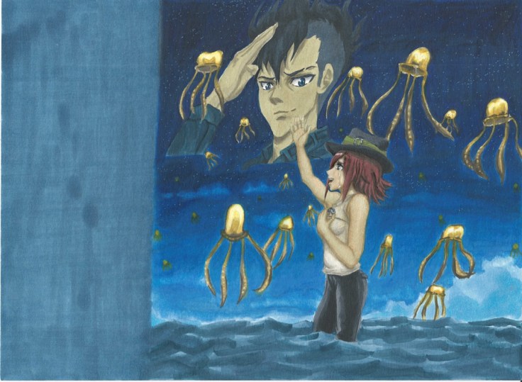
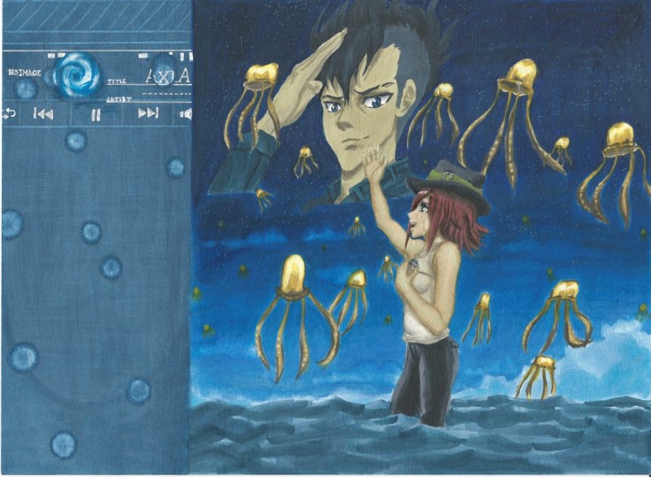
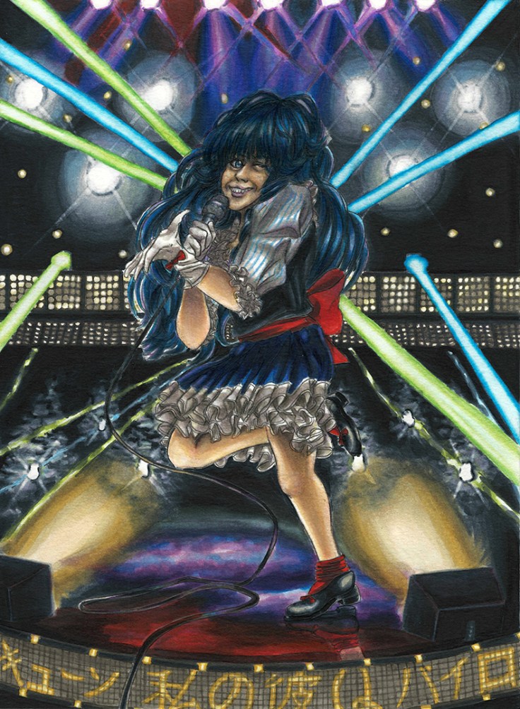
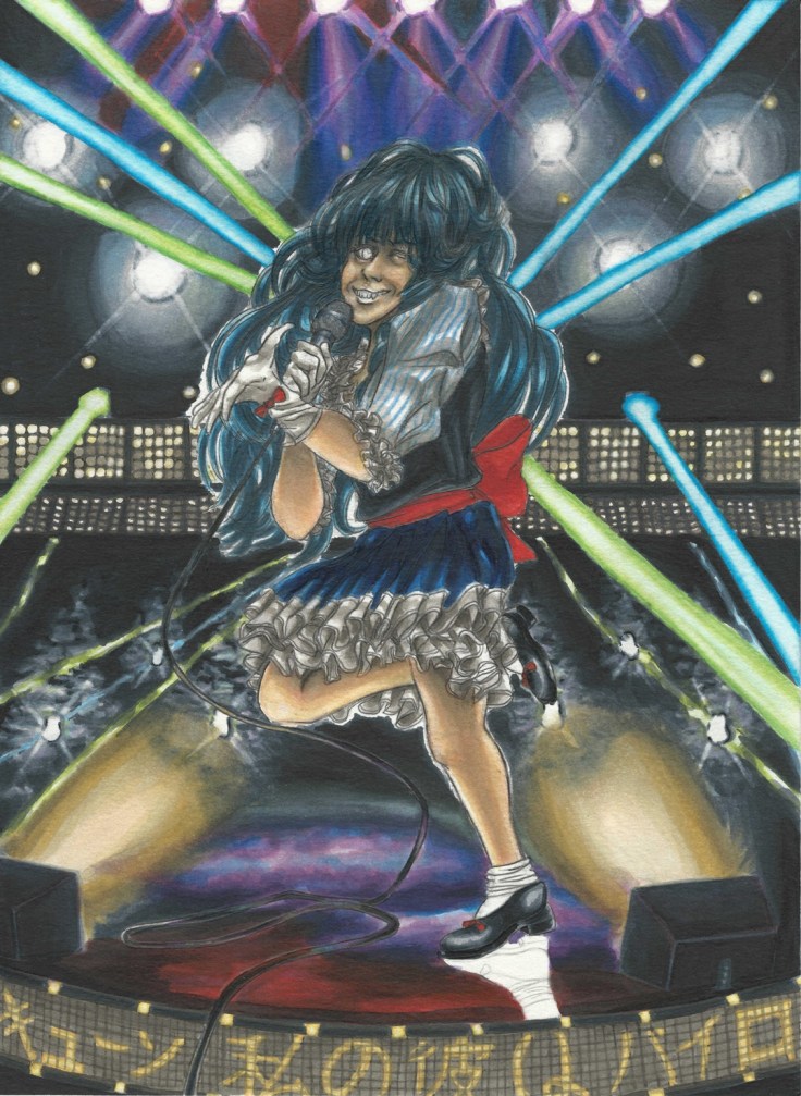
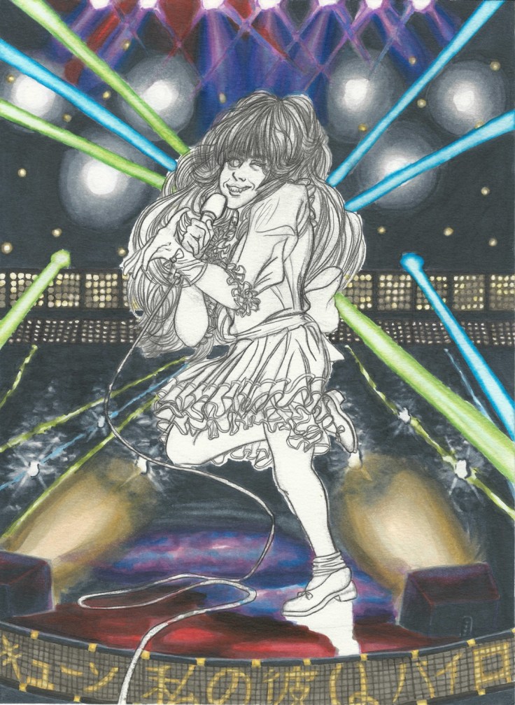
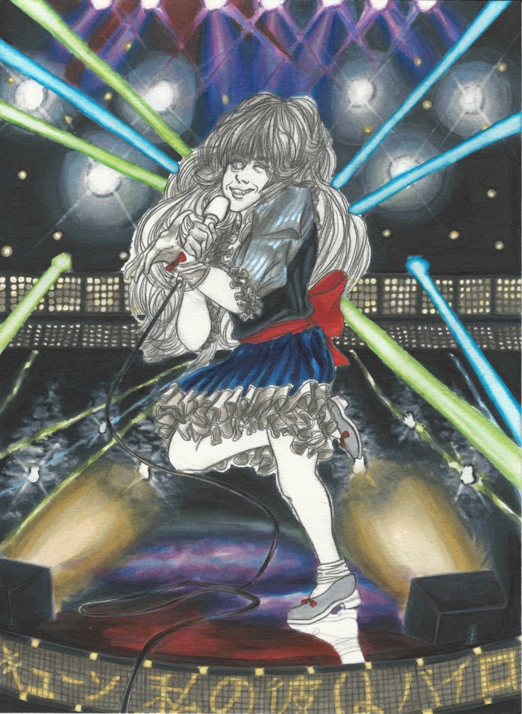
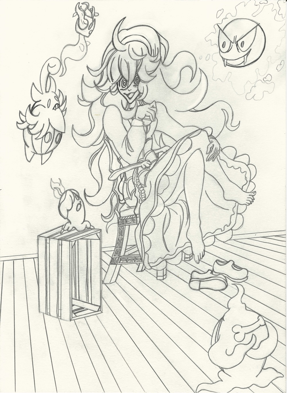
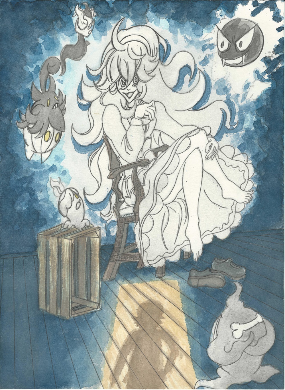
And now some scans of the process.

Drunken Jackie Chun I resize

Drunken Jackie Chun II resize

Drunken Jackie Chun III resize

Drunken Jackie Chun IV resize

Drunken Jackie Chun V cropped resize

After painting on the title I was contemplating painting on the rest of the text. And well, I tried but soon realized to instead do it digitally.

Drunken Jackie Chun VI resize

I decided to make the text digitally because it would be alot cleaner, the text would be level and wouldn’t be crooked. On top of that, I was trying to have it ready for Nan Desu Kan.

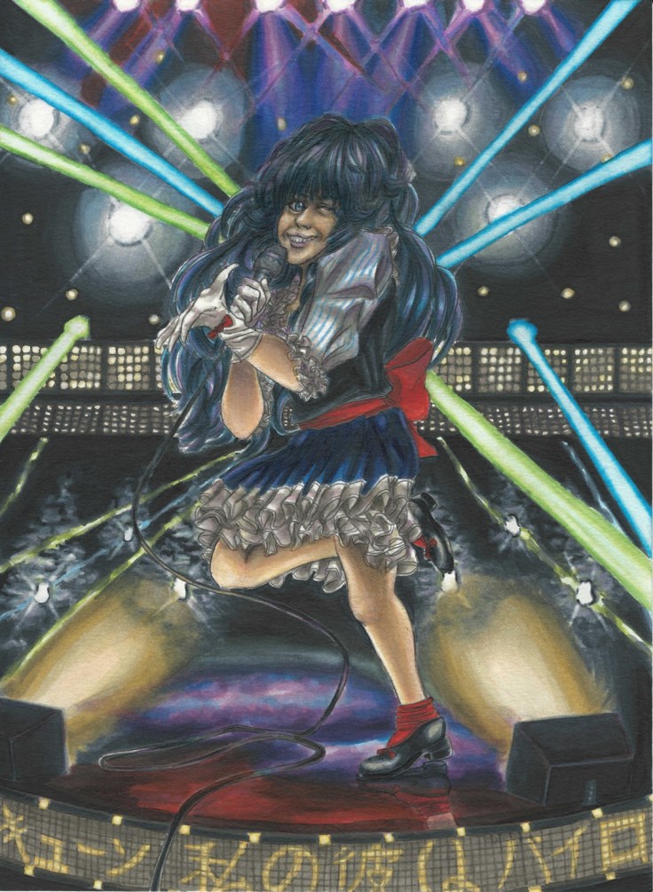
Here is the original poster again:

drunken-master-poster

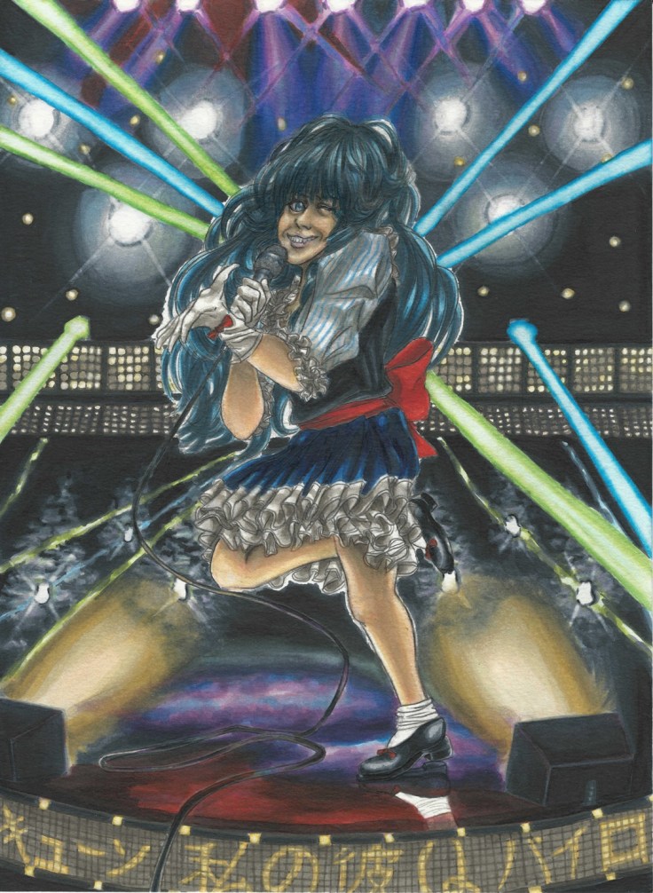
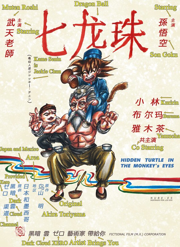
And here is my finished version:

Hidden Turtle in Monkey's Eyes rough background resize 1080

I tried to emulate as close as I could all the text around the poster (as well as the background texture), I don’t know Chinese (though I did study a bit of it for a semester once, I obviously am nowhere near at the level where I can say I know a little or any really, just a couple of words and phrases) so I had to guess what each sections of the text would mean. For some of them I just added whatever I thought I could cram with references to me and my work.

Here is what each of the characters I typed means (I used Google translate to come up with the characters so it most likely has a lot of typos and misspelled words and phrases):

Hidden Turtle in Monkey's Eyes Meaning of Characters

That concludes the process for this Dragon Ball piece. Hope you enjoyed it and that it helped you on your art journey if even a little.

Hasta la proxima,

-Nube

Pokemon Quick artwork

My little brother likes making his own wallets, so this time he asked me if I could design him some Pokemon artwork. He didn’t really have any idea as to what Pokemon he wanted, so I went for the starter Pokemon Fushigidane (Bulbasaur), Zenigame (Squirtle), Hitokage (Charmander) and of course the ever so famous Pikachu.

I started and finished them all yesterday, so I’m actually quite amazed at how much I have improved. Of course these are all simple designs, but they look good despite being drawn and colored in a day.

I tried having them in habitats that they would most likely appear at. Though if I made more time to think and design I would try something a bit more tricky and have some sort of scenario for the artwork, but since I didn’t do that I guess the backgrounds are a bit generic.

Here are the designs:

Pokemon wallet designs resizePokemon wallet designs II resize

Aside from the Pokemon, I tried doing everything without reference and only relied on my mental images of what I think things and places may look like. I’d say it looks good, no? I guess aside from that, I did have to come up with poses for the Pokemon. They actually didn’t take much time at all to think up. Looking at them now, Fushigidane (Bulbasaur) is a bit generic compared to the others. Seeing as he is my favourite, maybe I should have drawn it differently… Oh well. I was thinking of going over it with pens to add more details, but since I have quite a bit of artwork I want to do, I will leave it as is.

Human Culture’s Songstress


Here is the final piece, it will be added to the gallery now.

Human Culture’s Songstress resize

Two questions.

What do you guys think of the final piece?

and

Do you guys know what is on the light panel?

Hasta la proxima,

-XERO

Mikoto Misakas and Tsuyu Asui Final

Finally done. This piece was done with a combination of both watercolor and Copic markers.

I wanted to make a drawing with a simple background, which I have a really hard time doing. So I want to now focus on these for a while so that I know how to do them. I was annoyed by how much time it took to come up with something. Keep in mind a design like this is quite easy, so finishing it in one day should be absolutely no problem. And yet the amount of time it took me to come up with something is excruciatingly slow. So really, it’s more of my mental capability to make up backgrounds that will need to be strengthened so that I can not only make backgrounds that fit with the drawing but are also interesting to look at.

Since it is done traditionally I have to rely on just my brushes and my markers. This is where I can run into problems if I want to make identical patterns. I could do it the dumb way of drawing it one by one, but that will take too long, it also wont be perfect recreations and really it would be really annoying to do it that way. So the best options are either making stencils or better yet make a stamp. Which is what I ended up doing.

And here it is (it’s made of an old eraser that I cut into shape with an e-xacto knife, sadly the eraser was too soft so it gave me problems when applying tint on it, and to make matters worse it started breaking off in the end):

Gekota stamp

So in the end I came up with a really simple design that was brush painted in a light green. From there I decided to make the Gekota stamp to make reference towards Misaka’s adoration to anything Gekota so that way I can connect why she seems to be entranced by Tsuyu Asui, definitely one of my favorite characters from Boku no Hero Academia.

Now, why are there other Misakas? To be honest my original plan was something a bit different. And that had to do with having the background filled with Misaka imoutos (younger sister, aka Misaka clones). For that idea I was originally thinking of making a stencil with the figure of an imouto, then reproducing it on the background to give it a somewhat cute/creepy mood overall. In the end I opted against it and went for a much simple design which funnily enough took me more time to come up with…

Misaka's dream XI cropped edited resize

In any case along with that idea I wanted to have Last Order the smallest Misaka and Misaka 9982 (the most cheeky of all the Misaka sisters). I remembered Last Order having those goggles so I quickly came up with the scenario where she would have like to make a trade for Tsuyu’s goggles which look quite interesting and of course Misaka 9982 being the voice of reason when it comes to Misaka Mikoto’s obsession with anything Gekota. I also really loved the annoyed facial expression she makes so I really wanted to recreate it.

Now as for Misaka Mikoto I really wanted to capture this catlike expression she makes whenever her curiosity and infatuation comes into play. And of course not wanting to make the drawing too simplistic I also wanted to add some creepy/cute love aura around Misaka. I also thought making Tsuyu look a bit more worried would be a good idea, but I remember that she rarely changed her expression and going back through the manga I was right so I decided to keep this simple expression.

The drawing looking a bit too lonely on the left side I decided to add a speech bubble that emphasizes her worry about the situation. What do you guys think it says? (Hopefully I spelled it right)

Misaka's dream XII FINAL resize

Before I forget I should also give it a title. The title will be: “Misaka Mikoto’s PARADISE and Tsuyu Asui’s Confusion”

It will be up as a print in the gallery.

And that concludes this piece. What do you guys think?

Hasta la proxima,

-XERO

Messer and Kaname Final

So I have finally finished this new piece (well I finished it yesterday but whatever). This is now available in the gallery as a print. Coloring has gotten easier it seems. I’m no longer afraid of dark colors so I can do a lot more with them.

I wanted to try something a bit new which is why I left the the left side blank. I decided to add the music player that Messer had containing Kaname’s song AXIA – Daisuki de Daikirai.

Singing for a Special Fan - Kaname and Messer resize

After I had the music player drawn out at the top I noticed that maybe it would have been better to extend the player vertically instead of horizontally. The original idea was to add the lyrics of AXIA in the bottom section. Heck I even copied the lyrics on my notebook.

AXIA lyrics resize

As you can see I got the lyrics from Hina from Hinatube who does covers and of course not only covered AXIA but also put the lyrics on the video.

Here is a link to it:

But after writing it all out and seeing the space, the kanji (which I didn’t want to miss-write, and the limitations to how precise I can my my strokes with the current pens I have,  I decided to skip it all together. And that is when I lamented the option of having the music player being vertical.

But not wanting to waste much time regretting that decision I instead went ahead and added some other details so that area wasn’t alone. Right away I had the idea of having tear drops falling on the “screen”. So I added those, but it still did not seem complete and since the screen seems to be projected and translucent I made the background on the right continue on the left. Over all the effect looks good.

What do you guys think?

Now that this one is done it is time to move on to the next project.

Hasta la proxima,

-XERO

Messer and Kaname Update I

So as you can tell I changed the drawing a bit from the rough draft I posted before.

Kaname and Messer I resize

If you can tell above I was thinking of having Kaname in her Walkure uniform, but after seeing episode 11 I started thinking that for the scene I was going for it wouldn’t really fit. So for that reason I went ahead and used the outfit from the scene where Messer revealed that he was saved by Kaname thanks to her song back when she was the lead vocalist.

Kaname and Messer II resize

The outfit really reminds me of Ai Takahashi’s outfit in the MV “C\C Cinderella Complex”by High King.

Kaname and Messer III resize

By this point I decided that this was set in the future as a memorial where Kaname sings AXIA in Messer’s memory. This scene of course is inspired by both the time Messer and Kaname talked (before he died) and the scene in episode 11 where Kaname decided to continue singing and become a stronger singer.

Kaname and Messer IV resizeKaname and Messer V resize

And now here are some scans as I colored Messer and Kaname.

Kaname and Messer VI resizeKaname and Messer VII resizeKaname and Messer VIII resize

Kaname and Messer IX resizeKaname and Messer X resize

I will continue to update this as I go along, almost done.

Hasta la proxima,

-XERO

Lynn Minmey, not the final piece

I finally got my Copic refills. So I worked on the Lynn Minmey drawing. Hmmm… I guess I could do more, but I wish to move to another piece now so I am pleased with what I have now. I learned quite a bit from this drawing. I really enjoyed drawing Minmey and really want to draw another piece of her sometime soon (except I want to stick closer to the anime aesthetic).

Now that I have finally finished this drawing I have decided on the title for this piece; “Human Culture’s Songstress” a title that most fans of the series will get (I hope…). If you haven’t seen the series please do, despite it’s age it really holds up. Having seen it as an adult I can really pick up on the adult themes that are much deeper than I could have anticipated. In short it is a masterpiece and a classic anime from the 80s.

Here is the final piece, it will be added to the gallery now.

Lynn Minmey FINAL resize

I almost forgot, but do you guys know what is on the light panel?

Hasta la proxima,

-XERO

Lynn Minmay Update VIII FINAL?

I say final but I really think I have to do a couple of more touches a little later. In the end I ended up using all the ink in some of my markers and need to buy some refills. I will have to put this one on hold for a little while, I’d say it is at least 95% done. All that is left is a couple of more details really. I am considering adding a shadow behind her due to the lights lighting her from the front, but I am still over all undecided. What I find kind of irritating is that from afar the face (or maybe expression better describes it) I drew and wanted people to see changes quite a bit, if you look at it from a closer point then the real expression becomes more noticeable. I’ll have to look at it a bit more later when I have the markers ready to go again. I really want to emphasize movement as well… hopefully when I come back to it I can make it possible. For now I will leave this here, and as of yet unfinished piece.

Lynn Minmey FINAL resize

Hasta la proxima,

-XERO

Lynn Minmay Update VII

I’ll be posting another update later today. Sorry for not posting on Wednesday, I actually decided to give the drawing a few days so that I could review it with fresh eyes and make a decision on whether the way I left it was ok or whether I would change it a bit later. Results of that will come with the second post, so please look forward to that. For now see what I have as of now.

Lynn Minmey XIX resizeLynn Minmey XX resizeLynn Minmey XXI resizeLynn Minmey XXII resize

Hasta al rato,

-XERO

Lynn Minmay Update VI

I actually had most of this done since Friday, except the last two scans but I kind of took the weekend off to think and rest a bit, so sorry for those who were awaiting the latest updates.

I’m quite surprised I was taking as long as I was to color the background. As expected dealing with darkness is quite tough, especially when not doing a stylistic approach to it. I had to really think before adding any colors and going over and over (repeating many times) till I had the right shades in place and then eventually adding darker areas around the parts that were supposed to have light both from the light sources and the light being reflected on the ground. I really wanted a shiny floor no matter what since I don’t really deal with such backgrounds due to knowing how hard they are but in the end I decided to go at it anyway. Over all despite the amount of time it took and cont less retouches I felt pretty confident on what I managed to bring forth. Now it is time to actually focus on Lynn Minmay herself which I had a hard time deciding on what color scheme her clothes would have. I actually did quite a couple before scrapping them and coloring them over with what she has now.

In the scans she looks quite darker than in real life, and the hair having no color surely doesn’t help things either. But trust me it shouldn’t look too weird once I have everything else in place. I’m hoping on finishing this tomorrow, here’s hoping it goes along well.

Lynn Minmey XIII resizeLynn Minmey XIV resizeLynn Minmey XV resizeLynn Minmey XVI resizeLynn Minmey XVII resizeLynn Minmey XVIII resize

Hasta la proxima,

-XERO

Pokemon Ghost Girl Artwork

So I have finally finished the Pokemon Ghost Girl artwork. I was going to do it fully out of watercolors, but I decided to instead touch it up with my Copics which made it pop out even more and gave it a cleaner look. I have tried this before, but I think I have now finally started to get the hang of it so that they can blend seamlessly. Before I had to use so much of my Copic ink since I was still unsure of what I could do so that the colors didn’t look too washed up. Of course this also has to do with me using better watercolors (kuretake gansai tambi). With these I can make the colors do exactly what I want. They are still not as vibrant as the Copics so I do have to rely on them when doing dark backgrounds. But they are great when doing light ones.

For this drawing I decided to do another Halloween themed drawing. Although this is not tied down by it. It should fit at any time of the year since it’s just spooky and it has to do with Pokemon. At the beggining of the year I decided to do a drawing somewhat like this (just as stated in the post before this one). But seeing as I can do both characters I decided to make them two different art pieces. When thinking about the Pokemon Ghost Girl, I started thinking of what importance she would have for the future Pokemon game/s. Seeing  as though she is looking for a certain person. I decided to focus on that. I had her in a room as if waiting for someone. And to make it fit a spooky atmosphere I decided to add ghost Pokemon. To not use up too much space with the Pokemon, I decided to use ghost Pokemon in their first form.

As for colors, I decided to play around with the blues. The main idea is keeping the light and darkness clash against each other but making sure that they blend well together. What do you guys think? Did I accomplish it?

Pokemon Ghost Girl I resize Pokemon Ghost Girl II resize Pokemon Ghost Girl III resize Pokemon Ghost Girl IV resize Pokemon Ghost Girl V resize Pokemon Ghost Girl VI resize Pokemon Ghost Girl VII resize Pokemon Ghost Girl VIII Final resize

Also, here are my Youtube videos for this drawing in case you want to learn or just want to see it.

Create a website or blog at WordPress.com

Up ↑