Cima Garahau 80s Shiseido like advertisement

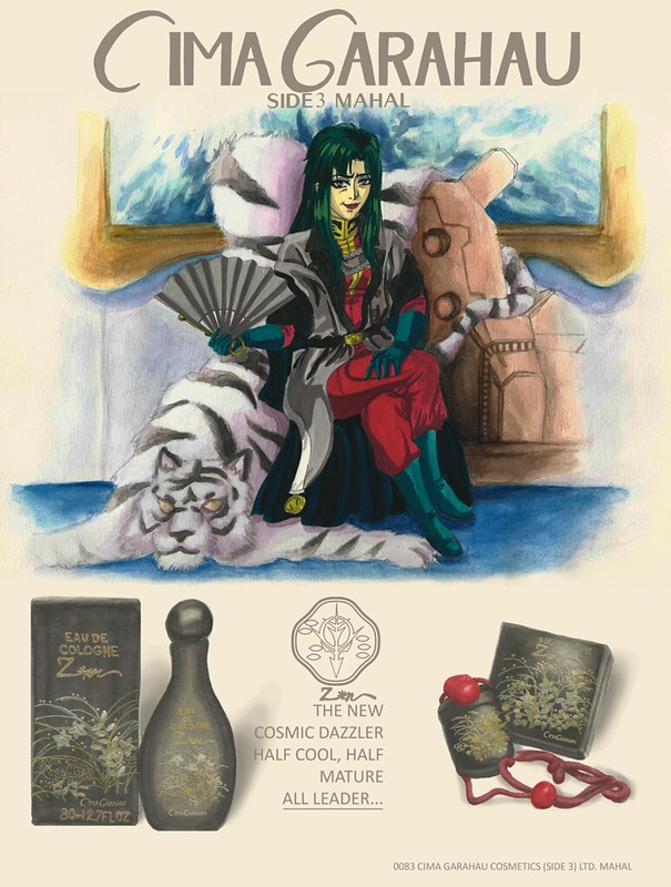
Earlier this year I showed my youngest brother Gundam 0083 Stardust Memory (I also made sure he saw Top Gun first). After seeing it again I was really taken by Cima Garahau, she really is in my opinion the best part and most interesting character of the series (a shame things ended how they did).

One other thing I have really been into are Japanese 80s magazine ads. Over this year I was going crazy accumulating all the references I could acquire. Now my collection is around 1tb of pictures (this is going to be a pain to categorize…). But it is all worth it.

These are the references I used:

https://www.flickr.com/photos/darkcloudxero/41604180954/in/dateposted-public/

Sayoko Yamaguchi (pictured below):

https://www.flickr.com/photos/darkcloudxero/42326311871/in/dateposted-public/

https://www.flickr.com/photos/darkcloudxero/42279220572/in/dateposted-public/

https://www.flickr.com/photos/darkcloudxero/41424855725/in/dateposted-public/

Sayoko Yamaguchi (pictured below):

https://www.flickr.com/photos/darkcloudxero/42326322131/in/dateposted-public/

https://www.flickr.com/photos/darkcloudxero/40520064140/in/dateposted-public/

https://www.flickr.com/photos/darkcloudxero/27457481247/in/dateposted-public/

Up above are two pictures of Sayoko Yamaguchi who I came upon when finding reference pictures, I really feel that Cima looks a lot like her so of course I used her as part of the painting.

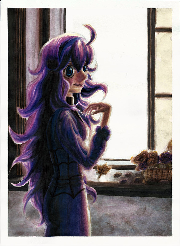
In any case, this piece was done both traditionally and digitally. First the painting of Cima. I wanted to emulate the painting style of the original anime and used my Knicker Poster Color paints to paint her but then used my Kuretake Gansai Tambi for the background. I wanted to loose details as I went further away from the focal point (which is Cima).

https://www.flickr.com/photos/darkcloudxero/28454114288/in/dateposted-public/

https://www.flickr.com/photos/darkcloudxero/40520424960/in/dateposted-public/

https://www.flickr.com/photos/darkcloudxero/28454114168/in/dateposted-public/

https://www.flickr.com/photos/darkcloudxero/40520424860/in/dateposted-public/

https://www.flickr.com/photos/darkcloudxero/28454114058/in/dateposted-public/

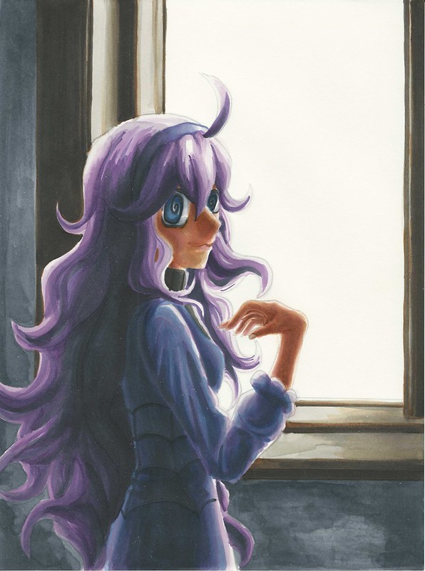
After finishing painting and scanning it I have to fix the colors since the scanning process dulls everything.

https://www.flickr.com/photos/darkcloudxero/41604614534/in/dateposted-public/

Once that is finished I then went ahead and started working on creating the ad. Since the main painting is done, now I had to paint the product. The hard part was coming up with what the ad would be promoting. After looking through Sayoko Yamaguchi’s reference pictures I noticed that she promoted Shiseido a good bit so after looking around a bit I decided to use their perfume line. And I painted it using Copics.

https://www.flickr.com/photos/darkcloudxero/40520848640/in/dateposted-public/

https://www.flickr.com/photos/darkcloudxero/40520848500/in/dateposted-public/

Once they were painted I then used my Gel Writer gel pens to write in the text and paint in the artwork. Thinking back I should have modified it more to make it more Gundam like, or at the very least modify it further.

https://www.flickr.com/photos/darkcloudxero/42327075091/in/dateposted-public/

https://www.flickr.com/photos/darkcloudxero/42327075241/in/dateposted-public/

After this I positioned them in place and modified them digitally by removing the modified Shiseido logo. I had to make a custom Cima Garahau text so that it would fit with the shiseido text style, and also modified their logo with a Zeon emblem that I also had to create by hand and modify digitally.

These are the original Shiseido text and emblem:

https://www.flickr.com/photos/darkcloudxero/41605114494/in/dateposted-public/

https://www.flickr.com/photos/darkcloudxero/42280250212/in/dateposted-public/

These are the ideas I had for the modifications I wanted to make:

https://www.flickr.com/photos/darkcloudxero/42327558171/in/dateposted-public/

https://www.flickr.com/photos/darkcloudxero/40521281620/in/dateposted-public/

Then I used this ad as inspiration to finish it all off (after modifying it of course).

https://www.flickr.com/photos/darkcloudxero/41605442824/in/dateposted-public/

And this is the final artwork.

Cima Garahau 80s Shiseido perfume ad resize


Hasta la proxima,

– NUBE

Nicker poster color 2nd attempt done in 1/15/18

School is just about done… it was quite a tough end of the month in April and the beginning of May, but I managed to power through. Now I should be a bit more free.


Quite a while ago I decided to buy a 24 color set of Nicker Poster Color paints. I read about how Ghibli uses them because they dry quickly, and I can confirm that. On top of that I can make the colors translucent or opaque depending on what the ratio of paint to water is. I haven’t had much time to practice much with them because of school and the construction work, but I did try some whenever I could. This one was done before I started school this semester, but wanted to talk about it a bit before posting it. I just didn’t think it would take about 5 months…

I would say that for a self taught artist, the best way to learn is to try and recreate other peoples work and try to understand their process and color choices. With that in mind, it shouldn’t be too surprising that I decided to recreate a background done by Kazuo Oga, the background artist for Studio Ghibli.

I decided to choose this image for my study                                                                              (it’s from “Only Yesterday”/”おもひでぽろぽろ”):

03-Only-Yesterday

I thought that I had documented the process, but thinking back I guess I was just focusing on painting.

As can be seen I didn’t really keep the proportions in place so I just focused on recreating the colors.

Ghibli Background Study 1st Attempt cropped resize

There’s an obvious difference in skill and color. But I was amazed at the versatility of the Nicker paints. I wonder just how far I can push them.

That will be all for now.

Hasta la proxima,

-NUBE

Some of the artwork I’ve been practicing 3-31-18

As mentioned before I said I was going to be uploading some artwork that I’ve been working on as a bit of practice so here it is (sorry about the delay, like usual the workload has been a bit of a pain but I’m pushing forward – luckily this semester is almost finally over… though construction work seems to be looking to increase).

I got a Samsung tablet for my self at the end of last year and didn’t really use it all that much, but while in a dollar store I saw a tablet stylus and decided to try it out. I was surprised at the accuracy I could get with such a clunky pen, so I ended up purchasing an app to do some art on the tablet. Sadly the tablet is not that powerful so it stuttered way too much while I was working on it and it even crashed plenty of times but it did get me interested on the possibilities of drawing/painting digitally directly. Though one can get used to looking up at the monitor using a normal drawing tablet, there is no comparison to actually looking at what you are drawing/painting. Now I’m really craving a drawing monitor…

Anyway here are two tries I made while waiting for my class start;

First try:

https://www.flickr.com/photos/darkcloudxero/41103228712/in/dateposted-public/

Second try:

https://www.flickr.com/photos/darkcloudxero/41103228612/in/dateposted-public/

On the traditional side of things I wanted to make some quick practice sketches with a pen. And not surprisingly the ink really made it standout and look cleaner than when using a pencil.

I wanted to try a conversion from a real person to an anime version so I decided on using this reference picture of Eri Kamei to try it out:

kamei024

I decided to only do the main lines to test out how it all looks.

This time I used a pen from the brand LePen, I want to test out how a lighter pen combines with color so I used their Dark Grey color which leaves a much lighter mark that I hope combines much better when I add watercolor and copics to it.

https://www.flickr.com/photos/darkcloudxero/27273111068/in/dateposted-public/

After I did the outline I wanted to see what would happen if I added more detail and darker lines, but my skill are still… anyway I’ll figure it out by doing some more when I have the chance. For the thicker lines I used one of those ink pens from Hobby Lobby that are meant for calligraphy. Did not end up how I wanted it…

https://www.flickr.com/photos/darkcloudxero/39337424070/in/dateposted-public/

But despite all this it does give me a good opportunity to try out if I can conceal mistakes using my Knicker Poster Color white, it does work but I have to gauge the right amount so as to make it thick enough to cover but not thick enough to make a mess. What I do know is that the thinner lines looked much better, I’ll have to figure out how to ink and shadow properly.

https://www.flickr.com/photos/darkcloudxero/27273110408/in/dateposted-public/

Next is Yuri Kim from Fearies Landing, here is the reference picture:

https://www.flickr.com/photos/darkcloudxero/40251652515/in/dateposted-public/

Here is the main outline.

https://www.flickr.com/photos/darkcloudxero/26274808197/in/dateposted-public/

I inked some sections and added some details but not much since I didn’t want to use too much time on it. I’ll practice some shading techniques on a blank paper to figure out what kind I should use and at what time.

https://www.flickr.com/photos/darkcloudxero/26274808087/in/dateposted-public/

Currently I’m trying to make a new finished piece, but I’ll leave that for another time.

Hasta la proxima,

-NUBE

DarkCloudXERO Let’sDraw Episode 1 Misaka MIkoto cool eyes

Video is finally up.

School and work sure dragged things out longer than it should have…

Plus all the new opening and closing animations were pretty time consuming. But that was all groundwork that I can now just edit for the new videos. One thing that will probably set me back still is recording commentary for the videos. That I’m not used to at all. Hopefully I learn to relax when recording so that I can do it faster and with little mistakes. We’ll see…

These are the reference pictures:

cosplayer:

https://www.flickr.com/photos/darkcloudxero/40792752271/in/dateposted-public/

“cool eyes”:

https://www.flickr.com/photos/darkcloudxero/40792752651/in/dateposted-public/

https://www.flickr.com/photos/darkcloudxero/40792753391/in/dateposted-public/

https://www.flickr.com/photos/darkcloudxero/39897964515/in/dateposted-public/

hair:
https://www.flickr.com/photos/darkcloudxero/39897965105/in/dateposted-public/

I tried a couple new things for the way I presented the video such as having the reference pictures appear as needed and zooming in and out of the sections that I would be drawing. Hopefully that becomes useful for those who use my videos to learn how to draw (and entertaining for those who just enjoy watching these types of videos).

I think I will just draw for this videos (there may be special exceptions from time to time, it depends on how good and fast I become) so that I can make them quickly and specially so that I can work on my own projects on the side, which I haven’t really had much time to do (though I do have some that I want to show you guys soon).

As for music, I’m really into Vaporwave and Future Funk (specially City Pop which is where Vaporwave/Future Funk sampled their songs from). Just as this video was uploaded I got a couple of copyright claims for the music used in the videos. Which I expected. I’m not really going to rely on Youtube monetarily, I already got denied that ability since my videos and subscriber count weren’t high enough according to their new guidelines. So these videos are really more of a hobby. Hopefully people do learn from them, because I know I have doing them (in more ways than one).

In any case, the music can be found here (formated as Artist – Album):

Yung Bae – BAE :
https://yungbaebae.bandcamp.com/album/bae

Yung Bae – Japanese Disco Edits :
https://yungbaebae.bandcamp.com/album/japanese-disco-edits

Nanidato – Mobile Sailor Gundam :
https://nanidato.bandcamp.com/album/mobile-sailor-gundam

Night Tempo – Pure Baby Maker [Rewind] :
https://neoncityrecords.bandcamp.com/album/pure-baby-maker-rewind


Name of the songs are in the video itself.

That should be it for now, I’m currently working on a new project for school which requires me to read another book. But at least I don’t have to do another powerpoint presentation again so it shouldn’t be too bad (though I still have to write another paper about it). Aside from that I am going to be working on another video as well. I already recorded so it’s just a matter of editing which should’nt be too bad, it’s the recording of my voice that really gets me. But if I don’t do it I wont get better, so I just have to grit my teeth and do it.

As mentioned before I did work on some new art pieces, nothing really new, they are just practice pieces. I will upload and talk about them later.

Hasta la proxima,

– NUBE

Just a little bit more time

It’s been a very tough time lately, it has been filled with a lot of work from all fronts (school even has me reading multiple books at once…). But the main time consuming thing is creating the new format for my Youtube videos. I will finally be making that comeback I mentioned, but I really want to up my game so I’m trying to create a strong new video format that I can feel proud of and that people will hopefully like and will also retain their interest. Time constraints are a bit rough right now though. I also have to make a presentation in a  week about a book we have to read for class and that will require a good a bit of time. Haaaaa…….

I have made some new things just haven’t had the time to upload and whatnot. Let me get through this things and hopefully I will have some more time soon. We have a lot of things to catch up on, seriously.

For those of you who read these here is a sneak peak to the video:

https://www.flickr.com/photos/darkcloudxero/39021947955/in/dateposted-public/

I will be adding some “shading” later on but haven’t had the time to do so yet. I’m still not done with the ending quite yet, but the meat of the video shouldn’t be too hard to figure out. But I do worry about whether I should actually talk in the videos or not…

Will try to keep in touch.

Hasta la proxima,

-NUBE

Start of a New Year! 2017

I guess since high school I have been doing an art piece especifically for new years. Usually I start it the day before and finish it on the first day of new years. This year though I made 2 before new years (one of them was El Chavo, and the other one I will show below) and the Eri Sawachika one for new years. I’ve been quite busy lately but when it comes to just drawing and not painting the workflow is not that bad and I can move relatively quickly.

This was one of the other pieces I did before new years. Again I was inspired by that video I showed on the last post. It was also done quickly so I made a lot of mistakes, but the biggest is the proportions… especially the “bobblehead”. But I figured I would try and fix it digitally using some techniques I saw online.

Character is Harima Kenji from School Rumble.

I used this reference, but decided to change things up a bit, for some reason had an image of him in a Kung Fu like scenario (like Bruce Lee). Decided to take off his glasses just as an extra challenge.

https://www.flickr.com/photos/darkcloudxero/24639023747/in/dateposted-public/

Bobblehead Harima… I guess I was so focused on the pens that I didn’t think of the proportions especially since I imagined his whole body from the get go and I ran out of space below.:

https://www.flickr.com/photos/darkcloudxero/24639000007/in/dateposted-public/

And here he is with an edited head:

https://www.flickr.com/photos/darkcloudxero/24639002027/in/dateposted-public/

Posture still seems a bit off. But it was just a test anyway so it should be fine as it is for now.

And so having shown both of the pre new years pieces, let’s now focus on the piece I made for and on new years. Again I chose someone from School Rumble. I wanted to do something simple and just modify it for new years (plus I wanted to learn a thing or two from a pro). With that in mind I decided to recreate this scene:

https://www.flickr.com/photos/darkcloudxero/39477590652/in/dateposted-public/

Here is the quick draft (as to be expected it is quite faster to just draw it one time instead of the two times that I usually do, rought draft then a clean final version):

https://www.flickr.com/photos/darkcloudxero/38799615714/in/dateposted-public/

By this point I finally figure out that there was no way I could just copy everything over (so much for just doing a simple piece…) New years in these parts of the world are winter after all, so I had to dress her up appropriately. After a quick search online for winter clothes I came upon this reference picture:

https://www.flickr.com/photos/darkcloudxero/38612206075/in/dateposted-public/

So I decide to use that sweater and that design:

https://www.flickr.com/photos/darkcloudxero/39477594802/in/dateposted-public/

Should’ve stopped by this point and made the rest digitally, but since I wasn’t sure of how I was going to go about it I continued on:

https://www.flickr.com/photos/darkcloudxero/39477594492/in/dateposted-public/

… I didn’t even do any clean designs, I just made some quick lines with no real ideas on the type of knitting. It doesn’t look horrible but I should try harder.

Here it is with the filled out dark parts:

https://www.flickr.com/photos/darkcloudxero/38612203505/in/dateposted-public/

So I got to this point by the end of new years but it was quite late so I had to call it a day.

Time was running low already so at this point I finally decided to mix it up with digital techniques. But for that I had to search up screentones and textures that I had to use. That took a while. On top of that I decided to clean up my messy texture lines so that it would be ready for the knit textures.

Here are the textures and screentones I used:

https://www.flickr.com/photos/darkcloudxero/39477592442/in/dateposted-public/

Then I had to take out the color and change the contrast:

https://www.flickr.com/photos/darkcloudxero/39477592872/in/dateposted-public/

This is the screentone I used to darken areas up:

https://www.flickr.com/photos/darkcloudxero/38799647334/in/dateposted-public/

Since it’s new years, of course I needed some fireworks:

https://www.flickr.com/photos/darkcloudxero/24640047977/in/dateposted-public/

That looked a bit lonely though so I decided to add a cityscape:

https://www.flickr.com/photos/darkcloudxero/39507959611/in/dateposted-public/

I couldve modified the darkness of the fireworks screentone with the cityscape’s lighter sky but that would take too much time, so I decided against it.

This is the final piece, clean and simple (though quite time comsuming due to finding and modifying the screentones, and cleaning up the rough knit lines I made).

Eri Sawachika  Happy New Years 2017 resize

After making the piece smaller and a .jpg it made the cityscape screentone quite choppy.

Aside from the obvious changes I made, I also changed her expression. I wanted her to be contemplative and yet have some hope for the future, thus the small smile.

Anyway, this year has finally started so lets do our best to make our goals successful.

Happy New Year.

And as always

Hasta la proxima,

-Nube

End of another year 2017

So another year come’s to a close…

It sure was a rather trying one…

But I and all of you made it through, now lets push forward!

Just for the heck of it I made a quick piece using only pens with hatching and cross hatching.

The idea mainly came from watching this video:

So really I wanted to see what I could do. I wasn’t really trying to make a finished work, instead I wanted to see if I could make it look anything at all like the reference picture. It’s quite rough, but the general idea is there.

reference:

https://www.flickr.com/photos/darkcloudxero/27644882729/in/dateposted-public/

and the quick artwork:

https://www.flickr.com/photos/darkcloudxero/39391816822/in/dateposted-public/

Obviously my level compared to Ryoichi Ikegami is still quite low. The lines are nowhere as refined and the lines are quite rough and not uniform but! I was able to acquire the main idea. I was actually quite surpsided at how fast I could acquire the effects that I wanted. I feel confident even saying that it was quite easy. I wonder just how well it would look if I were to do so with cleaner and well thought out lines?

The best way to learn is by recreating pieces, so that is what I will try to do for this coming year (on all fronts).

Almost forgot to even mention this, but the people above are from a Mexican show called “El Chavo del 8”. A comedy show from the 70s that has trancended time and that each generation watches at some point or another. A true gem of Mexico. As for why I chose them, I mainly wanted to draw a guy since I have mainly been drawing females for quite a while. And well I just felt like it would be fun to do so.

Let’s focus a bit of time on the Christmas Misaka and Misaki artwork. I used a combination of Knicker poster paints (yes I made the plunge, I’ll explain this at some other time), kuretake gansai tambi (watercolor set) and pencils.

Here is the process:

rough draft-

MIsaka MIsaki christmas rough draft I resize

clean lines for final artwork-

MIsaka MIsaki christmas I resize

MIsaka MIsaki christmas rough draft II resize

MIsaka MIsaki christmas rough draft III resize

coloring process-

Such a shame about not showing the before and after of the frills on Misakas coat, it shows just how versatile Knicker Poster Colors are.

DSC04043 resize crop

DSC04044 resize crop

DSC04045 resize crop

DSC04046 resize crop

DSC04047 resize

DSC04048 resize

DSC04049 resize

DSC04050 resize

DSC04051 resize

DSC04052 resize

DSC04053 resize

DSC04054 resize

DSC04055 resize

DSC04056 resize

DSC04057 resize

DSC04058 resize

As stated before, I’m still not done with it but this is the last state as of this writing.

Hasta la proxima,

Nube


Merry Christmas (and happy holidays!)

So Christmas has finally arrived.

I was working on an artwork for this year and just now finally finished it. I will be making a background at some point but that will have to wait for next year. But for those who visit my site, here is a peek at it. (The print won’t be available till next year though).

Will talk and upload more photos at a later date.

MIsaka MIsaki christmas 2017 edited resize

My brother’s finished presents.

https://www.flickr.com/photos/darkcloudxero/39265906372/in/dateposted-public/

https://www.flickr.com/photos/darkcloudxero/39265905482/in/dateposted-public/

Have a great time guys. Merry Christmas and happy holidays.

Hasta la proxima,

-NUBE

A little update 12\3\17

I finished my paper about two weeks ago but my side job has been aking for more of my time lately, though we should be done for the rest of the year once we finish the next job (whenever that is). As for school, I just have a class tommorrow and finals next week. So I’m almost finally done for this year and will have a couple of weeks where I can focus completely on art. So for this weekend I will be giving some time to just study, but for most of this week I should be able to keep working on art (aside from the daily chores and things to do).

Having said that, I have been working on some new artwork these past few days. Drawing I can hatch things out quite quickly but again color is still giving me problems. So I decided to make a piece with simple color schemes and color application like that done in older anime. This works two fold. I wan’t to give my brothers a specialized gift for Christmas and also make a demo of a possible service I can offer customers. This whole year I’ve been trying  to just learn as much as I can before I started to sell again. But I can’t keep it in the backburner for too long, the year is almost gone so I have to think about keeping the business side of things alive again.

So what is this new potential service? How about a personalized recreation of a poster where you or someone you know is taking the place of the protaganist/character. Or something simpler like the anime version (of you or someone you know) in what ever style you’d like.

I doubt my brothers check this page so here are the two artwork I am currently working on.

First is Gundam X, sorry the line art is too light for the scanner to really catch it. and I don’t have a digital line art copy for some reason.

https://www.flickr.com/photos/darkcloudxero/38788297862/in/dateposted-public/

I tried using the colors from the anime so I just focused on applying color. But as expected I still had a lot of trouble working it since I’m still not used to painting digitally. It’s a great tool I but I much prefer traditional. But I’m still not good enought to make colors as smooth as digital. Though I did learn a lot and could definitely get better. but I feel I might have to make a choice on which one to focus on. Learning both will take quite a while… We’ll see.

Despite that it look alright.

https://www.flickr.com/photos/darkcloudxero/38103035524/in/dateposted-public/

Next is the Evangelion one. I have started painting it digitally, but I think I will switch it to traditional. Time is running out and I wan’t to do a lot more pieces. I just don’t know how people could paint so amazingly using the digital medium. Switching between both really confuses me.

https://www.flickr.com/photos/darkcloudxero/38788297312/in/dateposted-public/

This is what I have so far digitally. I’ve seen people fix their colors and make really cool effects by adding textures to the paint jobs, but I don’t know if that is what is needed…

https://www.flickr.com/photos/darkcloudxero/27043309749/in/dateposted-public/

So there is the small update, have to go rest a bit and eat.

Hasta la proxima,

-NUBE


Working on a report

Currently working on a research report, won’t be back for a bit. I wan’t to finish it as soon as possible so that I can work on a couple of more artworks before I have to take another leave to study for finals.

(* ̄0 ̄)✎

Hasta la proxima,

-NUBE

Another year of life

So, another year has passed. I put some goals for my self this year, and although I could have done better I did accomplish them. So I will continue to go forward. The future does seem quite shaky and uncertain. But that’s life… I won’t give up.

I guess my goals for this new year is to take things further and accomplish even more things this year. I also want to be more physically active and learn Japanese to a proficient level. I’ve put those guys in the back burner for far too long. It’s time I give them the time they need.

This is the drawing for this year. I was thinking of adding some Dia de los Muertos influences, but maybe next time. Today was quite a busy day so I wanted to make a quick drawing. I really like Yoshitoki Oima’s art style a lot (creator of “A Silent Voice”), so I decided to use her style for this drawing. I didn’t have much time for coloring either (I actually just drew it in about half an hour a couple of minutes before I started making this entry) so I will just do the line art like if it was from a manga panel. I was thinking of inking it as well but the day is almost over so I will leave it like this. Besides it looks quite clean this way.

Nube 2017 crop centered resize

Here’s to working towards a better future and accomplishing our goals!

Hasta la proxima,

-Nube

Halloween/Fall Artwork; Ghost Girl by the window

I was hoping to do a bit more artwork for the seasons, that way I had a bit more to aim for and to just get into the spirit of the holidays around the year (I feel that if I continue not to do so the years will just continue to feel monotonous and boring). I might do another quick one for Halloween before the actual day. Though Dia de los Muertos is also approaching…

It’ll be fine…

I guess that midterm and the extra work that piled up really did a number. But that’s life I guess.

I want to be able to meld reality and anime a bit more, so I want to play around with that a bit more. And this is one of the paintings where I am giving that a shot.

I am wondering if the way I do watercolor paintings look good to others or If I should make them look smoother so that the grain of the paper isn’t as noticeable. I can do that a bit more if I use color pencils to go over the watercolors I already put in. I have used this technique before, but I want to get better with just watercolors first so that I don’t just rely on color pencils to fix my inexperience. Once I get better I will try to combine them again, but hopefully this time correctly.

In any case this is the painting in question:

Ghost Girl by the window resize

There’s something about the character design of the ghost girl from Pokemon X/Y that I really like. So that is the theme for this year’s halloween painting. I was also looking forward ot seeing if I could make her zig-zag mouth look like it could belong to our world (what do you guys think?).

The painting itself is largely inspired by this picture I used as reference:

Cosplayer: Cherry Neko

ZkFmTE91UWs4eG5nUDNreXZSR2sxQ0w1UzBzdnJJNEliTWRjQWVjM28wQVoyQktCdXVUekF3PT0

One other thing I really wanted to try out was seeing if I could choose the right color schemes despite the reference pictures having different colors. As I’ve mentioned before color is still something I’m struggling with. So this was designed to be a good challenge for me to play around with that. I’m still relying on references but I will learn faster this way, and I will have a better understanding of how colors work as well.

I’m starting to get the hang of watercolors a lot more, to the point that I’m no longer afraid to try new techniques and push ones I’ve used before further. I still get a bit frustated when the sessions go for too long and I can’t quite get it right, but that’s fine (nothing a little rest can’t fix).

Strangely enough I actually drew this picture various times (four times) and colored it twice. Once with Copic markers and the second one with watercolors which is the one you see above.

Here is the original sketch/drawing:

https://www.flickr.com/photos/darkcloudxero/37997922582/in/dateposted-public/

Here is the Copic version done with one of said four drawings:

Ghost girl 2017 I resize

The copic version exists because I wanted to first try out the color schemes that I thought would work. I did this because I didn’t want to use too much time painting only for it to come out wrong. And since Copics are faster to use and dry almost instantly it was a perfect medium to try out the colors. I was almost thinking of just using the Copic version as the final piece, but then I ran out of a couple of colors and buying replacements would be too costly so I just decided to start all over with watercolors. In other words I made this piece twice which is one of the reasons I haven’t posted in a while. But I’m finally done.

For those that are interested here is the process:

From this angle it look like a good start, but I would later learn that I had made quite a couple of mistakes.

https://www.flickr.com/photos/darkcloudxero/37975118286/in/dateposted-public/

https://www.flickr.com/photos/darkcloudxero/26252727129/in/dateposted-public/

https://www.flickr.com/photos/darkcloudxero/37975115126/in/dateposted-public/

https://www.flickr.com/photos/darkcloudxero/26252725479/in/dateposted-public/

https://www.flickr.com/photos/darkcloudxero/37975112316/in/dateposted-public/

https://www.flickr.com/photos/darkcloudxero/26252724059/in/dateposted-public/

https://www.flickr.com/photos/darkcloudxero/24176567568/in/dateposted-public/

https://www.flickr.com/photos/darkcloudxero/37319671004/in/dateposted-public/

https://www.flickr.com/photos/darkcloudxero/24176565838/in/dateposted-public/

https://www.flickr.com/photos/darkcloudxero/37319668314/in/dateposted-public/

https://www.flickr.com/photos/darkcloudxero/24176563958/in/dateposted-public/

https://www.flickr.com/photos/darkcloudxero/37319665864/in/dateposted-public/

https://www.flickr.com/photos/darkcloudxero/37319664754/in/dateposted-public/

https://www.flickr.com/photos/darkcloudxero/37319663354/in/dateposted-public/

https://www.flickr.com/photos/darkcloudxero/37319661714/in/dateposted-public/

https://www.flickr.com/photos/darkcloudxero/37319659964/in/dateposted-public/

https://www.flickr.com/photos/darkcloudxero/37319658714/in/dateposted-public/

https://www.flickr.com/photos/darkcloudxero/37319657424/in/dateposted-public/

https://www.flickr.com/photos/darkcloudxero/37319656314/in/dateposted-public/

https://www.flickr.com/photos/darkcloudxero/37975099496/in/dateposted-public/

https://www.flickr.com/photos/darkcloudxero/37975099066/in/dateposted-public/

https://www.flickr.com/photos/darkcloudxero/37975098526/in/dateposted-public/

https://www.flickr.com/photos/darkcloudxero/37975097926/in/dateposted-public/

https://www.flickr.com/photos/darkcloudxero/37319650324/in/dateposted-public/

https://www.flickr.com/photos/darkcloudxero/37975096866/in/dateposted-public/

https://www.flickr.com/photos/darkcloudxero/37319648004/in/dateposted-public/

https://www.flickr.com/photos/darkcloudxero/37975095856/in/dateposted-public/

https://www.flickr.com/photos/darkcloudxero/37319644924/in/dateposted-public/

https://www.flickr.com/photos/darkcloudxero/37975094196/in/dateposted-public/

https://www.flickr.com/photos/darkcloudxero/37319641914/in/dateposted-public/

https://www.flickr.com/photos/darkcloudxero/37975092656/in/dateposted-public/

https://www.flickr.com/photos/darkcloudxero/26252707219/in/dateposted-public/

https://www.flickr.com/photos/darkcloudxero/37975090236/in/dateposted-public/

Thinking I was pretty close to the end I noticed that the proportions were quite off. The head was much too big for the body, the shoulders were too small and so were the hips.

https://www.flickr.com/photos/darkcloudxero/38029011271/in/dateposted-public/

On top of that, after taking a break from painting when I came back I decided I needed to make even more changes to it.

https://www.flickr.com/photos/darkcloudxero/37975444346/in/dateposted-public/

And this was the final version I decided to go with:

Ghost Girl by the window resize

Well that’s it for today. Hopefully I can get another piece out before Halloween (though it will be simple if it is).

Hasta la proxima,

-NUBE


Create a website or blog at WordPress.com

Up ↑