Lynn Minmay Update VI

I actually had most of this done since Friday, except the last two scans but I kind of took the weekend off to think and rest a bit, so sorry for those who were awaiting the latest updates.

I’m quite surprised I was taking as long as I was to color the background. As expected dealing with darkness is quite tough, especially when not doing a stylistic approach to it. I had to really think before adding any colors and going over and over (repeating many times) till I had the right shades in place and then eventually adding darker areas around the parts that were supposed to have light both from the light sources and the light being reflected on the ground. I really wanted a shiny floor no matter what since I don’t really deal with such backgrounds due to knowing how hard they are but in the end I decided to go at it anyway. Over all despite the amount of time it took and cont less retouches I felt pretty confident on what I managed to bring forth. Now it is time to actually focus on Lynn Minmay herself which I had a hard time deciding on what color scheme her clothes would have. I actually did quite a couple before scrapping them and coloring them over with what she has now.

In the scans she looks quite darker than in real life, and the hair having no color surely doesn’t help things either. But trust me it shouldn’t look too weird once I have everything else in place. I’m hoping on finishing this tomorrow, here’s hoping it goes along well.

Lynn Minmey XIII resizeLynn Minmey XIV resizeLynn Minmey XV resizeLynn Minmey XVI resizeLynn Minmey XVII resizeLynn Minmey XVIII resize

Hasta la proxima,

-XERO

Lynn Minmay Update IV

I think I have everything that I wanted drawn, now it’s just a matter of coloring… I really hope I can pull it off.

Lynn Minmey VI resizeLynn Minmey VII resizeLynn Minmey VIII resize

Hasta la proxima,

-XERO

Lynn Minmay Update II

I had two final classes this week but I still have to do a couple more things until the 27th but over all I should have more time to focus on art (among other activities that will benefit my body and mind). Hmmm. I had a couple of days worth of searching for some more references of Macross and the main idols (Akina Nakamori and Seiko Matsuda) I will be using for this piece. Although I kept working on the piece throughout the week I didn’t really get much progress since I couldn’t decide on the outfit and the background.

Macross is quite interesting isn’t it? It has a very obvious 80s feel to it (it makes sense since it was made in the 80s) and yet is set around this time period. With that in mind I can actually modernize it if I felt like it. Though one can argue that the fall of the Macross on earth and the war that came from it might have stopped the progress of innovation when it comes to music and fashion. I think about things too much…

Anyway I decided to keep with the 80s feel so I set out to look at the concert performances during that time. I mostly focused on Akina Nakamori and after a couple of videos I came up with this:

Lynn Minmey rough draft II resizeLynn Minmey rough draft III resizeLynn Minmey rough draft IV resize

I wonder if it even makes sense? I want to make this so 80s it brings nostalgia for those who actually lived it or saw the movies and music in the 90s.

Hasta la proxima,

-XERO

Next project 5/1/16: Lynn Minmay

I have decided upon the next project for my next piece, and that is non other than Lynn Minmay from Super Dimensional Fortress Macross (my all time favorite anime). When I first watched Macross I really came to dislike Minmay, she seemed to fickle and self-centered. But upon re-watching last year now that I am older I came to really like her. She was written in a way that doesn’t make her dislikeable, in reality she only saw Hikaru as a friend and nothing more (at least throughout most of the series) so seeing her not treat Hikaru as anything more than a friend is quite understandable (having experienced it myself).

Anyway, despite what people might think regarding her personality and actions she is quite cute making her a good model to draw. I went on a binge of downloading and searching for references. Eventually I got the idea to actually search for actual photos of idols from the 80s to serve as a firsthand visual reference to make something a bit different and more in tune to reality. That’s when I learned that Minmay was actually based on two of the most famous idols of the 80s in Japan. Those idols being Akina Nakamori and Seiko Matsuda. They are quite famous even now, I was actually quite surprised how much of a fanbase there still exists. And I’m glad because I found treasure troves of reference pictures to make my artwork come alive.

I can really see the influences in Minmay after looking through the photos. At first I was thinking about using a Chinese model for the drawing but after learning that these two were the influences I decided on just using them. And just before writing this I learned that Lynn Minmay is actually half Japanese from he mothers side so it’s ok if I just use Matsuda and Nakamori as the models.

I’ve written quite a bit so I will just leave it at that, here is a little taste of what I have done so far:

Lynn Minmey rough draft I resize

I know it doesn’t look like much yet, but I am quite happy with the base I have so far. I want to start incorporating movement into my work. And I truly think this is a good chance to do so. Drawing shouldn’t be hard anymore, what I worry is when I add color (which I still haven’t mastered).

Here’s hoping for the best.

Hasta la proxima,

-XERO

RebelsRebels vs the Empire – A fight between father and Son

Sorry for disappearing again, the end of the semester is coming upon me and things got a bit out of hand. I just need to finish a paper and I will pretty much be free of school obligations.

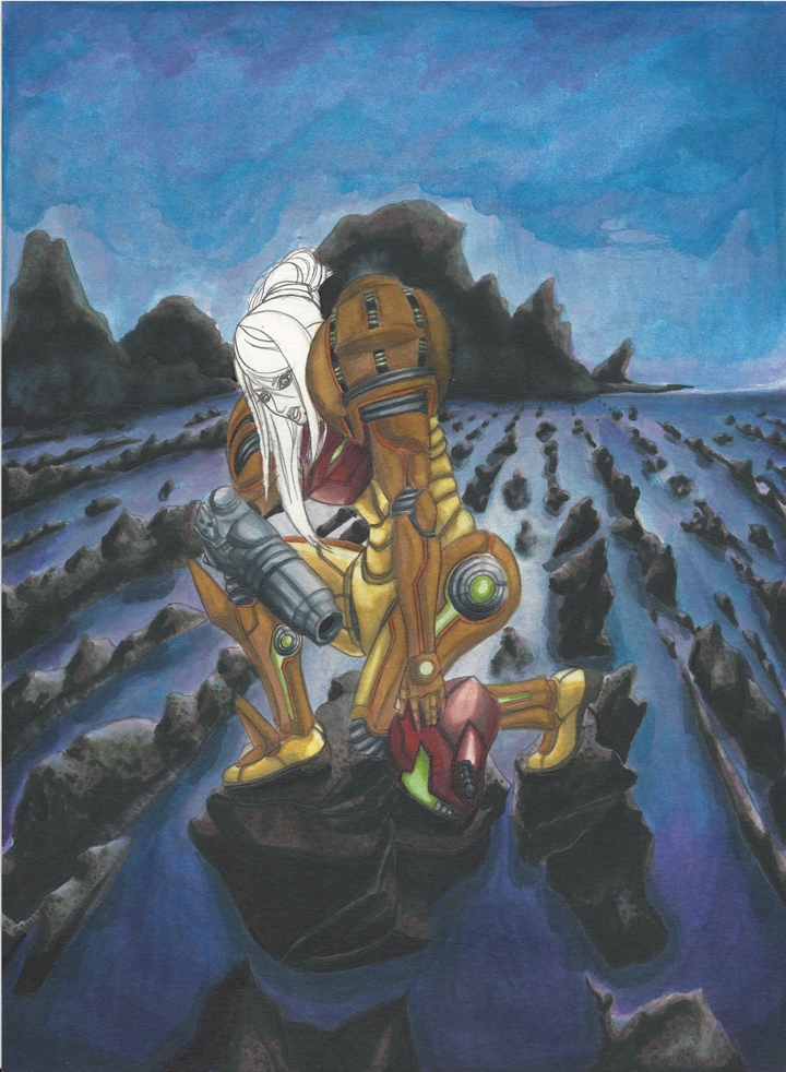
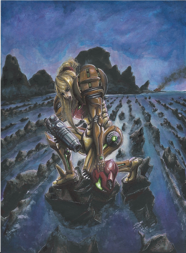
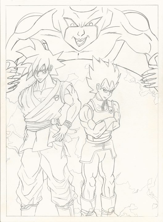
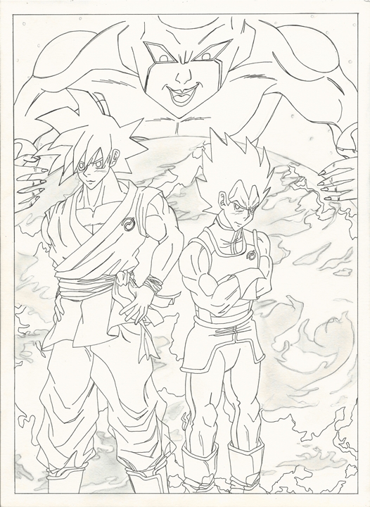
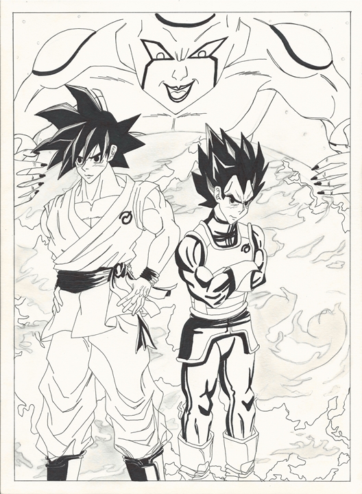
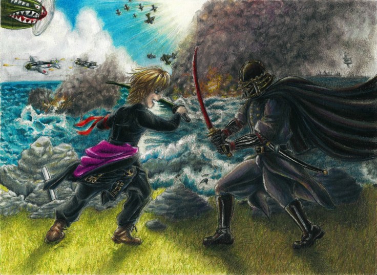
Anyway, after much thought I think it is finally time to make this piece go fully live. And like with all my previous works I have finally decided upon a name (although I had one a  long time ago but I forgot), “Rebels vs the Empire – A fight between father and Son”. The theme of this piece is set in the 1940s when WWII took place. A lot of influences were drawn from Germany for the Empire after all, and of course there’s the whole Japanese influence (mainly the ideas of samurais, ki, etc.).

So with that in mind I had Darth Vader use a German uniform. I really liked the baggy pants which aviator divisions (among others) used. I thought of making his buttons different colors, but decided against it. The idea of making a communication device provide those light did come to mind, but the place I wanted to place it on would be covered by his arms so again I decided against it. I thought of making him go in all black, but I decided for a mainly three color scheme of black, gold and grey. I really wanted some more variation within Vader’s uniform. Plus I had the idea of having some type of armor beneath his jacket and pants (some of which can be seen on his arms). The idea is that the technology isn’t there for fully robotic prosthetics, so what if he just had his burnt skin replace with metallic armor?

As for Luke I wanted him to portray some influences of Japan, but also the Allies from WWII. I eventually decided on a combination of Yankis (specially since he represents the rebel forces) and some parts of the uniforms of the allied forces (which pretty much just ended up being the boots, undershirt and maybe, just maybe the pants). I could’ve gone for a camo pattern, but since he is supposed to be like a delinquent he wouldn’t follow the rules would he? So the decision was made to have him in all black like in the final movie (0f the original trilogy).The jacket I wanted to look like those that Yankis wear. They tend to put nonsensical (usually) kanji together that sounds cool and tough into a completely made up word or phrase. So I decided to do the same. It was actually quite fun to do and now understand why Yanki do this (and why they get some weird words and phrases that don’t make sense). I used Kanji for “Rebel + Alliance” on the right arm and “Defeat + Evil Spirit” on the back. I was going to add something else to the left arm but decided (mest up/forgot) to not put anything on it… The Rebel crest is also there. As for the red cloth on Luke’s left arm, I was thinking of the headbands used by Yanki, but I decided to put it on his arm.

Finally, as for the swords, I used the colors from their final confrontation.

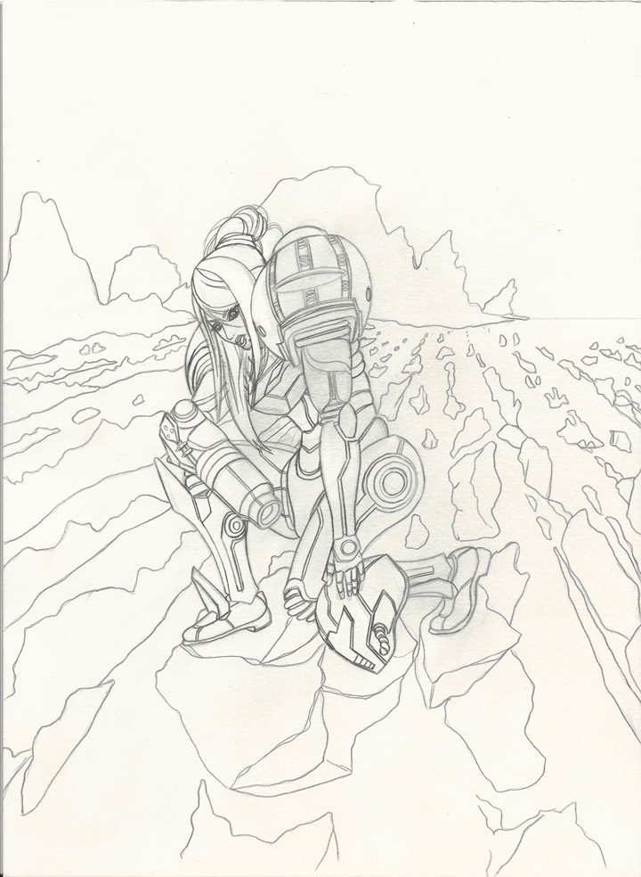
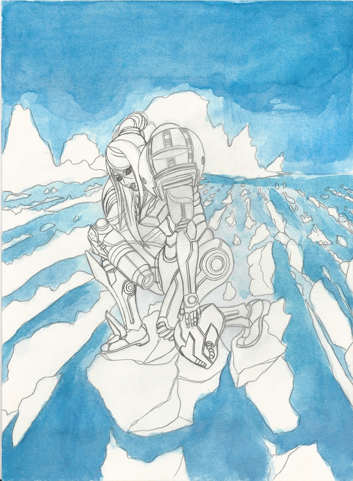
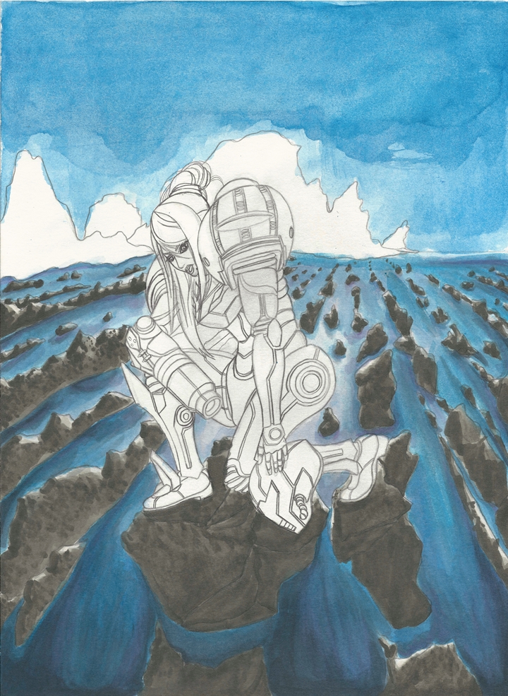
The setting was originally going to be inside a battleship, much like in the movie. But after much thought I figured I could do more on a cliff where I could add air and sea battles to the background.

This was a bit of an annoying piece due to the amount of details and objects I had to keep in mind as I worked on it. Not only that, but as I added new objects and colors I had to go back to previously finished areas to have them meld well together…

But it’s now, finally, officially done.

-XERO

Rebels vs the Empire - A fight between father and Son resize

I’m finally back, and some more updates on new projects

It took me quite some time to finish some work I had to do for school and some other things. But I am finally ready to start work again. I apologize for disappearing again, but the research paper took much longer than I thought. Now that is finally done and I will finally be able to work on some of my artwork, and some other projects such as some armor for a cosplay set me and my group plan to take for next years anime convention.

Here’s a sneak peek at what I am currently working on. This is Camus’ armor from Saint Seiya. There are about four more armors I will be working on. So I will not be saying what they are and let you guys take a guess as to what they will be.

I had to take this pile that I had all jumbled up and rebuild it back into the armor. That takes quite a bit of work, but I hope to take the template and finally make the cuts to the foam and build the actual armor. I currently have two armor templates done, next will be to build the next two.

Camus ICamus armor IICamus armor III

What do you guys think?

Update on upcoming artwork

Alrighty, so things did not go as planned and I ended up not posting this yesterday. Sorry. I ended up pondering what I wanted to have as the final piece and ended up going a different route from my original idea. Though not much.

Anyway. For this next piece I decided to do another Pokemon artwork. Since it’s Halloween I wanted something a bit spooky. So I went with an idea I had sketched earlier this year.

spooky girl rough draft resize

It’s a very rough sketch (looks really poor huh), and at this point I was still not sure what character to use. Seeing as I went for something a bit different this time, I can use  Nunotaba Shinobu from To Aru Kagaku No Railgun next time and go with an idea closer to the original (though I will probably change the pose a bit).

In any case, here is the rough idea of what I want. It’s quite simple but I want to play with darkness and light on this one. So it should be interesting. Assuming I do it right.

Pokemon Ghost Girl rough draft resize

Till next time,

-XERO

Samus Aran artwork (FINALLY)

The past week I have been working on the Metroid drawing and have finally managed to finish it. I’ve notice that I have become much better, but it still takes me a while to make decisions regarding how to go about accomplishing what I have in mind. I have gotten much quicker and know how to get certain effects, but I’ve noticed that as I learn a new technique, another possible technique emerges. Which is good, but it does let me know just how much I have to learn. A small part of me does feel a bit disappointed that I’m not better, but I’m glad that I feel like I can still grow as an artist. One thing I’ve noticed is that papers tend to give different effects. With that in mind, I will be trying out Bristol paper that seems and feels much better (time will tell). In any case here is the Metroid drawing.

So as many people know, Metroid is based on the Alien franchise. Can you believe that I just barely saw those films last year (only the first three, and I believe only the first two are the one’s to watch). Anyway, they both take the viewer to places that explore our fear of being isolated and in constant danger from an unknown force. So I decided to use that as a base for this drawing. I first contemplated about having Samus in a confined area to give the iconic claustrophobic feeling of both the game and the movies (Metroid games/Alien movies). But instead settled on an open world that was isolated giving that same feeling of being alone. As for Samus Aran herself, I wanted her to be struggling in this piece. So I had her exploring the land and showing that even she gets exhausted and has to take breaks along the mission, but she is definitely not defeated. I wanted to add a couple of more effects but worried that the drawing might get too jumbled, so I decided against it.

What do you guys think?

Hasta luego,

-XERO

Samus Aran I line art resize Samus Aran ii resize Samus Aran III resize Samus Aran IV resizeSamus Aran V resizeSamus Aran VI resizeSamus Aran VII resizeSamus Aran VIII resizeSamus Aran IX resizeSamus Aran X resize Samus Aran XI resize

Print now available.

Dragon Ball Drawing

I have been working on this weeks drawing quite a bit. Wasn’t too shure how to go about coloring. At first I wanted to draw it like a manga page. Meaning black and white, using only my pens. But I decided to instead make it like a color page in the manga and actually color it in. I decided to only use watercolors and my copics (they are really running low right now). I had to think about every stroke so that I didn’t waste any ink. While waiting on the next moves I drew a couple of rough drafts for what may become the next artwork. But that is for another time.

I named the drawing “Goku, Vegeta and the return of F” in commemoration of the new movie that will be coming out soon. I am actually looking forward to it. Even more so than the first one. Hopefully this will be a lot better (seeing as the other one was more of a reintroduction to all the characters). In any case here are some scans of the artwork in the process and the final piece. Wasn’t too sure since I spent quite a bit of time on it, but in the end I decided not to add it to the gallery.

Goku Vegeta I resize Goku Vegeta II resize Goku Vegeta III resize Goku Vegeta IV resize

Print now available.

Hope you like it,

XERO.

As promised.

Remember I was talking about a piece I had finished and wanted to show today. Well here it is. I’ll add more details about what I did tomorrow though.

Totoro I resize Totoro II resize Totoro III resize Totoro IV resize Totoro V resize Totoro VI FINAL resize

New artwork and Disappearance Explained

Sorry, sorry. I was going to work on some Christmas and Winter stuff, but quite a couple of things piled on. Though this was my fault. I should have been working on some Christmas artwork a couple of weeks before anyway. So that is what will happen next year.

As for this drawing? Well one of the things I was working on last week was this piece for a client. The first official client after deciding to go pro. I got a couple of clients the years before, but again, this is the first official client. I will keep producing some more quality artwork to bring in more people interested in my services. For my first commission I have Katara from Avatar the Last Airbender. As stated before, I ran out of my Copics (well, at least the most important colors). So I used watercolors this time. After applying the color pencils on top I managed to make the drawing even more vibrant. As for Katara’s pose, I haven’t seen Avatar despite my brother and all my friends telling me to check it out. But since she is a waterbender and water is usually depicted as fluid, I’m guessing that they use a version of Tai Chi so I went with one of their forms. As for the water she is bending, I wanted there to be some contrast between Katara and the water. I wanted Katara to appear calm and collected, while the water was turbulent and fierce, ready to destroy anything in it’s path.

What do you guys think? (I’ll start working on the next artwork now)

-XERO

Katara Rough Draft resizeKatara No COLOR resizeKatara COLOR I resize

Katara COLOR IV edit resize
Print available soon.

Aqua – Hope is not Lost… “SORA… “

I was seriously rather surprised that it took me this long to finish this drawing. There have been some setbacks on my end due to some complications but it seems like things have been settling down now. So I was finally able to make some advancements these last two days. The bad news is that the next work was pushed back, unless I manage to make a miracle. Cosmos, grant me a miracle! (that’s how Seiya said it right?)

But I will try and make it work, I’ll start with a Christmas themed drawing and move up to a winter one (or maybe two).

Now, a bit on the drawing. I have run out on many of my Copic markers, so I have to buy some refills. But I don’t know when that will be, hopefully soon. Why do I bring that up, well that’s because I had to do this drawing with nothing but color pencils. Except for a few places that I had to do some fixing where some of the color pencil couldn’t color in completely (I used some Copic’s and a white pen). I noticed a couple  of “problems”, like the color pencils don’t completely cover the paper completely unless I paste it on heavily (this only works with my PrismaColors). The problem is that I can’t blend them too well at that point. But if I don’t heavily color it, then I leave white crevices (spots) on the paper. This is why I like to use Copics as a base in the bottom. Hmmm…. I made sure to buy a new type of paper that is really smooth to overcome this problem (I used Bristol paper by the way), and although it seriously does reduce these imperfections, it’s obviously not perfect. One thing to keep note of, is that if the object is big, as in it covers most of the paper (like a face portrait) and it doesn’t have many objects and colors in it like my drawing does, then you should have an easier time blending things and make the imperfections less noticeable. Whatever the case, it does give it the distinctive color pencil look. So although my style has evolved to the two process coloring that I have been developing, I’ll leave this as it is.

This drawing was made in commemoration of Kingdom Hearts 2.5 and the upcoming and long awaited Kingdom Hearts III. Made almost exclusively out of color pencils. Drawing made in inspiration of the Kingdom Hearts 3 teasers.

What do you guys think?

Aqua x resize Aqua xi resize Aqua xii resize Aqua xiii resize

Print available now.

Is now available in the Gallery.

Create a website or blog at WordPress.com

Up ↑