Fubuki CD Cover

Man, I started this piece a long time ago. I figure it was about time I went ahead and finished it now that I have a bit more time to work. I had a different version made during the summer but I was not satisfied. Not only did I decide to edit Fubuki herself but opted to redo the whole background. It took around three, five separate attempts over a couple of months till I was finally able to finish. I felt a lot more confident in my technique and color selection. Hopefully this means I will be able to create more paintings at a faster pace. I also noticed I knew a lot more shortcuts and time management techniques which allowed me to keep a steady workflow. As for whether the painting actually looks good I don’t know. I’ve been working on it for a bit so it’s hard to know.

Any way this piece was based on the chapter covers of One Punch Man where Fubuki is drawn like in a CD cover (this sentence is written weirdly).

The paintings:

references used:

Can’t find the chapter art covers I mentioned, if I do find them I will update this post.


Man that was long…

Hasta la proxima,

-NUBE

Trying out different anime styles Takahashi Ai

I want to try out different styles, the quickest way is to do it digitally since I can redo every line and color as many times as I want.

It was a bit hard trying to contain my self and use simple color schemes, I just felt I could add more but it’s important to try and learn how and why these simplistic coloring styles work and hopefully will be able to create better works in the future. I was going for a 90s style.

reference used:


A more realist anime style:

Slightly more anime style:

Full anime:

That’s it for now.

Hasta la proxima,

-NUBE


Loneliness Tokyo Michishige Sayumi Artwork/process

So there have been some changes to Flickr and it seems like they will limit the amount of photos one can have in one’s account for free to 1,000. And I had almost 2,000. So I had the option to either delete some photos my self or have Flickr delete the first 1,000 photos. So some posts will have photos missing as of now. If you guys want any of the missing photos from those old post let me know and I will go back and fix them.

Because of that I had to find another site that I could use and that would not have a size limitation. I thought I got lucky and would be able to use Google photos but it seems like WordPress would have to download the photos and it would count towards my storage space so that wouldn’t solve the problem…

So I looked at the sites that would allow me to embed photos here easily and would not have a size limit. Begrudgingly it seems like I will have to use Facebook. A site I’m not too fond of… But I need it so I guess I will have to revive the old DarkCloud XERO Facebook page.

With that said and out of the way here is the new piece. I actually finished this on November 3rd. but decided to hold it off so I can space my artwork during the week. This piece is based from the previews that Sayumi has been posting on her Instagram for her new single “Loneliness Tokyo”. I took a screenshot and used that as a reference.

This is the painting:

Reference used:

It seems like I can post the whole gallery in one click so that’s cool. But it seems like to view it, it will take you to Facebook so I hope that won’t be a problem for you guys.:

I quite enjoyed making this painting. I started working on it on October 8th but had to wait till I finished Inktober. When I did come back to it I was surprised by how much easier it felt to paint her compared to when I first started a month before.

Congratulations on the new single Sayu! ₊·(ϱ॔⌄ᵕ๑॓)‧*

Hasta la proxima,

-NUBE


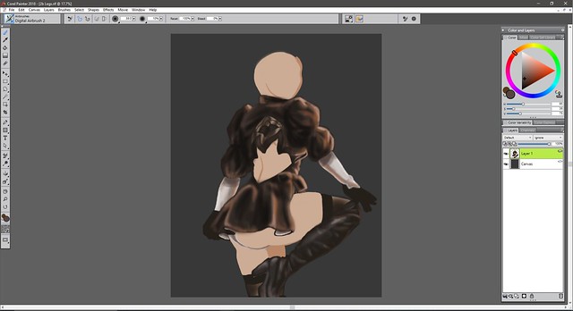
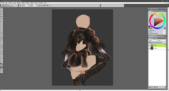
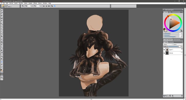
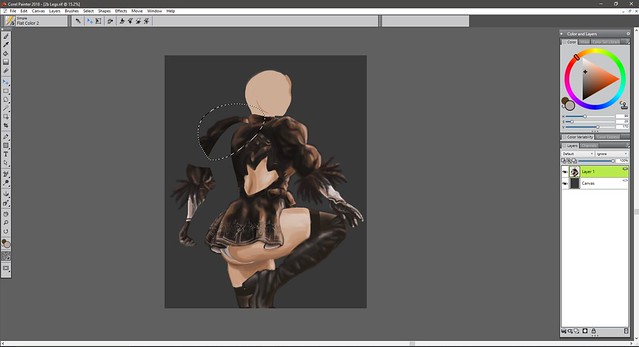
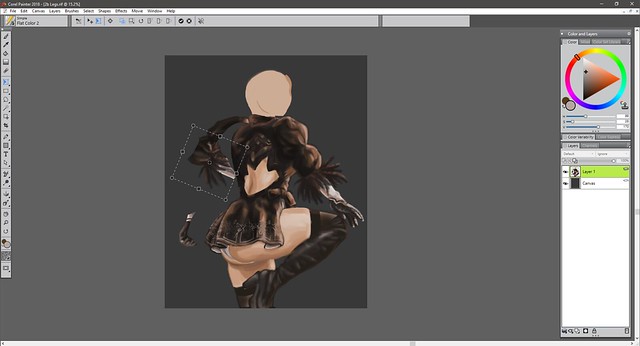
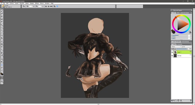
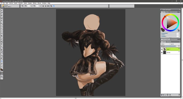
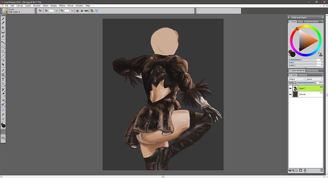
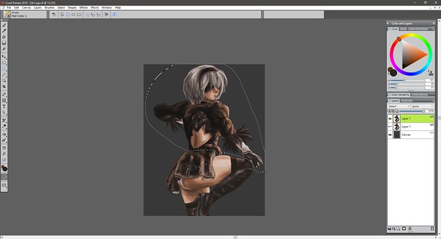
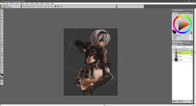
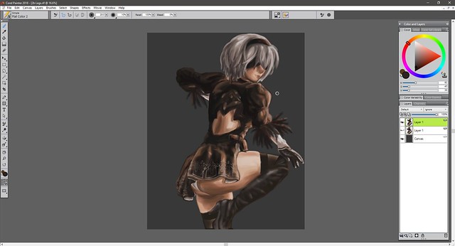
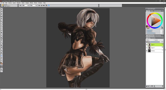
2b Legs (don’t really have a title) DIGITAL

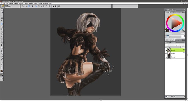
I believe this was started in September 4th and finished on September 23rd? I could push it forward but I feel I should probably keep practicing more instead of getting stuck on one piece. Man… digital painting is still a bit complicated. I’m practicing with colors but I still need to learn more about color theory.

I’ve been wanting to do a 2B piece for a while now, but I wanted to play the game first before I did so. The game was pretty good but I only completed the first part, need to complete the rest of the game when I have time. Man I really love her design. Back when they teased the game I didn’t know what it was about or any information about it, but I knew I wanted it.

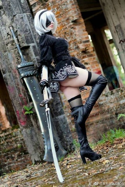
I don’t know if it was this video (I don’t think it is), but it did have this image which is what got me intrigued:


Here is the painting, I’ve been practicing getting colors by only using my eye and not sampling the colors from any reference:


2b Legs Final (rename it later) resized

I wanted to create an interesting pose, but I don’t know if I succeeded. I wondered if adding a background would make the colors I used work better… But that will be for another time.

These are the references used:


a8b0491egy1fehtwgo4ddj20ij0rsgxv


6ccc3b4bly1fg2gm0s9jij20hu0qmjwb


12248176_1653173404936134_7875822133602255115_o

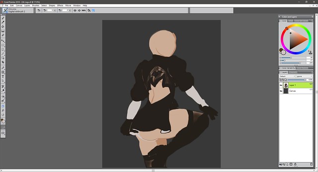
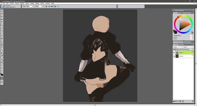
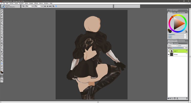
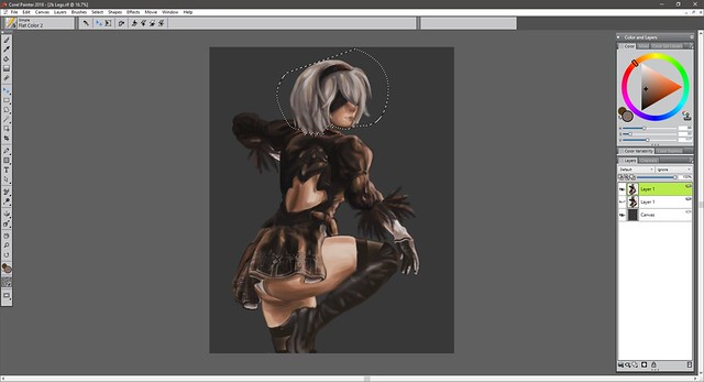
Here is the process:


2b legs I


2b legs II

2b legs III

2b legs IV

2b legs V

2b legs VI

2b legs VII

2b legs VIII

2b legs IX

2b legs X

2b legs XI

2b legs XII

2b legs XIII

2b legs XIV

2b legs XV

2b legs XVI

2b legs XVII

2b legs XVIII

2b legs XIX

2b legs XX

2b legs XXI

2b legs XXII

2b legs XXIII

2b legs XXIV

2b legs XXV

2b legs XXVI

2b legs XXVII

2b legs XXVIII

2b legs XXIX

2b legs XXX

2b legs XXXI

2b legs XXXII

2b legs XXXIV

2b legs XXXV

2b legs XXXVI

2b legs XXXVII

2b legs XXXVIII

2b legs XXXIX

2b legs XXXX

2b legs XXXXI

2b legs XXXXII

2b legs XXXXIII

2b legs XXXXIV

2b legs XXXXV

2b legs XXXXVI

2b legs XXXXVII

2b legs XXXXVIII

2b legs XXXXIX


2b Legs Final (rename it later) resized

Hasta la proxima,

-NUBE

“Academy City’s Railgun”

I mostly finished the Misaka drawing in June 21 then came back to it on August 28 to make some minor changes. Moral of the story, I should have made this post a long time ago… Sorry about that.

The first artwork to get the honor of being the first in being painted with my new P.H. Martin’s paints is I believe Kaleido Star (assuming that the scanned date is correct, which says it was only by two days, weird). In any case, Ph. Martin’s are quite different and since I am still learnint to use watercolors in general they were a quite hard to understand at the point of making this art piece. But after learning a bit more about watercolors in general I should be able to do better next time I use them. (•̀o•́)ง

In any case, from what I have learned going slow is the best strategy when painting. Especially if one is covering large areas such as backgrounds (something I didn’t do). The reason I bring this up is because just like with the Kaleido Star artwork I mixed both traditional and digital. Mainly because I couldn’t get the color right from the beginining and well, ruined it really. Plus, because I didn’t stretch the paper (something I’m barely trying) the paper of course buckled creating even more problems. (*´Д`)=з

After looking around my reference materials for To Aru Majutsu/Kagaku I came upon this cosplayer who did a spot on Misaka while doing a really interesting pose.

This is the cosplayer, which uploads her pictures on Weibo:

https://weibo.com/p/1005051873372180/home?from=page_100505&mod=TAB&is_hot=1#place

I would link the original picture but they get flagged and taken off. So to prepare for that I will upload it to my flickr (I hope that doesn’t become a problem).
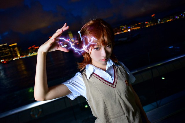
10572127_1475732952696554_3467700917655481847_o

Now as for the background I went through the episodes in To Aru Majutsu and screen captured locations of Academy City. I’ll put the screen captures on flickr in case any of you guys need them. But for now, these are the reference pictures I used.

https://www.flickr.com/photos/darkcloudxero/36449217334/in/dateposted-public/

https://www.flickr.com/photos/darkcloudxero/36449162454/in/dateposted-public/

I could have used the background on the cosplayer reference picture, but I wanted to set it in Academy City. Plus I had (at the point of starting this artwork) recently seen To Aru Kagaku no Railgun with my younger brother.

With that said, here is the process.

First Misaka Mikoto:

I’ll start with the rough drawing.
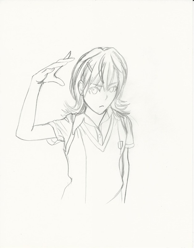
Misaka Mikoto 2017 I resize

Then I define the lines I want.

Misaka Mikoto 2017 II resize

First coats of paint.

Misaka Mikoto 2017 III resize

Adding more details and color to the painting.

Misaka Mikoto 2017 IV resize

Then I try to match the intensity and colors as close as I can with the original painting (the scanner leaves the scanned pictures very dull and lacks the intensity so I have to edit them afterwords). I usually do this edits and then I make another copy and multiply the second copy of the scanned picture to increase the details and colors.

https://www.flickr.com/photos/darkcloudxero/37178825826/in/dateposted-public/

But since the background is blue I tried to change the hues a bit to a cooler color.

https://www.flickr.com/photos/darkcloudxero/36516617344/in/dateposted-public/

With that done I prepare the actual subject (in this case Misaka) so that I can merge it with the background. Of course that means cleaning up and erasing the background. It sure is very time consuming. But it’s worth the effort.

misaka mikoto railgun no background resize

Next I try and match the colors as close as I can so that they merge better and that the subject looks like it actually is in the backgrounds environment. Now, just to make it clear, I made these changes after I merged it with the background.

Misaka Mikoto Final resize

Ok so Misaka is done and ready, now on to the background. Academy City. More especifically the bridge where Misaka and Touma met on very important ocassions (if you’ve seen the series than you’ll know what I’m talking about).

First are the outlines for the bridge and the city scape.

https://www.flickr.com/photos/darkcloudxero/36516910564/in/dateposted-public/

I’m still having a hard time doine dark color so I want to do more of them in order to understand how to use the colors correctly.

I had a good deal of trouble due to my low expertise, though this was a couple of months ago now, and judging by the recent painting I’m currently working on I have gotten better and am understanding the process a bit more. What I did know at this time is that  I had to add layers, though I was going too fast and not doing enough variation in colors.

https://www.flickr.com/photos/darkcloudxero/36556799243/in/dateposted-public/

https://www.flickr.com/photos/darkcloudxero/36516910274/in/dateposted-public/

So this is one of the things I had a lot of problems with, which is caused by adding too much paint. The problem is that the paint starts caking and adds a layer of shiny paint. Not only does it not look good, but it makes adding more layers harder since the paints don’t meld well together at all.

https://www.flickr.com/photos/darkcloudxero/36516909754/in/dateposted-public/

https://www.flickr.com/photos/darkcloudxero/36516909304/in/dateposted-public/

https://www.flickr.com/photos/darkcloudxero/36516909054/in/dateposted-public/

https://www.flickr.com/photos/darkcloudxero/36516908844/in/dateposted-public/

One other thing I wan’t to make a note of is the city scape. My understanding of going from dark to light and vise-versa still perplexed me. So I added colors way to dark and made my work harder when I wanted to add the light haze from the city scape. So because of my inexperience the colors were not coming out like I wanted.

https://www.flickr.com/photos/darkcloudxero/36516908504/in/dateposted-public/

https://www.flickr.com/photos/darkcloudxero/37369420005/in/dateposted-public/

https://www.flickr.com/photos/darkcloudxero/37179363296/in/dateposted-public/

https://www.flickr.com/photos/darkcloudxero/37369418745/in/dateposted-public/

Having the city somewhat done, it’s time to start adding details. Starting with the structure of the bridge.

https://www.flickr.com/photos/darkcloudxero/37179361936/in/dateposted-public/

Then I decided to change the color of the lights and add the rivots of the beams.

https://www.flickr.com/photos/darkcloudxero/37179364656/in/dateposted-public/

https://www.flickr.com/photos/darkcloudxero/37369427445/in/dateposted-public/

And this is how it looks like with all the digital edits and addtitions. Making it truly Traditional x Digital.
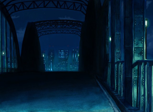
Academy city night Final resize

Now that I am satisfied with how it looks, next is merging Misaka with the background.

https://www.flickr.com/photos/darkcloudxero/36517240774/in/dateposted-public/

And to finish it off I added some more blue hues to Misaka so that they merge better.
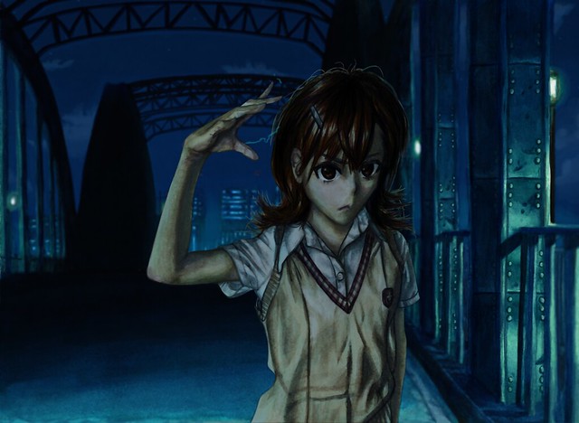
Academy city's Railgun Final resize 1080

And well that is the process of creating this art piece. Doing them seperate is interesting and gives me the possibility of doing a “2.5D” artwork if I so choose it. But on the other hand it does require more work and also needs a lot of thought, preperation and changes when merging them. I’ll try to do a “2.5D” piece to see if it’s worth it or not. Time will tell…

Bueno, hasta la proxima,

-NUBE


My Bamboo Manga has finally arrived – First impression Review

Yesterday I finally got my long awaited Bamboo Manga. I had been waiting for this day very intently. As soon as it arrived I was eager to play with it. Like with many electronic items I had to input the drivers and programs, which was actually rather easy and did not take too long. The only thing I could complain about right away is that I could not use the tutorial at all, I even reinstalled both the Bamboo drivers/programs and also the Adobe applications (which are needed to use the wacom programs). Despite that I did not seem to have any problems at all. There are some preinstalled games in a little application named Bamboo dock (which starts automatically), the games help first time users to get a feel for the pen and the tablet. After all, most people who use such a system for the first time may have a bit of a learning curve at the beggining since it is quite different looking at the computer screen instead of looking down where you would normally be drawing.

There are also some simple drawing programs that can be used. Sure, they are simple but even so, just by seeing how much I could do with just that was amazing.

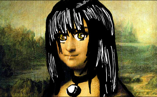
I know it kinda sucks, but this was my first try at drawing without practicing beforehand. It was made using a picture of “the Mona Lisa” as the background.

You may laugh but please, not too hard.

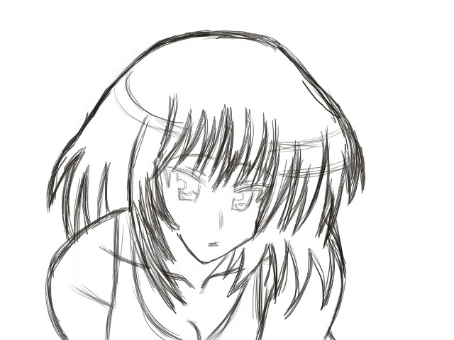
After finishing installing the programs and playing around with the settings for a couple of minutes I began to draw a couple of things (just figures and lines, as well as playing with the brushes). Eventually when I sort of got the feel for it, I began to draw on Open Canvas Lite (so far I like it more than Corel Painter). Here is the picture below.

When I finish my Yakumo drawing I’ll post it up (Yakumo is my favorite female character on School Rumble by the way, well alongside Eri).

I was actually surprised I would start getting the hang of drawing on the tablet so fast. There are some movements one has to beware of (otherwise the lines one would normally want will be too long, since te tablet is smaller than a normal piece of paper). Other than that it is just like drawing on paper, there are the obvious advantages of course. Like clean erasing and so on. Plus, one can save a lot of money this way as well (not having the need to buy more paint, markers, pencils, etc.) So far I really like it.

[EDIT] 12/22/12


About a year ago I did a quick report of what I thought about my new Bamboo Manga. The reason being that I seriously could not find much information about it online except for the little information Wacom provided on their website. That information was not enough though. And judging by the amounts of visits I get to my page because of this post in question, I assume it is the same for the rest of you.

I had to think quite hard of whether I should buy it or not, in the end I did. Was it worth it? It surprisingly was, it was so responsive I was actually really surprised. But of course there are some aspects that one has to get used to of course, such as looking up at the computer screen instead of looking down at your hands while drawing (this was the most challenging aspect I had to go through at the beggining). But luckily we as humans are capable of adjusting, so with practice this feeling does go away.

This video does not go in great depth, but it does provide some more information about the Bamboo Manga. I left out installation processes, as well as some real tests to see just how much one can bring out of the tablet. But the artwork in the box does give one a glimpse of what is possible if one practices dilligently enough. If you, the viewer, ask me to go into even more details about how to customize the button options, go through the installation and setup process I might consider it. But this should be a good amount of information for now.

If you happen to have any more questions go right ahead and ask.

Till next time

-XERO

Create a website or blog at WordPress.com

Up ↑