I’m finally back!

Sorry, man can’t believe I disappeared for about a month. But I was working on some projects (entering more contests on Deviantar). But I really don’t feel they are worth putting up here. I felt a bit weird drawing some of them so I wasn’t really able to produce anything that can be considered “good”. To be honest I used it as a chance to experiment on a couple of new techniques and see why some of my artwork looks so bad when I outlined them with a pen. And I have found the answer. If I don’t make the colors in the drawing simple and instead add a lot of details like I tend to try and do, it doesn’t mesh well and looks really bad. So I finally solved that mystery (though was it really that hard to figure out?).

I have been uploading some of my artwork to Pixiv, surprisingly I have not been doing abysmal there. Having been there for just a couple of weeks I have already obtained a couple of followers, something that took quite a while in deviantart. My views have not gone over 300 yet, but that’s something I hope can change soon.

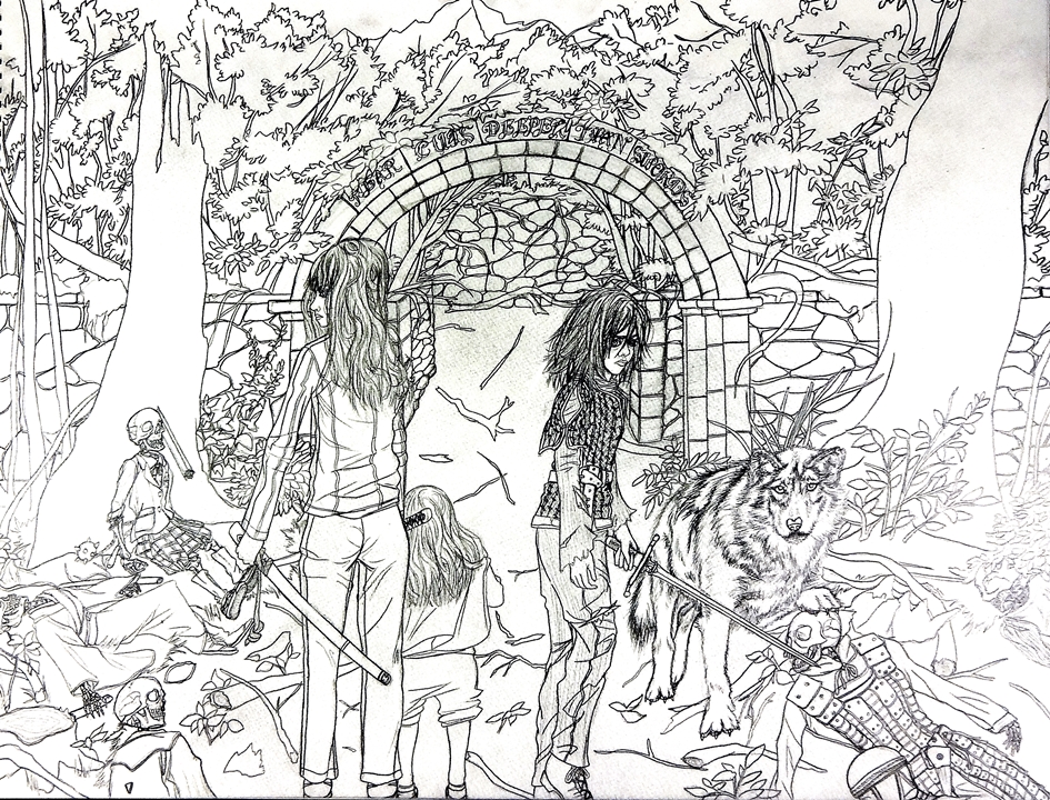
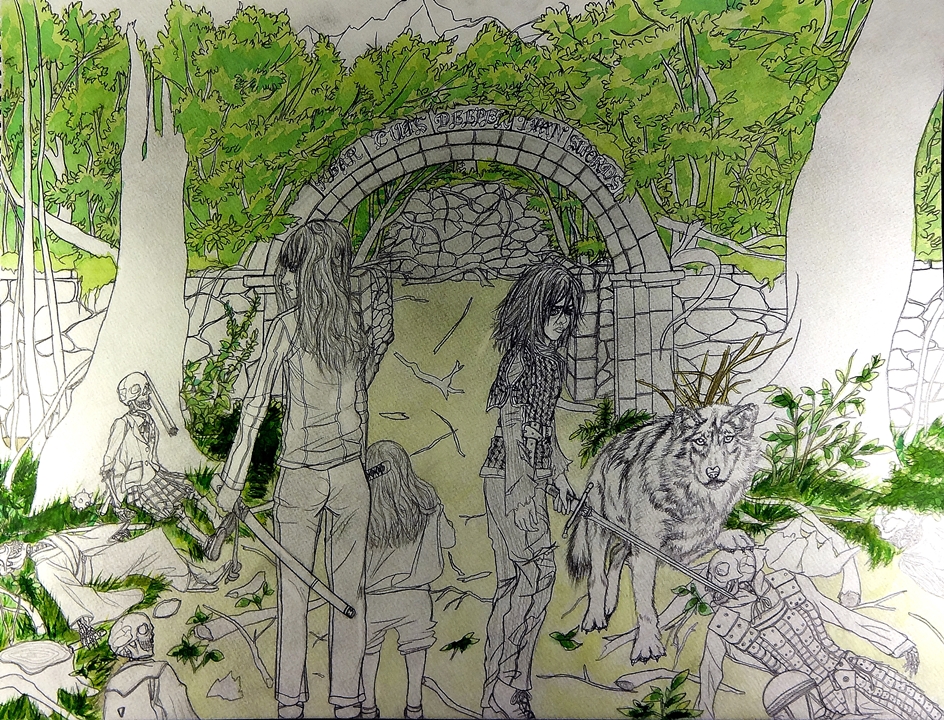
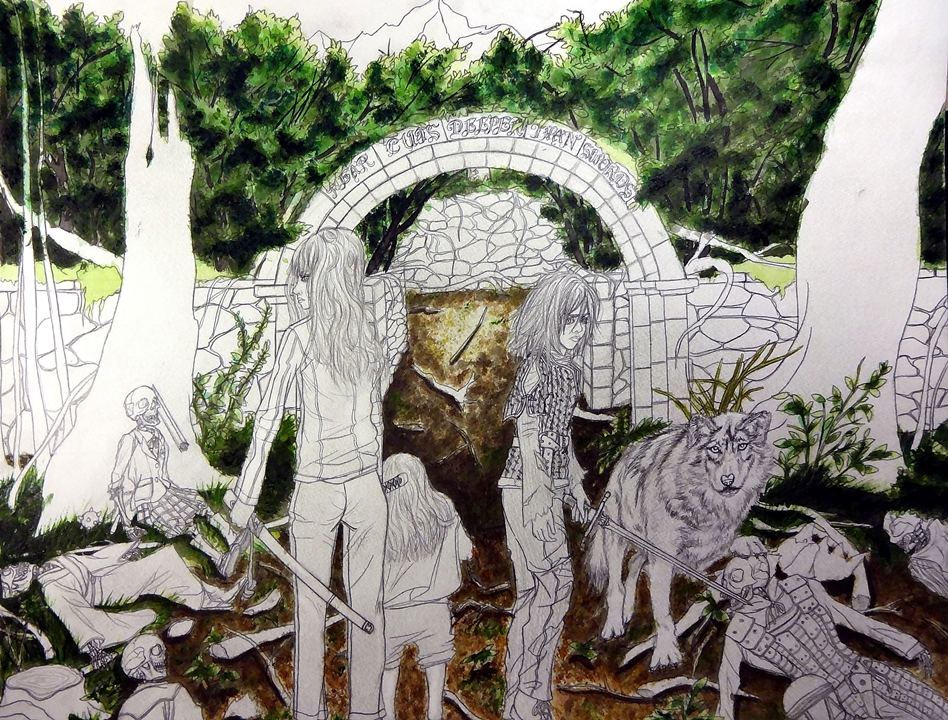
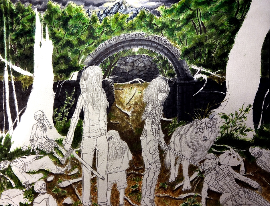
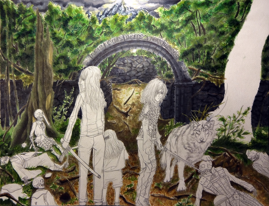
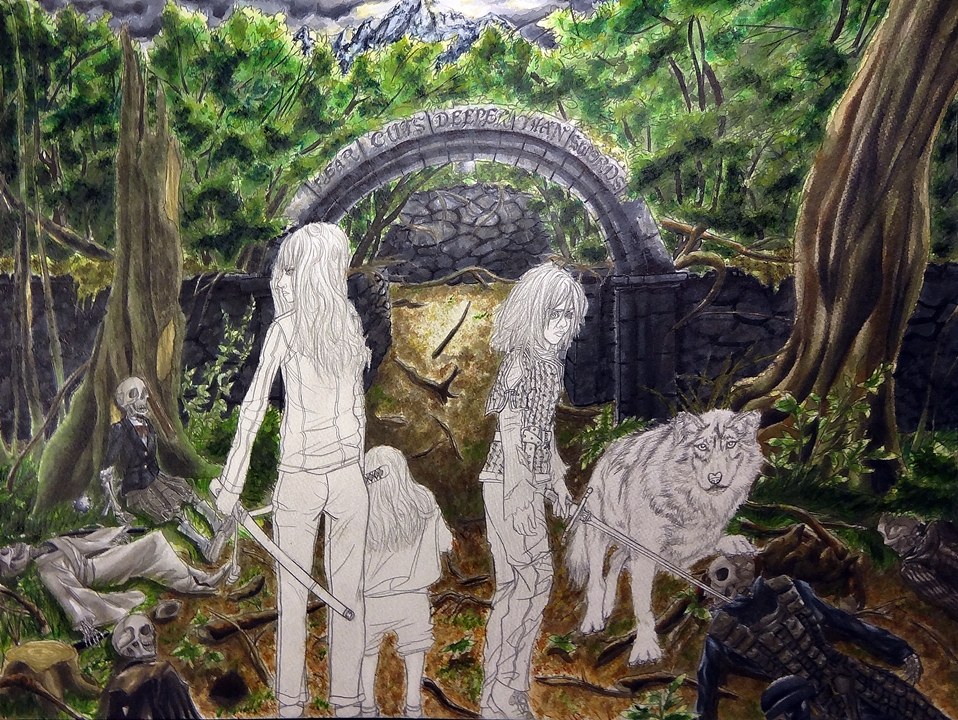
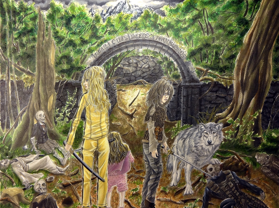
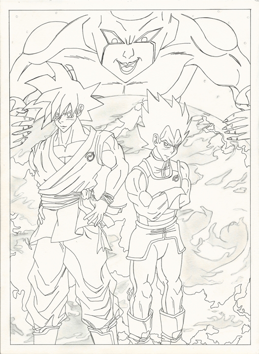
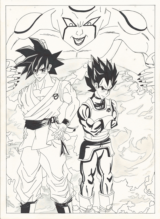
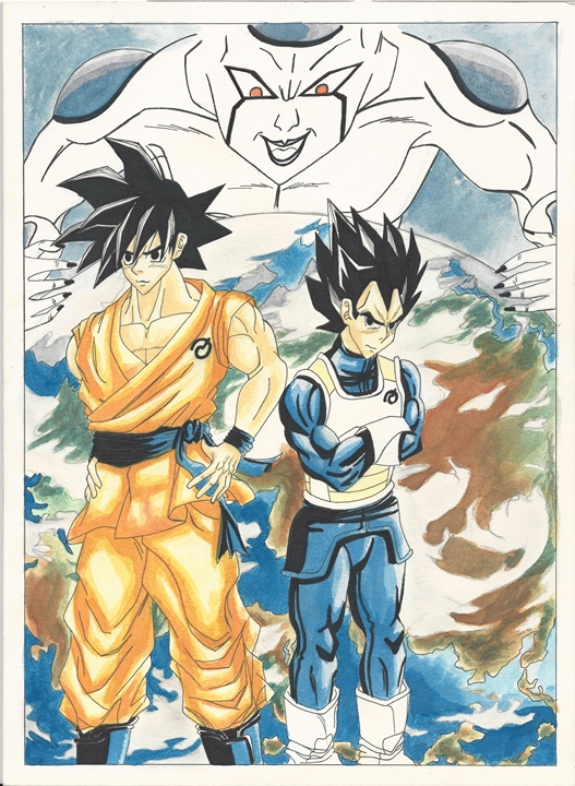
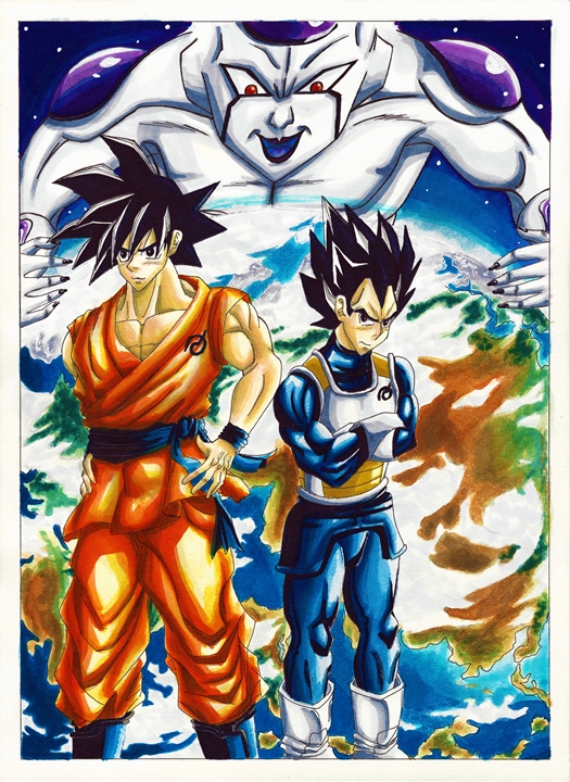
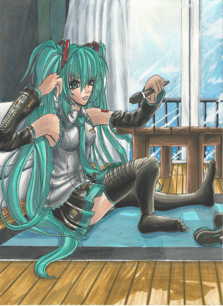
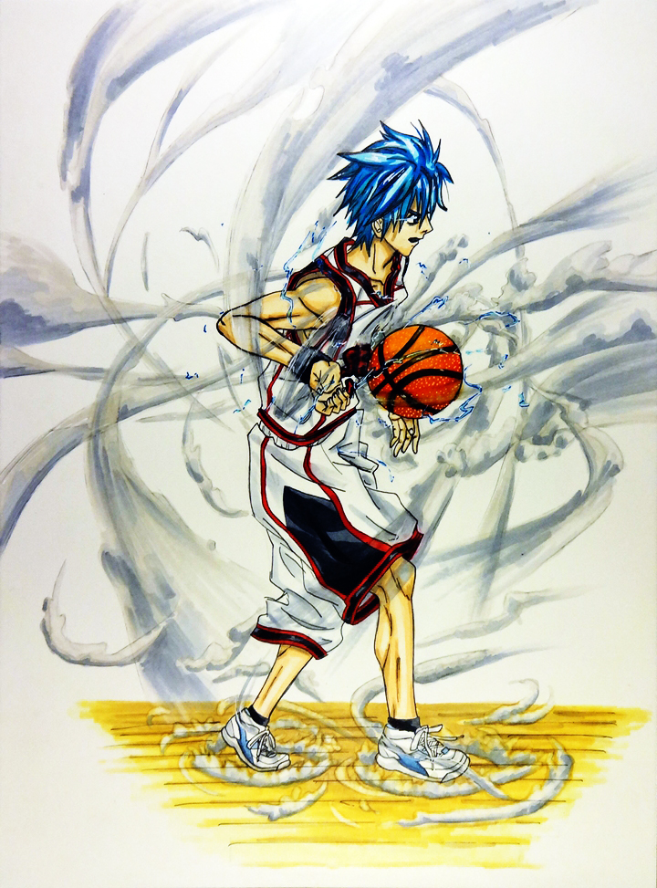
This was my last artwork by the way:

Shiori Hattori edit resize

It doesn’t look bad, but it does need some polishing (this was a contest entry by the way). I noticed that Copic markers don’t react too well with Bristol paper. There seems to be some blotchiness and that is a bit annoying. On the plus side it does give way to using it in conjunction with color pencils.

I also want to revive my youtube channel, but that will have to wait a bit more.

In any case, I will be working on some more artworks so I will keep you guys updated.

-XERO

One has to overcome fear in the name of revenge

I’ve finally decided on a title for the drawing I recently finished featuring Beatrix Kiddo and Arya Stark. It is now available as a print.

Print now available.

Now as for upcoming artwork. I got two requests on my Youtube page on how to draw Lelouch from Code Geass and kurono Kei from Gantz.

On top of that I have another commission dealing with Gundams (I have till the summer to finish that so I don’t have to rush).

But of course I also have to finish that Metroid drawing. I’m glad i waited though, I learned a lot from this last piece. So here’s hoping it comes out better than I had originally hoped.

Hasta luego,

-XERO

What I was working on

I had drawn pictures that were large before (I’m talking about the 18 x 24 in. paper), but I never really thought much about time. What I found out was that it took longer than expected. I had hoped to be able to finish the drawing in about a week. But that didn’t happen. It actually took me two weeks and a half. And that is too much time. I feel I can probably cut it to about a week and a half, but that is still quite long. So I will have to increase the price on the detailed drawings for that size (18 x 24 in.).

Now as for what I’m talking about, here is the commissioned drawing I was working on for so long. The main points that I had to work with were, “The bride” from Kill Bill and Arya Stark from The game of thrones. I had to keep “epic”, Mount Everest, Pan’s Labyrinth and a couple of quotes in mind while I was given full artistic control. So this is what I came up with. I was thinking of the hardships they both had to overcome in the name of revenge. And of course, that will have it’s repercussions being represented by the maze up ahead. But if they persevere, there is light at the end of the path (represented by the mountain being lit by the breaking sun). There are other things going on, but I will let you guys discern the rest.

This will be made available as a print (got permission from the customer of course). I scanned a high resolution version, but in separate parts. Which means I have to piece it together first.

Canada I resize Canada II resize Canada III resize Canada IV resize  Canada V resize Canada VI resize Canada VII resize Canada VIII resize Canada IX resizeCanada X resize

There are some more things I will be working on and of course I will finish the metroid drawing as well.

Till next time

-XERO

My neighbor Totoro

I just wanted to talk a bit about this drawing.

This was actually the first Studio Ghibli film that I got to watch. I first saw it when I was a grade schooler. I used to check movies out a lot back then from the library. I of course mainly focused on movies made for kids. I made sure to check out cartoons all the time. What’s strange is that I never really liked most of what I saw (looney toons, batman, or other cartoons that were popular at the time). But then I came across this masterpiece. Even then I noticed that there was something different about this movie than all the other animated films I saw at the time. It was a very magical movie for me. And so I decided to honor it by drawing this piece. I thought of what would happen in the future. Would Satsuki and Mei still be able to see Totoro and company? I fIgured they wouldn’t and after a bit of research it seems I was correct in thinking so. According to Miyazaki if they had kept in contact for any longer, they would not have been able to return back to the normal world and gotten stuck in the spirit world.

So with that in mind I decided to have Totoro and the other forest spirits hidden as they look over them. Most people tend to do parodies about the bus stop scene. Personally, I thought it is a bit overdone. At first I wanted to do it in a different location. But then I thought, why not use the bus stop, but make it different than all the other art out there. Which is why I made it daytime. Also I made sure to study the location by looking at the scene over and over again. In doing so I remembered that there was a fox shrine right next to the bus stop, almost nobody put that in their artwork so I decided to incorporate it into my own.

I really had fun drawing this piece, so I hope you guys will enjoy it too.

On another note. I will be adding a couple of more artwork to the gallery so look forward to that. I will also be working on some new artwork as well. I have so many projects running at once, but I will push through all obstacles.

Till next time.

-XERO

Print available now.

Dragon Ball Drawing

I have been working on this weeks drawing quite a bit. Wasn’t too shure how to go about coloring. At first I wanted to draw it like a manga page. Meaning black and white, using only my pens. But I decided to instead make it like a color page in the manga and actually color it in. I decided to only use watercolors and my copics (they are really running low right now). I had to think about every stroke so that I didn’t waste any ink. While waiting on the next moves I drew a couple of rough drafts for what may become the next artwork. But that is for another time.

I named the drawing “Goku, Vegeta and the return of F” in commemoration of the new movie that will be coming out soon. I am actually looking forward to it. Even more so than the first one. Hopefully this will be a lot better (seeing as the other one was more of a reintroduction to all the characters). In any case here are some scans of the artwork in the process and the final piece. Wasn’t too sure since I spent quite a bit of time on it, but in the end I decided not to add it to the gallery.

Goku Vegeta I resize Goku Vegeta II resize Goku Vegeta III resize Goku Vegeta IV resize

Print now available.

Hope you like it,

XERO.

Hatsune Miku Final

Materials- Copics: C1, C3, C5, C7, W1, W3, W5, W7, B0000, B01, B21, B24, B28, B32, B34, BG13, BV00, E00, E31, E33, R27, YR65, Y26, Y28, R00, RRV11, G09, 100

Sakura Koi watercolors:  Black, Gray, Blue, White, Yellow, Red

PrismaColor: PC 1069PC 1060, PC1063, PC 904, PC 935, PC 927, PC 950, PC 1084, PC 917, PC 918, PC1051, PC 906, PC 992, PC 1006, PC 928, PC 930, PC 925, PC 940, PC 915, PC 903, PC 905, PC 941, PC 938, PC 948, PC 1065, PC 997, PC 1034, PC 1072, PC 994, PC 1074

I finally managed to finish my Hatsune Miku drawing. So this is what I manged to do with it.

So if you remember this is where we last left off.

Hatsune Miku Colored resized

And this is how it looks when I added a some Color pencils, as promised I will add more pictures showcasing the process.

Hatsune Miku Colored II resize edit II Hatsune Miku Colored III resize edit II Hatsune Miku Colored FINAL resize edit II

The first one has some color pencil added to the background and a bit on Hatsune Miku. On the second one I added a bit more color to Miku’s skin and added a couple of light effects coming from the sun. I was surprised at how easy I was able to pull it off, the rainbow glare effects came out quite well. Also, I added some lighting to Miku’s eyes and some glowing effects around Miku’s body. One thing I did not like about how she looked before was her face. I didn’t really like some of the features so I decided to soften them and change a couple of things like her left eye. I feel she looks better now.

I wonder what name I should give this drawing? Anyway, what do you guys think?

Kuroko Tetsuya

So this weeks artwork will be featuring Kuroko Tetsuya from the Kuroko no Baske (“the basketball Kuroko plays”), a series that is much like Captain Tsubasa (except instead of Football, they play basketball). This means that there will be young school players that have extraordinary techniques that makes one think of Dragon Ball (minus the fighting). It is an amazing series and has the type of characters I like as a protagonist (the main one anyway), a weak player in all areas except passing. This means that he has a lot to improve throughout the series. And sure enough, the series delivers. Despite his weaknesses, Kuroko uses his strengths to make his lack of abilities more than make up for it. I don’t want to delve too much into it, so if you have not seen it, make sure to do so as soon as you can.

I have decided to finally start working with my collection of Copic markers I bought a couple of years ago. The smoothness that I can achieve from them always leaves me amazed to no end (though I still need to work on not using too much ink on my artwork). I started with a simpler design, but eventually decided to add a dark background to it later (backgrounds are still my weakness). Looking at them side by side, I think the simpler “light” design is still my favorite. But the “dark” design doesn’t look bad either. What do you guys think?

Kuroko White background

Kuroko Dark Background

Create a website or blog at WordPress.com

Up ↑