Just a little bit more time

It’s been a very tough time lately, it has been filled with a lot of work from all fronts (school even has me reading multiple books at once…). But the main time consuming thing is creating the new format for my Youtube videos. I will finally be making that comeback I mentioned, but I really want to up my game so I’m trying to create a strong new video format that I can feel proud of and that people will hopefully like and will also retain their interest. Time constraints are a bit rough right now though. I also have to make a presentation in a  week about a book we have to read for class and that will require a good a bit of time. Haaaaa…….

I have made some new things just haven’t had the time to upload and whatnot. Let me get through this things and hopefully I will have some more time soon. We have a lot of things to catch up on, seriously.

For those of you who read these here is a sneak peak to the video:

https://www.flickr.com/photos/darkcloudxero/39021947955/in/dateposted-public/

I will be adding some “shading” later on but haven’t had the time to do so yet. I’m still not done with the ending quite yet, but the meat of the video shouldn’t be too hard to figure out. But I do worry about whether I should actually talk in the videos or not…

Will try to keep in touch.

Hasta la proxima,

-NUBE

End of another year 2017

So another year come’s to a close…

It sure was a rather trying one…

But I and all of you made it through, now lets push forward!

Just for the heck of it I made a quick piece using only pens with hatching and cross hatching.

The idea mainly came from watching this video:

So really I wanted to see what I could do. I wasn’t really trying to make a finished work, instead I wanted to see if I could make it look anything at all like the reference picture. It’s quite rough, but the general idea is there.

reference:

https://www.flickr.com/photos/darkcloudxero/27644882729/in/dateposted-public/

and the quick artwork:

https://www.flickr.com/photos/darkcloudxero/39391816822/in/dateposted-public/

Obviously my level compared to Ryoichi Ikegami is still quite low. The lines are nowhere as refined and the lines are quite rough and not uniform but! I was able to acquire the main idea. I was actually quite surpsided at how fast I could acquire the effects that I wanted. I feel confident even saying that it was quite easy. I wonder just how well it would look if I were to do so with cleaner and well thought out lines?

The best way to learn is by recreating pieces, so that is what I will try to do for this coming year (on all fronts).

Almost forgot to even mention this, but the people above are from a Mexican show called “El Chavo del 8”. A comedy show from the 70s that has trancended time and that each generation watches at some point or another. A true gem of Mexico. As for why I chose them, I mainly wanted to draw a guy since I have mainly been drawing females for quite a while. And well I just felt like it would be fun to do so.

Let’s focus a bit of time on the Christmas Misaka and Misaki artwork. I used a combination of Knicker poster paints (yes I made the plunge, I’ll explain this at some other time), kuretake gansai tambi (watercolor set) and pencils.

Here is the process:

rough draft-

MIsaka MIsaki christmas rough draft I resize

clean lines for final artwork-

MIsaka MIsaki christmas I resize

MIsaka MIsaki christmas rough draft II resize

MIsaka MIsaki christmas rough draft III resize

coloring process-

Such a shame about not showing the before and after of the frills on Misakas coat, it shows just how versatile Knicker Poster Colors are.

DSC04043 resize crop

DSC04044 resize crop

DSC04045 resize crop

DSC04046 resize crop

DSC04047 resize

DSC04048 resize

DSC04049 resize

DSC04050 resize

DSC04051 resize

DSC04052 resize

DSC04053 resize

DSC04054 resize

DSC04055 resize

DSC04056 resize

DSC04057 resize

DSC04058 resize

As stated before, I’m still not done with it but this is the last state as of this writing.

Hasta la proxima,

Nube


Merry Christmas (and happy holidays!)

So Christmas has finally arrived.

I was working on an artwork for this year and just now finally finished it. I will be making a background at some point but that will have to wait for next year. But for those who visit my site, here is a peek at it. (The print won’t be available till next year though).

Will talk and upload more photos at a later date.

MIsaka MIsaki christmas 2017 edited resize

My brother’s finished presents.

https://www.flickr.com/photos/darkcloudxero/39265906372/in/dateposted-public/

https://www.flickr.com/photos/darkcloudxero/39265905482/in/dateposted-public/

Have a great time guys. Merry Christmas and happy holidays.

Hasta la proxima,

-NUBE

A little update 12\3\17

I finished my paper about two weeks ago but my side job has been aking for more of my time lately, though we should be done for the rest of the year once we finish the next job (whenever that is). As for school, I just have a class tommorrow and finals next week. So I’m almost finally done for this year and will have a couple of weeks where I can focus completely on art. So for this weekend I will be giving some time to just study, but for most of this week I should be able to keep working on art (aside from the daily chores and things to do).

Having said that, I have been working on some new artwork these past few days. Drawing I can hatch things out quite quickly but again color is still giving me problems. So I decided to make a piece with simple color schemes and color application like that done in older anime. This works two fold. I wan’t to give my brothers a specialized gift for Christmas and also make a demo of a possible service I can offer customers. This whole year I’ve been trying  to just learn as much as I can before I started to sell again. But I can’t keep it in the backburner for too long, the year is almost gone so I have to think about keeping the business side of things alive again.

So what is this new potential service? How about a personalized recreation of a poster where you or someone you know is taking the place of the protaganist/character. Or something simpler like the anime version (of you or someone you know) in what ever style you’d like.

I doubt my brothers check this page so here are the two artwork I am currently working on.

First is Gundam X, sorry the line art is too light for the scanner to really catch it. and I don’t have a digital line art copy for some reason.

https://www.flickr.com/photos/darkcloudxero/38788297862/in/dateposted-public/

I tried using the colors from the anime so I just focused on applying color. But as expected I still had a lot of trouble working it since I’m still not used to painting digitally. It’s a great tool I but I much prefer traditional. But I’m still not good enought to make colors as smooth as digital. Though I did learn a lot and could definitely get better. but I feel I might have to make a choice on which one to focus on. Learning both will take quite a while… We’ll see.

Despite that it look alright.

https://www.flickr.com/photos/darkcloudxero/38103035524/in/dateposted-public/

Next is the Evangelion one. I have started painting it digitally, but I think I will switch it to traditional. Time is running out and I wan’t to do a lot more pieces. I just don’t know how people could paint so amazingly using the digital medium. Switching between both really confuses me.

https://www.flickr.com/photos/darkcloudxero/38788297312/in/dateposted-public/

This is what I have so far digitally. I’ve seen people fix their colors and make really cool effects by adding textures to the paint jobs, but I don’t know if that is what is needed…

https://www.flickr.com/photos/darkcloudxero/27043309749/in/dateposted-public/

So there is the small update, have to go rest a bit and eat.

Hasta la proxima,

-NUBE


Another year of life

So, another year has passed. I put some goals for my self this year, and although I could have done better I did accomplish them. So I will continue to go forward. The future does seem quite shaky and uncertain. But that’s life… I won’t give up.

I guess my goals for this new year is to take things further and accomplish even more things this year. I also want to be more physically active and learn Japanese to a proficient level. I’ve put those guys in the back burner for far too long. It’s time I give them the time they need.

This is the drawing for this year. I was thinking of adding some Dia de los Muertos influences, but maybe next time. Today was quite a busy day so I wanted to make a quick drawing. I really like Yoshitoki Oima’s art style a lot (creator of “A Silent Voice”), so I decided to use her style for this drawing. I didn’t have much time for coloring either (I actually just drew it in about half an hour a couple of minutes before I started making this entry) so I will just do the line art like if it was from a manga panel. I was thinking of inking it as well but the day is almost over so I will leave it like this. Besides it looks quite clean this way.

Nube 2017 crop centered resize

Here’s to working towards a better future and accomplishing our goals!

Hasta la proxima,

-Nube

Halloween/Fall Artwork; Ghost Girl by the window

I was hoping to do a bit more artwork for the seasons, that way I had a bit more to aim for and to just get into the spirit of the holidays around the year (I feel that if I continue not to do so the years will just continue to feel monotonous and boring). I might do another quick one for Halloween before the actual day. Though Dia de los Muertos is also approaching…

It’ll be fine…

I guess that midterm and the extra work that piled up really did a number. But that’s life I guess.

I want to be able to meld reality and anime a bit more, so I want to play around with that a bit more. And this is one of the paintings where I am giving that a shot.

I am wondering if the way I do watercolor paintings look good to others or If I should make them look smoother so that the grain of the paper isn’t as noticeable. I can do that a bit more if I use color pencils to go over the watercolors I already put in. I have used this technique before, but I want to get better with just watercolors first so that I don’t just rely on color pencils to fix my inexperience. Once I get better I will try to combine them again, but hopefully this time correctly.

In any case this is the painting in question:

Ghost Girl by the window resize

There’s something about the character design of the ghost girl from Pokemon X/Y that I really like. So that is the theme for this year’s halloween painting. I was also looking forward ot seeing if I could make her zig-zag mouth look like it could belong to our world (what do you guys think?).

The painting itself is largely inspired by this picture I used as reference:

Cosplayer: Cherry Neko

ZkFmTE91UWs4eG5nUDNreXZSR2sxQ0w1UzBzdnJJNEliTWRjQWVjM28wQVoyQktCdXVUekF3PT0

One other thing I really wanted to try out was seeing if I could choose the right color schemes despite the reference pictures having different colors. As I’ve mentioned before color is still something I’m struggling with. So this was designed to be a good challenge for me to play around with that. I’m still relying on references but I will learn faster this way, and I will have a better understanding of how colors work as well.

I’m starting to get the hang of watercolors a lot more, to the point that I’m no longer afraid to try new techniques and push ones I’ve used before further. I still get a bit frustated when the sessions go for too long and I can’t quite get it right, but that’s fine (nothing a little rest can’t fix).

Strangely enough I actually drew this picture various times (four times) and colored it twice. Once with Copic markers and the second one with watercolors which is the one you see above.

Here is the original sketch/drawing:

https://www.flickr.com/photos/darkcloudxero/37997922582/in/dateposted-public/

Here is the Copic version done with one of said four drawings:

Ghost girl 2017 I resize

The copic version exists because I wanted to first try out the color schemes that I thought would work. I did this because I didn’t want to use too much time painting only for it to come out wrong. And since Copics are faster to use and dry almost instantly it was a perfect medium to try out the colors. I was almost thinking of just using the Copic version as the final piece, but then I ran out of a couple of colors and buying replacements would be too costly so I just decided to start all over with watercolors. In other words I made this piece twice which is one of the reasons I haven’t posted in a while. But I’m finally done.

For those that are interested here is the process:

From this angle it look like a good start, but I would later learn that I had made quite a couple of mistakes.

https://www.flickr.com/photos/darkcloudxero/37975118286/in/dateposted-public/

https://www.flickr.com/photos/darkcloudxero/26252727129/in/dateposted-public/

https://www.flickr.com/photos/darkcloudxero/37975115126/in/dateposted-public/

https://www.flickr.com/photos/darkcloudxero/26252725479/in/dateposted-public/

https://www.flickr.com/photos/darkcloudxero/37975112316/in/dateposted-public/

https://www.flickr.com/photos/darkcloudxero/26252724059/in/dateposted-public/

https://www.flickr.com/photos/darkcloudxero/24176567568/in/dateposted-public/

https://www.flickr.com/photos/darkcloudxero/37319671004/in/dateposted-public/

https://www.flickr.com/photos/darkcloudxero/24176565838/in/dateposted-public/

https://www.flickr.com/photos/darkcloudxero/37319668314/in/dateposted-public/

https://www.flickr.com/photos/darkcloudxero/24176563958/in/dateposted-public/

https://www.flickr.com/photos/darkcloudxero/37319665864/in/dateposted-public/

https://www.flickr.com/photos/darkcloudxero/37319664754/in/dateposted-public/

https://www.flickr.com/photos/darkcloudxero/37319663354/in/dateposted-public/

https://www.flickr.com/photos/darkcloudxero/37319661714/in/dateposted-public/

https://www.flickr.com/photos/darkcloudxero/37319659964/in/dateposted-public/

https://www.flickr.com/photos/darkcloudxero/37319658714/in/dateposted-public/

https://www.flickr.com/photos/darkcloudxero/37319657424/in/dateposted-public/

https://www.flickr.com/photos/darkcloudxero/37319656314/in/dateposted-public/

https://www.flickr.com/photos/darkcloudxero/37975099496/in/dateposted-public/

https://www.flickr.com/photos/darkcloudxero/37975099066/in/dateposted-public/

https://www.flickr.com/photos/darkcloudxero/37975098526/in/dateposted-public/

https://www.flickr.com/photos/darkcloudxero/37975097926/in/dateposted-public/

https://www.flickr.com/photos/darkcloudxero/37319650324/in/dateposted-public/

https://www.flickr.com/photos/darkcloudxero/37975096866/in/dateposted-public/

https://www.flickr.com/photos/darkcloudxero/37319648004/in/dateposted-public/

https://www.flickr.com/photos/darkcloudxero/37975095856/in/dateposted-public/

https://www.flickr.com/photos/darkcloudxero/37319644924/in/dateposted-public/

https://www.flickr.com/photos/darkcloudxero/37975094196/in/dateposted-public/

https://www.flickr.com/photos/darkcloudxero/37319641914/in/dateposted-public/

https://www.flickr.com/photos/darkcloudxero/37975092656/in/dateposted-public/

https://www.flickr.com/photos/darkcloudxero/26252707219/in/dateposted-public/

https://www.flickr.com/photos/darkcloudxero/37975090236/in/dateposted-public/

Thinking I was pretty close to the end I noticed that the proportions were quite off. The head was much too big for the body, the shoulders were too small and so were the hips.

https://www.flickr.com/photos/darkcloudxero/38029011271/in/dateposted-public/

On top of that, after taking a break from painting when I came back I decided I needed to make even more changes to it.

https://www.flickr.com/photos/darkcloudxero/37975444346/in/dateposted-public/

And this was the final version I decided to go with:

Ghost Girl by the window resize

Well that’s it for today. Hopefully I can get another piece out before Halloween (though it will be simple if it is).

Hasta la proxima,

-NUBE


Updates – Practicing with watercolor, broken camera, new paints and plans


After thinking all this year and trying to learn a much as I can about colors, it was now time to actually put it into action. The best way to learn is to learn from others. So that is what I am currently doing right now. One of the things I really want to be able to do is realistic paintings. This requires a good understanding of applying paints and mixing colors. I’ve mainly been watching three youtubers;

The Mind of Watercolor

This channel is great because he teaches a lot of tehnical techniques and explains them in great clarity. On top of that he is very fun to listen to and his videos are very entertaining.

Lioba Brückner

This artist has a very beautiful style that I really want to learn. I’ve been watching her videos and learned quite a lot.

Laovaan 

Actually saw his videos first, and through his videos I found the two channels above on the reccomended list on the side of youtube.

Anyway, years ago after I graduated from high school I bought some photobooks of Platinum Era Morning Musume with the idea of one day being good enough to paint them. Well, after taking a year (this year) to learn I felt it was finally time to give it a try. I was actually a bit aprehensive to start. Heck, I would even say I was actually a bit scared? But it is finally time to make my art finally grow and gain more experience.

One other thing I want to learn is dealing with dark colors, so I chose this photo (the one on the bottom):

5cfee3a9jw1dk56dbkpa0j edit

Maybe it was a bit reckless of me to choose one with three people instead of just one, but I wish to be able to do a background and deal with multiple focal points. One problem with my artwork is that I have been adding too much details to areas that are not the focal point. The problem with doing that is that one, the focal point is not clear, but more importantly, it just doesn’t look good. When I finally figured that out, I decided to pay attention to what I see and really think about what can bee seen on the sides of the focal point. What I mean is that I look at an object (whatever it is) and try to pay attention to the surroundings and learn just how much detail I am actually able to see when I focus on one point. Turns out, not much. I can see the outlines and main figures, but not any really fine details. So I’ll have to keep that in mind from now on.

Using photos as references can also be problematic since they can see things very differently than a human. So in that sense I will have to choose what requires details and what doesn’t. And then I have to learn just how much details are enough to convey the athmosphere while making it all meld well together.

I was also afraid of using the colors I saw because I had never used them before. Such as when I see yellows, pinks, browns, reds and blues etc (on skin colors). I tend to go with very generic colors instead due to my inexperience and fear of ruining what I have at that certain point. That in turn makes very flat artwork that doesn’t really exist in a realistic sense. It may look good with anime/manga characters but once I apply such colors to real life people, it just doesn’t look right.

One other thing to mention is that due to that fear I also end up making very muddled artwork that just ends up looking dirty. Copic Markers are great, but they do have their limitations and one has to know them otherwise one can mix colors that don’t combine well or one can also over work the colors to the point that they make very dirty colors. This of course does no good to the final picture. One good example of this is the Macross artwork I did a while back;

Human Culture’s Songstress
Print now available.

When you are working with something that requires alot of concentration, detail, colors and experience. It is easy to understand if one messes it up. For one I am assuming the colors and ignoring the ones I see in the actual reference pictures (as can be seen here);

https://www.flickr.com/photos/darkcloudxero/36830534054/in/dateposted-public/

https://www.flickr.com/photos/darkcloudxero/36830533774/in/dateposted-public/

https://www.flickr.com/photos/darkcloudxero/36830532954/in/dateposted-public/

https://www.flickr.com/photos/darkcloudxero/37492201346/in/dateposted-public/

After learning what not to do, I decided to actually give it a try and paint what I see instead what I think it should be.

With all that said this is the finished piece:

Rockies Memories resize

And here is the process of how I drew and painted this new piece.

DSC_0018

DSC_0019

DSC_0020

DSC_0021

DSC_0028

DSC_0029

DSC_0030

DSC_0031

DSC_0032

DSC_0033

DSC_0034

DSC_0035

DSC_0036

DSC_0037

DSC_0038

DSC_0039

DSC03816

DSC03817

DSC03818

DSC03819

DSC03820

DSC03821

DSC03822

DSC03823

DSC03824

DSC03825

DSC03826

DSC03827

DSC03828

DSC03829

DSC03830

DSC03831

DSC03832

DSC03833

DSC04012

DSC04013

DSC04014

DSC04015

DSC04016

DSC04017

DSC04018

DSC04019

DSC04020

DSC04021

DSC04022

DSC04023

DSC04024

DSC04025

DSC04026

DSC04027

DSC04028

DSC04029

DSC04035

Let’s talk about the broken Camera.

Before I started recording this watercolor piece I had dropped my camera which sadly cracked my lens. That is noticeable on the first videos I recorded. So I had two options, buy a new camera or try and fix it. Hopoing I had not damaged the  sensor I ordered a replecement lens. It took a while to arrive, so half of my recordings have that crack. When it arrived I was debating whether I should finish painting this piece first or if I should fix it before continuing. One concern was that if I messed it up and couldn’t fix it, I could very well end up with the camera in even worse condition.

After some thought I just decided to go for it. And that took a bit of time to get done, but since I have some experience from fixing some of my other electronics it didn’t take long for me to figure it out. It did take me three times to hook up the ribbon cables (which gave me problems that of course freaked me out a bit). Luckily it was all working well when I properly hooked them up and the rest of the videos did not have that crack.

As for the paints.

I decided to use some of the money I made from NanDesuKan and buy some paints that I have been interested for a couple of years. (I’ll talk a bit more on some of these things later.) Those paints are Nicker Poster Color. The way they can cover a whole area completely opaque but can also be thinned out really caught my attention. And the idea that I can paint on top of what I have already painted while still being completly opaque. I still haven’t tried them out yet, but if they work like I think they do it will be my dream medium.

Plans.

Fall is here, and October is here. So that means that I should make the effort to make some pieces with those themes. Since I am in October, I should make some Halloween themed paintings. I actually have one that is already drawn out since last year. I was planning on finishing it for last years Halloween, but decided to learn how to use colors first then come back to it so that I could do a much better job. Of course I could wait to get better, but I feel this could be a good learning experience now that I know a bit more. Hopefully I won’t mess it up, but I have to not be afraid to try new painting techniques.

Aside from that I do want to make maybe two more new ones. I just haven’t decided what character to choose or any ideas of what to do.

But those are my plans, I will have a midterm soon so I hope I won’t hit a snag.

That’s it for now.

Hasta la proxima,

-Nube

Hidden Turtle in Monkey’s Eyes


I don’t know if I have mentioned this before, but I am a big Martial Arts movie fan. More specifically Hong Kong Kung Fu movies from the 80s and 90s. Jackie Chan movies being my favorites. So I wanted to try out making an homage poster like artwork. Now one of the other things I really love is the original Dragon Ball (when he was a kid, I say this because people think I mean Dragon Ball Z which was just ok). I want to talk about these two loves of mine a bit more, but I will have to wait on that because I am planning on covering these topics on future videos.

With that out of the way Inspiration came from the gag character Jacky Chun and my love for old Hong Kong films. I chose one of the first movies where sparks of what Jackie Chan would later present to the world, Drunken Master. A 1978 classic Martial Arts film. And since Dragon Ball has many martial arts influences including Drunken Master it would fit perfectly.

There are many poster variations but I ended up picking this one (which I feel might be the original poster).

drunken-master-poster

I really like these old posters where they hand paint them and have really interesting themes and expressions.

This is the rough draft that I originally made while at an anime convention.

Drunken Master rough draft resize

These two are the basis of what I am working with, and next is the process. First are the pictures I took with my phone.

https://www.flickr.com/photos/darkcloudxero/37311149092/in/dateposted-public/

I used Copic Markers for coloring by the way.

https://www.flickr.com/photos/darkcloudxero/37311148792/in/dateposted-public/

https://www.flickr.com/photos/darkcloudxero/37311148482/in/dateposted-public/

https://www.flickr.com/photos/darkcloudxero/37311148292/in/dateposted-public/

https://www.flickr.com/photos/darkcloudxero/37311147582/in/dateposted-public/

https://www.flickr.com/photos/darkcloudxero/37293944066/in/dateposted-public/

https://www.flickr.com/photos/darkcloudxero/37311146852/in/dateposted-public/

https://www.flickr.com/photos/darkcloudxero/37311146422/in/dateposted-public/

https://www.flickr.com/photos/darkcloudxero/37311145752/in/dateposted-public/

https://www.flickr.com/photos/darkcloudxero/37293943226/in/dateposted-public/

https://www.flickr.com/photos/darkcloudxero/37340990021/in/dateposted-public/

https://www.flickr.com/photos/darkcloudxero/37293942896/in/dateposted-public/

https://www.flickr.com/photos/darkcloudxero/37340989371/in/dateposted-public/

https://www.flickr.com/photos/darkcloudxero/37340989051/in/dateposted-public/

https://www.flickr.com/photos/darkcloudxero/37293940916/in/dateposted-public/

https://www.flickr.com/photos/darkcloudxero/37340988661/in/dateposted-public/

https://www.flickr.com/photos/darkcloudxero/37293940466/in/dateposted-public/

https://www.flickr.com/photos/darkcloudxero/37340988351/in/dateposted-public/

https://www.flickr.com/photos/darkcloudxero/37293939806/in/dateposted-public/

https://www.flickr.com/photos/darkcloudxero/37340988011/in/dateposted-public/

https://www.flickr.com/photos/darkcloudxero/36631801324/in/dateposted-public/

https://www.flickr.com/photos/darkcloudxero/36631801324/in/dateposted-public/

https://www.flickr.com/photos/darkcloudxero/37340987681/in/dateposted-public/

https://www.flickr.com/photos/darkcloudxero/36631800874/in/dateposted-public/

https://www.flickr.com/photos/darkcloudxero/37340987411/in/dateposted-public/

https://www.flickr.com/photos/darkcloudxero/37340987081/in/dateposted-public/

https://www.flickr.com/photos/darkcloudxero/37311141932/in/dateposted-public/

https://www.flickr.com/photos/darkcloudxero/37340986821/in/dateposted-public/

https://www.flickr.com/photos/darkcloudxero/37340986821/in/dateposted-public/

https://www.flickr.com/photos/darkcloudxero/37311141632/in/dateposted-public/

The title of the movie poster is done with a brush, so I wanted to do it traditonally. I measured the center and spaced out three spaces for the characters.

https://www.flickr.com/photos/darkcloudxero/37340986531/in/dateposted-public/

I also tried to emulate brush strokes for the characters.

https://www.flickr.com/photos/darkcloudxero/37311141462/in/dateposted-public/

https://www.flickr.com/photos/darkcloudxero/37340986281/in/dateposted-public/

And now some scans of the process.

Drunken Jackie Chun I resize

Drunken Jackie Chun II resize

Drunken Jackie Chun III resize

Drunken Jackie Chun IV resize

Drunken Jackie Chun V cropped resize

After painting on the title I was contemplating painting on the rest of the text. And well, I tried but soon realized to instead do it digitally.

Drunken Jackie Chun VI resize

I decided to make the text digitally because it would be alot cleaner, the text would be level and wouldn’t be crooked. On top of that, I was trying to have it ready for Nan Desu Kan.

Here is the original poster again:

drunken-master-poster

And here is my finished version:

Hidden Turtle in Monkey's Eyes rough background resize 1080

I tried to emulate as close as I could all the text around the poster (as well as the background texture), I don’t know Chinese (though I did study a bit of it for a semester once, I obviously am nowhere near at the level where I can say I know a little or any really, just a couple of words and phrases) so I had to guess what each sections of the text would mean. For some of them I just added whatever I thought I could cram with references to me and my work.

Here is what each of the characters I typed means (I used Google translate to come up with the characters so it most likely has a lot of typos and misspelled words and phrases):

Hidden Turtle in Monkey's Eyes Meaning of Characters

That concludes the process for this Dragon Ball piece. Hope you enjoyed it and that it helped you on your art journey if even a little.

Hasta la proxima,

-Nube

“Academy City’s Railgun”

I mostly finished the Misaka drawing in June 21 then came back to it on August 28 to make some minor changes. Moral of the story, I should have made this post a long time ago… Sorry about that.

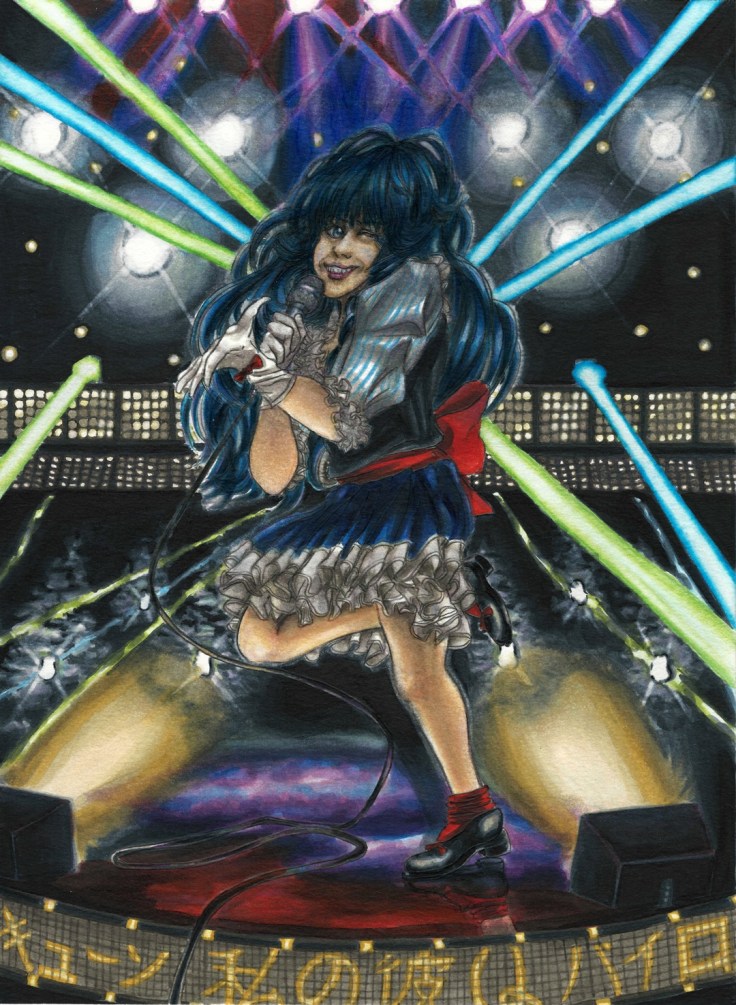
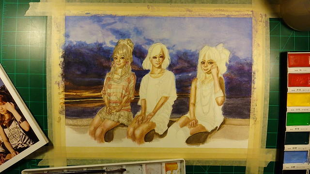
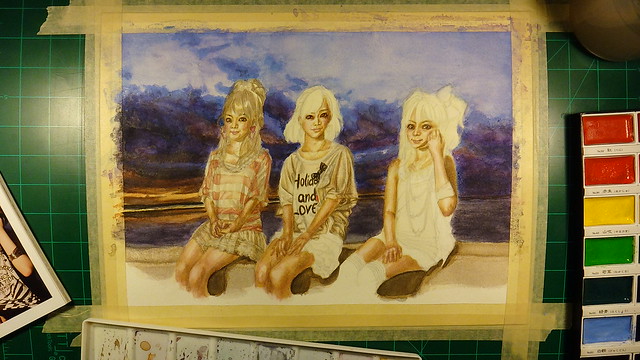
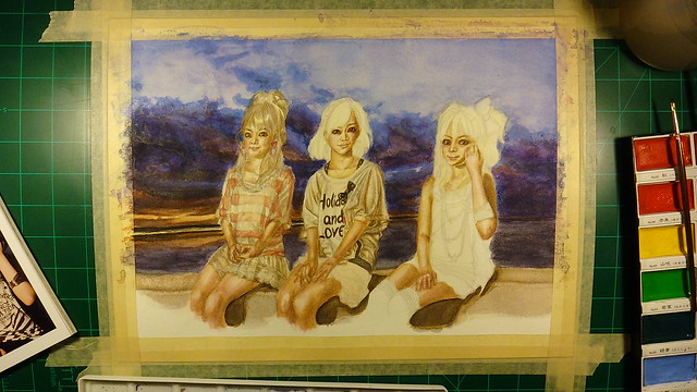
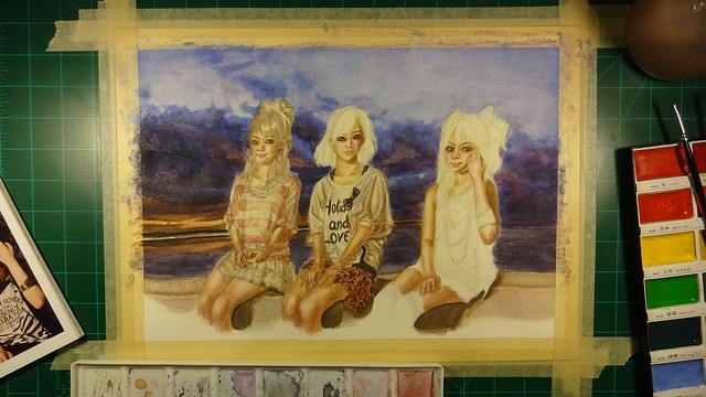
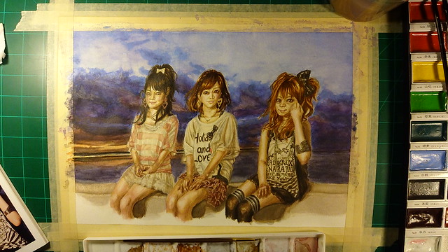
The first artwork to get the honor of being the first in being painted with my new P.H. Martin’s paints is I believe Kaleido Star (assuming that the scanned date is correct, which says it was only by two days, weird). In any case, Ph. Martin’s are quite different and since I am still learnint to use watercolors in general they were a quite hard to understand at the point of making this art piece. But after learning a bit more about watercolors in general I should be able to do better next time I use them. (•̀o•́)ง

In any case, from what I have learned going slow is the best strategy when painting. Especially if one is covering large areas such as backgrounds (something I didn’t do). The reason I bring this up is because just like with the Kaleido Star artwork I mixed both traditional and digital. Mainly because I couldn’t get the color right from the beginining and well, ruined it really. Plus, because I didn’t stretch the paper (something I’m barely trying) the paper of course buckled creating even more problems. (*´Д`)=з

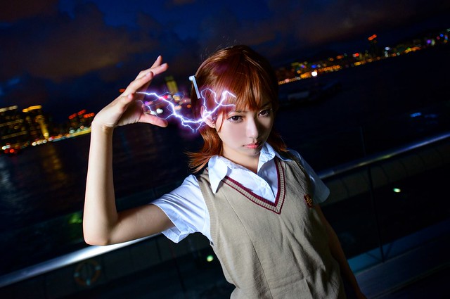
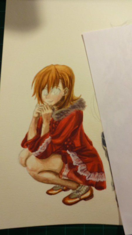
After looking around my reference materials for To Aru Majutsu/Kagaku I came upon this cosplayer who did a spot on Misaka while doing a really interesting pose.

This is the cosplayer, which uploads her pictures on Weibo:

https://weibo.com/p/1005051873372180/home?from=page_100505&mod=TAB&is_hot=1#place

I would link the original picture but they get flagged and taken off. So to prepare for that I will upload it to my flickr (I hope that doesn’t become a problem).

10572127_1475732952696554_3467700917655481847_o

Now as for the background I went through the episodes in To Aru Majutsu and screen captured locations of Academy City. I’ll put the screen captures on flickr in case any of you guys need them. But for now, these are the reference pictures I used.

https://www.flickr.com/photos/darkcloudxero/36449217334/in/dateposted-public/

https://www.flickr.com/photos/darkcloudxero/36449162454/in/dateposted-public/

I could have used the background on the cosplayer reference picture, but I wanted to set it in Academy City. Plus I had (at the point of starting this artwork) recently seen To Aru Kagaku no Railgun with my younger brother.

With that said, here is the process.

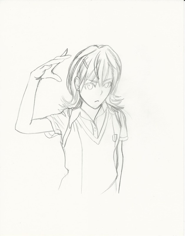
First Misaka Mikoto:

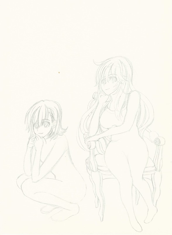
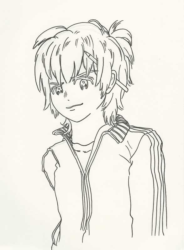
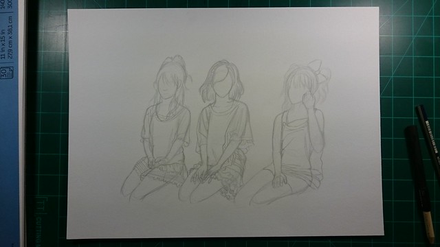
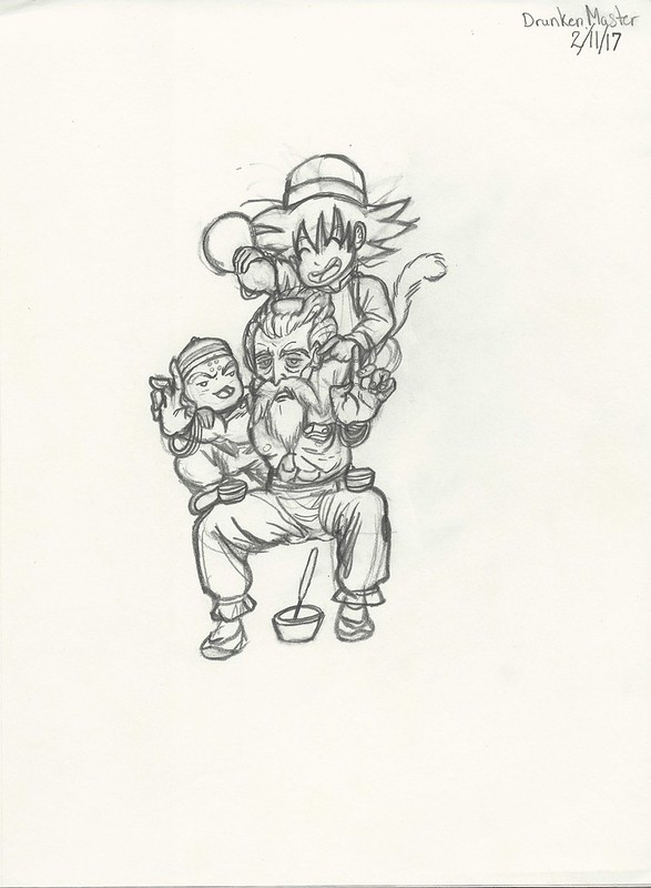
I’ll start with the rough drawing.

Misaka Mikoto 2017 I resize

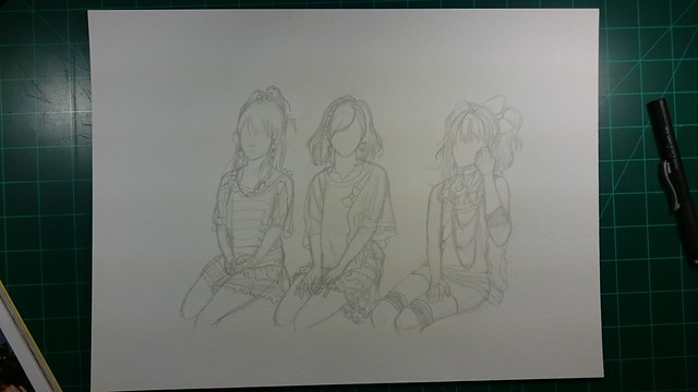
Then I define the lines I want.

Misaka Mikoto 2017 II resize

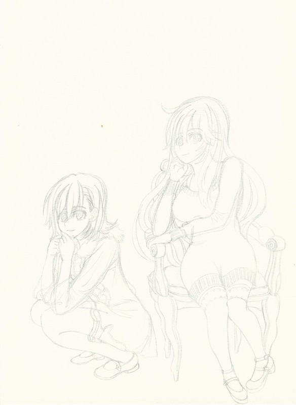
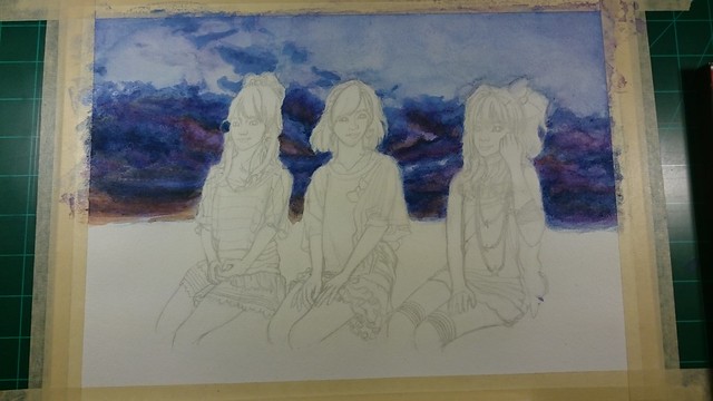
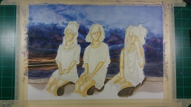
First coats of paint.

Misaka Mikoto 2017 III resize

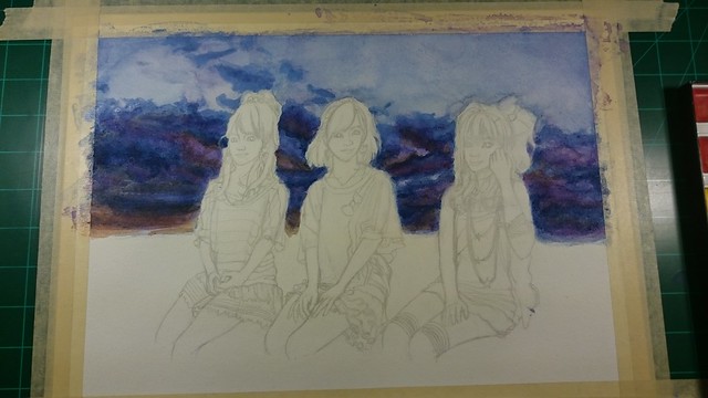
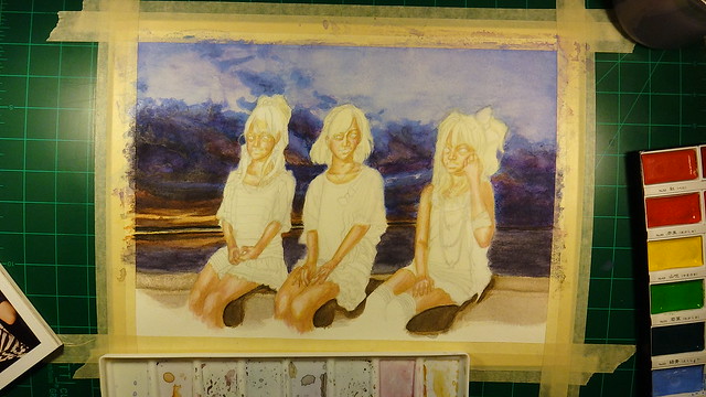
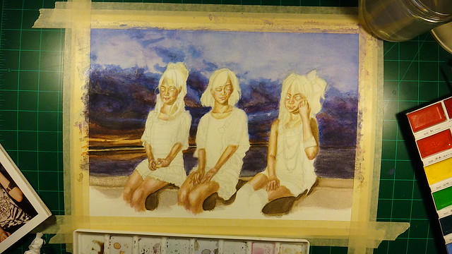
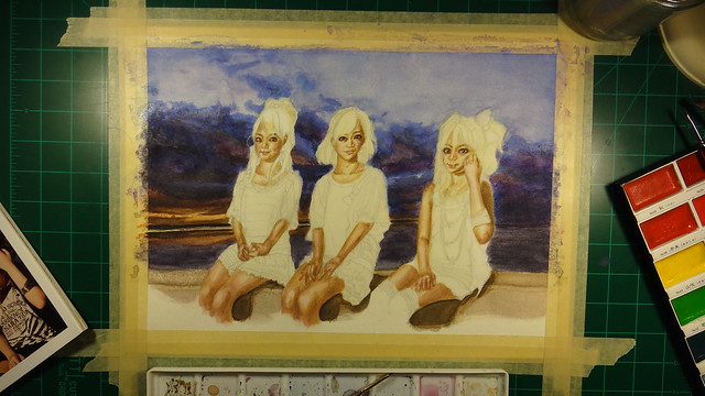
Adding more details and color to the painting.

Misaka Mikoto 2017 IV resize

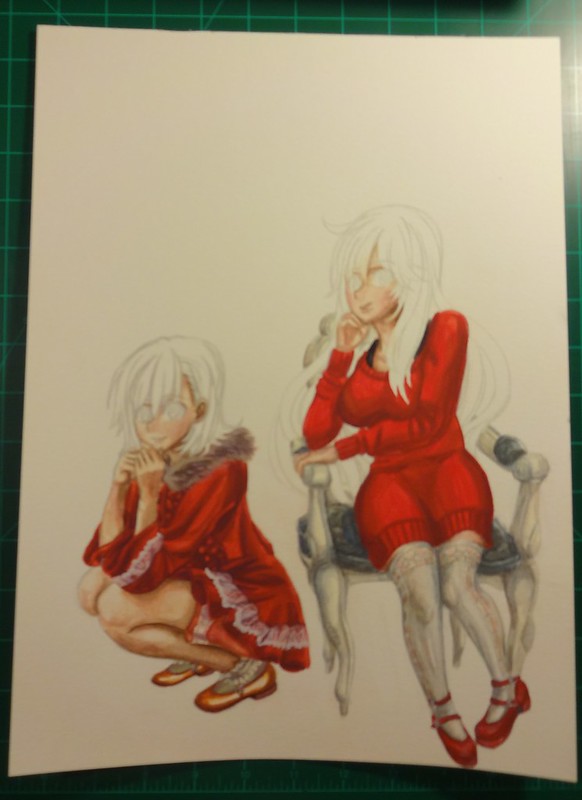
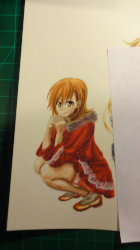
Then I try to match the intensity and colors as close as I can with the original painting (the scanner leaves the scanned pictures very dull and lacks the intensity so I have to edit them afterwords). I usually do this edits and then I make another copy and multiply the second copy of the scanned picture to increase the details and colors.

https://www.flickr.com/photos/darkcloudxero/37178825826/in/dateposted-public/

But since the background is blue I tried to change the hues a bit to a cooler color.

https://www.flickr.com/photos/darkcloudxero/36516617344/in/dateposted-public/

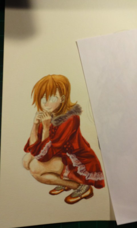
With that done I prepare the actual subject (in this case Misaka) so that I can merge it with the background. Of course that means cleaning up and erasing the background. It sure is very time consuming. But it’s worth the effort.

misaka mikoto railgun no background resize

Next I try and match the colors as close as I can so that they merge better and that the subject looks like it actually is in the backgrounds environment. Now, just to make it clear, I made these changes after I merged it with the background.

Misaka Mikoto Final resize

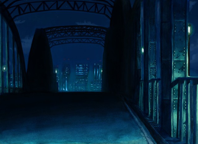
Ok so Misaka is done and ready, now on to the background. Academy City. More especifically the bridge where Misaka and Touma met on very important ocassions (if you’ve seen the series than you’ll know what I’m talking about).

First are the outlines for the bridge and the city scape.

https://www.flickr.com/photos/darkcloudxero/36516910564/in/dateposted-public/

I’m still having a hard time doine dark color so I want to do more of them in order to understand how to use the colors correctly.

I had a good deal of trouble due to my low expertise, though this was a couple of months ago now, and judging by the recent painting I’m currently working on I have gotten better and am understanding the process a bit more. What I did know at this time is that  I had to add layers, though I was going too fast and not doing enough variation in colors.

https://www.flickr.com/photos/darkcloudxero/36556799243/in/dateposted-public/

https://www.flickr.com/photos/darkcloudxero/36516910274/in/dateposted-public/

So this is one of the things I had a lot of problems with, which is caused by adding too much paint. The problem is that the paint starts caking and adds a layer of shiny paint. Not only does it not look good, but it makes adding more layers harder since the paints don’t meld well together at all.

https://www.flickr.com/photos/darkcloudxero/36516909754/in/dateposted-public/

https://www.flickr.com/photos/darkcloudxero/36516909304/in/dateposted-public/

https://www.flickr.com/photos/darkcloudxero/36516909054/in/dateposted-public/

https://www.flickr.com/photos/darkcloudxero/36516908844/in/dateposted-public/

One other thing I wan’t to make a note of is the city scape. My understanding of going from dark to light and vise-versa still perplexed me. So I added colors way to dark and made my work harder when I wanted to add the light haze from the city scape. So because of my inexperience the colors were not coming out like I wanted.

https://www.flickr.com/photos/darkcloudxero/36516908504/in/dateposted-public/

https://www.flickr.com/photos/darkcloudxero/37369420005/in/dateposted-public/

https://www.flickr.com/photos/darkcloudxero/37179363296/in/dateposted-public/

https://www.flickr.com/photos/darkcloudxero/37369418745/in/dateposted-public/

Having the city somewhat done, it’s time to start adding details. Starting with the structure of the bridge.

https://www.flickr.com/photos/darkcloudxero/37179361936/in/dateposted-public/

Then I decided to change the color of the lights and add the rivots of the beams.

https://www.flickr.com/photos/darkcloudxero/37179364656/in/dateposted-public/

https://www.flickr.com/photos/darkcloudxero/37369427445/in/dateposted-public/

And this is how it looks like with all the digital edits and addtitions. Making it truly Traditional x Digital.

Academy city night Final resize

Now that I am satisfied with how it looks, next is merging Misaka with the background.

https://www.flickr.com/photos/darkcloudxero/36517240774/in/dateposted-public/

And to finish it off I added some more blue hues to Misaka so that they merge better.

Academy city's Railgun Final resize 1080

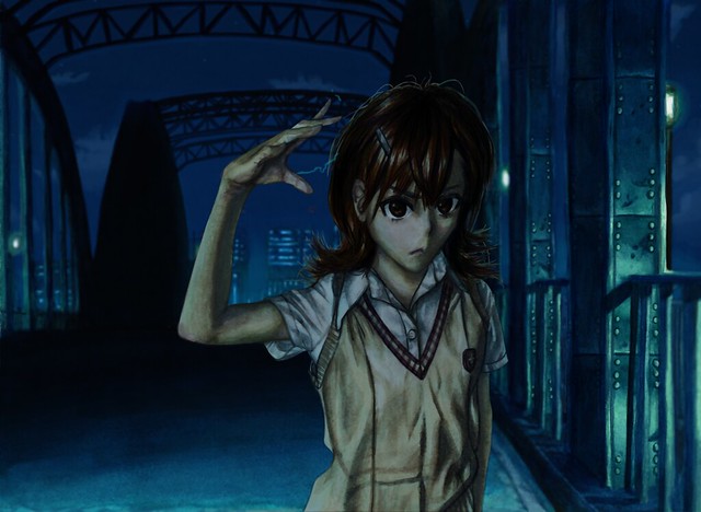
And well that is the process of creating this art piece. Doing them seperate is interesting and gives me the possibility of doing a “2.5D” artwork if I so choose it. But on the other hand it does require more work and also needs a lot of thought, preperation and changes when merging them. I’ll try to do a “2.5D” piece to see if it’s worth it or not. Time will tell…

Bueno, hasta la proxima,

-NUBE


It’s been a stressful week… + NanDesuKan Report

This week has been full of tedious and time consuming obligations. I’m still not done but things have been progressing quite well. Of course I haven’t really stopped working and have some things to show you guys. One other thing to note is that last week was NanDesuKan so I’ll talk a bit about that.

Since I went to two conventions earlier this year I was having convention fatigue. I didn’t really feel like going but I did want to take some artwork for the Art Gallery section of the event. This time I decided to take only some prints so that I could sell them for a lower price in hopes that I could sell them this time. This year I took the piñatas That I made all throughout the end of last year and the beginning of this year. Some have actually sold already, such as the Popplio and Eevee and have been comissioned to make another one. So for NanDesuKan I was offering Pikachu, Rowlette, Litten, Mimikyu, Totoro, Jiji, and I made two new ones for this convention. Goku and Kuririn. I made them as kids wearing their attire from their training days under Muten Roshi (I even decided to make their turtle shells the day before the convention).

Just in case you forgot or haven’t seen them before, here are the piñatas that I took with me.

https://www.flickr.com/photos/darkcloudxero/32628223106/in/dateposted-public/

https://www.flickr.com/photos/darkcloudxero/32628014416/in/dateposted-public/

https://www.flickr.com/photos/darkcloudxero/32515650162/in/dateposted-public/

https://www.flickr.com/photos/darkcloudxero/32628204896/in/dateposted-public/

https://www.flickr.com/photos/darkcloudxero/31856433233/in/dateposted-public/

https://www.flickr.com/photos/darkcloudxero/32546322051/in/dateposted-public/

Here are Goku and Kuriring that I made especifically for NanDesuKan.

https://www.flickr.com/photos/darkcloudxero/37152283125/in/dateposted-public/

https://www.flickr.com/photos/darkcloudxero/36754812210/in/dateposted-public/

The construction of the turtle shells using foam board.

https://www.flickr.com/photos/darkcloudxero/36963133466/in/dateposted-public/https://www.flickr.com/photos/darkcloudxero/37152447945/in/dateposted-public/https://www.flickr.com/photos/darkcloudxero/36316265314/in/dateposted-public/https://www.flickr.com/photos/darkcloudxero/37152441715/in/dateposted-public/https://www.flickr.com/photos/darkcloudxero/36316258924/in/dateposted-public/https://www.flickr.com/photos/darkcloudxero/36316255544/in/dateposted-public/

https://www.flickr.com/photos/darkcloudxero/37152447945/in/dateposted-public/https://www.flickr.com/photos/darkcloudxero/36316265314/in/dateposted-public/https://www.flickr.com/photos/darkcloudxero/37152441715/in/dateposted-public/https://www.flickr.com/photos/darkcloudxero/36316258924/in/dateposted-public/https://www.flickr.com/photos/darkcloudxero/36316255544/in/dateposted-public/

https://www.flickr.com/photos/darkcloudxero/36316265314/in/dateposted-public/

https://www.flickr.com/photos/darkcloudxero/37152441715/in/dateposted-public/

https://www.flickr.com/photos/darkcloudxero/36316258924/in/dateposted-public/

And here they are with them on and painted (painted using spray paint). Tied with some garden ropes to emulate the ones in the series.

https://www.flickr.com/photos/darkcloudxero/36338391343/in/dateposted-public/

https://www.flickr.com/photos/darkcloudxero/37152268315/in/dateposted-public/

https://www.flickr.com/photos/darkcloudxero/37152251955/in/dateposted-public/

https://www.flickr.com/photos/darkcloudxero/36316051194/in/dateposted-public/

https://www.flickr.com/photos/darkcloudxero/36754626810/in/dateposted-public/

https://www.flickr.com/photos/darkcloudxero/36754643650/in/dateposted-public/

This was the piñata side of things. But I prefer drawing more, so of course I took some of the new 2d art that I have been working on this year. Thinking back I was learning more than creating this year. But I feel it was worth it (I still have a ways to go, but I’m starting to understand things a bit more now).

My original plan was to show these pieces on their own and before the convention so that those who take the time to visit this site would get a sneak peak as a sort of special “reward” for visiting the site. But I got really busy preparing for the convention that I didn’t have the time (those two weeks before the convention were also quite stressful). Luckily I did get not only the new piñatas finished, but I also had two new artworks done in those weeks prior.

I took 4 art pieces in total this year.

I made a new piece with the prints of the legendary Pokemon from X/Y.

https://www.flickr.com/photos/darkcloudxero/37153150535/in/dateposted-public/

I dumbly chose to do a Saber piece (from Fate Stay Night, I think). But that series can get rather complicated if you haven’t seen or played any of the games (which I haven’t). (There’s so many Sabers) So I really didn’t know what I was doing at all… This was one of the pieces I was doing right before the convention. Thinking back maybe I should have done something else, but oh well.

Done both traditionally and digitally.

https://www.flickr.com/photos/darkcloudxero/37153226875/in/dateposted-public/

This piece I had been working with during the summer. I took a bit of a break and did some minor tweaks right before the convention though.

It is Misaka Mikoto from the To Aru series (will make a post especifically for it later).

https://www.flickr.com/photos/darkcloudxero/36982080862/in/dateposted-public/

And the last piece that I offered this year is the other drawing that I made right before the convention.

This one is of Goku, Kuririn and Muten Roshi. (I will also make another post just for this one and talk about it more).

https://www.flickr.com/photos/darkcloudxero/36982148692/in/dateposted-public/

So these are the pieces I took this year. Now for the results. Out of all the piñatas, only Rowlette and Mimikyu were sold. And of the 2d art, all of them were sold except for the Saber piece. And out of all the pieces only one went to the live auction, that being the Pokemon X/Y piece.

On top of selling a good amount of them this year, I also won an award again this year.

https://www.flickr.com/photos/darkcloudxero/36982351652/in/dateposted-public/

https://www.flickr.com/photos/darkcloudxero/36982350522/in/dateposted-public/

s

https://www.flickr.com/photos/darkcloudxero/37153546725/in/dateposted-public/

Seems like I won the 3D category again this year. Plus I also won the Video Game Room Art Show award. Seems like the 3D award was for the piñatas, and the Video Game award was especifically for Rowlette. With that said, I assured another weekend pass for next year.

Not too bad.

Sorry I haven’t really been posting much, but it has gotten a bit stressful these days. And now the future is looking a bit shaky… Heck even the sun and moon were kind of ominous when the outcome of the future was put on jeapardy.

https://www.flickr.com/photos/darkcloudxero/36340111293/in/dateposted-public/

https://www.flickr.com/photos/darkcloudxero/36756416450/in/dateposted-public/

A bit weird but won’t deny, they looked beautiful. (by the way, they look red because of the fires that were burning on the west coast.)

Nothing can be done except go forward I guess… ε- ( ̄、 ̄A) フゥー

That should be all for now, I’ll get back to you guys later.

Hasta la proxima,

-Nube

XERO DRAWING – Levi Ackerman

https://www.flickr.com/photos/darkcloudxero/35906917792/in/dateposted-public/

suggestion redraw/request: Tessa Sansom

Shorter version can be seen here on my main channel:

Longer version can be seen on my second channel:

Image used as reference can be found here

A couple of years ago I had drawn and colored a rather bad drawing of Levi Ackerman. It was suggested that I should maybe redraw Levi and try to make a better version of it. I was dealing with various things and practicing new things, I didn’t get to it till now. I want to make more videos so I decided to go ahead and draw it finally.

Hopefully someone finds it usefull.

A series of videos where I help people draw. I make these videos on requests. So if you need help drawing someone or something, leave a message.


-Nube


Title: Epic
Artist: Bensound
Genre: Cinematic
Mood: Angry
Download: http://goo.gl/bFTwWp

You’re free to use this song in any of your videos, but you must include the following in your video description:
Music by BENSOUND http://www.bensound.com/royalty-free-…
Creative Commons — Attribution 3.0 Unported— CC BY 3.0
http://creativecommons.org/licenses/b…

Epic – Bensound: https://youtu.be/ae8FyeVc7qk

XERO DRAWING – Kaname Kuran

I accidently used a watercolor paper and didn’t notice it till I had uploaded the video… No wonder I couldn’t really blend as much as I thought I could. On top of that, I somehow made Kaname look… younger? There’s something about the face that just looks off. Maybe lowering the mouth and nose down? Hmmmm…

https://www.flickr.com/photos/darkcloudxero/36076112875/in/dateposted-public/

Normal short version on my main channel:


Extended longer version on my secondary channel:


request by: Mia S

I chose this pose since it seems like something Kaname probably would do (without even being embarrased to do so).

It’s funny, I was at the store and was surprised to find the complete collection of Vampire Knight including Guilty (right now I’m trying to buy all my favorite series so of course I picked it up). Just when I got out of the store and looked at my phone I happened to get this request for Kaname. Quite serendipitous.

If you have any questions or comments write them down below.

I’ll have a longer version on my other channel here:

A series of videos where I help people draw. I make these videos on requests. So if you need help drawing someone or something, leave a message.


-Nube


Title: Solo Cello Passion
Artist: Doug Maxwell, Media Right Productions
Genre: Classical
Mood: Sad
Download: https://www.youtube.com/audiolibrary/…

Create a website or blog at WordPress.com

Up ↑