Today is day two of Inktober. I decided to follow the prompt this time which is “suit”. As I thought about it, I came up with the idea of drawing Goku wearing a suit. Then I thought it would be cute if I drew Goku and Chi Chi together dressed in formal attire.
Happy Goku day. I can’t believe I just found out that May 9th is Goku Day. I didn’t have anything ready or planned, but luckily I had the line art of Goku celebrating that fits the occasion perfectly. Really like a gif of Goku and Krillin fighting during their younger days so I used that setting and colors for my painting.
It’s been two years since we witnessed Goku’s ultra instinct (in animate form). I’m surprised it took me this long to actually make a painting. When it comes to Dragon Ball’s many forms, my favorite is Kaio Ken because it makes the usage of it a gamble and gives it stakes every time Goku uses it. Of course this was later replaced and pretty much forgotten when the Super Saiyan form was introduced. Luckily, during the run of Super it was brought back and paired up with Super Saiyan Blue. (۶ꈨຶꎁꈨຶ )۶ʸᵉᵃʰᵎ
The second form that I really liked was Ultra Instinct. This brought it back more to fighting and not so much who has the most power. It’s a form that requires a state of mind more than anything so that the body can move on experience and instinct during a fight. Plus the mastered form looks really cool.
This is a double feature of sorts. I will be doing two types of painting on this drawing of Goku which has been drawn with ink. I first used watercolors to paint Goku and then I painted him again digitally using Corel Painter 2020. The time between each was very noticeable. The traditional painting took and the digital painting took me only . I really have to think about how I advance after every movement. Meanwhile with digital painting, I seem to have more experience and I can make as many mistakes as I want since I can undo right away. But I guess that doesn’t completely transfer over to traditional. Although I can go as detailed as I want, it might be better if I develop a simpler style like Little Thunders which can be so versatile but not overworked.
This painting has made it clear that I should practice more with watercolors. One other thing I remembered, don’t ink your drawing if you will be using watercolors on it (this is only if the inks aren’t waterproof). Otherwise they will smudge when painting. Instead, go over the lines by pressing hard on them using a pencil (I mean I know this, I don’t know why I didn’t remember). Then erase everything. If done correctly, the lines will be visible even when painting over them. One you are done painting, the line art process can finally be done. This can be done with ink, color pencils or more watercolors.
The idea I originally had was of Goku returning to Mexico but I decided to to have Bulma tag along this time. In fact, she was the first one to be painted. Well, her car was, then her. The car is from the first chapter of Dragon Ball. Looking online, it seems the car is a Renault 5 Turbo. I’m always amazed at how compact and round Toriyama draws his cars, they look extra cute. The background was painted first which was done very roughly but I wanted the focus on Bulma and Goku so that’s fine.
About 1 or 2 years ago I wanted to make a painting of a Testarossa at night, when I didn’t quite get color theory and how it interacts with each other. So of course that didn’t go very well. But to my surprise, only using the manga panel for reference I managed to paint a good rendition of a car in a night scene with lighting effects and all. Maybe I should give that Testarossa piece another try at some point.
The Renault was apparently meant to be a rally car before it was released as a consumer car so I wanted Bulma to dress like she is travelling across Mexico. I really liked her outfit from chapter 5 (when they first met Oolong). Looking at more panels, there are a couple of details that I could have added but since she is kind of far away it should be fine. As for Goku, I had to think for a while about what he would wear, and I decided to give him a jacket reminicent of Jackie Chan’s jacket from Police Story 4. Looking at Jackies jacket they aren’t really that similar except in the color but I still think it looks good on Goku. As for what Goku is eating, I had him eating some Churros and buñuelos.
October has finally arrived, and that means that Inktober has as well. I had some ideas on the past days but just yesterday I had an idea of Goku kicking me in the back sending me flying like in a gag manga. I thought the idea fit this year and the start of this Inktober quite well. I wanted a simple style much like the one used in the original Dragon Ball. Once I was done I was tempted to add more details, but I really have to contain my tendency to overwork pieces. I think this will be a good starting piece, I’ll try new ink styles over the coming days.
One of the fun things of seeing original Dragon Ball are the references to other stories or media that Akira Toriyama likes. And now that my exposure to more media has expanded I can now see more of it whenever I rewatch Dragon Ball. One such character is the Robot Pirate that is a really cool reference to the Xenomorph from Alien. What I really like about the design is the obvious inspiration to Alien while still making an original and cool design. I knew that when I rewatched Dragon Ball about two years ago I wanted to make a parody painting. It took me two years to finally do it, but that’s just the way things work out sometimes. The scene is of course in reference to the iconic scene with Newt, moments before she was abducted by a Xenomorph.
I think I mentioned this before but I have been quite busy lately with my other job and building my desk PC which took me 4 weeks to complete. Had I had a bit more time to work on it I think I could have completed it in two weeks but such is life. Now I have more workspace since I added about 6 inches on the contour of the desk (minus the front side) so that I could clamp my three monitors thus giving me all of my original (about) 4 x 3 feet to use with all of my supplies that I would use as I work. I actually just made the finishing touches yesterday so I wasn’t really even able to use the desk till today. So far I’m really happy with the way it is all set up and because I made the outside contours on the sides so that I could clamp down my monitors I can now fully see all of the screen on both sides as I work on my XP-Pen which I of course left on the center. I’ll show some pics of it and the setup at some other time.
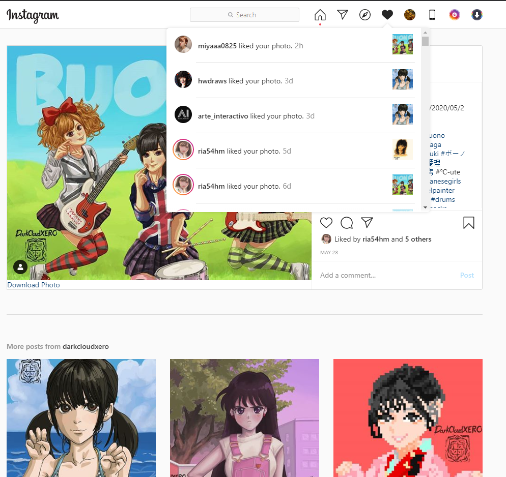
Way back in, whoa, May 28th (it’s been that long after all huh) I uploaded my painting celebrating Buono! To my surprise on June 8th I actually got a like from Natsuyaki Miyabi! Man it feels nice to know that the person you decided to make a painting of has seen your work. But to also get their approval of it is quite nice. I’m really glad my feelings of appreciation for her work has reached her.
Here is the painting just in case you missed it. And here is a link to the original post.
While I was getting some supplies for my desk PC I stopped by a nearby dollar store and came across some small vials with cork caps. I got a set of two of the 6 packs so that I could store some pre mixed inks and watercolors that I could use when working with linework/outlines. For today I made a set of ink that got lighter and lighter for when I want to use different levels of black to gray inks. I have my diluted ink that is still quite dark in my original container and a set of 5 vials containing the newly created ink. I also made a reference sheet to show me the intesity of the ink within each vial and a date of when they were created just in case one of them runs out and I have to create a new batch which of course might not be the same as the previous one. Since it was running a bit late when I was completely done getting my worspace ready I decided to make a quick drawing. Since it was all about testing the desk I of course decided to go traditional (plus I also got to try out my inks, although I only used my base ink for this drawing). I’ll try to see if I could make a quick drawing every weekday for the rest of the summer on top of whatever new paintings I decide to work on. I already have an idea of the first piece I will be working on (hopefully starting tomorrow).
Here is that Goku drawing I did. Maybe I should have made some lines to express movement but overall I’m quite pleased with the results (was a bit scared that I wouldn’t be able to draw as I liked since I hadn’t done it in about 4 weeks).
I really wanted to draw Goku in his snow outfit from the muscle tower arc. When I was getting reference pictures from the anime I noticed the Suno seemed to have a crush on Goku. Later when I compared the same arc in the manga, the whole subplot was completely absent. In any case I decided to make a piece of Goku and Suno. I wanted to make it seem like it was a scene from the anime. I wasn’t too sure how I would pose Goku and Suno so I first started by painting the background. I really like the way it came out. After that I decided on having Suno looking at Goku as they built a snowman. Lastly I decided to add some snowflakes.
Wanted to do a piece that represents the Fall season. As my subjects I chose Goku and Bulma. Bulma is sporting her jacket from the first chapters of the series and I decided to have Goku use the same sweater that Suno (I just figured out that her name is pretty much just snow) wore in the Muscle Tower saga.
About a week ago or so I got to see the Dragon Ball Super: Broly movie in the theater. Out of all the Dragon Ball movies I have seen so far it is definitely my favorite. I didn’t really care much for Broly before (I mean sure he was strong and had cool powers but
┐( ̄ー ̄)┌ )
but I did like the way everything was connected with all the events up to this point. To think that someone stuck in one planet could have so much power to not only keep up with Super Saiyan blue but to far surpass it. Who knows how Broly would fare against ultra instinct but I’m guessing that they are setting things up to have Goku power up even further with Broly.
I liked that most of the fight with Broly was martial arts based, really hope they bring the focus on that again in the future. One other thing to note is that the artwork and painting was much better than not only the anime but also the last movies. The only complaint I have is the cg section which just didn’t look good and was really out of place when it happened. It was only for one section of the fight but it does make me wonder why they decided to so in the first place.


 and a quick drawing of Goku celebrating")
