October is finally here! Inktober 2018 #1

I first heard about Inktober last year. I wasn’t really planing on joining in this year but after thinking about it, it should be a good way to practice my drawing and inking techniques.

What I understood about Inktober is that one should not only draw only using ink and a pen, but that one should not use anything else. So no rough drafting, just drawing with the pen and working with the mistakes that happens as one goes along.

For the my first drawing I of course drew Sayumi Michishige. I seem to be able to draw rather fast… or at least it seemed fast, I feel that those countless hours I spend investing on my drawing skills have been paying off.


IMG_20181001_223411

This is the reference I used from her book “Sayu: Sayumi Michishige Personal Book”:


IMG_20181001_210550

This is the process for those who are interested.


IMG_20181001_210858


IMG_20181001_211436

If you look to the right at Sayu’s left elbow you can see a big blotch of ink. That was a careless mistake I made where I ran my hand over it while the ink was still wet. Nothing I can do except keep going.


IMG_20181001_211912

IMG_20181001_212444


IMG_20181001_213222


IMG_20181001_213500


IMG_20181001_214015


IMG_20181001_215534


IMG_20181001_220342

IMG_20181001_221441

IMG_20181001_221956


IMG_20181001_223411

Oh, before I forget. I used a brush pen and this other pen to ink the boots. Forgot to take a photo of them with the dip pen.

I’ll try to draw one drawing everyday for Halloween, and also do some of the other artwork… it’s going to be a rather busy month.

In any case, that should be all,

Hasta la proxima,

-NUBE

Goodbye Summer 2018

Just a really quick piece for the end of summer 2018. Wanted to play around with flat colors, so I did just that.

End of Summer 2018 colored resize

This is the process. Done traditionally then painted digitally.

https://www.flickr.com/photos/darkcloudxero/29909639797/in/dateposted-public/

https://www.flickr.com/photos/darkcloudxero/44845764771/in/dateposted-public/

https://www.flickr.com/photos/darkcloudxero/29909639657/in/dateposted-public/

IMG_20180921_212236 resize

I then scanned it so that I could paint it digitally.

End of Summer 2018 cropped resize

End of Summer I

End of Summer II

Hasta la proxima,

-NUBE

Trying out an ANIME X CARTOON style: Sayumi Michishige

While looking through Pixiv and some Mexican memes on “Fresh Anime Memes from a Mexican Otaco” I came across two artist that made art that was rather cartoony and “round” and yet also very anime like. I really like it so I wanted to give it a try.

This was done in 8/10/18:

I believe I did this with my dip pen and a pen named Bimoji Fedepen, the hard tip one (there are various types that also go to a brush type that is pretty cool).

Sayumi Michishige anime-cartoon style linework Cropped resize

This is the reference picture I used. This was from Sayu’s photo book “Mille-feuille”.

005

I then colored the line art with my Copic markers (process will be shown a bit below). I noticed that I was much too preoccupied with the way the other artist were drawing their eyes from the references (will post them below) I was looking at so she looks a bit angry.

Sayumi Michishige anime-cartoon Colored (color corrected) cropped resize

Noticing that I used, I believe Photoshop to widen her eyes.

Sayumi Michishige anime-cartoon Colored wider eyes (color corrected) cropped resize

I widened them even more, and noticed that there is quite a bit of flexibility with this style so I really want to try out more things to see what I can come up with.

Sayumi Michishige anime-cartoon Colored wider eyes even more (color corrected) cropped resize

These were some of the references I used to try and understand the style.

Artist – Sh1tty:

33333806_1691094654279817_4256116696877629440_o

33375601_1691018417620774_1236248551663599616_n

33432191_1691943044194978_1179157119060934656_n


And here is the process:

IMG_20180809_200352 resize

IMG_20180809_214950 resize

IMG_20180809_215428 resize

IMG_20180809_215841 resize

IMG_20180809_221207 resize

IMG_20180809_221425 resize

IMG_20180809_221654 resize

IMG_20180809_222403 resize

IMG_20180809_223011 resize

When I finished painting this piece and scanning it I had to go ahead and correct the colors that get washed out in the scanning process.

IMG_20180810_141319 resize

After that I began trying out different eye shapes.

That should be all for now.

Hasta la proxima,

-NUBE

Chavo del 8 – Barril is Unbreakable

This was inspired by some Mexican memes and of course Chavo del 8 (a legendary 70s Mexican show, that is still aired today and has been shown through all of Latin America). And well, by this point JoJo no longer seems to need an introduction since it kinda owns the meme world.

The name Barril is Unbreakable is not my idea, I first heard it from another meme I saw in Fresh Anime Memes from a Mexican Otaco’s facebook page.

This is the finished piece (finished on August 2nd):

Chavo del Ocho Barril is Unbreakable I resize

I made it using my new dip pen (or at least it was at the time) using the g nib. It was much easier to use than I thought (the manga Bakuman made it sound much harder). What I like about these pens are that I can change the thickness and the lightness of my pen strokes on my command. The downsides are that the ink can dry up pretty fast and gunk up the nib, which means I have to clean it in intervals as I work. That and since the nib is quite sharp it can scratch off the paper fibers and get stuck on the nib’s wedge. So yeah, it does require quite a bit of upkeep as one uses it. But over all I really love the versatility. All of the illustration was done with the same nib which I find quite amazing. My lines are still not clean, but I can pick that up with experience.

I should have made Chapulin Colorado’s (the character/stand on the far right) pose a lot more dynamic to make it pop out more…

I don’t really remember if I was keeping track of the process, but what I do have is this:

If you notice I made a bit of a mistake and dripped some ink on the top of the paper.

https://www.flickr.com/photos/darkcloudxero/43786248795/in/dateposted-public/

Chavo del Ocho BIU 2nd half I resize

I was actually planning on making it into some manga panels but in the end decided to just join them together. I first had to scan them and then join them together using Photoshop. The reason they are cut off is because I used a large paper that doesn’t fit on my scanner.

That it for now.

Hasta la proxima,

-NUBE

Some of the artwork I’ve been practicing 3-31-18

As mentioned before I said I was going to be uploading some artwork that I’ve been working on as a bit of practice so here it is (sorry about the delay, like usual the workload has been a bit of a pain but I’m pushing forward – luckily this semester is almost finally over… though construction work seems to be looking to increase).

I got a Samsung tablet for my self at the end of last year and didn’t really use it all that much, but while in a dollar store I saw a tablet stylus and decided to try it out. I was surprised at the accuracy I could get with such a clunky pen, so I ended up purchasing an app to do some art on the tablet. Sadly the tablet is not that powerful so it stuttered way too much while I was working on it and it even crashed plenty of times but it did get me interested on the possibilities of drawing/painting digitally directly. Though one can get used to looking up at the monitor using a normal drawing tablet, there is no comparison to actually looking at what you are drawing/painting. Now I’m really craving a drawing monitor…

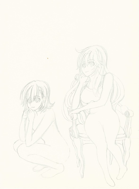
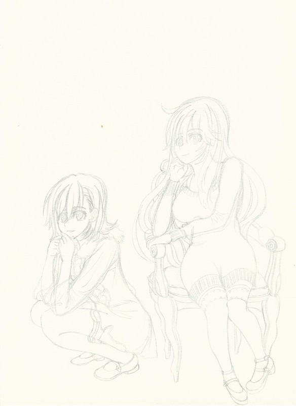
Anyway here are two tries I made while waiting for my class start;

First try:

https://www.flickr.com/photos/darkcloudxero/41103228712/in/dateposted-public/

Second try:

https://www.flickr.com/photos/darkcloudxero/41103228612/in/dateposted-public/

On the traditional side of things I wanted to make some quick practice sketches with a pen. And not surprisingly the ink really made it standout and look cleaner than when using a pencil.

I wanted to try a conversion from a real person to an anime version so I decided on using this reference picture of Eri Kamei to try it out:

kamei024

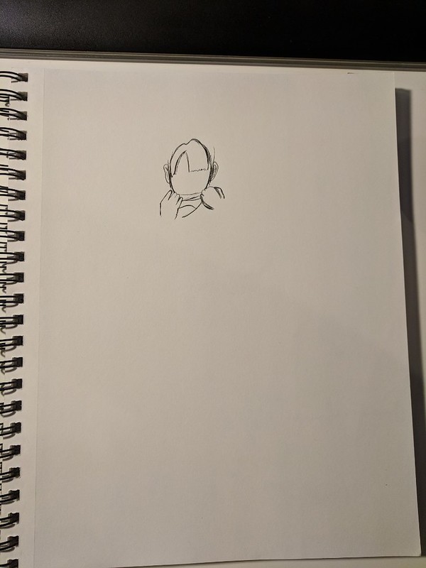
I decided to only do the main lines to test out how it all looks.

This time I used a pen from the brand LePen, I want to test out how a lighter pen combines with color so I used their Dark Grey color which leaves a much lighter mark that I hope combines much better when I add watercolor and copics to it.

https://www.flickr.com/photos/darkcloudxero/27273111068/in/dateposted-public/

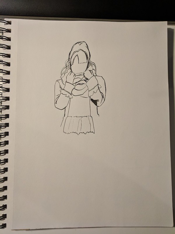
After I did the outline I wanted to see what would happen if I added more detail and darker lines, but my skill are still… anyway I’ll figure it out by doing some more when I have the chance. For the thicker lines I used one of those ink pens from Hobby Lobby that are meant for calligraphy. Did not end up how I wanted it…

https://www.flickr.com/photos/darkcloudxero/39337424070/in/dateposted-public/

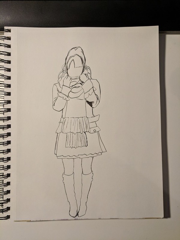
But despite all this it does give me a good opportunity to try out if I can conceal mistakes using my Knicker Poster Color white, it does work but I have to gauge the right amount so as to make it thick enough to cover but not thick enough to make a mess. What I do know is that the thinner lines looked much better, I’ll have to figure out how to ink and shadow properly.

https://www.flickr.com/photos/darkcloudxero/27273110408/in/dateposted-public/

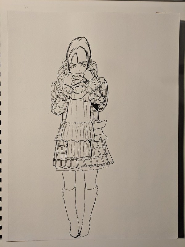
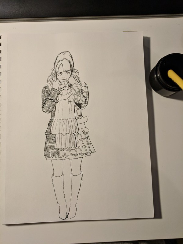
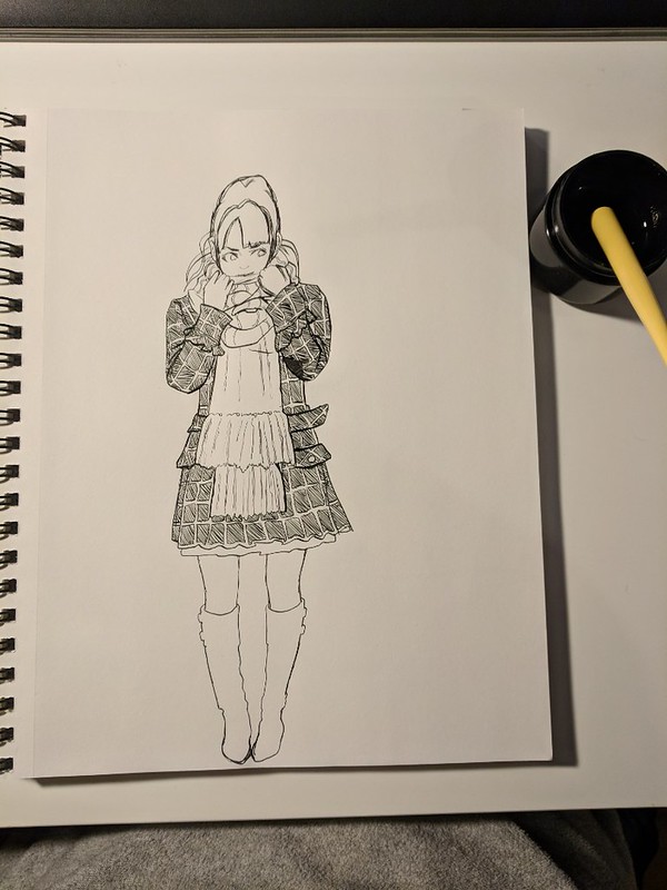
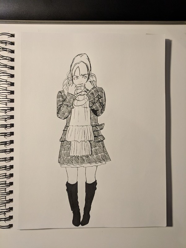
Next is Yuri Kim from Fearies Landing, here is the reference picture:

https://www.flickr.com/photos/darkcloudxero/40251652515/in/dateposted-public/

Here is the main outline.

https://www.flickr.com/photos/darkcloudxero/26274808197/in/dateposted-public/

I inked some sections and added some details but not much since I didn’t want to use too much time on it. I’ll practice some shading techniques on a blank paper to figure out what kind I should use and at what time.

https://www.flickr.com/photos/darkcloudxero/26274808087/in/dateposted-public/

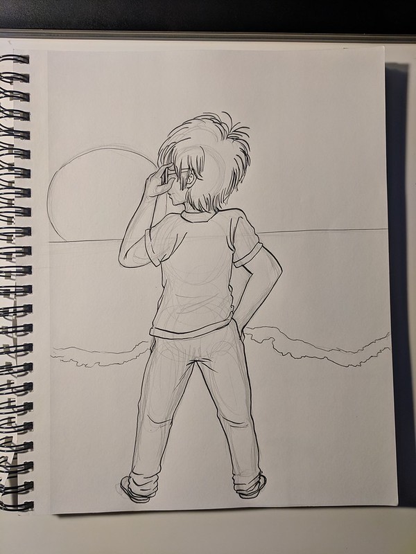
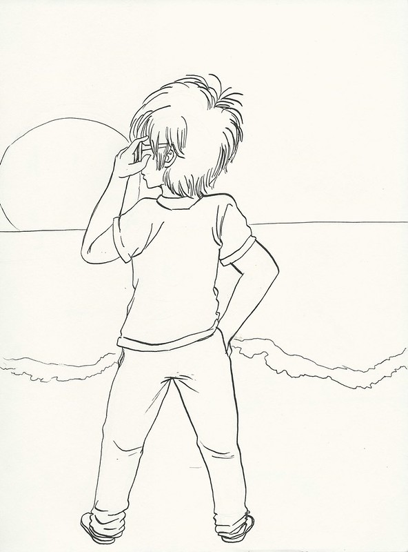
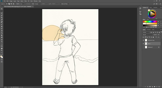
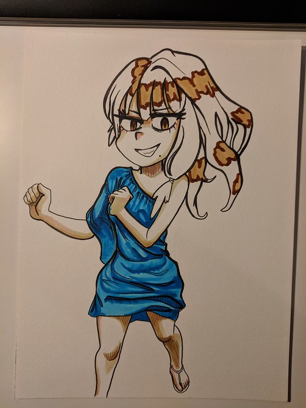
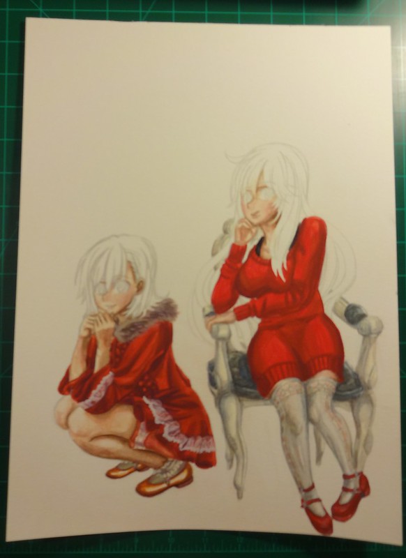
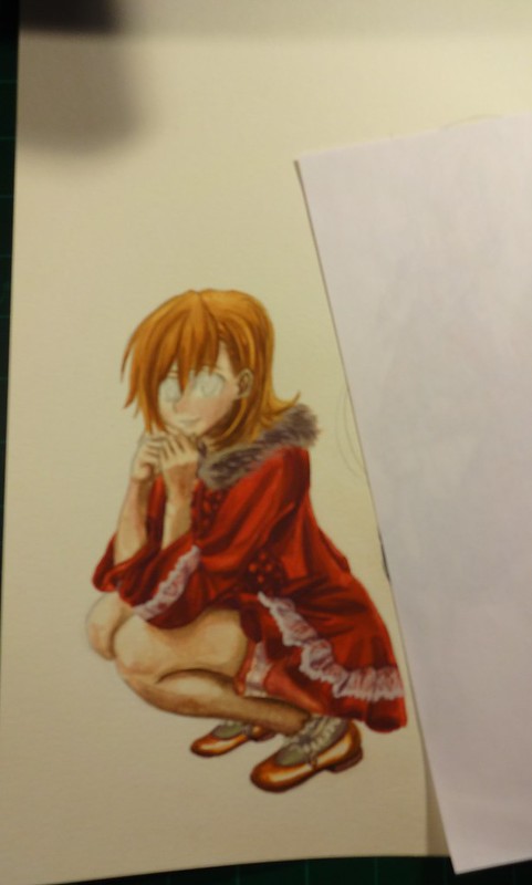
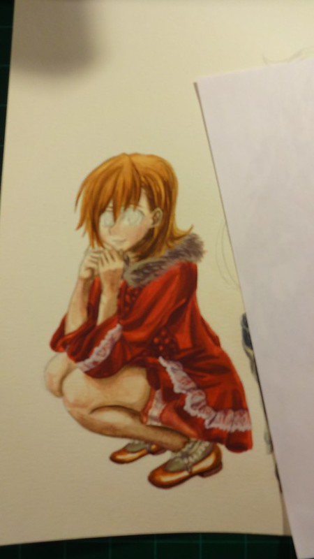
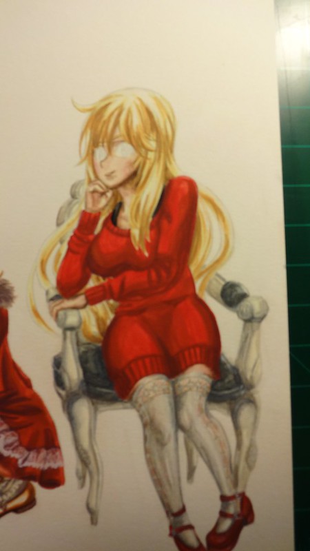
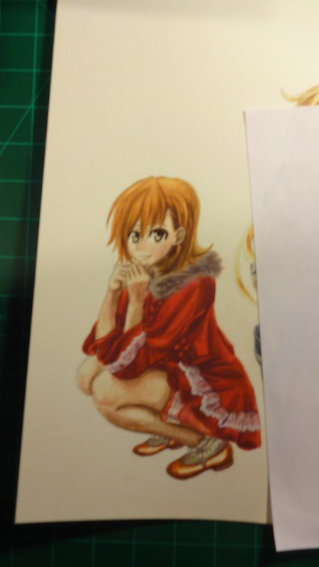
Currently I’m trying to make a new finished piece, but I’ll leave that for another time.

Hasta la proxima,

-NUBE

End of another year 2017

So another year come’s to a close…

It sure was a rather trying one…

But I and all of you made it through, now lets push forward!

Just for the heck of it I made a quick piece using only pens with hatching and cross hatching.

The idea mainly came from watching this video:

So really I wanted to see what I could do. I wasn’t really trying to make a finished work, instead I wanted to see if I could make it look anything at all like the reference picture. It’s quite rough, but the general idea is there.

reference:

https://www.flickr.com/photos/darkcloudxero/27644882729/in/dateposted-public/

and the quick artwork:

https://www.flickr.com/photos/darkcloudxero/39391816822/in/dateposted-public/

Obviously my level compared to Ryoichi Ikegami is still quite low. The lines are nowhere as refined and the lines are quite rough and not uniform but! I was able to acquire the main idea. I was actually quite surpsided at how fast I could acquire the effects that I wanted. I feel confident even saying that it was quite easy. I wonder just how well it would look if I were to do so with cleaner and well thought out lines?

The best way to learn is by recreating pieces, so that is what I will try to do for this coming year (on all fronts).

Almost forgot to even mention this, but the people above are from a Mexican show called “El Chavo del 8”. A comedy show from the 70s that has trancended time and that each generation watches at some point or another. A true gem of Mexico. As for why I chose them, I mainly wanted to draw a guy since I have mainly been drawing females for quite a while. And well I just felt like it would be fun to do so.

Let’s focus a bit of time on the Christmas Misaka and Misaki artwork. I used a combination of Knicker poster paints (yes I made the plunge, I’ll explain this at some other time), kuretake gansai tambi (watercolor set) and pencils.

Here is the process:

rough draft-

MIsaka MIsaki christmas rough draft I resize

clean lines for final artwork-

MIsaka MIsaki christmas I resize

MIsaka MIsaki christmas rough draft II resize

MIsaka MIsaki christmas rough draft III resize

coloring process-

Such a shame about not showing the before and after of the frills on Misakas coat, it shows just how versatile Knicker Poster Colors are.

DSC04043 resize crop

DSC04044 resize crop

DSC04045 resize crop

DSC04046 resize crop

DSC04047 resize

DSC04048 resize

DSC04049 resize

DSC04050 resize

DSC04051 resize

DSC04052 resize

DSC04053 resize

DSC04054 resize

DSC04055 resize

DSC04056 resize

DSC04057 resize

DSC04058 resize

As stated before, I’m still not done with it but this is the last state as of this writing.

Hasta la proxima,

Nube


XERO DRAWING – Sailor Mars The Calm Flame Warrior

Time spent: hours 8 minutes 03
Materials used: Sakura 0.7 mechanical pencil, Faber Castell Perfection 7056 pencil eraser, eraser,
Sakura Pigma Micron set Black,
Uniball Sigmo White, Black
Sakura Moonlight gellyroll: Yellow, Red pink, Orange
Copic Markers: Y11, Y15, Y17, Y21, Y26, Y28, YR04, YR09, YR68, R08, R27, R29, C1, C3, C5, C7, W1, W3, W5, W7, G21, G28, BG18, V01, V15, V17, 0, E00, 100

So we are now on the third Sailor senshi, two more to go. From what I have seen so far, Rei Hino is definitely my favorite one. What is interesting is that they changed her personality a lot on the original anime from the one in the manga which I find a bit weird. But from what I have seen so far, this one seems to be more like the manga Rei which is more to my liking. Here powers are cooler too, specially since she already had spiritual powers to begin with.

Now for the drawing. I wanted to change things a bit more for this one. I wanted Rei to be a bit more like a Yamato Nadeshiko. So I made sure to not add much indication of eyelashes. And also change the shape of the eyes a bit. And truthfully, it worked out. She came out even better than I expected. One thing that I did sort of messed up are her eyes. I made them purple, but I was reading that they turned red when she was in her senshi form. But oh well. I really like her purple eyes. They blend really well with her long dark hair.

What do you guys think?

-XERO

Changes to the Content and Layout

It has been over a year that I have erected this blog, so I think it is now time to make some more changes and keep evolving. I will be deleting some of my pictures and adding new more recent one’s. I will also be updating the information and try and make things a bit more easy to navigate (So I apologize in return if things are still under construction when you visit).

On another note, I have recently purchased a Wacom Bamboo touch and pen Manga tablet (when I get it, I can review it) so I will be entering into the digital realm in the hopes of acquiring more abilities and widening my range of skills. So I hope you guys look forward to that.

-XERO

Create a website or blog at WordPress.com

Up ↑