Xero Drawing – Erza Scarlet Yūen no Koromo (COMMENTARY)

Time spent: 9h22m

Materials used: Mechanical pencil, ruler, eraser, Faber Castell eraser pencil
Colored Pencil: water color PrismaColor – peacock blue, ultramarine blue, french grey 20%, true blue, violet, black, crimsom red, lilac, white, blush pink
PrismaColor – ginger root, peach, beige, cream, sand, light peach, 20% french grey, lilac, parma violet, dark purple, mulberry, carmine red, pink, process red, yellowed orange, crimson lake, 50% warm grey, 70% cool grey, 70% warm grey, 50% gold Grey, White, Black
Crayola – pale rose, violet, brown, taupe, lemon yellow, jade green, harvest gold, magenta
Rose Art – violet, orchid
Verithin – dahlia purple
Ultra Color – purple


We have made it to the second video, this time the objective is Erza Scarlet from Fairy Tail. A good series (that relies on way too much fan service…). For this drawing I thought I would only use color pencils and nothing else. I figured I would try to show different techniques that can be implemented with different tools. The most common one that people can easily get their hands on are color pencils. They are rather versatile and can leave some really good effects, but only if used right. I’m mainly a pencil type of artist so I’m a bit shaky when it comes to coloring. But I have been practicing and coming up with new methods ever since I decided to go pro. I’ve actually been starting to understand how to fully utilize the full potential that color pencils possess. And that is what this video will be about.

Hope you guys enjoy the new format, and learn much more this way. Till next time.

-XERO


Sorry it’s taking long.

I’m currently working on the first video of the new series of videos, but because of some life made delays it is taking a while. But it is going well. I want to add quite a bit of new elements that will make it more enjoyable to viewers so I want to make sure the long wait is actually worth it. But once things have been taken cared of, I plan on making videos on a weekly basis. So please look forward to that.

-XERO

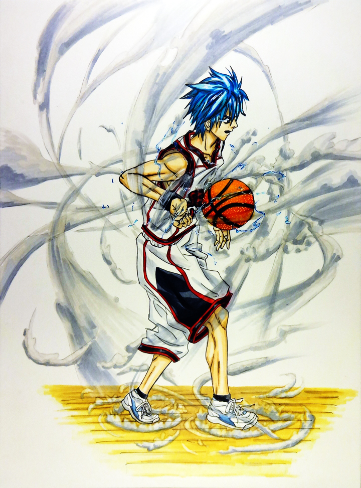
Kuroko Tetsuya

So this weeks artwork will be featuring Kuroko Tetsuya from the Kuroko no Baske (“the basketball Kuroko plays”), a series that is much like Captain Tsubasa (except instead of Football, they play basketball). This means that there will be young school players that have extraordinary techniques that makes one think of Dragon Ball (minus the fighting). It is an amazing series and has the type of characters I like as a protagonist (the main one anyway), a weak player in all areas except passing. This means that he has a lot to improve throughout the series. And sure enough, the series delivers. Despite his weaknesses, Kuroko uses his strengths to make his lack of abilities more than make up for it. I don’t want to delve too much into it, so if you have not seen it, make sure to do so as soon as you can.

I have decided to finally start working with my collection of Copic markers I bought a couple of years ago. The smoothness that I can achieve from them always leaves me amazed to no end (though I still need to work on not using too much ink on my artwork). I started with a simpler design, but eventually decided to add a dark background to it later (backgrounds are still my weakness). Looking at them side by side, I think the simpler “light” design is still my favorite. But the “dark” design doesn’t look bad either. What do you guys think?

Kuroko White background

Kuroko Dark Background

Artist Project Update 2/28/2014

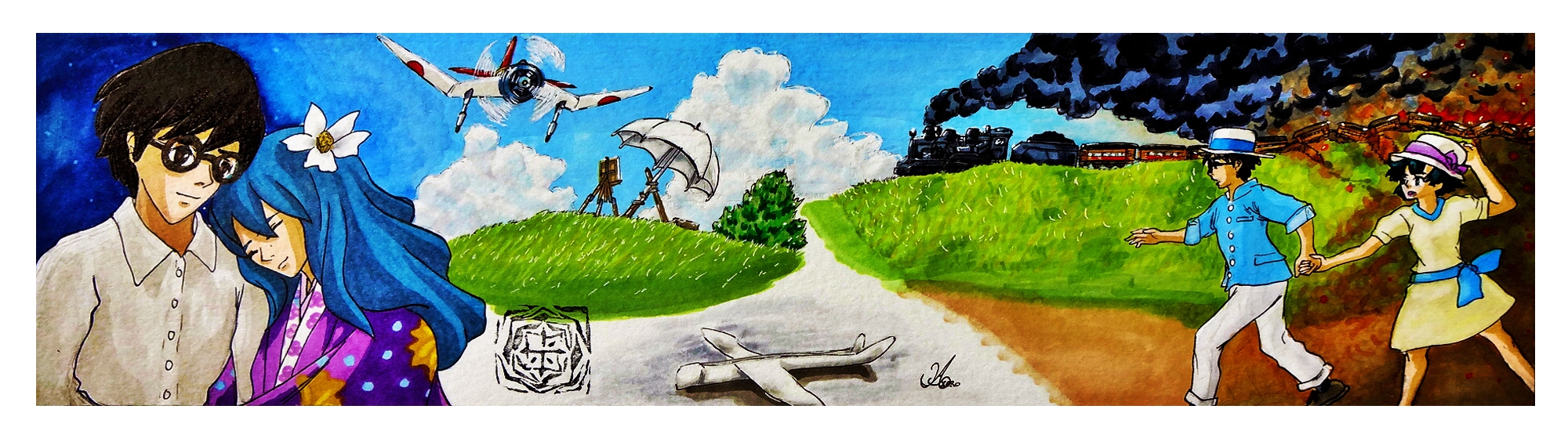
I missed posting on Monday again. But just like last time I was working on another contest that appeared right after I had finished writing last Friday. This time the theme was for the new film The Wind Rises (Kaze Tachinu), which will be Hayao Miyazaki’s last film. It still requires that weird format, but this time I had last competition’s experience under my belt. This is what I assumed would happen if I kept joining contests since it forces one to produce quality artworks in a small amount of time that requires one to keep a deadline in mind at all times. I felt I could do even better, but this was a big leap from the last entry. With this format (2000 x 550) it was still a bit annoying but surprisingly I did better. I decided on a theme that touched upon the harsh past that flowed to a  brighter future because of their meeting each other (sadly judging by the trailers the woman protagonist will most likely die from tuberculosis). I could only come up with so much by seeing the trailers and reading the extremely short synopsis given by deviantart.

This time I decided to work with my small collection of Copic markers I bought a couple of years ago, I was hesitant in using them because of how expensive they were. As well as my struggling ability to work with color (though I have been getting much better). To my surprise, using them was extremely intuitive. Mixing, blending and just coloring was much faster and effortless than with color pencils, which require a lot of work to have the colors stay on the paper and meld with the picture it self. There is this new technique I have been thinking of using for quite some time now, and seeing just how much I can bring out of the markers and color pencil (though I still need to work more on the color pencils) I can see the vast possibilities I can bring to my work.

The drawing and design for this piece was definitely better than last times, sadly my camera was not able to capture all of it’s greatness. The end sides got distorted because they bend up, making the drawing and colors blur. I just might have to invest on a big scanner. It’s a pain but it will be worth it if it shows my work in it’s original intended form.

In any case this is my entry:

The Wind Rises - warm breeze


Until next time,

-XERO

Artist Project Update 2/21/2014

Sorry. It seems I disappeared again. Luckily it was only for about a week. The reason being that I was working on an artwork for the “Lightning Returns Deviant Art contest”. I only had five days, and the weird format it had to be in was rather tough for me. I struggled a bit working on it because of this. I’d say doing the background was what made me worry the most. I had to come up with something that melded well with the actual drawing/design, but also not overtake the attention from the actual focal point. I worked with a lot of background designs, till I finally decided to make it as simple as possible.

Seeing the other entries, my hopes of winning are slim. It seems that quite a couple of them have a bit of experience in these types of formats and situations. I soon realized just how much I have to improve in  a number of areas. On the plus side I did learn a couple of cool new trick on photoshop that I plan to use and perfect for future artwork. Again, my biggest weakness is coming up with backgrounds. So that will have to be the focus of my training regimen. In any case, competitions really help hone one’s skills and show one’s weaknesses. Having that in mind, I will try to enter a couple of more in the coming days and see how much I improve.


Here’s my entry.

Lightning Returns Ace Swordsman


Unit 01 Beast Inside

Here is the drawing for this week, Unit 01 from Neon Genesis Evangelion. I was pretty much done with it yesterday, but there was something that kept bothering me about my drawings. The fact that they look so unrefined. I knew why that was of course. I did not blend the colors anymore. This happened because I decided to practice doing this so that I could increase my abilities without the need to blend them, that way once I decided to go back and put some good effort into my work I would be able to produce some amazing stuff. Sadly I got so used to doing this that I had almost forgotten the blending techniques I had developed. And because of it I have to start all over again. I gave it a try for this drawing which came out pretty well (though it looks unfinished without a background, I’ll have to do something about that from now on). Now that I have remembered a couple of my old techniques and about blending colors, I will try to bring out some better quality work from here on out.

Hope you look forward to it.

-XERO

Print Available
Print Available

Ending the Youtube videos… sort of.

For the past, maybe three years or so. I have been making Youtube videos of my drawings and the process that goes to make them. I felt that it was probably the best way to make my work be known and to make my self commit to drawing something weekly. At the time I was not really sure about my future and my self making art as a sustainable solution. I just wanted to test the waters and see if my art was good enough to attract the attention of people. What I found out was that it was really hard to compete against other youtubers who made all sorts of entertainment videos. Even more so going against other artists that had a large following and fan base like Mark Crilley. My over all results were hit or miss really.

At the beginning I took requests, and that seemed to make people get more exited to watch my videos and contribute ideas as well as comment and interact with the channel. That  though meant that I would have to draw things that I didn’t really enjoy. But I went with it for about a year till my account was struck with penalties. That’s when I decided to open my secondary account that I still use to this day, Darkcloudxero. For a while I kept the same format and continued to ask for requests, but I noticed that my enthusiasm kept lowering as time went by. I eventually decided to stop taking request and focused on drawing things I liked, while also lessening the amount of video I uploaded. This in turn started to stunt the growth of my channel. Views started to dwindle, and so did comments. In the end the popularity of the video and drawing was hit or miss (many times the most unexpected one got more views).

The reason for why my videos did so poorly can be attributed on a number of things. I did not seem to put my utmost effort into my drawings when making videos (specially when taking some requests). I felt constrained to unpleasant static and stiff positions because of the camera (couldn’t move the sketch book too much or get close to the drawing otherwise I would block the view). Quality of the drawings was very inconsistent, some came out great while others just looked childish. Inconsistent uploading of videos, sometimes it took me  a whole month in between videos. Drew things that were no longer in style (things or characters people no longer cared about). etc. etc.

Point is that I had to fix quite a bit of things. But I decided to give this part up, my work suffered a great deal because of it. And not only that, but it took a long time to draw something since I had to go by the time I was given by the battery. The time it took to charge was excruciating. Plus it also didn’t help that when I am drawing, I get in a zone where I just have to keep going without interruptions otherwise it just doesn’t feel right later on. So for the sake of producing better work, I decided to give up making videos and just focus on drawing and producing some awesome stuff.

Hope you look forward to it,

-XERO

As you can see, this week I do not have a video for this week. And that will most likely be the case from now on. More on that on Friday.

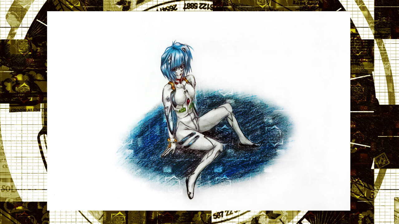
Rei Ayanami, the person that got me interested in Neon Genesis Evangelion (well her and the song “A Cruel Angel’s Thesis”) . Strangely enough, even though I wasn’t let down when I finally saw the series, Asuka stole my attention as soon as she appeared. I feel that in the remakes of Evangelion Rei seems to have more of a future (much like Asuka). I am really looking forward to see what happens in the last movie.

As for the drawing it self. Over all I was really pleased in how it came out. But while drawing this I made a lot of mistakes which led me to make a couple of changes that led me to create the blue shadow. I have always wanted to play around with these kinds of backgrounds but over all I think it brought down the quality of the drawing it self. I’ll have to work on that a bit more from now on. On the plus side, while adding the watermark it gave it a really cool effect.

Print Available
Print Available

Darkcloud Xero Drawing – Asuka Shikinami Langley

This is the first drawing video of 2014, and to commemorate the new season of videos, I have created a new title and image. Drawing videos will now be called “Darkcloud XERO Drawing”. One of the new features for these videos is the availability to buy a print of the featured drawing (can be purchased in darkcloudxero.com ).

Back when I was first getting into anime (I was probably 11-12), I saw a preview of this really amazing series that contained one of the most incredible songs (“A Cruel Angel’s Thesis” which really fit) I have ever heard. I used to rewind the cassette just to rehear the song over and over again. I eventually learned that the public library had the series but it was in dvd, something I did not have at the time. It took me a couple of years to accumulate the money to buy a PS2 so that I could finally watch them.

Though much of the content was for a mature audience, I got really hooked and watched it till the end. I felt conflicted. I loved it yet I hated it? It had a lot of things that I enjoyed watching and exploring, but it also contained themes and characters (Shinji and Gendo) that I really disliked. I feel that this combination is what made it so memorable though. Something that surprised me was the amount of symbolism I was able to pick up despite my age. Most people will either love or hate it, but I will say this, watch it at least once.

While watching the trailer (before actually watching the series) I was captivated by Rei Ayanami. After watching the series though, that focus shifted to Asuka, who was both the strongest and the weakest character in the series. Despite her problematic past and trauma, she made sure to push forward hoping to forge a new path for her future (only to be demolished by Shinji in the “End of Evangelion”). Another reason that made me really dislike Evangelion.

After a couple of years I heard word of the new Evangelion movies, strangely enough I didn’t see them till just last year (all three of them). I really liked the changes they made to Asuka as a character (though I still dislike the fact that she has affection for Shinji again). And yes I know that I lot of people dislike the changes they made (to Asuka and the series), but I think this is for the best since it gives it a totally different spin on the original, which I greatly enjoyed. In this series, Asuka seems to have more of a future, the chance to totally change her and the remaining humans lives. Still, I’m sure that Gendo is acting the way he does for a reason. The problem is that we will not know completely till the final film.

RE-Initializing Weekly Videos

I got really busy getting all the preparations for the Online Store and for my debut as a pro artist, so I had to sacrifice a lot of things. Among them was the production of my drawing videos. Luckily though, now that I have taken care of most of my plans and obligations, I can finally begin recording again. I plan to make two definite posts every week (unless there is an inconvenience or a situation that does not allow me), Monday will feature a new video (I have already made a short timeline of the people/characters/themes I am going to cover). On Friday I will put a status on the Artist Project I started last Friday. Sometimes I will talk about other things, but it will be mainly focusing on the Artist Project.

So for the first drawing (of this new segment and of the year I believe), I will be drawing Asuka Shikinami Langley from the new Evangelion movies.

Hope you look forward to it

-XERO

Create a website or blog at WordPress.com

Up ↑