XERO DRAWING – Sailor Mercury The Intellectual Warrior

Time spent: 8 hours 59 minutes
Materials used: Sakura 0.7 mechanical pencil, Faber Castell Perfection 7056 pencil eraser, eraser,
Sakura Pigma Micron set Black,
Sakura gellyroll White,
Sakura Moonlight gellyroll: Light green, Dark purple, Blue, Yellow
Reeves Water Colours 18 set: Viridian hue, Phthalo Blue, Ultramarine,
Copic Markers: 0, E00, C1 C3, C5, C7, W1, W3, W5, W7, YR00, Y11, Y17, Y28, V01, G21, G24, G28, BG10, BG78, B0000, B01, B05, B21, B24, B26, B28, B32, B34, B39, B45, B69, B97
Sharpie Oil Based PAINT White Fine Point

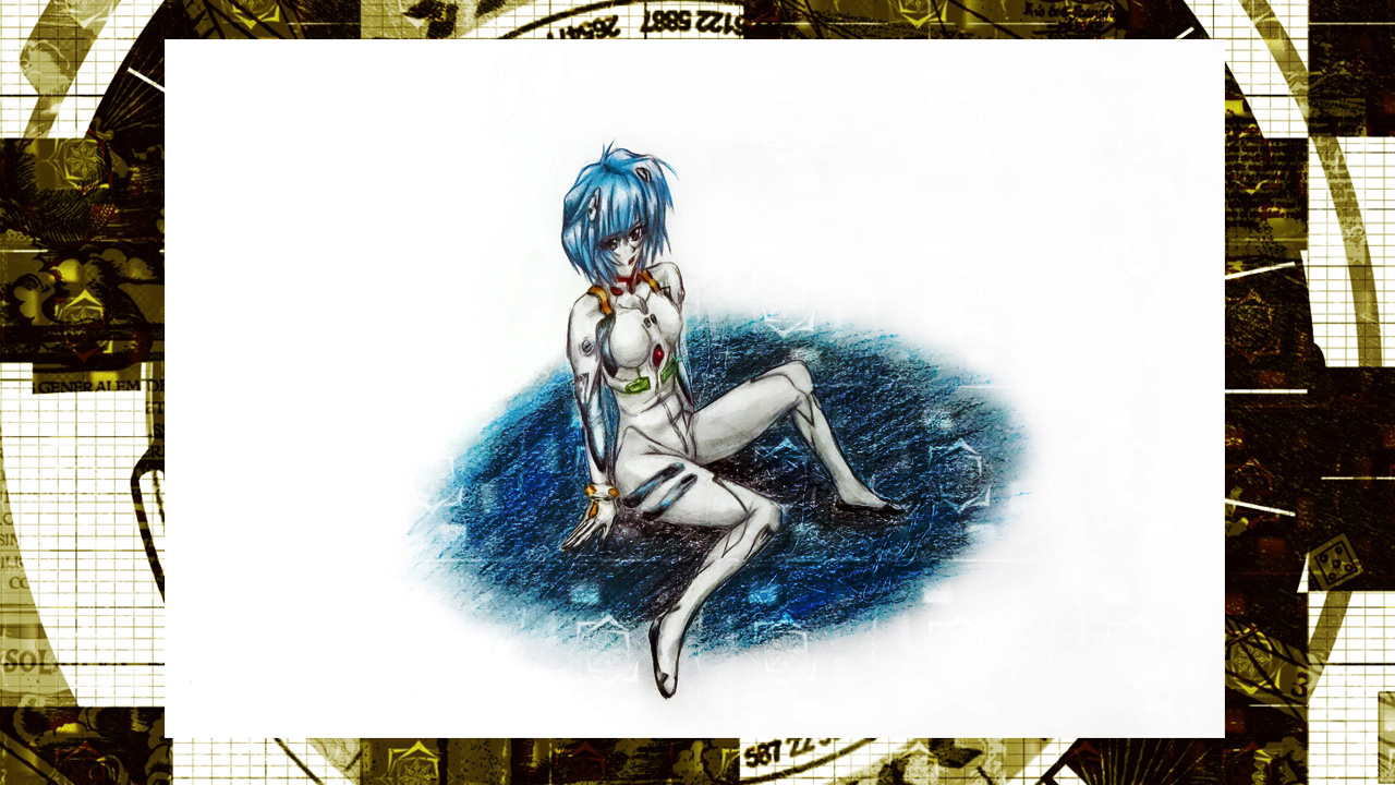
And so we continue with the Sailor Senshi series. This time it is the second member to be revealed in the series Sailor Mercury, real name Ami Mizuno. So far, I like her more than Sailor Moon. Though she hasn’t really made a strong impression on me either. On another note, I still don’t quite understand what Sailor Moon’s attacks are based on, most likely they are just random attacks that Naoko Takeuchi thought were cool. But for all other members, it seems like they have an elemental affinity tied to them. For Ami Mizuno it is water, so since the start I wanted to incorporate that. In the end I was thinking about it being either ripples or waves. I never really made up my mind before starting the drawing, but in the end I just combined them together. And surprisingly, it worked quite well together.

In any case, I hope you guys enjoy and learn from this video.

-XERO

XERO DRAWING – Sailor Moon Warrior from the Moon

Time spent: 7 hours 56 minutes
Materials used: Sakura 0.7 mechanical pencil, Faber Castell Perfection 7056 pencil eraser, eraser,
Sakura Pigma Micron set Sepia +Sakura Pigma Micron set Black, Sakura gellyroll White, Sakura Moonlight gellyroll: Yellow, light pink, Dark Pink,
Reeves Water Colours 18 set: Lemon Yellow, Medium Yellow, Ivory Black, Phthalo Blue, Violet, Ultramarine,
Copic Markers: R08, R27, R29, Y11, Y17, Y21, Y28, B01, B05, B34, B45, B97, C1, C3, W1, W2, V01, G21, G24, G28.

There was no video last week because I bought a new scanner, but it would not arrive till after a couple of days later after I usually upload a video. So I decided to hold it back and wait for the scanner to arrive. It is a large scanner that allows me to scan areas up to A3 (which is a scanner I have been looking for for quite some time). Now I can get a good quality copy of my artwork here at home.

In any case, for this weeks drawing, we will be doing Sailor Moon. I heard the new series would be broadcasted so I decided to give it a chance and see what it was about. I know I saw some episodes when I was younger but I only saw a few and don’t really remember much. So I said, what the heck, lets give it a chance. After all, I kept hearing good things from both females and males about it. My overall impressions at this point? Personally the old animation looks more appealing to me, but it definitely doesn’t look bad at all. I hear this series is following the manga better so I will see this through to the end to see how good it is. I gotta say, Usagi is rather dumb… But I guess that’s a common feature among Shoujo heroines (as well as Shonen heroes of course). We’ll see how this goes.

-XERO

Xero Drawing – Erza Scarlet Yūen no Koromo (COMMENTARY)

Time spent: 9h22m

Materials used: Mechanical pencil, ruler, eraser, Faber Castell eraser pencil
Colored Pencil: water color PrismaColor – peacock blue, ultramarine blue, french grey 20%, true blue, violet, black, crimsom red, lilac, white, blush pink
PrismaColor – ginger root, peach, beige, cream, sand, light peach, 20% french grey, lilac, parma violet, dark purple, mulberry, carmine red, pink, process red, yellowed orange, crimson lake, 50% warm grey, 70% cool grey, 70% warm grey, 50% gold Grey, White, Black
Crayola – pale rose, violet, brown, taupe, lemon yellow, jade green, harvest gold, magenta
Rose Art – violet, orchid
Verithin – dahlia purple
Ultra Color – purple


We have made it to the second video, this time the objective is Erza Scarlet from Fairy Tail. A good series (that relies on way too much fan service…). For this drawing I thought I would only use color pencils and nothing else. I figured I would try to show different techniques that can be implemented with different tools. The most common one that people can easily get their hands on are color pencils. They are rather versatile and can leave some really good effects, but only if used right. I’m mainly a pencil type of artist so I’m a bit shaky when it comes to coloring. But I have been practicing and coming up with new methods ever since I decided to go pro. I’ve actually been starting to understand how to fully utilize the full potential that color pencils possess. And that is what this video will be about.

Hope you guys enjoy the new format, and learn much more this way. Till next time.

-XERO


Sorry it’s taking long.

I’m currently working on the first video of the new series of videos, but because of some life made delays it is taking a while. But it is going well. I want to add quite a bit of new elements that will make it more enjoyable to viewers so I want to make sure the long wait is actually worth it. But once things have been taken cared of, I plan on making videos on a weekly basis. So please look forward to that.

-XERO

Long time no see.

Man, no matter how much I tried I was just not able to continue posting (finals and other things have been piling up quite badly, but I will be done this week). But that does not mean that I wasn’t thinking about what I should be doing. It’s obvious that many of my drawing videos have not being doing too great. Mainly of course because I have not maintained consistency which is of utmost importance, but also because I have not been doing what people actually want to see. It seems that for most videos, specially those with minor movements and whatnot need to have commentary to have people drawn in. Also this helps viewers have a connection to the creator. I knew this before of course, but I wanted to test out if I could break free from those restrictions. The end result was mixed, some got quite a few views while others were abysmal (which sucks because the drawing it self was rather good). Another reason was because of the background noise that would appear. So my original plan was to buy a good microphone, but that would take too long, and it wouldn’t be good to invest in something that would not guaranteed results. So I will be using my phone instead which surprisingly has a good microphone built in. And luckily there are plenty of freeware audio editing software to edit the recordings if needed. So when I finally come back, that will be what I will be doing with my videos from now on. Whatever the reasons I would like to apologize for disappearing yet again, I can’t control the outcome of events to come, but I will do my utmost to overcome them whatever they may be. Specially since summer vacation is finally here.

Now for my other plans… my main channel will now be taking requests again. I’d say I had enough time to draw what I liked, so it’s time to give back to others. One difference is that I’m thinking of giving the artwork away, but I have not thought out the specifics yet so more on that later. My other channel darkcloudxero.extended will be used to answer questions (that I do not do in my main channel) and talking about any other things regarding art or anything in general.

One third thing, I would like to create one third channel, this one will be used for myself mainly. If you have been following me lately, than you know that I really like Morning Musume … well sort of. What I really like is the time between 2007-2010, what I and many other fans of that time like to refer to as the Platinum Era. There I will be doing different types of videos regarding that specific formation. It’s kind of funny how 4 years have passed now, and I am still thinking about them nonstop. It’s crazy in a way. But that’s how influential they have been in my life so I will be supporting them for as long as I can. Specially now that that last remaining member of that Era Michishige Sayumi is leaving (and in a grand way might I add). The sad thing is that the Platinum Era is being blamed for their popularity drop even more so now that the current Morning Musume has gained a lot of popularity lately. So I will be giving my own opinions on that and everything else in the channel mentioned before.

On a side note, it has been raining nonstop where I live. Some people don’t seem to like the rain, but I love it. And now it has me in a nostalgic mood.

Till next time,

-XERO

Kuroko Tetsuya

So this weeks artwork will be featuring Kuroko Tetsuya from the Kuroko no Baske (“the basketball Kuroko plays”), a series that is much like Captain Tsubasa (except instead of Football, they play basketball). This means that there will be young school players that have extraordinary techniques that makes one think of Dragon Ball (minus the fighting). It is an amazing series and has the type of characters I like as a protagonist (the main one anyway), a weak player in all areas except passing. This means that he has a lot to improve throughout the series. And sure enough, the series delivers. Despite his weaknesses, Kuroko uses his strengths to make his lack of abilities more than make up for it. I don’t want to delve too much into it, so if you have not seen it, make sure to do so as soon as you can.

I have decided to finally start working with my collection of Copic markers I bought a couple of years ago. The smoothness that I can achieve from them always leaves me amazed to no end (though I still need to work on not using too much ink on my artwork). I started with a simpler design, but eventually decided to add a dark background to it later (backgrounds are still my weakness). Looking at them side by side, I think the simpler “light” design is still my favorite. But the “dark” design doesn’t look bad either. What do you guys think?

Kuroko White background

Kuroko Dark Background

Artist Project Update 2/28/2014

I missed posting on Monday again. But just like last time I was working on another contest that appeared right after I had finished writing last Friday. This time the theme was for the new film The Wind Rises (Kaze Tachinu), which will be Hayao Miyazaki’s last film. It still requires that weird format, but this time I had last competition’s experience under my belt. This is what I assumed would happen if I kept joining contests since it forces one to produce quality artworks in a small amount of time that requires one to keep a deadline in mind at all times. I felt I could do even better, but this was a big leap from the last entry. With this format (2000 x 550) it was still a bit annoying but surprisingly I did better. I decided on a theme that touched upon the harsh past that flowed to a  brighter future because of their meeting each other (sadly judging by the trailers the woman protagonist will most likely die from tuberculosis). I could only come up with so much by seeing the trailers and reading the extremely short synopsis given by deviantart.

This time I decided to work with my small collection of Copic markers I bought a couple of years ago, I was hesitant in using them because of how expensive they were. As well as my struggling ability to work with color (though I have been getting much better). To my surprise, using them was extremely intuitive. Mixing, blending and just coloring was much faster and effortless than with color pencils, which require a lot of work to have the colors stay on the paper and meld with the picture it self. There is this new technique I have been thinking of using for quite some time now, and seeing just how much I can bring out of the markers and color pencil (though I still need to work more on the color pencils) I can see the vast possibilities I can bring to my work.

The drawing and design for this piece was definitely better than last times, sadly my camera was not able to capture all of it’s greatness. The end sides got distorted because they bend up, making the drawing and colors blur. I just might have to invest on a big scanner. It’s a pain but it will be worth it if it shows my work in it’s original intended form.

In any case this is my entry:

The Wind Rises - warm breeze


Until next time,

-XERO

Artist Project Update 2/21/2014

Sorry. It seems I disappeared again. Luckily it was only for about a week. The reason being that I was working on an artwork for the “Lightning Returns Deviant Art contest”. I only had five days, and the weird format it had to be in was rather tough for me. I struggled a bit working on it because of this. I’d say doing the background was what made me worry the most. I had to come up with something that melded well with the actual drawing/design, but also not overtake the attention from the actual focal point. I worked with a lot of background designs, till I finally decided to make it as simple as possible.

Seeing the other entries, my hopes of winning are slim. It seems that quite a couple of them have a bit of experience in these types of formats and situations. I soon realized just how much I have to improve in  a number of areas. On the plus side I did learn a couple of cool new trick on photoshop that I plan to use and perfect for future artwork. Again, my biggest weakness is coming up with backgrounds. So that will have to be the focus of my training regimen. In any case, competitions really help hone one’s skills and show one’s weaknesses. Having that in mind, I will try to enter a couple of more in the coming days and see how much I improve.


Here’s my entry.

Lightning Returns Ace Swordsman


Unit 01 Beast Inside

Here is the drawing for this week, Unit 01 from Neon Genesis Evangelion. I was pretty much done with it yesterday, but there was something that kept bothering me about my drawings. The fact that they look so unrefined. I knew why that was of course. I did not blend the colors anymore. This happened because I decided to practice doing this so that I could increase my abilities without the need to blend them, that way once I decided to go back and put some good effort into my work I would be able to produce some amazing stuff. Sadly I got so used to doing this that I had almost forgotten the blending techniques I had developed. And because of it I have to start all over again. I gave it a try for this drawing which came out pretty well (though it looks unfinished without a background, I’ll have to do something about that from now on). Now that I have remembered a couple of my old techniques and about blending colors, I will try to bring out some better quality work from here on out.

Hope you look forward to it.

-XERO

Print Available
Print Available

As you can see, this week I do not have a video for this week. And that will most likely be the case from now on. More on that on Friday.

Rei Ayanami, the person that got me interested in Neon Genesis Evangelion (well her and the song “A Cruel Angel’s Thesis”) . Strangely enough, even though I wasn’t let down when I finally saw the series, Asuka stole my attention as soon as she appeared. I feel that in the remakes of Evangelion Rei seems to have more of a future (much like Asuka). I am really looking forward to see what happens in the last movie.

As for the drawing it self. Over all I was really pleased in how it came out. But while drawing this I made a lot of mistakes which led me to make a couple of changes that led me to create the blue shadow. I have always wanted to play around with these kinds of backgrounds but over all I think it brought down the quality of the drawing it self. I’ll have to work on that a bit more from now on. On the plus side, while adding the watermark it gave it a really cool effect.

Print Available
Print Available

Create a website or blog at WordPress.com

Up ↑