Pixiv School Girl prompt

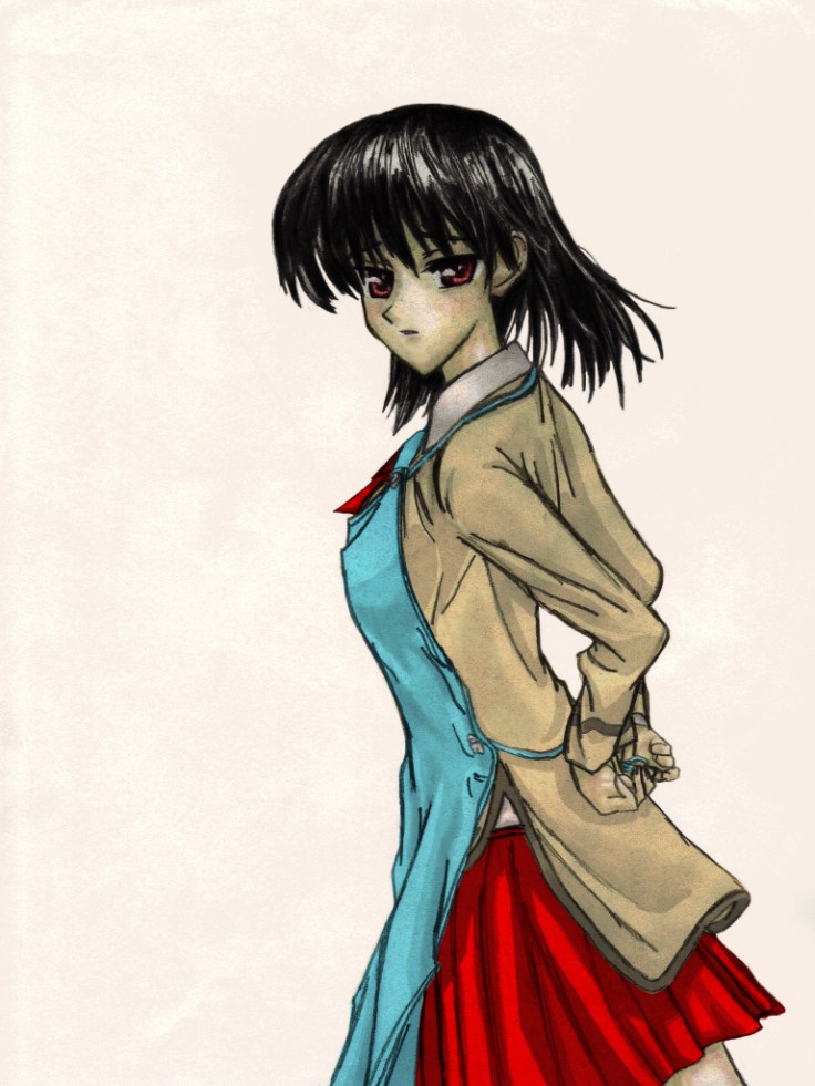
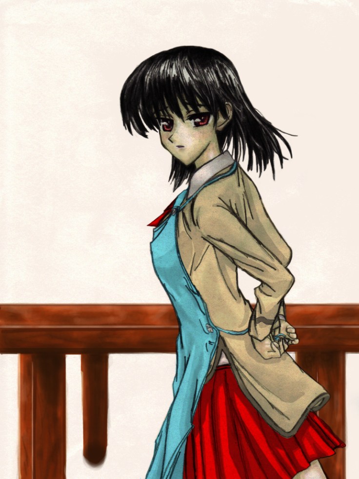
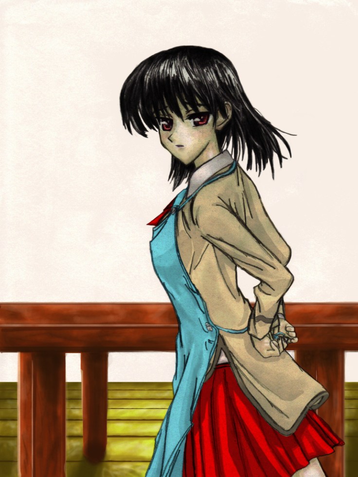
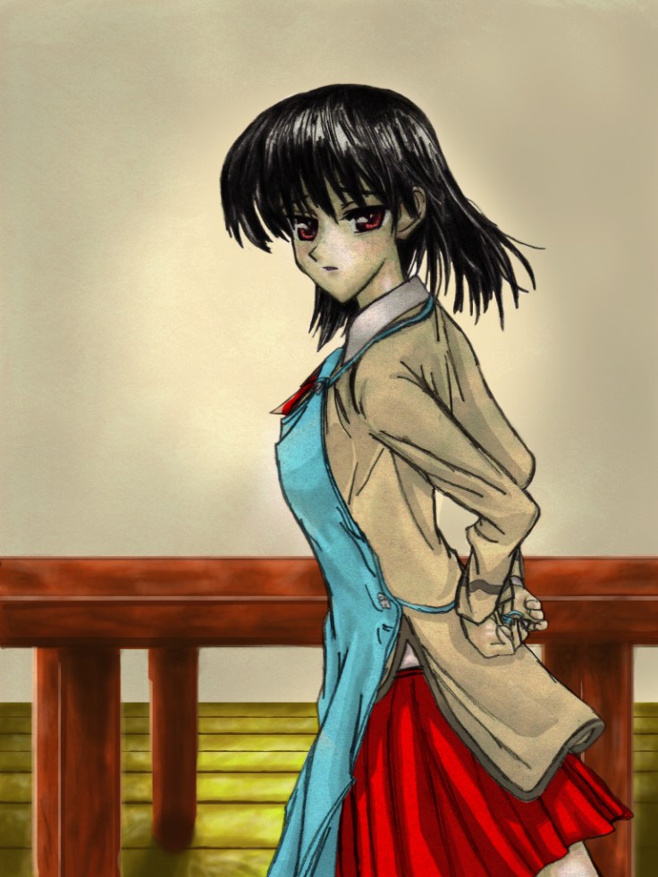
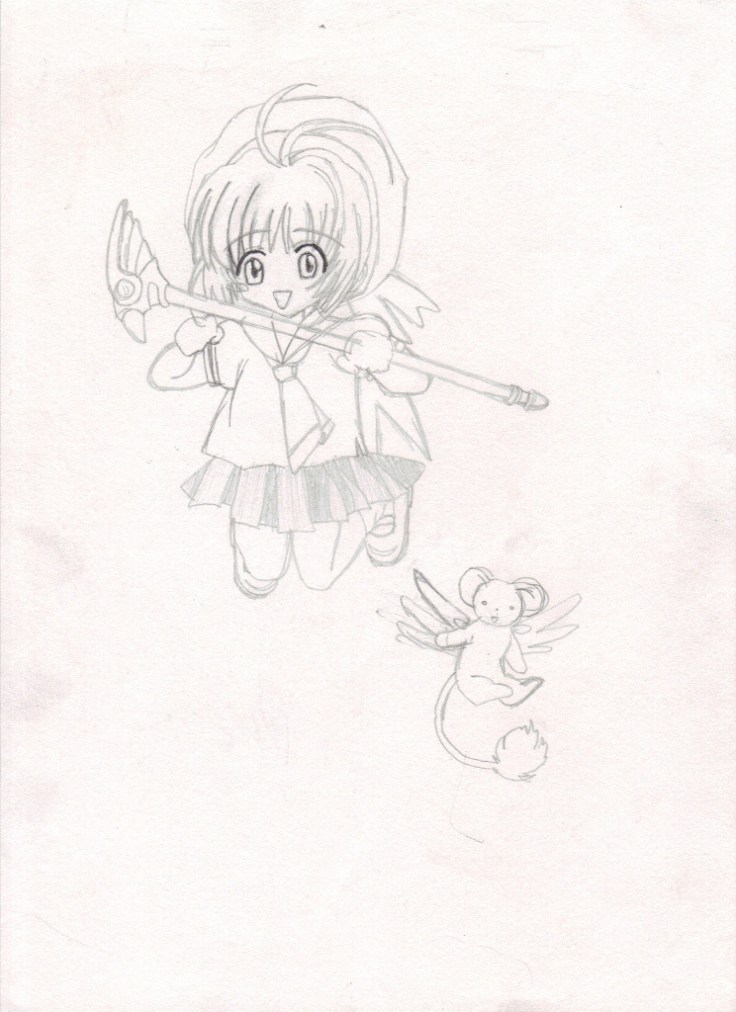
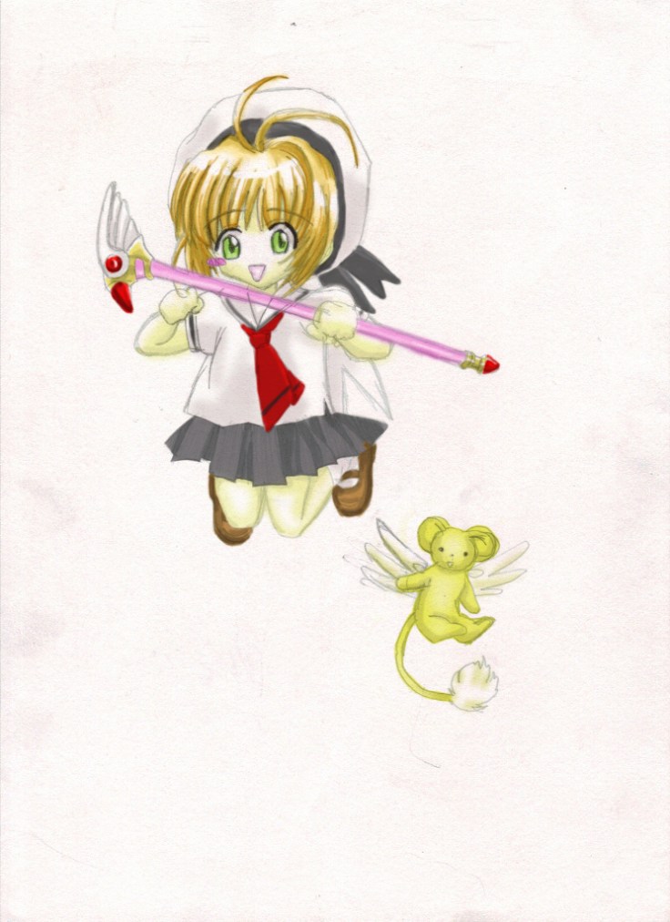
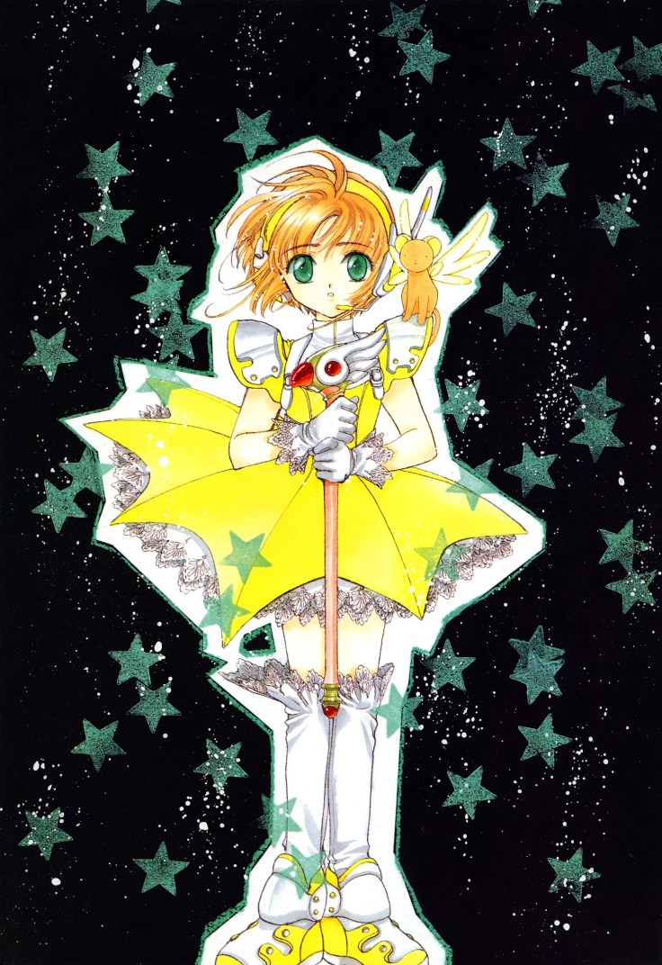
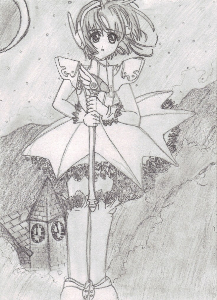
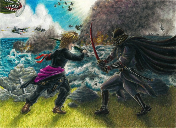
Hey, let’s keep playing around with the Pixiv prompts. This time it’s sailor uniform. I’m still trying out different simple coloring techniques. No matter how I look at it I prefer to add a bit more colors. Leaving it too simple just doesn’t seem right. I guess my style is starting to develop. (・∧‐)ゞ

I should be able to push it even more but I don’t want to spend too much time on one piece right now. I just have to keep drawing everyday and let my skills develop naturally. Once I get to a level I feel is good and also feel my speed is fast enough then I will start playing around with adding backgrounds.

Let’s see what happens.

The finished piece:

Reference used, altered to fit the theme among other things:

I drew it and inked it traditionally first. I truthfully prefer drawing this way though I have gotten used to doing it digitally.

This flat color style doesn’t look bad.

That’s it for now. I’ve been working on other pieces but I feel I should try to make and upload a piece a day so I can brute force my development.

Hasta la proxima,

-NUBE


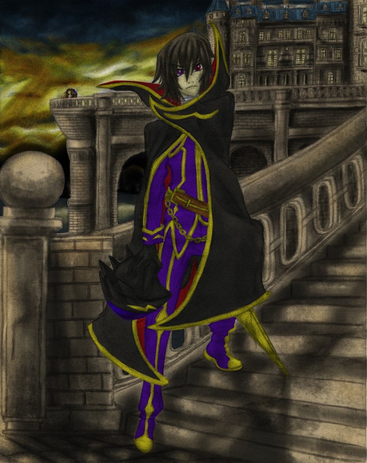
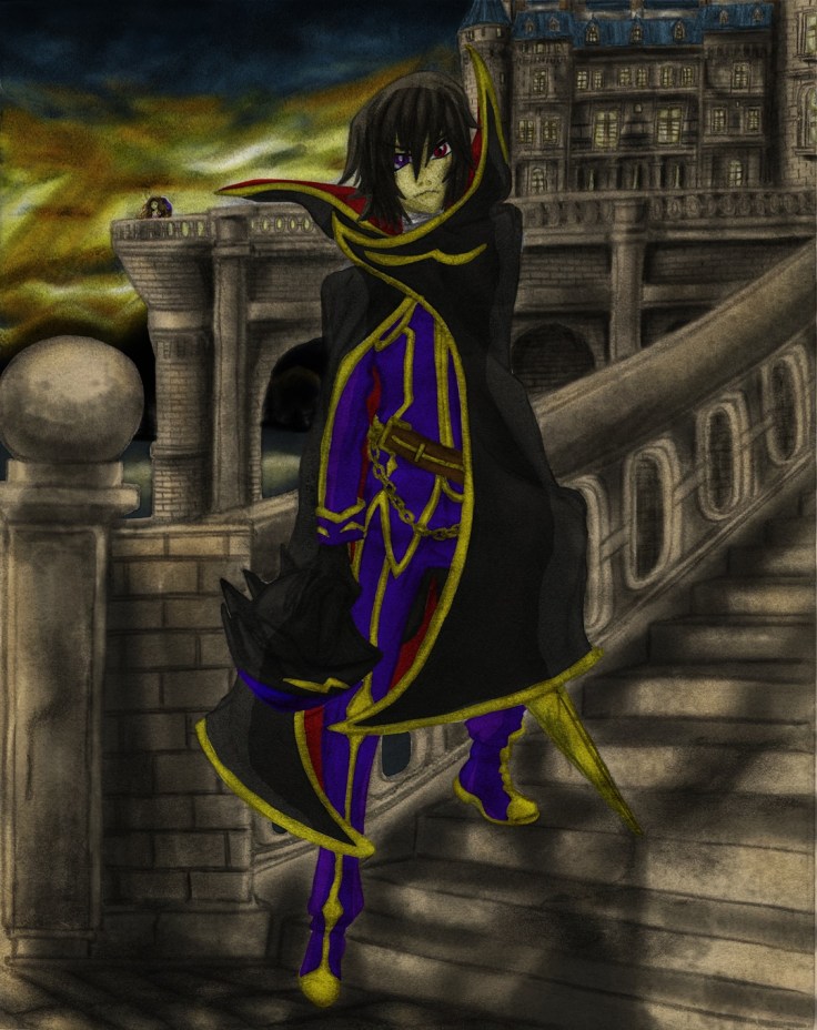
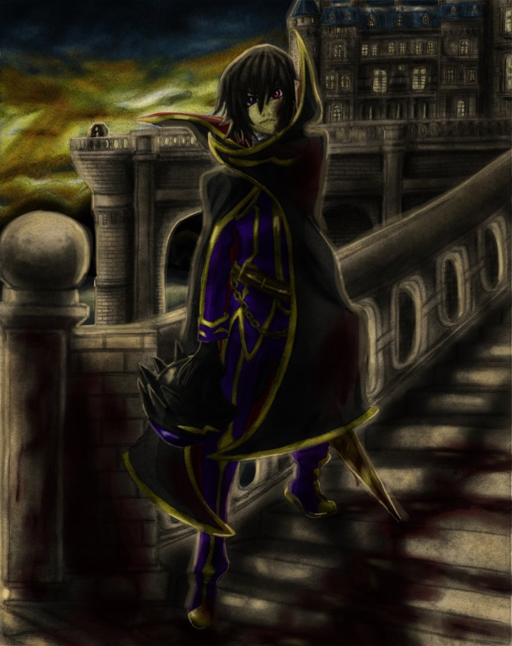
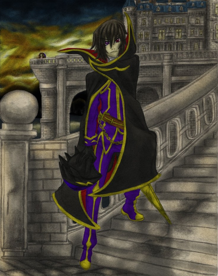
Actual Lelouch final

So after taking a small break from the Lelouch drawing I decided to go at it again to make a couple of little tweaks. But before that, here is how the drawing looks without the original drawing:

Lelouch no drawing resize

It looks really funny.

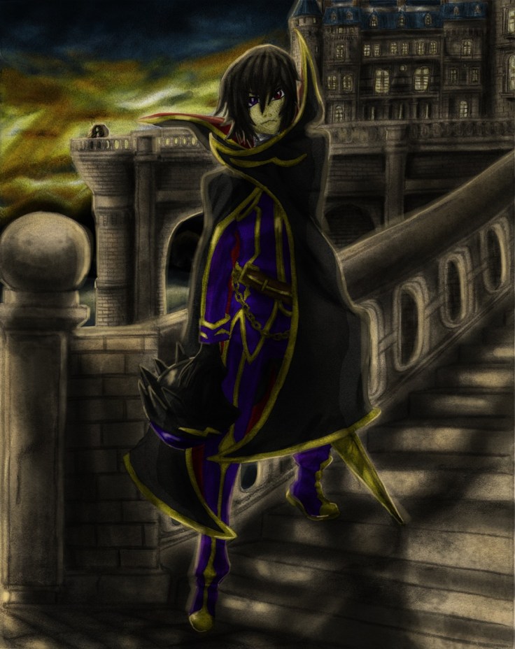
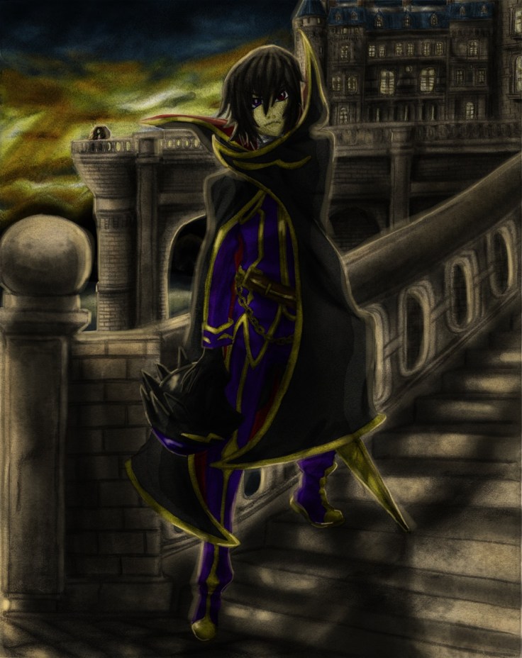
But any way here is the actual final piece:

Blood stained gift for her future darker resize

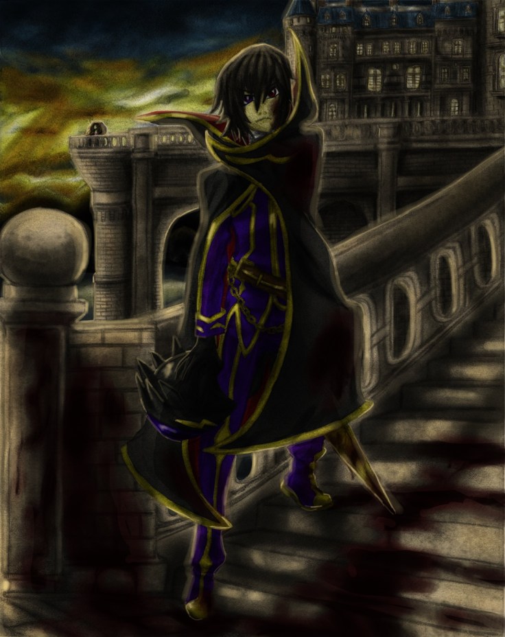
I just eased the blood lighting, darkened some areas especially on Lelouch and I also added the Geass. I don’t really want to spend too much time on this so I will leave it as is. This was a good test of what is possible.

Hasta la proxima,

-XERO

Traditional X Digital (Color) IV II Final

It, took longer than I expected…

I really thought I would have been able to finish this one quite easily, but in the end as usual it took quite some time to go about modifying areas over and over as I went along. Luckily that doesn’t surprise me anymore and can work on that as I go along. Color theory is still a bit of a pain, but I feel like I am getting the hang of it. The great thing about coloring digitally is that I can make as many mistakes as I want and I can always go back and fix it. On top of that I don’t have to redo my whole work either, I can just change the hue of the layer and modify it so that it fits with the overall picture.

This one was quite technical. Digital art isn’t as straightforward as traditional (although traditional is harder and requires quite a bit of thinking beforehand, in essence it requires a lot of skill and concentration). With that in mind I made sure to use every technique I have picked up so far using digital color to acquire a good image. It is still lacking compared to the pro digital artist, but I feel like I have gotten one step closer. This image had numerous layers that allowed me to get the feel and effects I was imagining.

There is one revelation that became quite clear as I was working on this piece though, and it’s a really important one. Coloring pencil artwork might not be such a great idea. It’s quite tough when they actually have a background. Because there is only so much one can do to smooth things out and have as little areas that aren’t uniformly shaded, this create areas that are very… rough, uneven, grainy, etc. These defects get passed on to the digital artwork. And although I can probably use this to my advantage in some artwork, it won’t work for most of it. For this piece I spent quite a bit of time just trying to downplay the amount of grainyness from the pencil shading that gave it a “dirty” look when colored. This is quite disappointing…

Of course I have thought of other ways to use these same shadings to my advantage on some future projects, but as explained before, it won’t work with everything. It seems that this technique will work best with simple drawings with no background, but will work even better with using artwork that only focuses on the outlines for me to color in digitally.

Hmmm…. I do have one more drawing I wan’t to try coloring though, it is also done with pencil but this one is done on a much higher quality paper that I managed to pour all of my skills onto (well, at least at the time). So I wan’t to see just how big the difference is.

In any case I do want to finally show what I managed to make. Don’t know if I want to add it to the gallery though… What do you guys think? (for now here is the final piece, I’ll upload pictures showing the process tomorrow on this same post. It’s quite late right now and I really want to take a break and rest for a bit):

Here are some pictures of the process, will add the “whole” process later in video form (something new I want to try out):

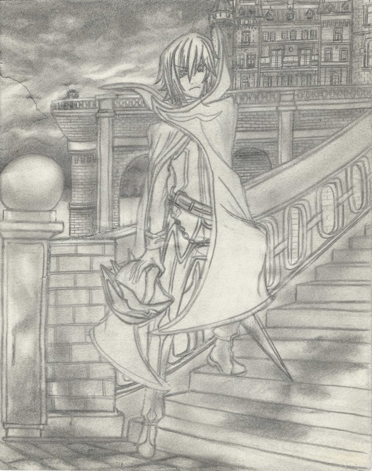
So from where we left off last time, here I went over it and shaded the drawing a bit closer to bring out more details. Doing that had some collateral damage though, now there are even more rips on the paper.
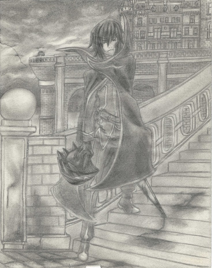
Lelouch III cropped resize

And as expected the longer I worked on it the worse the rips became, it was really annoying but luckily I have some experience dealing with rips.
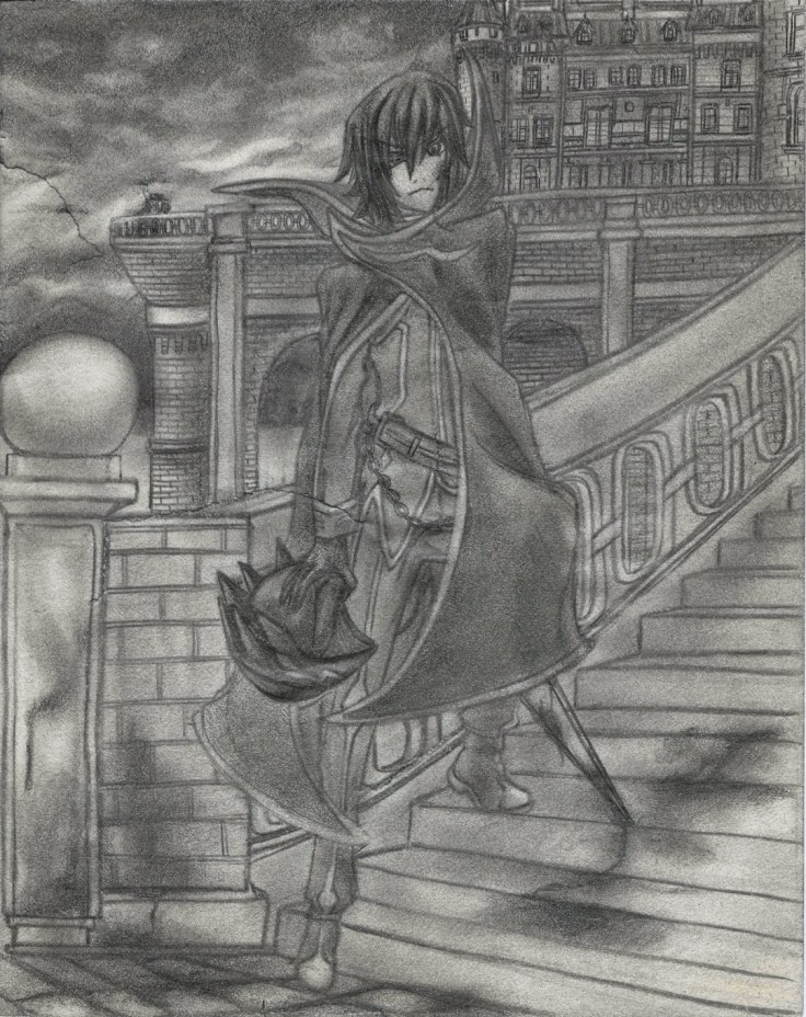
Lelouch rips not fixed resize

Rips fixed! I went ahead and started repairing it digitally using the clone tool which took me quite some time to understand… make sure to right click the area you want to clone as you hold the Alt button if you which to copy the right area instead of struggling to find out why the clone tool is painting something you don’t want. In the end I found that the best tool for the job was the healing brush tool since it blended in the area according to the surroundings. Of course it also had it’s quirks so you have to pay attention and do small areas as you go, but it’s quite easy to use and made repairing the rips quite easy.
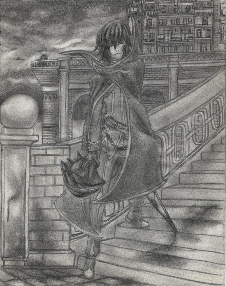
Lelouch rips fixed resize.jpg

From here I just started to add color using the method mentioned on my other posts of Traditional X Digital.
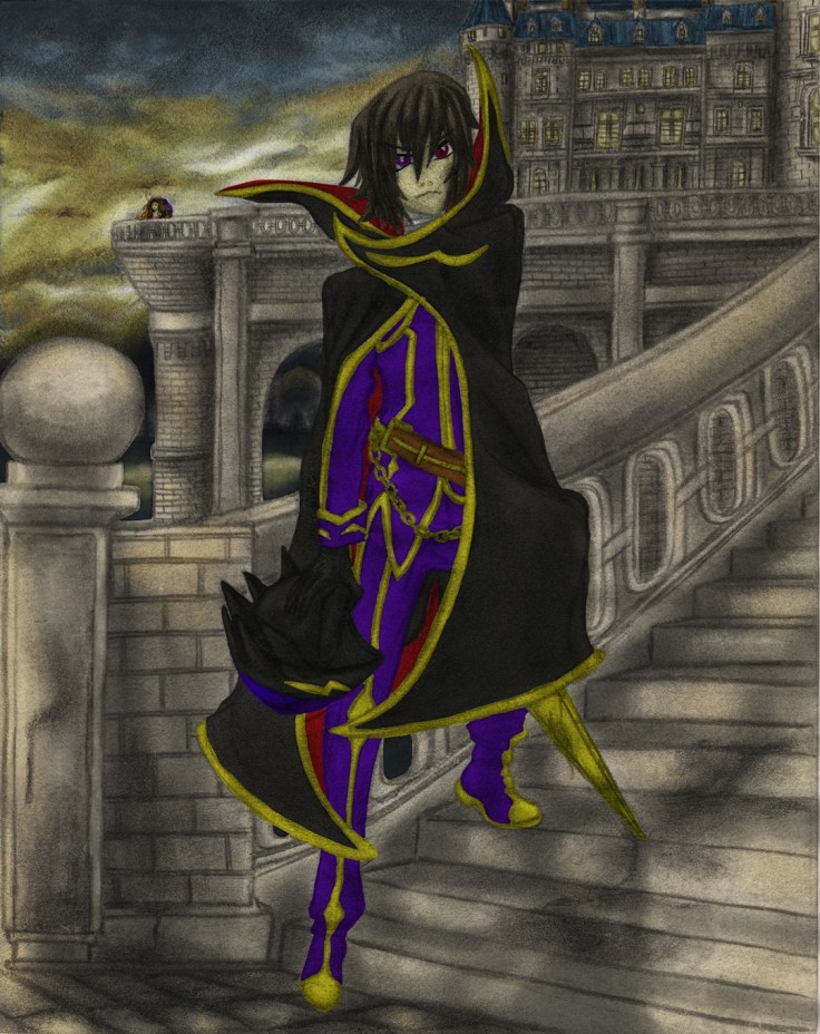
 

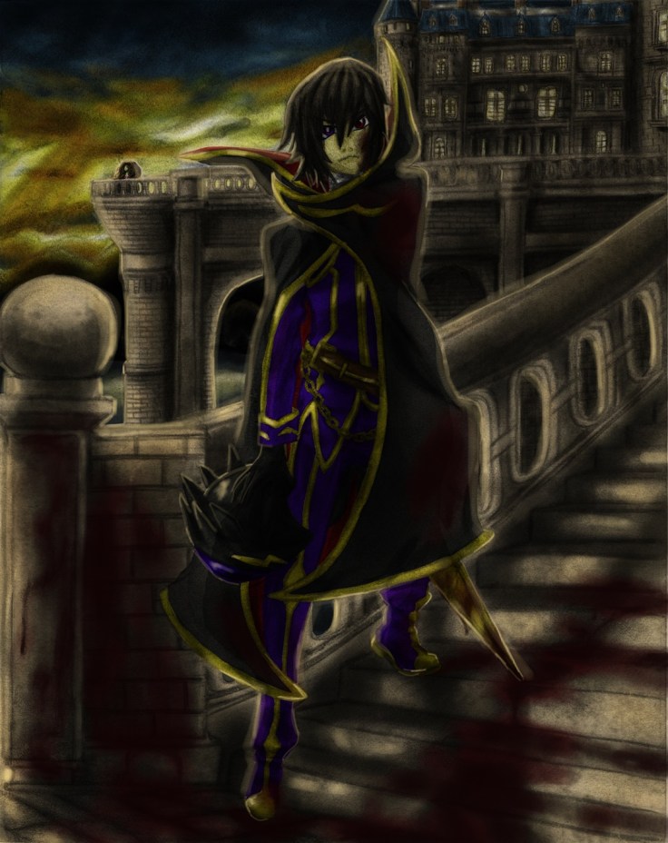
Lelouch IV resizeLelouch V resizeLelouch VI resizeLelouch VII resizeLelouch VIII resizeLelouch X resizeLelouch XI resizeLelouch XII resizeLelouch XIII resize

Lelouch - Blood stained gift for her future resize

I did the best that I could digitally on this one. I have a ways to go, but I feel it look much better than it would have looked had I tried this even just a month ago. I’m no longer afraid of digital, I’ll make sure to understand it more as I continue to polish my skills in all areas!

That is all for now (Aside from adding that video I mentioned above).

Hasta la proxima,

-XERO

Traditional X Digital (Color) IV

Here is the next project for the Traditional X Digital series. This one is different in that it is a somewhat recent piece. I had it originally as a rough draft, but I guess at some point I forgot that and added way too many details to it. It was also originally going to be a drawing that I would make for a Youtube video as a request. But if I remember correctly I ended up drawing a simpler drawing with no background for that. I wonder if the requester even saw that video…

In any case, as I was working on some other work, I remembered I had this piece that just needed a couple of detailing and shading to bring it back to live so that I could color it digitally. This was specially important because the sketchbook I use is a really cheap one that has very sensitive paper. Since I only make rough drafts on it I don’t mind, but since it does contain this one piece that I don’t feel like redrawing since it looks quite good and has a lot of detail, I decided to just finish shading and polishing this piece.

Despite taking some care, as expected I did end up creating some rips all around the drawing. Which kinda sucks, but I should be able to revive it digitally. For now i should just focus on shading and finishing this piece. Since this one actually is an original piece I should be able to put it on my gallery (assuming it comes out great). So please look forward to that.

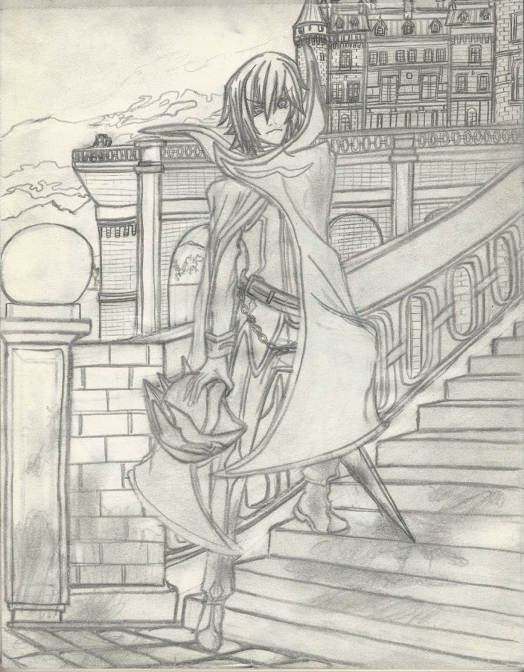
Here are some scans:

Lelouch I resize

If you look around the drawing you should be able to see the rips I sadly made on the paper as I was working on it.

Lelouch II resize

Well, that’s it for today. I will keep working on it, and hopefully will be done soon.

Hasta la proxima,

-XERO
Traditional X Digital (Color) III

This is the third try at coloring. This time I will be using an old piece from 2008. This one is from one of my top manga favourites School Rumble. The reference used for this recreation came from Vol. 1 Chapter b01.

Here is the original:

[Yanime] School Rumble b01-02

I remember the first time I saw this page I fell in love with the artwork so much that I just felt compelled to recreate it. I noticed that there isn’t much shading done on my attempt. I wonder if that is because I drew with pencils not much stronger than HB or because it is so old that the graphite has rubbed off? Or maybe this was back when I was still trying to master shading?

In any case here is the piece I used to practice my digital painting:

2008 Yakumo getting ready (768x1024)

I’d say i got rather close, although my lines are quite rough thus showing how much I was struggling making fine lines and making a clean recreation. On top of that the lack of shading does make coloring digitally more difficult. Despite all that, I am quite amazed at how it turned out.

As for my first attempt to color it, here it is:

2008 Yakumo getting ready (768x1024) Single layer

It doesn’t look all that much special does it? Take into account that I did do quite a bit of work on this piece. I also added quite a bit of details with countless layers to add more depth to the drawing, but in the end it still looked rather mediocre.

That’s when I remembered a technique I had been playing around with when I was painting the first Cardcaptor Sakura drawing. And that is to add a duplicate layer of the drawing (specially if the if it lacks shading) so that it can give it more depth and detail. So here’s how it looks after doing just that.

Remember I just duplicated the original drawing layer (the drawing layer is all on it’s own set above all layer, marked as Multiply):

2008 Yakumo getting ready (768x1024) Double layers

Doing something so simple gave it so much depth, and I really didn’t have to change any of the colors to achieve it. It’s quite wondrous how much the drawing and colors changed just by duplicating the original drawing. The hair alone was giving me problems, but this one technique gave me the color and feel I was looking for.

After this I tried adding some more details like a bit of blush and more details around her body:

2008 Yakumo getting ready (768x1024) (COLOR)

After this I just tried playing around to try and create a background from scratch just using my imagination and the tablet. I did ok, and would just need to add a bit more layers of detail on all aspects to truly bring it to life. But in the end I see no need for that since I can do that and more just by doing it traditionally first then applying color later.

In any case here are my unfinished attempts at creating a background:

2008 Yakumo getting ready (768x1024) table2008 Yakumo getting ready (768x1024) Table and Floor2008 Yakumo getting ready (768x1024) Table, Floor and wall

It looks quite out of place next to Yakumo, but making it all fit would require quite a bit of tweaking to make it all cohesive and look good. But I think I should just develop my own style for now and learn how to make art digitally that way and then eventually learn about making all digital work (at least for backgrounds) later on. Though I will just end up integrating those techniques to work along side mostly traditional artwork.

I will stop working on art for a bit so I can work on that Youtube video I mentioned before. I want to try and make something different and that’s also high quality, so that will probably take me a bit to make and edit. Hopefully not too long.

Hasta la proxima,

-XERO
Traditional X Digital (Color) II

Here is another go at coloring digitally. For this one I will be doing a much more simple drawing with no background. I wanted to use only about two different varieties of the same color to see how simple coloring would look on a drawing. This drawing is again of Cardcaptor Sakura and also from 2006. I know this is a reproduction, but I don’t know where I got the reference from. Most likely it is from one of the volumes of the manga, the things is I just don’t know which volume… So I apologize I can’t show you the original this time.

In any case here is the scanned drawing:

2006 chibi Sakura and Kero (744x1024)

It’s a bit rough, but it will do. It is a very simple drawing that I can just apply color to it.

2006 chibi Sakura and Kero (744x1024)

So for this drawing I tried to use some of my traditional techniques. On top of that I used some the few digital techniques I picked up so far.Not looking too closely, it almost looks like if I colored it using Copics. And that makes me ecstatic. Of course this is still a bit new to me, and I have much more to learn. The road seems to be a long one, but I really hope I can grow exponentially as I go along.

Here’s working towards the best!

Hasta la proxima,

-XERO

Traditional X Digital (Color) I

A few days ago I said that I was working on a new technique where I digitally colored an old drawing that I had archived and scanned. From there I plugged it into Photoshop and after converting it to a layer and setting it on multiply I placed every other color layer below the scanned picture. What is amazing about doing this is that I get to keep every single detail that I placed on that drawing once I color it in. This is great because I really suck at drawing on the tablet. I prefer traditional. I’ve gotten to the point that I can draw traditionally very good at a really good pace, but when it comes to adding color… I am still learning and that is where most of my time now goes. And since it takes so long, I don’t have time to practice digital art. Doing this will be the best of both worlds! (If you have been reading the past posts you may be wondering why I keep repeating all this. The reason is simple. I am super exited that I can do this and am really looking forward to when I get to master this technique.)

For the first piece I will use to try out this new technique (at least to me anyway), I will give the honor to a drawing of Sakura Kinomoto from Cardcaptor Sakura (one of my all time favourite animes, and a fond childhood memory). This was done at a time when I was still learning how to draw by mimicking my favorite artist (almost all my old drawings are reproductions of one thing or another). This is a drawing I tried to recreate from one of Cardcaptor Sakura artbooks.

This is the piece I’m talking about:

233

I still couldn’t let go of a lot of my habits from traditional drawing… I will have to try and develop some new ones. The best way is to learn from others that have already learned how use the digital medium, and luckily there is  alot of artists making Youtube videos showcasing their artwork and techniques so really it is just a matter of looking for it.

Anyway, here is the drawing I did when I was around 14 or 15 years old.

2006 Sakura (740x1024)

Now as to why the drawing is inverted is any ones guess (no seriously I really don’t know why, maybe the copy of the artbook I got was inverted because it was Japanese and  they decided to have it open like western books here in the States… thinking about it, that might not be far off.)

Now as for the first piece to go through my fledgling digital abilities, here it is. I will admit, it isn’t the best coloring job ever but I did the best I could with my current digital art level.

2006 Sakura (740x1024) Colored I

It may not look like much to you, but for some reason this did take me quite a few hours to do. Aside from painting it over I was also messing around with my tablet and learning keyboard shortcuts along the way. I actually learned quite a lot from this piece and also configure my tablet’s buttons to do all the shortcuts that I felt I would need the most to move in the most productive way possible. The original scanned drawing doesn’t have much detail or shading so I do wonder what kind of effect it would have on it when I add even the most simple of coloring techniques?

Well this was a quick update on the beginning of my quest to mastering the elusive Digital Artwork!

Hasta la proxima,

-XERO

RebelsRebels vs the Empire – A fight between father and Son

Sorry for disappearing again, the end of the semester is coming upon me and things got a bit out of hand. I just need to finish a paper and I will pretty much be free of school obligations.

Anyway, after much thought I think it is finally time to make this piece go fully live. And like with all my previous works I have finally decided upon a name (although I had one a  long time ago but I forgot), “Rebels vs the Empire – A fight between father and Son”. The theme of this piece is set in the 1940s when WWII took place. A lot of influences were drawn from Germany for the Empire after all, and of course there’s the whole Japanese influence (mainly the ideas of samurais, ki, etc.).

So with that in mind I had Darth Vader use a German uniform. I really liked the baggy pants which aviator divisions (among others) used. I thought of making his buttons different colors, but decided against it. The idea of making a communication device provide those light did come to mind, but the place I wanted to place it on would be covered by his arms so again I decided against it. I thought of making him go in all black, but I decided for a mainly three color scheme of black, gold and grey. I really wanted some more variation within Vader’s uniform. Plus I had the idea of having some type of armor beneath his jacket and pants (some of which can be seen on his arms). The idea is that the technology isn’t there for fully robotic prosthetics, so what if he just had his burnt skin replace with metallic armor?

As for Luke I wanted him to portray some influences of Japan, but also the Allies from WWII. I eventually decided on a combination of Yankis (specially since he represents the rebel forces) and some parts of the uniforms of the allied forces (which pretty much just ended up being the boots, undershirt and maybe, just maybe the pants). I could’ve gone for a camo pattern, but since he is supposed to be like a delinquent he wouldn’t follow the rules would he? So the decision was made to have him in all black like in the final movie (0f the original trilogy).The jacket I wanted to look like those that Yankis wear. They tend to put nonsensical (usually) kanji together that sounds cool and tough into a completely made up word or phrase. So I decided to do the same. It was actually quite fun to do and now understand why Yanki do this (and why they get some weird words and phrases that don’t make sense). I used Kanji for “Rebel + Alliance” on the right arm and “Defeat + Evil Spirit” on the back. I was going to add something else to the left arm but decided (mest up/forgot) to not put anything on it… The Rebel crest is also there. As for the red cloth on Luke’s left arm, I was thinking of the headbands used by Yanki, but I decided to put it on his arm.

Finally, as for the swords, I used the colors from their final confrontation.

The setting was originally going to be inside a battleship, much like in the movie. But after much thought I figured I could do more on a cliff where I could add air and sea battles to the background.

This was a bit of an annoying piece due to the amount of details and objects I had to keep in mind as I worked on it. Not only that, but as I added new objects and colors I had to go back to previously finished areas to have them meld well together…

But it’s now, finally, officially done.

-XERO

Rebels vs the Empire - A fight between father and Son resize

XERO DRAWING – Godzilla x Gypsy Danger PART II

Time spent: 11 hours 48 minutes (total: 17 h 08 m)
Materials used: Sakura 0.7 mechanical pencil, Faber Castell Perfection 7056 pencil eraser, eraser,
Sakura Pigma Micron set Black 03,
Sakura gellyroll White,
Uniball Signo White
Reeves Water Colours 18 set: Ivory Black, Phthalo Blue
Copic Markers: 100, C1, C3, C5, C7, W1, W3, W5, W7, Y11, Y15, Y17, Y26, YR04, YR68, B0000, B01, B05, B21, B24, B32, B34, B45, B97, BG10, BG13, BG72, BG75, BV00, E04, R00, RV14, R27, V01, G21, G24, YG03, 0

I’ve finally gotten done with this drawing! It took quite a long time. It took a total of about 17 hours and 8 minutes. The longest so far (I think). In any case, I’ll probably make a couple of slight modifications like adding more details to it before I add it to deviant art.

I made the drawing with them at the start of the conflict but ready to go with their strongest attack. I also wanted to try out a couple of new techniques, so I decided to make the scene dark, something I rarely do. Over all I am satisfied with how it turned out, but I also feel that if I were to do this again it would look at least a bit better and cleaner since I have a better understanding of the process I have to take to make certain effects like on the water, or making light.

As for who I like more? Obviously Godzilla. I seriously enjoyed the Pacific Rim movie specially because it was done by a paisano but, Godzilla has a lot of sentimental value to it. And I enjoyed the Heisei movies more (even though they were a bit cheesy at times). This goes for who would win in a fight as well by the way.

-XERO

XERO DRAWING – Sailor Mercury The Intellectual Warrior

Time spent: 8 hours 59 minutes
Materials used: Sakura 0.7 mechanical pencil, Faber Castell Perfection 7056 pencil eraser, eraser,
Sakura Pigma Micron set Black,
Sakura gellyroll White,
Sakura Moonlight gellyroll: Light green, Dark purple, Blue, Yellow
Reeves Water Colours 18 set: Viridian hue, Phthalo Blue, Ultramarine,
Copic Markers: 0, E00, C1 C3, C5, C7, W1, W3, W5, W7, YR00, Y11, Y17, Y28, V01, G21, G24, G28, BG10, BG78, B0000, B01, B05, B21, B24, B26, B28, B32, B34, B39, B45, B69, B97
Sharpie Oil Based PAINT White Fine Point

And so we continue with the Sailor Senshi series. This time it is the second member to be revealed in the series Sailor Mercury, real name Ami Mizuno. So far, I like her more than Sailor Moon. Though she hasn’t really made a strong impression on me either. On another note, I still don’t quite understand what Sailor Moon’s attacks are based on, most likely they are just random attacks that Naoko Takeuchi thought were cool. But for all other members, it seems like they have an elemental affinity tied to them. For Ami Mizuno it is water, so since the start I wanted to incorporate that. In the end I was thinking about it being either ripples or waves. I never really made up my mind before starting the drawing, but in the end I just combined them together. And surprisingly, it worked quite well together.

In any case, I hope you guys enjoy and learn from this video.

-XERO

XERO DRAWING – Sailor Moon Warrior from the Moon

Time spent: 7 hours 56 minutes
Materials used: Sakura 0.7 mechanical pencil, Faber Castell Perfection 7056 pencil eraser, eraser,
Sakura Pigma Micron set Sepia +Sakura Pigma Micron set Black, Sakura gellyroll White, Sakura Moonlight gellyroll: Yellow, light pink, Dark Pink,
Reeves Water Colours 18 set: Lemon Yellow, Medium Yellow, Ivory Black, Phthalo Blue, Violet, Ultramarine,
Copic Markers: R08, R27, R29, Y11, Y17, Y21, Y28, B01, B05, B34, B45, B97, C1, C3, W1, W2, V01, G21, G24, G28.

There was no video last week because I bought a new scanner, but it would not arrive till after a couple of days later after I usually upload a video. So I decided to hold it back and wait for the scanner to arrive. It is a large scanner that allows me to scan areas up to A3 (which is a scanner I have been looking for for quite some time). Now I can get a good quality copy of my artwork here at home.

In any case, for this weeks drawing, we will be doing Sailor Moon. I heard the new series would be broadcasted so I decided to give it a chance and see what it was about. I know I saw some episodes when I was younger but I only saw a few and don’t really remember much. So I said, what the heck, lets give it a chance. After all, I kept hearing good things from both females and males about it. My overall impressions at this point? Personally the old animation looks more appealing to me, but it definitely doesn’t look bad at all. I hear this series is following the manga better so I will see this through to the end to see how good it is. I gotta say, Usagi is rather dumb… But I guess that’s a common feature among Shoujo heroines (as well as Shonen heroes of course). We’ll see how this goes.

-XERO

Xero Drawing – Erza Scarlet Yūen no Koromo (COMMENTARY)

Time spent: 9h22m

Materials used: Mechanical pencil, ruler, eraser, Faber Castell eraser pencil
Colored Pencil: water color PrismaColor – peacock blue, ultramarine blue, french grey 20%, true blue, violet, black, crimsom red, lilac, white, blush pink
PrismaColor – ginger root, peach, beige, cream, sand, light peach, 20% french grey, lilac, parma violet, dark purple, mulberry, carmine red, pink, process red, yellowed orange, crimson lake, 50% warm grey, 70% cool grey, 70% warm grey, 50% gold Grey, White, Black
Crayola – pale rose, violet, brown, taupe, lemon yellow, jade green, harvest gold, magenta
Rose Art – violet, orchid
Verithin – dahlia purple
Ultra Color – purple


We have made it to the second video, this time the objective is Erza Scarlet from Fairy Tail. A good series (that relies on way too much fan service…). For this drawing I thought I would only use color pencils and nothing else. I figured I would try to show different techniques that can be implemented with different tools. The most common one that people can easily get their hands on are color pencils. They are rather versatile and can leave some really good effects, but only if used right. I’m mainly a pencil type of artist so I’m a bit shaky when it comes to coloring. But I have been practicing and coming up with new methods ever since I decided to go pro. I’ve actually been starting to understand how to fully utilize the full potential that color pencils possess. And that is what this video will be about.

Hope you guys enjoy the new format, and learn much more this way. Till next time.

-XERO