Gengar Starry Sky

I tried doing another piece using photographs as the “paint”. My brother actually suggested I made one with Gengar when he showed me that photo I mentioned before (when I made Lynn Minmey). Also here is the artist and the picture I mentioned name is kotetsu_of  (link will take you to the artists instagram).

I’ve always been a fan of this Pokemon and it’s previous evolutions.


With that said here is the finished piece:

Without a background:

Here are the photos used and reference:

Photos obtained from Pexels.com

Milkyway by kendall hoopes

Purple/Pink starry sky by Luck Galindo

star clouds and also the full moon by Pixabay


Here is the drawing process:

Digital process:

Hasta la proxima,

-NUBE


Obscurus 2019

I’ve been developing ideas for a story I wish to create. One of the things I did come up with right away were designs for characters, starting of course with the main character. Looking back on my notes about the story it self, well… it’s quite embarrassing. (⁄ ⁄^⁄ᗨ⁄^⁄ ⁄)

I’m kinda glad I was just writing notes all these years. Now that I have a bit more experience in life, art and stories which I deem good and bad I feel I can make a much better and interesting story. Some of the main ideas will remain but a good number of them will be either axed or used as a joke. More detail on this later.

Any way here is the main character Obscurus Nube (his name was at one point Nube Obscura) (will say more about what kind of character he is at a later date):

I feel his hair is a bit too big, will have to try a couple more versions till I decide on the final design. Decided to take off his necktie but overall his design remained the same. This was the original drawing I did in 2011 I believe.

I drew it traditionally first, inked and then scanned and edited digitally.

Here are the files I used to create the background. Wasn’t sure what to put for the background so I was just playing around till I noticed some things looking good and after some more editing I came up with the final piece.

And here is the process:

I want this character to be connected to the motif of the Moon (as for why I will talk about it later).

Hasta la proxima,

-NUBE

Kanzaki Kaori Fallen Angel

In episode 8 of To Aru Majutsu No Index III everyone was left hanging with the scene of Kanzaki Kaori wearing her Fallen Angel cosplay for Touma as a thanks for helping the Amakusa followers. So I figured I would draw her after finishing up the Kojiro painting. When I was done with the Fallen Angel painting I went ahead and watched episode 9 of To Aru today and much to my surprise they did show a bit more of Kanzaki with her cosplay (a lot more…) (#゚ロ゚#)

Hmmm… I made her outfit much less revealing but figured it would only take a couple of edits to change it to fit more closely to the one shown in the anime, though looking at it closely I’m amazed by how much of her cleavage is exposed (to the point it doesn’t make sense)! Σ(゚Д゚;)

So with that I decided to make two versions. This was done using a G Pen and then colored using Photoshop.

Original:

More exposed version based on the anime:

References used:

The image that made me make two versions:

Here is the process:

I am contemplating make another version that has more details to see how much I can push it but still have it look good. Personally I really like the way this version came out. I’ll keep practicing these simpler color versions. I need to be as versatile as possible to be a good artist all around.

Hasta la proxima,

-NUBE


Neo-Geo Land Miss X and Athena

This is the final piece all finally composited together. Making the background sure did take a while. It was all done using Copics. Copics are great but they do have their limitations and require quite a bit of steps in order to have them work the way I want them to. And since covering large areas takes a lot of ink it can be quite an expensive medium. But I wanted to see if I could get a handle on colors and values using nothing but the Copics.

I had to think a good bit about what I wanted the background to be but since I was going for a yanki theme I figured having them in the arcade setting would fit well. I was considering having Athena carrying a bat but decided against that for this one (maybe on another piece sometime in the future). Once I did finish the background I did have to calibrate the colors digitally and also clean up some of the forground objects so that I could place Athena and Miss X behind them. Once I did do that I went ahead and fixed their values so that they fit in with the background and then also added some shadows. 

The final piece:

Reference picture used:

Background process:

Digital process:

Hope you guys like it.

Hasta la proxima,

-NUBE

First painting corel painter 2018 Sayumi Michishige

This painting was finished on August 15.

I’ve been wanting to learn how to add color to my pieces so the best way is to study photos and also see why other peoples paintings work by recreating them. Using the eyedropper tool is quite useful but I want to practice and learn how to choose color just by using my eyes and instincts. Doing it traditionally is easier since I’m limited to the colors I have in hand. But digitally I have to really focus and think about it since I have every color imaginable at my disposal so it can get a bit overwhelming and the chance of screwing up is quite a possibility.

At the time of this painting I had invested in upgrading my Corel version up to 2018. So this is the inaugural painting I did for it. Corel and Photoshop are quite different. Photoshop is quite versatile and one can do a lot of things with it quite easily when it comes to editing but I feel that Corel is the better program to paint. Something about it makes painting more intuitive. But I tend to switch from one to the other when creating new paintings regularly. Sometimes I hit a bump and for some reason seem to find it easier to do on the other program. (・∧‐)ゞ

In any case I of course chose Sayumi Michishige as the subject, as you can guess I really love her aesthetic and her photo books are filled with a lot of great pictures to choose from. As stated before I chose colors by eyeballing it and am surprised I wasn’t too far off. If you compare my painting to the photo of course there are a lot of differences but I feel like I managed to capture the essence and you can tell it’s Sayu right?  (๑•̀ㅂ•́)و✧

First painting corel painter 2018 Sayumi Michishige resize

This is the reference picture used from Sayu’s photobook “La”:

007

Here is the process:

Sayu Corel Painter 2018 I

Sayu Corel Painter 2018 II

Sayu Corel Painter 2018 III

Sayu Corel Painter 2018 IV

Sayu Corel Painter 2018 V

Sayu Corel Painter 2018 VI

Sayu Corel Painter 2018 VII

Sayu Corel Painter 2018 VIII

Sayu Corel Painter 2018 IX

Sayu Corel Painter 2018 X

Sayu Corel Painter 2018 XI

Sayu Corel Painter 2018 XII

Sayu Corel Painter 2018 XIII

Sayu Corel Painter 2018 XIV

Sayu Corel Painter 2018 XV

Sayu Corel Painter 2018 XVI

Sayu Corel Painter 2018 XVII

Sayu Corel Painter 2018 XVIII

Sayu Corel Painter 2018 XIX

Sayu Corel Painter 2018 XX

Sayu Corel Painter 2018 XXI

The eyes were too big so I had to resize them.

Sayu Corel Painter 2018 XXII

Sayu Corel Painter 2018 XXIII

background Sayu Corel Painter I

background Sayu Corel Painter II

background Sayu Corel Painter III

background Sayu Corel Painter IV

background Sayu Corel Painter V

background Sayu Corel Painter VI

background Sayu Corel Painter VII

Sayu Corel Painter 2018 XXIV

First painting corel painter 2018 Sayumi Michishige resize

And that should wrap it up for now. I really loved working on this painting and am glad I was able to get it to this point. It looks realistic but also like a painting which I really like.

Hope you guys like it.

Hasta la proxima,

-NUBE

First attempt at using Stabilo Pens – subject: Michishige Sayumi

I recently bought some new pens when I went to a somewhat local art store. When I was browsing around I came upon some pens that I haven’t seen before named Stabilo pens. After looking at them I noticed that they were almost exactly what I was looking for. In the past Copics used to have multiliners that came in different colors which I would have loved to use as outlines for my artwork, but they got discontinued a good bit ago. Ever since I was trying to find a replacement I could try and use instead but I wasn’t too happy with the limited selection Prismacolor had so I haven’t really used them since I bought them a couple of years ago. But these Stabilo pens seem to have a rather robust color selection  and they also offered different nib sizes (though for now I’m really only interested in the multiliner type). And when I saw their price being really cheap I thought what the heck, so I bought 10 (all of them either skin tones or grays). So since this was going to be my first try using them I decided to give the honor to Michishige Sayumi as the subject. Here’s what it looks like finished (done with my new Stabilo pens and Copics). Process below for those who are interested.

Sayumi Michishige 1st attempt Stabilo pens resize


It’s been a while since I’ve done a piece traditionally so I was a bit worried, but it went rather smoothly and the whole portrait took me only a couple of hours.

On the right are my new pens, these are the colors I have so far.

IMG_20180905_151147 resize

And as usual I start outlining using my 2H pencil.

IMG_20180905_151757 resize

IMG_20180905_152444 resize

IMG_20180905_153153 resize

IMG_20180905_154916 resize

IMG_20180905_155053 resize

IMG_20180905_160853 resize

IMG_20180905_162644 resize

IMG_20180905_162647 resize

IMG_20180905_165725 resize

IMG_20180905_170841 resize

IMG_20180905_172125 resize

IMG_20180905_172739 resize

IMG_20180905_173337 resize

IMG_20180905_173849 resize

IMG_20180905_173934 resize

IMG_20180905_174506 resize

IMG_20180905_174555 resize

IMG_20180905_175512 resize

IMG_20180905_175621 resize

IMG_20180905_180144 resize

IMG_20180905_180459 resize

IMG_20180905_181252 resize

IMG_20180905_181449 resize

IMG_20180905_181726 resize

IMG_20180905_182253 resize

IMG_20180905_182411 resize

IMG_20180905_182547 resize

IMG_20180905_182718 resize

IMG_20180905_182925 resize

IMG_20180905_183134 resize

IMG_20180905_183938 resize

IMG_20180905_184255 resize

IMG_20180905_184616 resize

IMG_20180905_184747 resize

IMG_20180905_185103 resize

IMG_20180905_185410 resize

IMG_20180905_191938 resize

IMG_20180905_191945 resize

IMG_20180905_192440 resize

IMG_20180905_204230 resize

IMG_20180905_205007 resize

IMG_20180905_210104 resize

IMG_20180905_211648 resize

IMG_20180905_212626 resize

IMG_20180905_212903 resize

IMG_20180905_213850 resize

IMG_20180905_214032 resize

And that leads me to the finished piece (already shown at the beginning):

Sayumi Michishige 1st attempt Stabilo pens resize

My thoughts on the Stabilo pens? So far I really love them. They leave beautiful marks and are resistant to my Copics too. Not only that but the color selection makes them quite useful for different applications. I’m definitely planning on upgrading my collection. The only downside is that they don’t seem to be refillable, but they’re not expensive so it’s not a big deal. Can’t wait to see what I can create with them.

-Bonus-

In any case, as I was writing this I had recently gotten off my other job and was happy to find a new video with members of Platinum Era Morning Musume, and that led me to another video that happened to give me a rather happy coincidence.

-By the way I use a dual monitor set up, left is my XP-Pen (that doubles as a monitor when not used for art) and my normal monitor on the right.

Anyway as I was watching this video I noticed that Sayu was looking right at them as they performed, I noticed this and found it funny and a coincidence as a certain number was happening. (I know I’m the only one finding pleasure and happiness in this but whatever).

Happy coincidence Sayu

Those who get it, get it.

Anyway, that’s this update.

Hasta la proxima,

-Nube


Just a little bit more time

It’s been a very tough time lately, it has been filled with a lot of work from all fronts (school even has me reading multiple books at once…). But the main time consuming thing is creating the new format for my Youtube videos. I will finally be making that comeback I mentioned, but I really want to up my game so I’m trying to create a strong new video format that I can feel proud of and that people will hopefully like and will also retain their interest. Time constraints are a bit rough right now though. I also have to make a presentation in a  week about a book we have to read for class and that will require a good a bit of time. Haaaaa…….

I have made some new things just haven’t had the time to upload and whatnot. Let me get through this things and hopefully I will have some more time soon. We have a lot of things to catch up on, seriously.

For those of you who read these here is a sneak peak to the video:

https://www.flickr.com/photos/darkcloudxero/39021947955/in/dateposted-public/

I will be adding some “shading” later on but haven’t had the time to do so yet. I’m still not done with the ending quite yet, but the meat of the video shouldn’t be too hard to figure out. But I do worry about whether I should actually talk in the videos or not…

Will try to keep in touch.

Hasta la proxima,

-NUBE

Start of a New Year! 2017

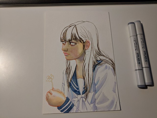
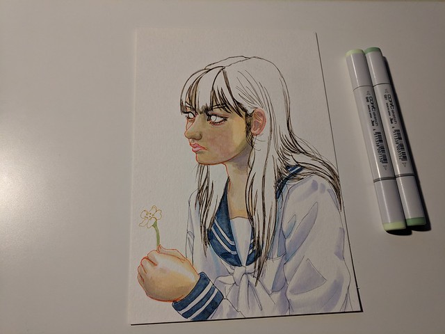
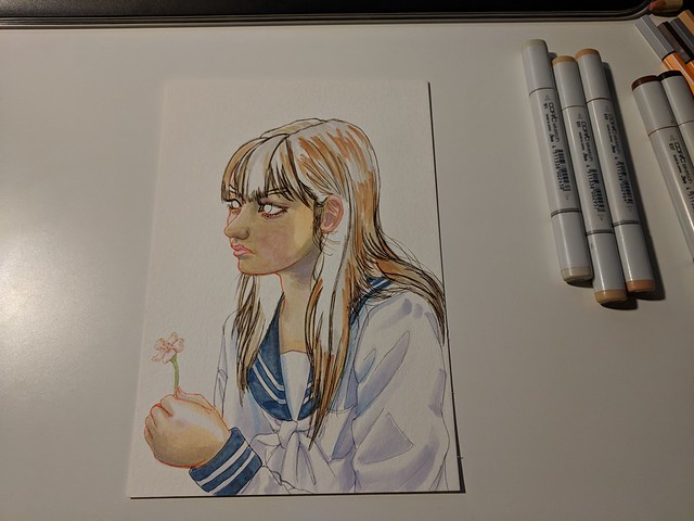
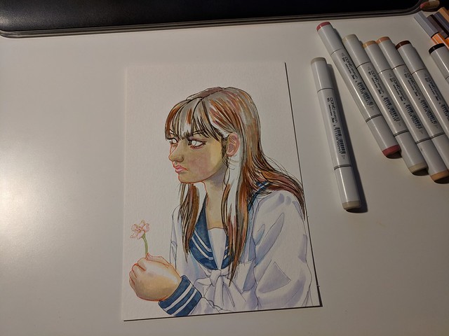
I guess since high school I have been doing an art piece especifically for new years. Usually I start it the day before and finish it on the first day of new years. This year though I made 2 before new years (one of them was El Chavo, and the other one I will show below) and the Eri Sawachika one for new years. I’ve been quite busy lately but when it comes to just drawing and not painting the workflow is not that bad and I can move relatively quickly.

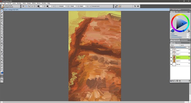
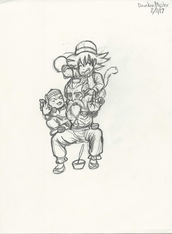
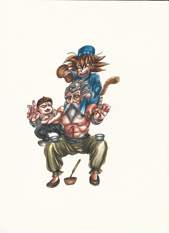
This was one of the other pieces I did before new years. Again I was inspired by that video I showed on the last post. It was also done quickly so I made a lot of mistakes, but the biggest is the proportions… especially the “bobblehead”. But I figured I would try and fix it digitally using some techniques I saw online.

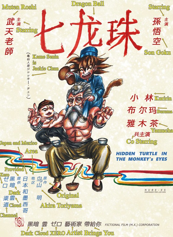
Character is Harima Kenji from School Rumble.

I used this reference, but decided to change things up a bit, for some reason had an image of him in a Kung Fu like scenario (like Bruce Lee). Decided to take off his glasses just as an extra challenge.

https://www.flickr.com/photos/darkcloudxero/24639023747/in/dateposted-public/

Bobblehead Harima… I guess I was so focused on the pens that I didn’t think of the proportions especially since I imagined his whole body from the get go and I ran out of space below.:

https://www.flickr.com/photos/darkcloudxero/24639000007/in/dateposted-public/

And here he is with an edited head:

https://www.flickr.com/photos/darkcloudxero/24639002027/in/dateposted-public/

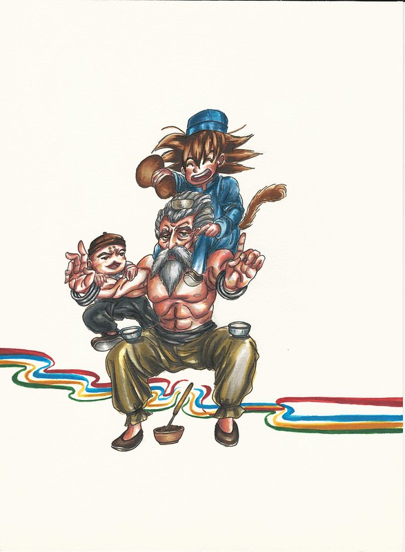
Posture still seems a bit off. But it was just a test anyway so it should be fine as it is for now.

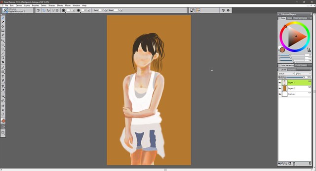
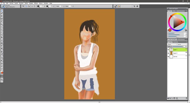
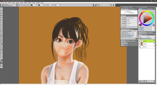
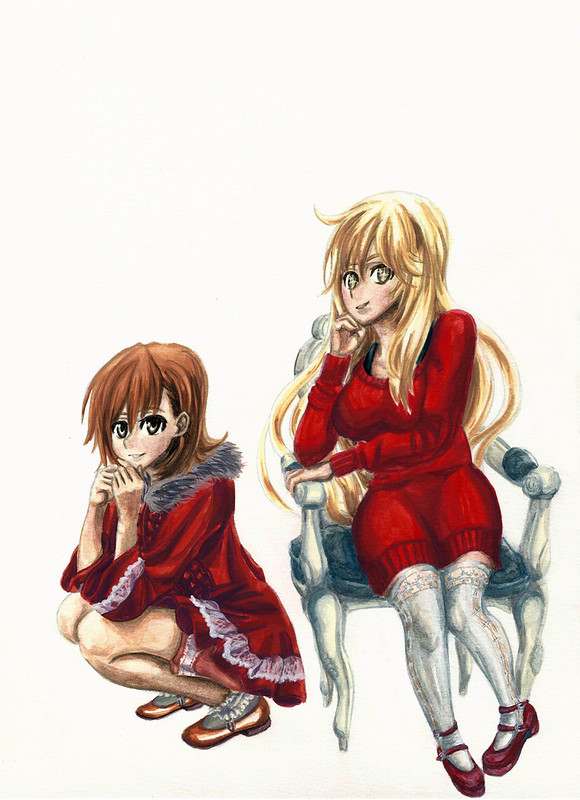
And so having shown both of the pre new years pieces, let’s now focus on the piece I made for and on new years. Again I chose someone from School Rumble. I wanted to do something simple and just modify it for new years (plus I wanted to learn a thing or two from a pro). With that in mind I decided to recreate this scene:

https://www.flickr.com/photos/darkcloudxero/39477590652/in/dateposted-public/

Here is the quick draft (as to be expected it is quite faster to just draw it one time instead of the two times that I usually do, rought draft then a clean final version):

https://www.flickr.com/photos/darkcloudxero/38799615714/in/dateposted-public/

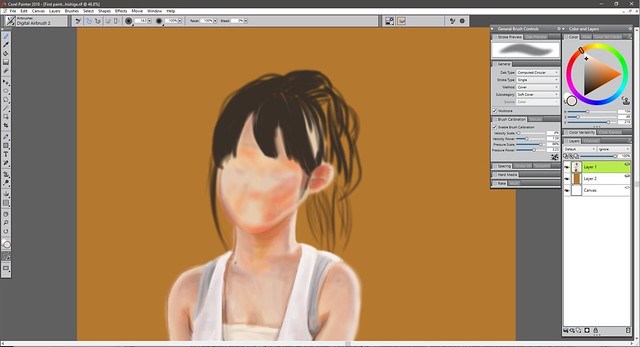
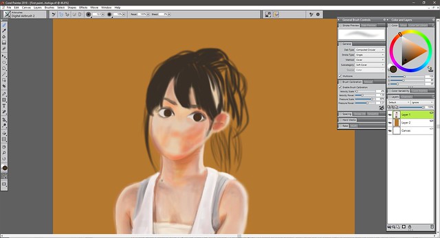
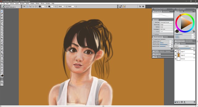
By this point I finally figure out that there was no way I could just copy everything over (so much for just doing a simple piece…) New years in these parts of the world are winter after all, so I had to dress her up appropriately. After a quick search online for winter clothes I came upon this reference picture:

https://www.flickr.com/photos/darkcloudxero/38612206075/in/dateposted-public/

So I decide to use that sweater and that design:

https://www.flickr.com/photos/darkcloudxero/39477594802/in/dateposted-public/

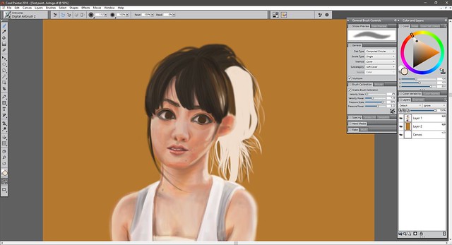
Should’ve stopped by this point and made the rest digitally, but since I wasn’t sure of how I was going to go about it I continued on:

https://www.flickr.com/photos/darkcloudxero/39477594492/in/dateposted-public/

… I didn’t even do any clean designs, I just made some quick lines with no real ideas on the type of knitting. It doesn’t look horrible but I should try harder.

Here it is with the filled out dark parts:

https://www.flickr.com/photos/darkcloudxero/38612203505/in/dateposted-public/

So I got to this point by the end of new years but it was quite late so I had to call it a day.

Time was running low already so at this point I finally decided to mix it up with digital techniques. But for that I had to search up screentones and textures that I had to use. That took a while. On top of that I decided to clean up my messy texture lines so that it would be ready for the knit textures.

Here are the textures and screentones I used:

https://www.flickr.com/photos/darkcloudxero/39477592442/in/dateposted-public/

Then I had to take out the color and change the contrast:

https://www.flickr.com/photos/darkcloudxero/39477592872/in/dateposted-public/

This is the screentone I used to darken areas up:

https://www.flickr.com/photos/darkcloudxero/38799647334/in/dateposted-public/

Since it’s new years, of course I needed some fireworks:

https://www.flickr.com/photos/darkcloudxero/24640047977/in/dateposted-public/

That looked a bit lonely though so I decided to add a cityscape:

https://www.flickr.com/photos/darkcloudxero/39507959611/in/dateposted-public/

I couldve modified the darkness of the fireworks screentone with the cityscape’s lighter sky but that would take too much time, so I decided against it.

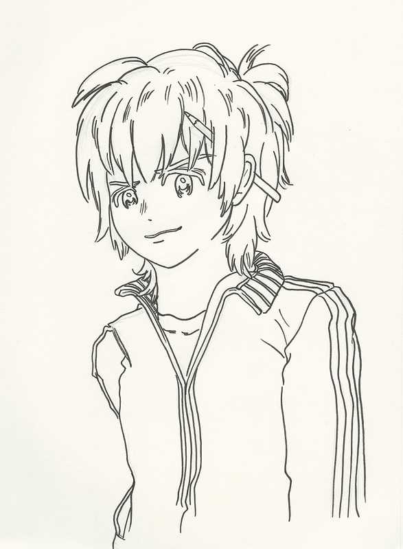
This is the final piece, clean and simple (though quite time comsuming due to finding and modifying the screentones, and cleaning up the rough knit lines I made).

Eri Sawachika  Happy New Years 2017 resize

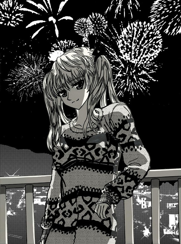
After making the piece smaller and a .jpg it made the cityscape screentone quite choppy.

Aside from the obvious changes I made, I also changed her expression. I wanted her to be contemplative and yet have some hope for the future, thus the small smile.

Anyway, this year has finally started so lets do our best to make our goals successful.

Happy New Year.

And as always

Hasta la proxima,

-Nube

Merry Christmas (and happy holidays!)

So Christmas has finally arrived.

I was working on an artwork for this year and just now finally finished it. I will be making a background at some point but that will have to wait for next year. But for those who visit my site, here is a peek at it. (The print won’t be available till next year though).

Will talk and upload more photos at a later date.

MIsaka MIsaki christmas 2017 edited resize

My brother’s finished presents.

https://www.flickr.com/photos/darkcloudxero/39265906372/in/dateposted-public/

https://www.flickr.com/photos/darkcloudxero/39265905482/in/dateposted-public/

Have a great time guys. Merry Christmas and happy holidays.

Hasta la proxima,

-NUBE

A little update 12\3\17

I finished my paper about two weeks ago but my side job has been aking for more of my time lately, though we should be done for the rest of the year once we finish the next job (whenever that is). As for school, I just have a class tommorrow and finals next week. So I’m almost finally done for this year and will have a couple of weeks where I can focus completely on art. So for this weekend I will be giving some time to just study, but for most of this week I should be able to keep working on art (aside from the daily chores and things to do).

Having said that, I have been working on some new artwork these past few days. Drawing I can hatch things out quite quickly but again color is still giving me problems. So I decided to make a piece with simple color schemes and color application like that done in older anime. This works two fold. I wan’t to give my brothers a specialized gift for Christmas and also make a demo of a possible service I can offer customers. This whole year I’ve been trying  to just learn as much as I can before I started to sell again. But I can’t keep it in the backburner for too long, the year is almost gone so I have to think about keeping the business side of things alive again.

So what is this new potential service? How about a personalized recreation of a poster where you or someone you know is taking the place of the protaganist/character. Or something simpler like the anime version (of you or someone you know) in what ever style you’d like.

I doubt my brothers check this page so here are the two artwork I am currently working on.

First is Gundam X, sorry the line art is too light for the scanner to really catch it. and I don’t have a digital line art copy for some reason.

https://www.flickr.com/photos/darkcloudxero/38788297862/in/dateposted-public/

I tried using the colors from the anime so I just focused on applying color. But as expected I still had a lot of trouble working it since I’m still not used to painting digitally. It’s a great tool I but I much prefer traditional. But I’m still not good enought to make colors as smooth as digital. Though I did learn a lot and could definitely get better. but I feel I might have to make a choice on which one to focus on. Learning both will take quite a while… We’ll see.

Despite that it look alright.

https://www.flickr.com/photos/darkcloudxero/38103035524/in/dateposted-public/

Next is the Evangelion one. I have started painting it digitally, but I think I will switch it to traditional. Time is running out and I wan’t to do a lot more pieces. I just don’t know how people could paint so amazingly using the digital medium. Switching between both really confuses me.

https://www.flickr.com/photos/darkcloudxero/38788297312/in/dateposted-public/

This is what I have so far digitally. I’ve seen people fix their colors and make really cool effects by adding textures to the paint jobs, but I don’t know if that is what is needed…

https://www.flickr.com/photos/darkcloudxero/27043309749/in/dateposted-public/

So there is the small update, have to go rest a bit and eat.

Hasta la proxima,

-NUBE


Another year of life

So, another year has passed. I put some goals for my self this year, and although I could have done better I did accomplish them. So I will continue to go forward. The future does seem quite shaky and uncertain. But that’s life… I won’t give up.

I guess my goals for this new year is to take things further and accomplish even more things this year. I also want to be more physically active and learn Japanese to a proficient level. I’ve put those guys in the back burner for far too long. It’s time I give them the time they need.

This is the drawing for this year. I was thinking of adding some Dia de los Muertos influences, but maybe next time. Today was quite a busy day so I wanted to make a quick drawing. I really like Yoshitoki Oima’s art style a lot (creator of “A Silent Voice”), so I decided to use her style for this drawing. I didn’t have much time for coloring either (I actually just drew it in about half an hour a couple of minutes before I started making this entry) so I will just do the line art like if it was from a manga panel. I was thinking of inking it as well but the day is almost over so I will leave it like this. Besides it looks quite clean this way.

Nube 2017 crop centered resize

Here’s to working towards a better future and accomplishing our goals!

Hasta la proxima,

-Nube

Hidden Turtle in Monkey’s Eyes


I don’t know if I have mentioned this before, but I am a big Martial Arts movie fan. More specifically Hong Kong Kung Fu movies from the 80s and 90s. Jackie Chan movies being my favorites. So I wanted to try out making an homage poster like artwork. Now one of the other things I really love is the original Dragon Ball (when he was a kid, I say this because people think I mean Dragon Ball Z which was just ok). I want to talk about these two loves of mine a bit more, but I will have to wait on that because I am planning on covering these topics on future videos.

With that out of the way Inspiration came from the gag character Jacky Chun and my love for old Hong Kong films. I chose one of the first movies where sparks of what Jackie Chan would later present to the world, Drunken Master. A 1978 classic Martial Arts film. And since Dragon Ball has many martial arts influences including Drunken Master it would fit perfectly.

There are many poster variations but I ended up picking this one (which I feel might be the original poster).

drunken-master-poster

I really like these old posters where they hand paint them and have really interesting themes and expressions.

This is the rough draft that I originally made while at an anime convention.

Drunken Master rough draft resize

These two are the basis of what I am working with, and next is the process. First are the pictures I took with my phone.

https://www.flickr.com/photos/darkcloudxero/37311149092/in/dateposted-public/

I used Copic Markers for coloring by the way.

https://www.flickr.com/photos/darkcloudxero/37311148792/in/dateposted-public/

https://www.flickr.com/photos/darkcloudxero/37311148482/in/dateposted-public/

https://www.flickr.com/photos/darkcloudxero/37311148292/in/dateposted-public/

https://www.flickr.com/photos/darkcloudxero/37311147582/in/dateposted-public/

https://www.flickr.com/photos/darkcloudxero/37293944066/in/dateposted-public/

https://www.flickr.com/photos/darkcloudxero/37311146852/in/dateposted-public/

https://www.flickr.com/photos/darkcloudxero/37311146422/in/dateposted-public/

https://www.flickr.com/photos/darkcloudxero/37311145752/in/dateposted-public/

https://www.flickr.com/photos/darkcloudxero/37293943226/in/dateposted-public/

https://www.flickr.com/photos/darkcloudxero/37340990021/in/dateposted-public/

https://www.flickr.com/photos/darkcloudxero/37293942896/in/dateposted-public/

https://www.flickr.com/photos/darkcloudxero/37340989371/in/dateposted-public/

https://www.flickr.com/photos/darkcloudxero/37340989051/in/dateposted-public/

https://www.flickr.com/photos/darkcloudxero/37293940916/in/dateposted-public/

https://www.flickr.com/photos/darkcloudxero/37340988661/in/dateposted-public/

https://www.flickr.com/photos/darkcloudxero/37293940466/in/dateposted-public/

https://www.flickr.com/photos/darkcloudxero/37340988351/in/dateposted-public/

https://www.flickr.com/photos/darkcloudxero/37293939806/in/dateposted-public/

https://www.flickr.com/photos/darkcloudxero/37340988011/in/dateposted-public/

https://www.flickr.com/photos/darkcloudxero/36631801324/in/dateposted-public/

https://www.flickr.com/photos/darkcloudxero/36631801324/in/dateposted-public/

https://www.flickr.com/photos/darkcloudxero/37340987681/in/dateposted-public/

https://www.flickr.com/photos/darkcloudxero/36631800874/in/dateposted-public/

https://www.flickr.com/photos/darkcloudxero/37340987411/in/dateposted-public/

https://www.flickr.com/photos/darkcloudxero/37340987081/in/dateposted-public/

https://www.flickr.com/photos/darkcloudxero/37311141932/in/dateposted-public/

https://www.flickr.com/photos/darkcloudxero/37340986821/in/dateposted-public/

https://www.flickr.com/photos/darkcloudxero/37340986821/in/dateposted-public/

https://www.flickr.com/photos/darkcloudxero/37311141632/in/dateposted-public/

The title of the movie poster is done with a brush, so I wanted to do it traditonally. I measured the center and spaced out three spaces for the characters.

https://www.flickr.com/photos/darkcloudxero/37340986531/in/dateposted-public/

I also tried to emulate brush strokes for the characters.

https://www.flickr.com/photos/darkcloudxero/37311141462/in/dateposted-public/

https://www.flickr.com/photos/darkcloudxero/37340986281/in/dateposted-public/

And now some scans of the process.

Drunken Jackie Chun I resize

Drunken Jackie Chun II resize

Drunken Jackie Chun III resize

Drunken Jackie Chun IV resize

Drunken Jackie Chun V cropped resize

After painting on the title I was contemplating painting on the rest of the text. And well, I tried but soon realized to instead do it digitally.

Drunken Jackie Chun VI resize

I decided to make the text digitally because it would be alot cleaner, the text would be level and wouldn’t be crooked. On top of that, I was trying to have it ready for Nan Desu Kan.

Here is the original poster again:

drunken-master-poster

And here is my finished version:

Hidden Turtle in Monkey's Eyes rough background resize 1080

I tried to emulate as close as I could all the text around the poster (as well as the background texture), I don’t know Chinese (though I did study a bit of it for a semester once, I obviously am nowhere near at the level where I can say I know a little or any really, just a couple of words and phrases) so I had to guess what each sections of the text would mean. For some of them I just added whatever I thought I could cram with references to me and my work.

Here is what each of the characters I typed means (I used Google translate to come up with the characters so it most likely has a lot of typos and misspelled words and phrases):

Hidden Turtle in Monkey's Eyes Meaning of Characters

That concludes the process for this Dragon Ball piece. Hope you enjoyed it and that it helped you on your art journey if even a little.

Hasta la proxima,

-Nube

Create a website or blog at WordPress.com

Up ↑