Took a couple of days to rest for a bit due to the new year. But now I will be going full force. I want to make a special drawing as the new drawing for the new year which is something I have as a tradition, for a couple of years now. It will be a bit simple, but once I’m done with that I will finish the Star Wars drawing. I’m also getting a big commission so I will be pretty busy pretty soon. School is coming soon too… man, this year is going to be amazing.
Here’s an update of what I have done so far on the Star Wars drawing.
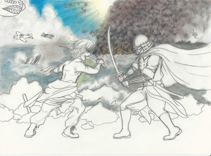
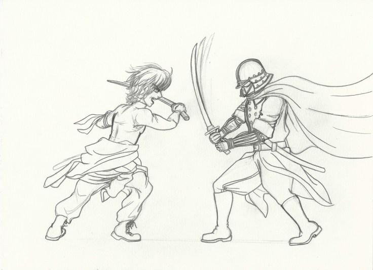
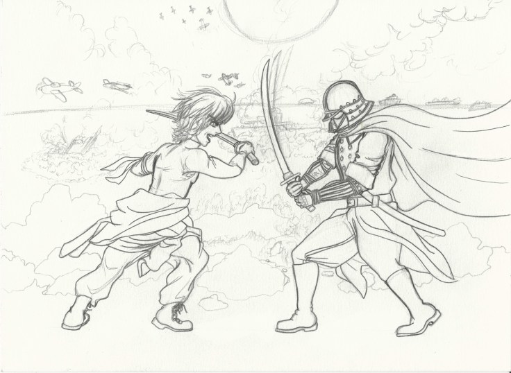
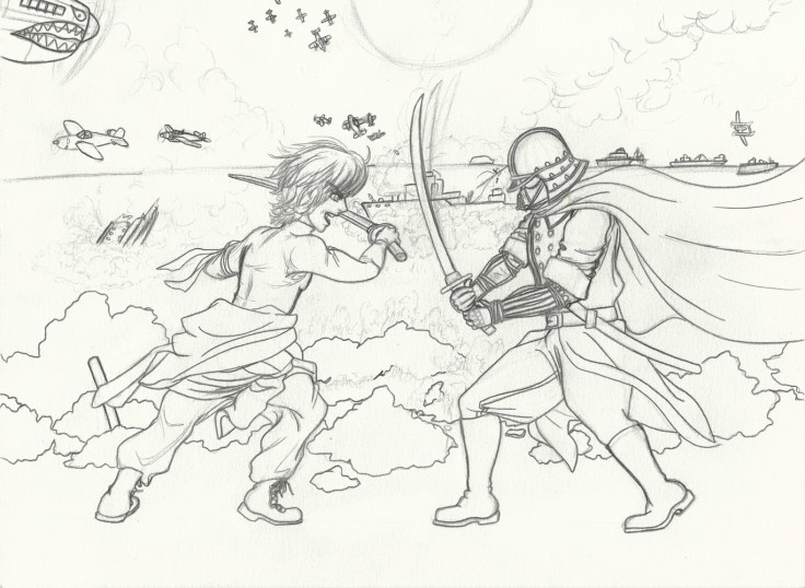
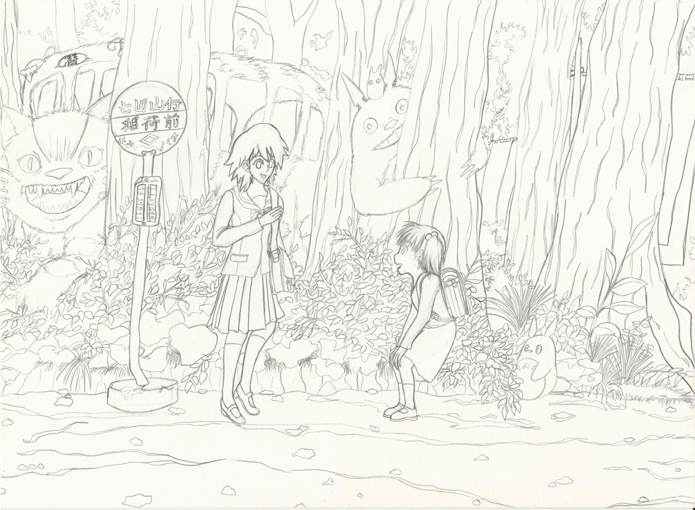
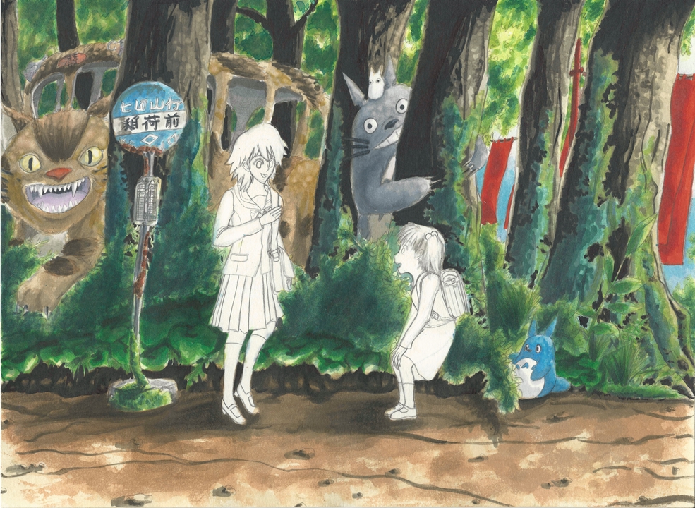
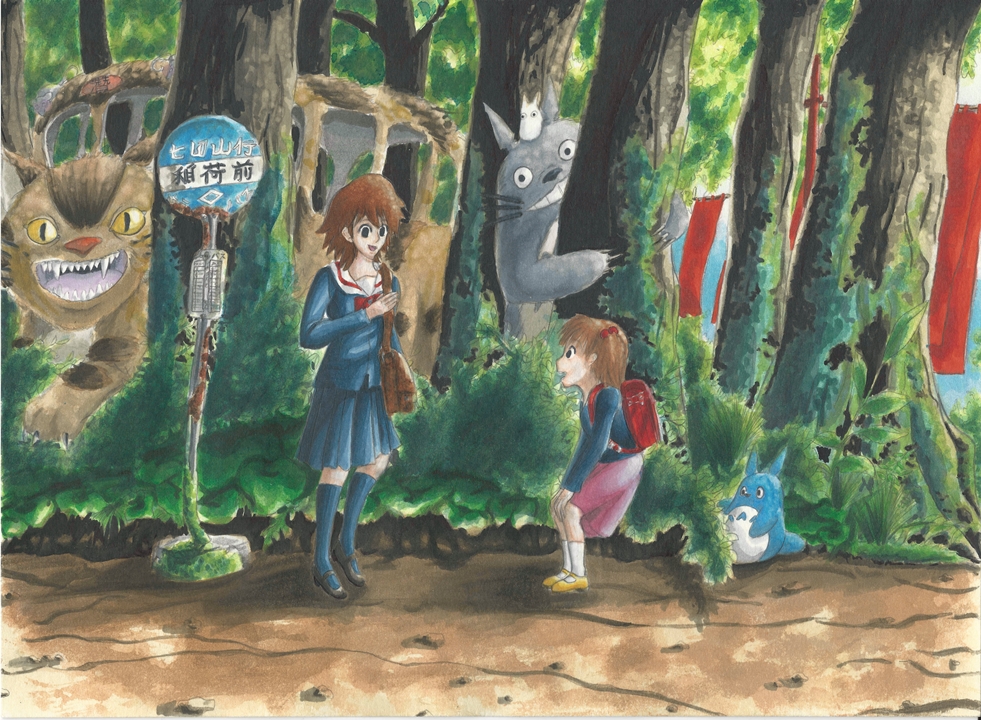
Alright, here is an update on what I have so far for this new piece I am currently working on. Christmas has now passed and some visiting relatives will be leaving soon, so I can work more without much distractions and family duties.
With that said, I would say I take the longest time to come up with an idea, and fleshing it out as a rough draft. This time I had a hard time deciding what the location would be for this drawing. Since I have made Darth Vader look more German, I decided to make Luke look like a someone from the Allies from World War II. Of course since this is all me taking liberties with the original designs, I decided to have fun with it and decided to make Luke look more like a yanki with some combat boots (inspired by the Allied soldiers). As I was finishing the drawing itself I thought, “Wait, Luke is part of the rebel alliance and yankis are rebels against society. Now it fits even better.” Aside from my personal touches they are both still Japanese influenced, this works to connect it to the original work and to give them some connection as father and son.
Now as for the location, I wanted them to be fighting on a cliff with the ocean as the background, but I also toyed with the idea of having them fighting inside a ship as if they were fighting inside the deathstar. In the end though I felt it would be better if I went with my original idea. But I did decide to add some more battles going on around them. I was a bit scared to add more things to draw because I would then have to make them fit with the whole drawing as a whole, and then there is the whole having to color them later. But I decided to to go for it anyway. It will take a bit of time and some major concentration, but if I break it down into parts I should be okay.
I wanted to use a new technique using color pastels. I am using some really cheap one’s I bought when I was in either middle school or high school, can’t even remember. They are really not that good, but I only needed them as a base that I will use to layer on top of. Don’t know if I will succeed or not. But I do feel confident I will be okay. We’ll see.
Anyway here is what I have so far. Colors are still really rough, but I will refine little by little tomorrow. Will explain the process next time (hopefully it works).
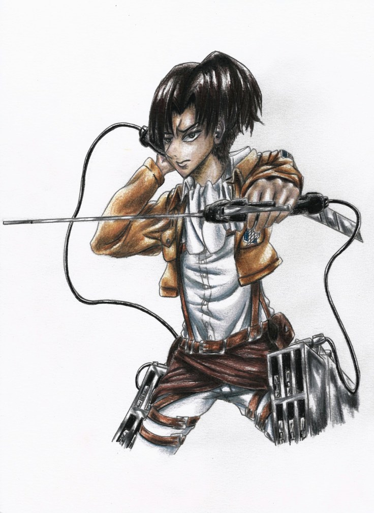
I have finally finished the Levi Ackerman video, and has been uploaded.
In this episode I will tackle Levi Ackerman from Attack on Titan.
As per request I used only color pencils for this drawing. I’m guessing that judging from her age she can only afford to invest on the basic art utensils. For that reason I made sure to use only Crayola color pencils (except for my black PrismaColor color pencil which works much better than the crayola, it can be bought on it’s own in a hobby shop).
Crayola pencils used: white, peach, light brown, silver, green blue, turquoise, tan, dark brown, blue, taupe, pink, brown, slate
(if using crayola, make sure to get a 36 colors box so that the transitions in colors can be done much smoother.
Overall the difference between professional color pencils and the mass market one’s are quite apparent. Crayola color pencils take quite a bit of time to blend together since the pigment doesn’t do more than three layers easily. And even then, the layers have to be placed in light coats first than applied on thicker coats little by little. I really like using a white color pencil to blend light colors together to give them a smooth transition from one color to the other and to go from color to white.
The best thing to keep in mind is that color pencils can be layered on top of one another. As for making outlines for the drawing before coloring. One can outline it with pens, but be prepared to keep the colors simple so that they don’t look bad and out of place and/or changing the thickness of the outlines throughout the drawing to make it blend well. I obviously did not do this. Instead I used only my mechanical pencil and darkened it once I had the rough lines drawn. From there I can start coloring and choose areas that I wish to lighten. I do this by applying color pencils over the lines. But be aware of how the color pencils can smear the graphite from the pencils.
This is just a speed drawing video, a slower (and longer) video will be uploaded soon.
Here are the links –
speed drawing version:
EXTENDED version:
And the drawing itself:
If you have any questions or comments, please leave them below.
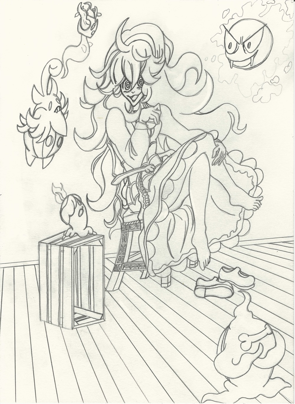
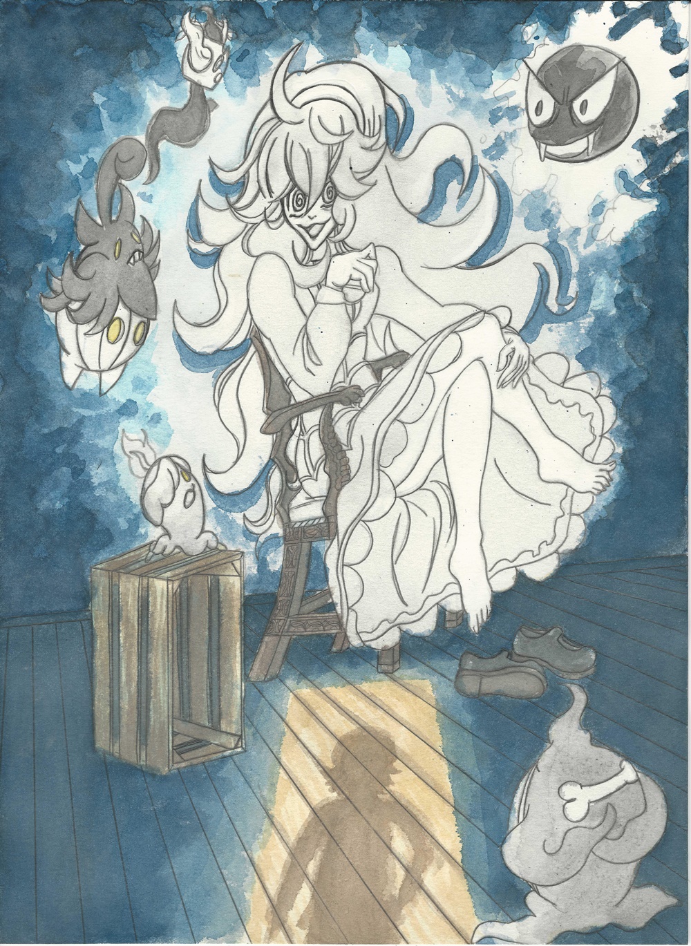
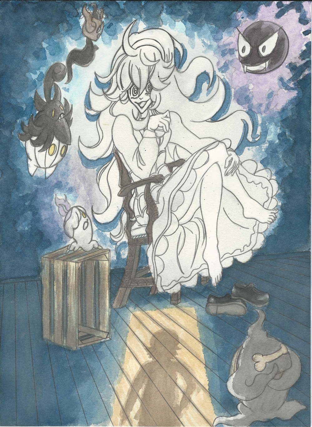
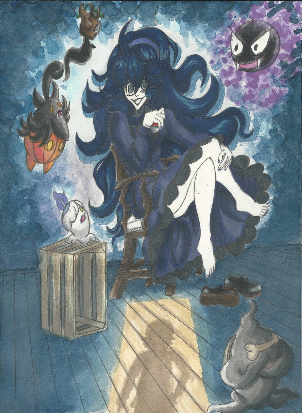
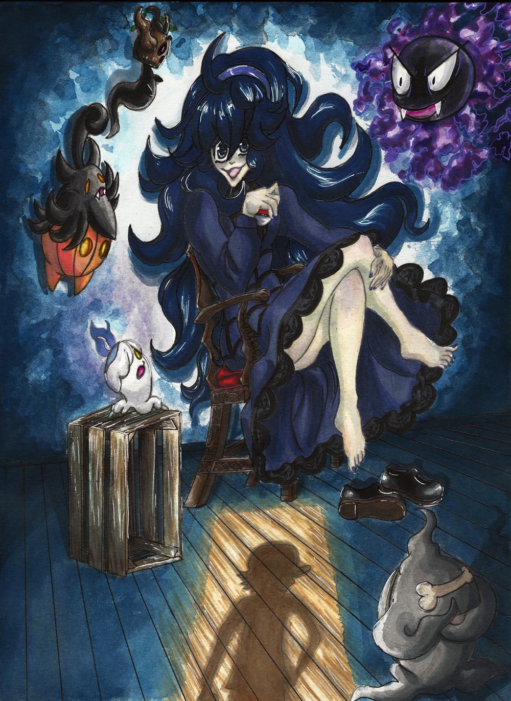
So I have finally finished the Pokemon Ghost Girl artwork. I was going to do it fully out of watercolors, but I decided to instead touch it up with my Copics which made it pop out even more and gave it a cleaner look. I have tried this before, but I think I have now finally started to get the hang of it so that they can blend seamlessly. Before I had to use so much of my Copic ink since I was still unsure of what I could do so that the colors didn’t look too washed up. Of course this also has to do with me using better watercolors (kuretake gansai tambi). With these I can make the colors do exactly what I want. They are still not as vibrant as the Copics so I do have to rely on them when doing dark backgrounds. But they are great when doing light ones.
For this drawing I decided to do another Halloween themed drawing. Although this is not tied down by it. It should fit at any time of the year since it’s just spooky and it has to do with Pokemon. At the beggining of the year I decided to do a drawing somewhat like this (just as stated in the post before this one). But seeing as I can do both characters I decided to make them two different art pieces. When thinking about the Pokemon Ghost Girl, I started thinking of what importance she would have for the future Pokemon game/s. Seeing as though she is looking for a certain person. I decided to focus on that. I had her in a room as if waiting for someone. And to make it fit a spooky atmosphere I decided to add ghost Pokemon. To not use up too much space with the Pokemon, I decided to use ghost Pokemon in their first form.
As for colors, I decided to play around with the blues. The main idea is keeping the light and darkness clash against each other but making sure that they blend well together. What do you guys think? Did I accomplish it?
Also, here are my Youtube videos for this drawing in case you want to learn or just want to see it.
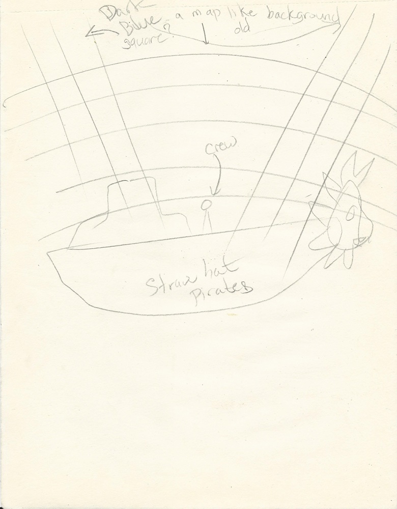
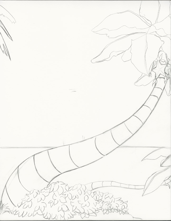
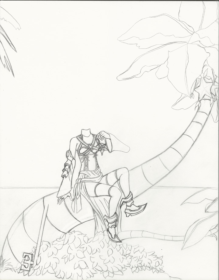
So I was thinking about adding this piece about two weeks ago. But something else came up, which ended up making waste about a week of my time. Anyway, I managed to work on this a bit at a time trying out different ideas of what I wanted with this piece. I’m still not sure what to do with the background though… But I want to stay in touch as much as I can regarding new projects.
For now I will post this and keep you guys updated on anything new that has been added and of course the progress of when I start working on the final piece. I will also eventually show you guys another piece I was working on. But that is for later.
I’m currently working on the next artwork. I was a bit unsure on what I should draw, than I remembered of a certain series that I happen to enjoy immensely. I’ve actually finished most of the rough draft already, I just need to add a couple of details. That is all I will say for now. But I will give you guys a hint as to what the theme is this time.
This week has been quite problematic. I had a major problem with a virus that was going around and got sick because of it. That had me out of commission for the whole week, and to top it all off it’s is now going to be finals week so I have to take some time to study. For that reason I will have to delay this week’s artwork. \
Sorry about that.
But here are some scans of what I have done so far.