Sayu-Mask

Despite the end of last year being quite dry, the start of this year has given us quite a bit of snow. I quite like the athmosphere this creates which is why I decided to use it for the painting this time around. The line art was done for Inktober 2021 day 27 which can be seen here:

The model for this painting is Sayumi Michishige. I really love the outfit and colors. I debated on how I wanted Sayu’s colors to be overall. Light and faded, or darker, affected by the scenery. I opted for the darker route.

Reference photo of Sayu can be seen here (7th Photo):

Hasta la proxima,

-NUBE

Sayumi 2nd Microsoft Surface Pro 5

I’ve been wanting to paint Sayu in this outfit ever since it was uploaded. She kind of reminds me of a Team Rocket member.

This is the second Microsoft Surface Pro 5 painting. This time around working with the surface felt a lot smoother. The next test will consist of me working in portrait mode. I know it works since I tried to see what would happen if I tilted the whole screen, although it did make Corel crash… I’ll have to play with it a bit more.

Hasta la proxima,

-NUBE

Yane Yukata

I finally got the chance to paint the Yane line art. I decided to go for a cool spring setting and color. Somehow, the leaves without a more solid form looked weird so ended up making some line work for some of the leaves as well.

Line art can be seen here:

Yane Yukata Line Art

You can see Yane here.

Reference picture used:

Hasta la proxima,

-NUBE

Yane Yukata Line Art

I came upon a photo of Yane wearing a yukata which I feel fits the spring quite well. I’m still not too sure how I will go about the next stage for this drawing, will I ink it, hatch it, or paint it? I haven’t quite decided that yet. I did add a bit of hatching already, but if I decide to do something different I could always edit it out later on.

You can see Yane here.

Reference picture used:

Hasta la proxima,

-NUBE

Gina Nina BoomBox

This is a study using an old ad from Sanyo. The ink drawing was first drawn for inktober 2020 day 04. For this piece I wanted to try out a super simple painting with no shadows or lighting, but as I kept working on it, I decided to just go ahead and try adding more details just to compare and contrast. To add a bit more of color to the simple painting style, I decided to use color burn for the line art which worked really well with the static and colors used on Gina since it reacted in very interesting ways. I wanted to go for a more pop art look so I went with more saturated and vibrant colors which really makes it pop.

When I first saw the reference ad used I thought it was Phoebe Cates, but as I was working I noticed that there was a name on the ad in the left bottom corner that spelled out Gina Nana. When I searched that up, no much came up about it except 2 or 3 other ads with the same model. When I searched up her name using Katakana more photos and ads came up. So yes, this model is actually a different person by the name of Gina Nana. It seems she was a model for Sanyo for a while during their cassette electronic campaign. The reference I used was from 1985.

Reference used: https://i.pinimg.com/564x/5e/0d/8a/5e0d8af9940bc91dee1021a525068556.jpg

Hasta la proxima,

-NUBE

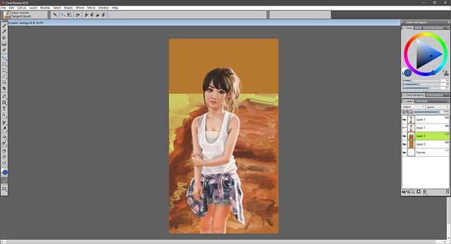
First painting corel painter 2018 Sayumi Michishige

This painting was finished on August 15.

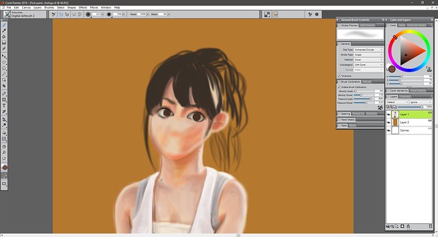
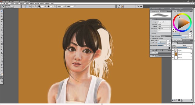
I’ve been wanting to learn how to add color to my pieces so the best way is to study photos and also see why other peoples paintings work by recreating them. Using the eyedropper tool is quite useful but I want to practice and learn how to choose color just by using my eyes and instincts. Doing it traditionally is easier since I’m limited to the colors I have in hand. But digitally I have to really focus and think about it since I have every color imaginable at my disposal so it can get a bit overwhelming and the chance of screwing up is quite a possibility.

At the time of this painting I had invested in upgrading my Corel version up to 2018. So this is the inaugural painting I did for it. Corel and Photoshop are quite different. Photoshop is quite versatile and one can do a lot of things with it quite easily when it comes to editing but I feel that Corel is the better program to paint. Something about it makes painting more intuitive. But I tend to switch from one to the other when creating new paintings regularly. Sometimes I hit a bump and for some reason seem to find it easier to do on the other program. (・∧‐)ゞ

In any case I of course chose Sayumi Michishige as the subject, as you can guess I really love her aesthetic and her photo books are filled with a lot of great pictures to choose from. As stated before I chose colors by eyeballing it and am surprised I wasn’t too far off. If you compare my painting to the photo of course there are a lot of differences but I feel like I managed to capture the essence and you can tell it’s Sayu right?  (๑•̀ㅂ•́)و✧

First painting corel painter 2018 Sayumi Michishige resize

This is the reference picture used from Sayu’s photobook “La”:

007

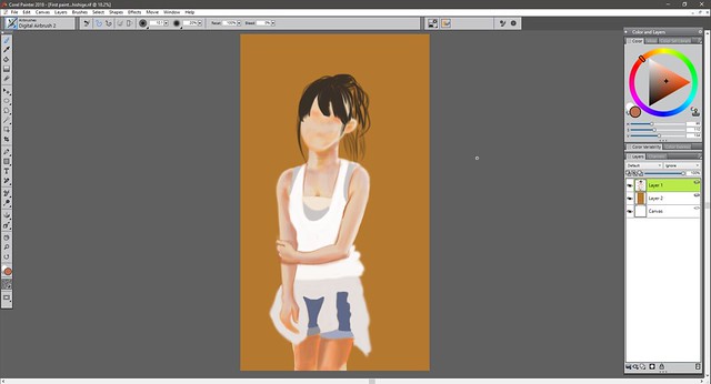
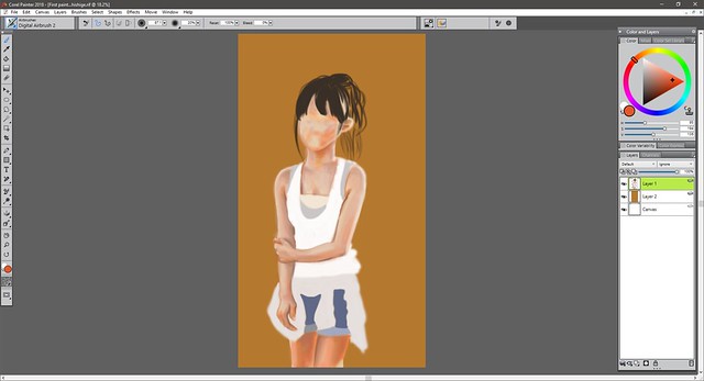
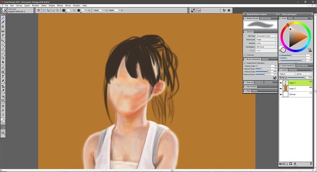
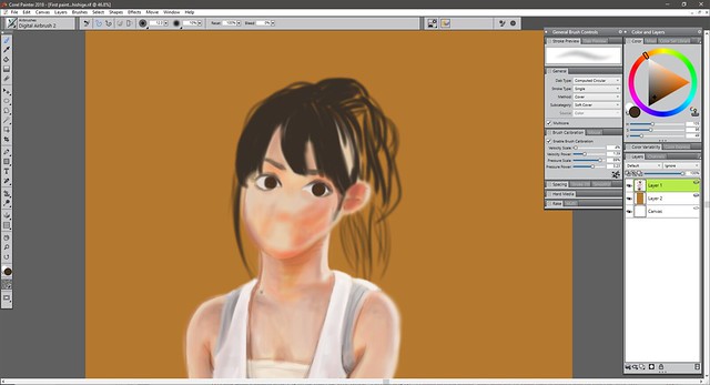
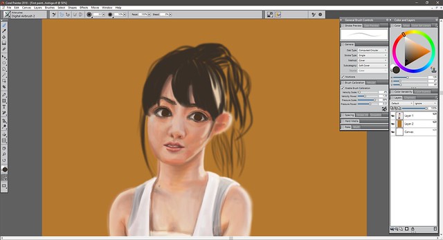
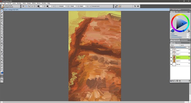
Here is the process:
Sayu Corel Painter 2018 I

Sayu Corel Painter 2018 II

Sayu Corel Painter 2018 III

Sayu Corel Painter 2018 IV

Sayu Corel Painter 2018 V

Sayu Corel Painter 2018 VI

Sayu Corel Painter 2018 VII

Sayu Corel Painter 2018 VIII

Sayu Corel Painter 2018 IX

Sayu Corel Painter 2018 X

Sayu Corel Painter 2018 XI

Sayu Corel Painter 2018 XII

Sayu Corel Painter 2018 XIII

Sayu Corel Painter 2018 XIV

Sayu Corel Painter 2018 XV

Sayu Corel Painter 2018 XVI

Sayu Corel Painter 2018 XVII

Sayu Corel Painter 2018 XVIII

Sayu Corel Painter 2018 XIX

Sayu Corel Painter 2018 XX

Sayu Corel Painter 2018 XXI

The eyes were too big so I had to resize them.

Sayu Corel Painter 2018 XXII

Sayu Corel Painter 2018 XXIII

background Sayu Corel Painter I

background Sayu Corel Painter II

background Sayu Corel Painter III

background Sayu Corel Painter IV

background Sayu Corel Painter V

background Sayu Corel Painter VI

background Sayu Corel Painter VII

Sayu Corel Painter 2018 XXIV

First painting corel painter 2018 Sayumi Michishige resize

And that should wrap it up for now. I really loved working on this painting and am glad I was able to get it to this point. It looks realistic but also like a painting which I really like.

Hope you guys like it.

Hasta la proxima,

-NUBE

Create a website or blog at WordPress.com

Up ↑