I was a bit worried that I wouldn’t be able to finish these presents in time but I was somehow able to do it. I thought I would also try out a new technique (for me) emulating Ichiro Tsuruta’s artwork that was used for the Noevir Cosmetic Renaissance ads. I would classify it as Japanese 80s Art Deco but of course I could be wrong.
Thank you for all these years of bringing happiness to your fans Sayu, I always look forward to checking out what you bring us.
I’ve been doing a couple of paintings these last two days but I won’t be showcasing them till a couple of days later. In the meantime I decided to make a simple and quick drawing. At first I was of doing it completely with ink but ended up doing it with a combination of both. Although I’m sure I could have done a lot more interesting effects I wanted to emulate a smooth color coverage.
As for the reference picture I used, surprisingly I came up with the idea of drawing Metal Bat (one of my favorite S rank members) when I was looking through one of my 80s reference folders. I came upon an ad for the Be-Bop Highschool movie poster. If you look at of the actors named Tōru Nakamura, he looks a lot like Metal Bat. I seriously wouldn’t be surprised if he was based off of the actors image in the movie. Which you can look at here: https://cdn.shopify.com/s/files/1/2691/7222/products/12933_abd05aff-36ce-4d72-84be-65e945c0d7da_1024x1024.jpg?v=1584502254
I had finished the first draft of this painting a couple of days before but wasn’t truly satisfied so I gave it some days and had a go at it again today. I think it looks better than the first version. This is a study of one of her photos from her Momochi Zukan Photobook.
Are you a bad enough dude to join the Red Ribbon Army? This has been an idea I’ve had for a couple of months now. Originally I planned on having all the main players of the Red Ribbon Army present in the poster showcasing the different locations one could be stationed at around the world but after drawing out a rough draft I felt it was too busy so I went for a more simplistic one containing Commander Red and Staff Sergeant Black. I figured it would be fun to play around with the idea of the painting done in episode 50 of the anime where Black was shortened and Red was taller and had a more rustic and wise appearance. I then wanted to copy the look of the old War World II recruitment posters. The text in the black box is from the Red Ribbon Army theme song. Line work done with one of my diluted inks and using my Holbein watercolors.
Just to change it up a bit let’s draw a guy this time, and let’s try a new angle (as advised by my younger brother). For this drawing I decided try out a new technique I saw a couple of years ago. This I believe is what they call foreshortening. It worked amazingly well so that I could draw out Luffy’s arm and finger pointing at us. When I finished drawing I then shaded the drawing by using ink and brush. Now Luffy is ready to move forward and become the king of the pirates.
I think I mentioned this before but I have been quite busy lately with my other job and building my desk PC which took me 4 weeks to complete. Had I had a bit more time to work on it I think I could have completed it in two weeks but such is life. Now I have more workspace since I added about 6 inches on the contour of the desk (minus the front side) so that I could clamp my three monitors thus giving me all of my original (about) 4 x 3 feet to use with all of my supplies that I would use as I work. I actually just made the finishing touches yesterday so I wasn’t really even able to use the desk till today. So far I’m really happy with the way it is all set up and because I made the outside contours on the sides so that I could clamp down my monitors I can now fully see all of the screen on both sides as I work on my XP-Pen which I of course left on the center. I’ll show some pics of it and the setup at some other time.
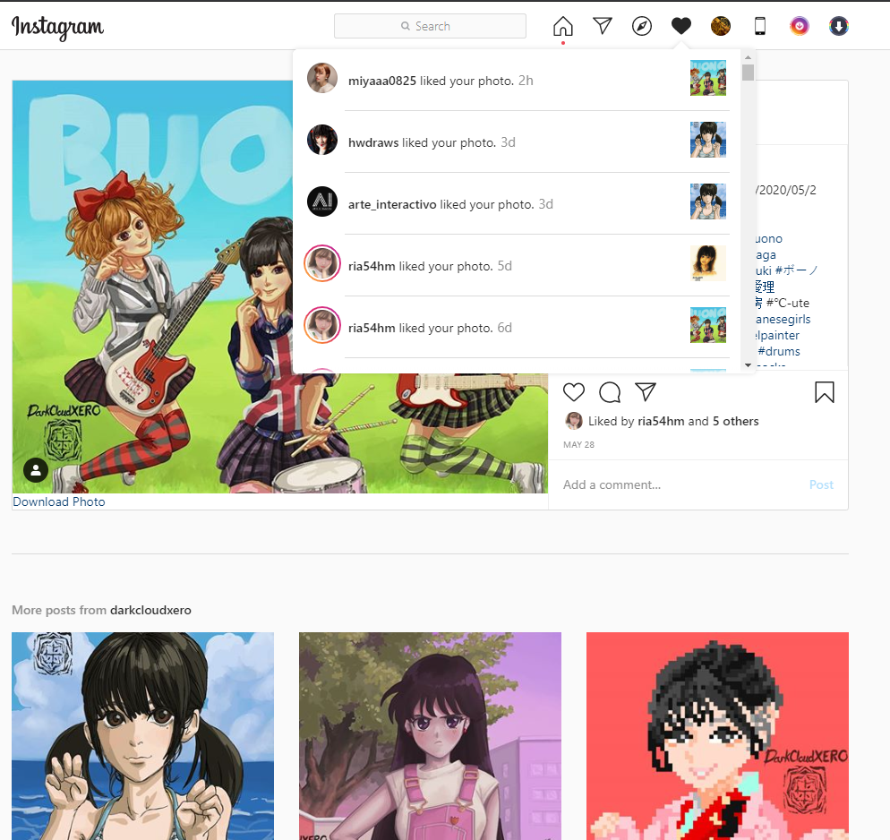
Way back in, whoa, May 28th (it’s been that long after all huh) I uploaded my painting celebrating Buono! To my surprise on June 8th I actually got a like from Natsuyaki Miyabi! Man it feels nice to know that the person you decided to make a painting of has seen your work. But to also get their approval of it is quite nice. I’m really glad my feelings of appreciation for her work has reached her.
Here is the painting just in case you missed it. And here is a link to the original post.
While I was getting some supplies for my desk PC I stopped by a nearby dollar store and came across some small vials with cork caps. I got a set of two of the 6 packs so that I could store some pre mixed inks and watercolors that I could use when working with linework/outlines. For today I made a set of ink that got lighter and lighter for when I want to use different levels of black to gray inks. I have my diluted ink that is still quite dark in my original container and a set of 5 vials containing the newly created ink. I also made a reference sheet to show me the intesity of the ink within each vial and a date of when they were created just in case one of them runs out and I have to create a new batch which of course might not be the same as the previous one. Since it was running a bit late when I was completely done getting my worspace ready I decided to make a quick drawing. Since it was all about testing the desk I of course decided to go traditional (plus I also got to try out my inks, although I only used my base ink for this drawing). I’ll try to see if I could make a quick drawing every weekday for the rest of the summer on top of whatever new paintings I decide to work on. I already have an idea of the first piece I will be working on (hopefully starting tomorrow).
Here is that Goku drawing I did. Maybe I should have made some lines to express movement but overall I’m quite pleased with the results (was a bit scared that I wouldn’t be able to draw as I liked since I hadn’t done it in about 4 weeks).
Man, this one is already about a year old now. I was planning on releasing it at some point but it never happened and ultimately I decided to release it when it got hot out again. And seeing as the weather has been getting hot lately (plus I haven’t uploaded in a while) I figure now would be a good time to upload it. The painting of Momoko is the same that was done a year ago but wasn’t pleased with the background so I tried out my new pc upgrades with this piece by painting a new beach background. There is no more stuttering or slowing down anymore (although the temps of the CPU are a bit worrisome). I tried out some of the other brushes that Corel Painter offers and saw no problems at all. Last time I tried it with my old components my pc couldn’t keep up. Although it could handle my favorite oil brush it tended to close up (Corel) on me from time to time. The last time when I was painting the Buono piece I lost half an hour’s worth of work which really sucked. I was going to wait on upgrading for a bit longer but after that happened I decided to pull the trigger. And I’m very happy I did.
I really like Momochii’s Yurushite Nyan pose so I went with that when I first drew her. My thought process at the time was to try out 80s/90s style painting which can look extremely beautiful if done right. But as mentioned when I was looking at the old background it just wasn’t up to par so I made a new one that would fit Momoko.
I’m planning on making more paintings throughout the summer ( I actually have had some ideas floating around for a while now). But work and my decision to make a desk computer will be keeping me busy for a bit longer. Hopefully the extra space in the desk will help cool down my cpu and gpu if not I’m going to have to invest in a new cooler…
It has also been a while since I’ve done some traditional watercolor paintings so I hope to get back into that as well.
This drawing was originally done for inktober 2019 on day 4. My first main goal was to make an anime painting with hard color changes. When I was done I noticed that it didn’t fit in at all with the texture background I had started. They didn’t fit together at all. So I was a bit disappointed. It looked amazing with a completely white background though. The colors were really vibrant and had really light and dark tones so I wondered what type of background would fit. After I was done painting Elsa in I thought about it for a while and decided to paint the background with Corel. I had absolutely no plan when painting but after just choosing a base color that would fit with Elsa’s color scheme I just started adding color till I eventually ended up with her sitting on a her comfy seat surrounded by some curtains (I believe that’s what they would be called). But Elsa still did not fully fit in with the background. It didn’t look back bad but the lights weren’t interacting with her at all. So I then put a gradient on her to darken the bottom half of her body and putting the layer on multiply.
This was first drawn from inktober 2019 day 3. This time I wanted to do a more simplistic coloring style more in the style of anime. If one uses the right colors it can really pop and look amazing. I really like the way it came out.
This drawing was done on the 29th day of inktober 2019. I really like Shiho So‘s artwork. I first discovered it when Night Tempo was using it for his cassette releases. With the linework done it was now just a matter of coloring it in. I really like playing around with these bright pastel colors. Although it looked good just painting Misaka, I wanted to make a background for it that fit. After playing around I started to get different ideas like making it like a manga page with panels. Then I thought I would put in a perverse beastly Kuroko ready to attack. And then things started to flow from there. I used Clip Studio for the manga effects like the screentone and effect lines (what were they called again?). Just when I was about to call it finished I decided to write Misakachu with magenta, and luckily it worked out quite well. The painting it self didn’t take too long to do, it was just the small details and ideas that I came up with along the way that added a couple of hours. Still though, overall it was around 5 hours I think. Not bad. Once I have more practice with this style I should be able to work faster. Which I will do at some point since I really like it.
It’s kind of a shame I didn’t do this one for Airi’s birthday but I was quite busy so it couldn’t be helped. This drawing was done in April 17 of 2019. I tried painting it on the 23rd using the reference picture as a guide for the colors as well. But it didn’t end well. The line art was just not working correctly with the painting. So over all it looked quite unnatural and weird. I then tried again on the 25th after I got frustrated and made the colors simpler and more anime like in an effort to make the lineart work better. But the result wasn’t much better. I just had too much trouble trying to blend them together. Well, after a year of countless hours of painting I decided to give it another try. I won’t lie, I still had that trauma of not being able to paint it correctly but the only way to find out is to just go ahead and do it. Annoyingly I did have some problems when I started painting it. Seeing as the line work was pretty dark and plentiful (when it came to the hatching) it just didn’t look right. I tried flat colors thinking that would work but after three tries I had to stop and rethink everything. The next day though I finally decided to paint it the way I have been painting lately. But this time I decided to make the linework lighter, I left it at around 65% of the darkness. Also, this time I decided to try and not look at the reference photo and just paint it the way I believed would work. Also, since most of my paintings have been coming out quite light (in terms of color and values), I decided to go for a more vibrant and deeper color pallette. And well, I really like the result.
I have noticed I have been working mainly with the warm colors in the yellow and red range, but whenever I try to do another color scheme I mess it up or it just doesn’t look right. I want to try cool colors for my next piece.
I’m amazed at just how much effort Yusuke Murata puts into both the characters created by ONE and the ones coming out (so far) in Murata’s version. One of the characters that really captured my eye is Ring Ring. It’s a shame she only came out for a couple of chapters. I was hoping that she would come out a bit more but the chances of that happening are slim. Maybe she will come back with Suiryu after training to become heroes. One can hope. Another shame is that we didn’t get to see her techniques, she got defeated too quickly… While drawing her I noticed that her design is simple and yet very iconic and cute. The addition of the bells and her hairstyle is a really good touch.
Looking at the One punch man wiki, it seems that Lin Lin was supposed to be Suiryus sister, so I guess there were more plans for her…
 and a quick drawing of Goku celebrating")
