Kiki and Jiji 90s

I learned about the using the filter abilities that Photoshop offers, one of the options is grain, which really gives off old analog TV vibes. I’ve done something like this before when I painted my Saki Shimizu drawing.

Which can be seen here: https://darkcloudxero.com/2020/12/15/otona-na-no-yo-saki-shimizu/

For this painting wanted to do something more flat, but in the end I felt it would look better with some shading. I feel that if I did want to use super flat colors, I need to make a simpler design for the line art. I think I will make that my goal for tomorrows piece.

Hasta la proxima,

-NUBE

Nicker poster color 2nd attempt done in 1/15/18

School is just about done… it was quite a tough end of the month in April and the beginning of May, but I managed to power through. Now I should be a bit more free.


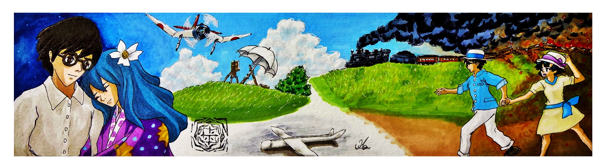
Quite a while ago I decided to buy a 24 color set of Nicker Poster Color paints. I read about how Ghibli uses them because they dry quickly, and I can confirm that. On top of that I can make the colors translucent or opaque depending on what the ratio of paint to water is. I haven’t had much time to practice much with them because of school and the construction work, but I did try some whenever I could. This one was done before I started school this semester, but wanted to talk about it a bit before posting it. I just didn’t think it would take about 5 months…

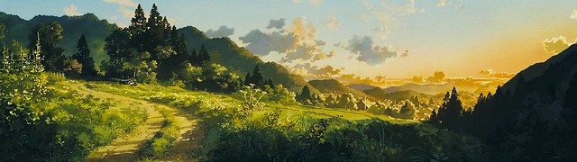
I would say that for a self taught artist, the best way to learn is to try and recreate other peoples work and try to understand their process and color choices. With that in mind, it shouldn’t be too surprising that I decided to recreate a background done by Kazuo Oga, the background artist for Studio Ghibli.

I decided to choose this image for my study                                                                              (it’s from “Only Yesterday”/”おもひでぽろぽろ”):

03-Only-Yesterday

I thought that I had documented the process, but thinking back I guess I was just focusing on painting.

As can be seen I didn’t really keep the proportions in place so I just focused on recreating the colors.

Ghibli Background Study 1st Attempt cropped resize

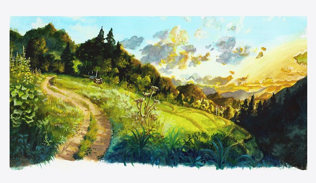
There’s an obvious difference in skill and color. But I was amazed at the versatility of the Nicker paints. I wonder just how far I can push them.

That will be all for now.

Hasta la proxima,

-NUBE

Artist Project Update 2/28/2014

I missed posting on Monday again. But just like last time I was working on another contest that appeared right after I had finished writing last Friday. This time the theme was for the new film The Wind Rises (Kaze Tachinu), which will be Hayao Miyazaki’s last film. It still requires that weird format, but this time I had last competition’s experience under my belt. This is what I assumed would happen if I kept joining contests since it forces one to produce quality artworks in a small amount of time that requires one to keep a deadline in mind at all times. I felt I could do even better, but this was a big leap from the last entry. With this format (2000 x 550) it was still a bit annoying but surprisingly I did better. I decided on a theme that touched upon the harsh past that flowed to a  brighter future because of their meeting each other (sadly judging by the trailers the woman protagonist will most likely die from tuberculosis). I could only come up with so much by seeing the trailers and reading the extremely short synopsis given by deviantart.

This time I decided to work with my small collection of Copic markers I bought a couple of years ago, I was hesitant in using them because of how expensive they were. As well as my struggling ability to work with color (though I have been getting much better). To my surprise, using them was extremely intuitive. Mixing, blending and just coloring was much faster and effortless than with color pencils, which require a lot of work to have the colors stay on the paper and meld with the picture it self. There is this new technique I have been thinking of using for quite some time now, and seeing just how much I can bring out of the markers and color pencil (though I still need to work more on the color pencils) I can see the vast possibilities I can bring to my work.

The drawing and design for this piece was definitely better than last times, sadly my camera was not able to capture all of it’s greatness. The end sides got distorted because they bend up, making the drawing and colors blur. I just might have to invest on a big scanner. It’s a pain but it will be worth it if it shows my work in it’s original intended form.

In any case this is my entry:

The Wind Rises - warm breeze


Until next time,

-XERO

Create a website or blog at WordPress.com

Up ↑