
A quick rough draft for a future painting.
Hasta la proxima,
-NUBE
"A Hopeless Dream Chaser"
A quick rough draft for a future painting.
Hasta la proxima,
-NUBE

No but seriously why bend to the Celestial Dragons? Why work for them?
Resist!!!!!
Hasta la proxima,
-NUBE

Rough draft for a One Piece drawing.
Hasta la proxima,
-NUBE

No matter how tough it looks never give up. Together we are stronger.
Hasta la proxima,
-NUBE

Rough draft of Luffy standing back up in the cold.
Hasta la proxima,
-NUBE


Run Perona, Run!
Recently saw a video of Yu Yu Hakusho and thought this would be fun to draw.
Hasta la proxima,
-NUBE


This drawing is of Luffy making an homage to Frankenstein.
Hasta la proxima,
-NUBE


I think this might be my first time drawing Law. There are some details I forgot to draw such as the spots on his pants. But at least I managed to draw the main idea.
Hasta la proxima,
-NUBE

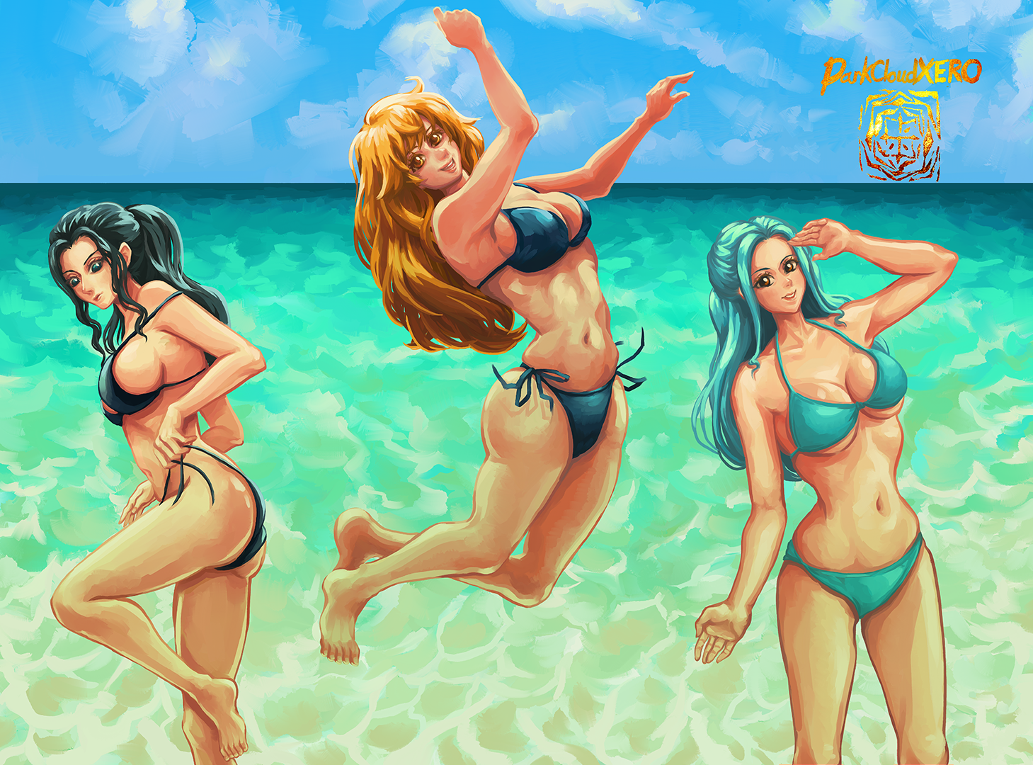
I decided to work on the Nami painting again. But I felt she was too lonely so aside from reworking her and the background I decided to add the other (official) female members of the Strawhats. For some reason I was having trouble with the colors for Robin and Vivi’s hair.
Hasta la proxima,
-NUBE

When Bonney finally realized that Luffy was the Nika that she and her father have been looking for, I felt that.
Hasta la proxima,
-NUBE

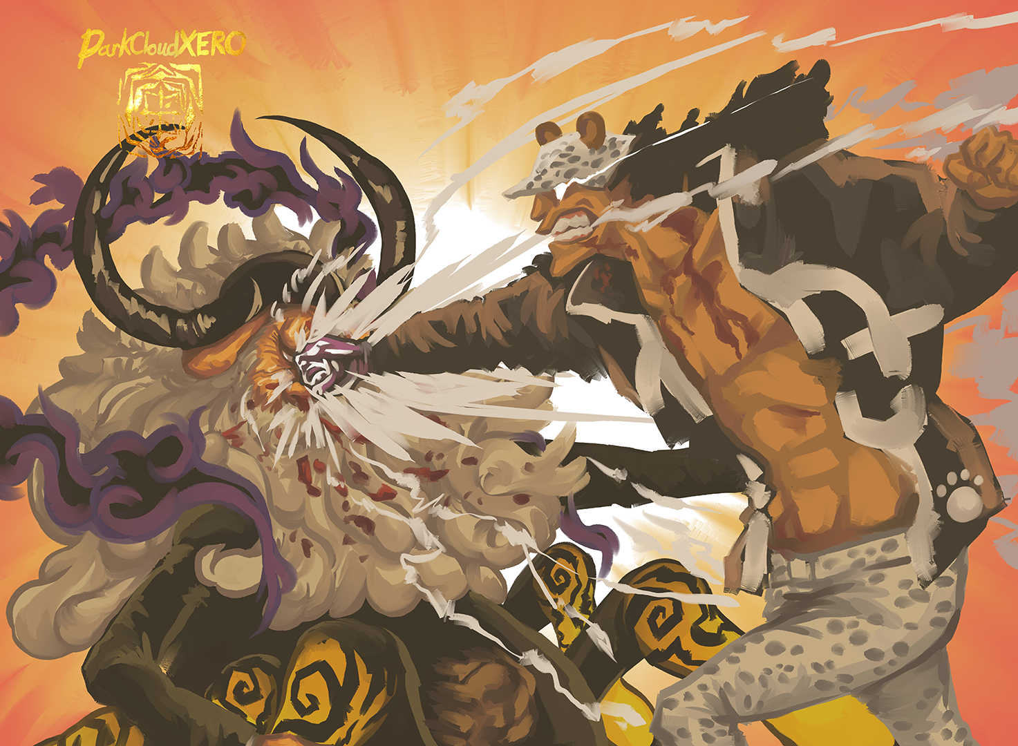
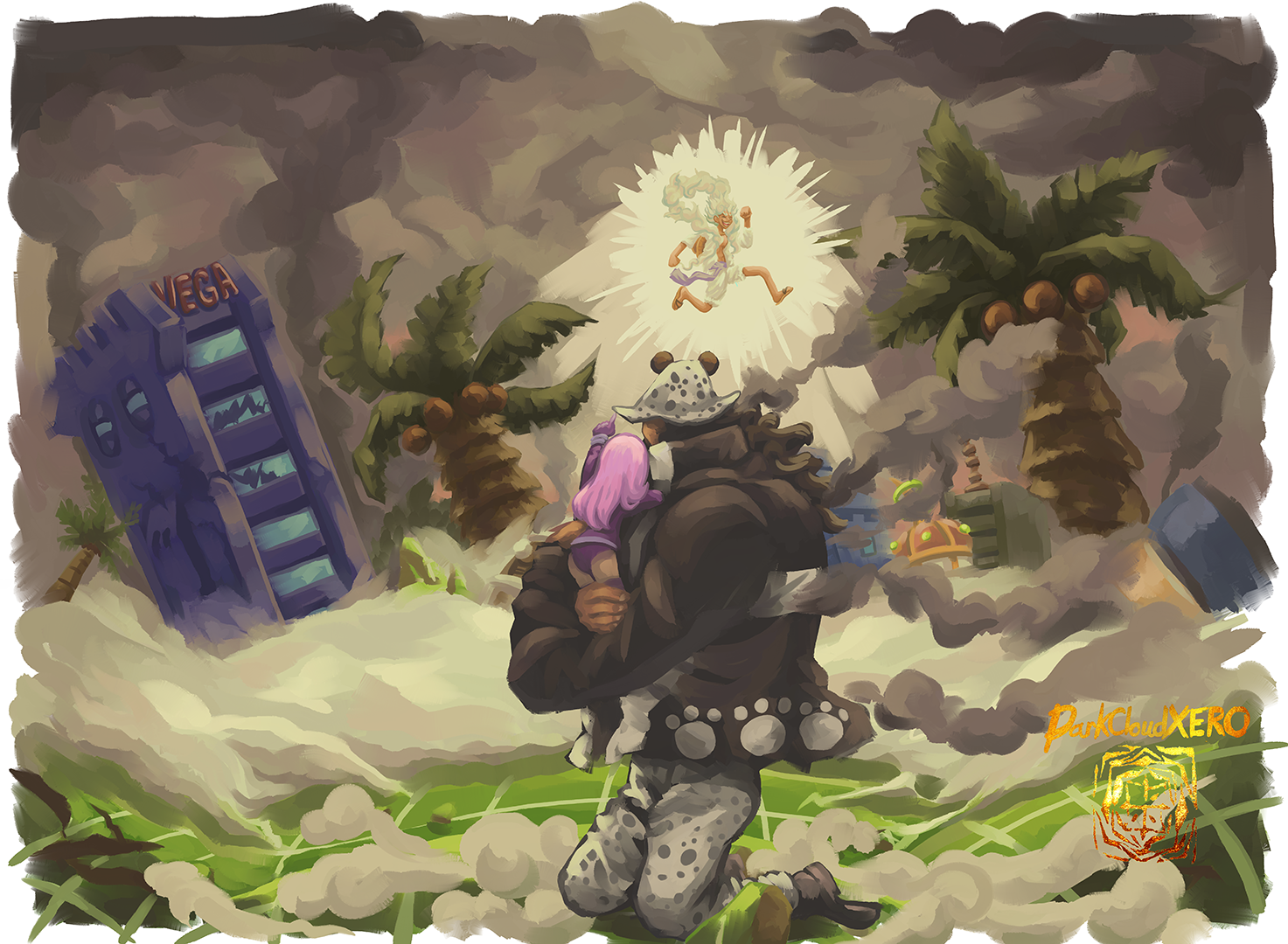
Seeing Kuma override his protocols and just pummel Saint Saturn was such a satisfying moment. All his families hardships at the hands of the five elders/world government was in that one punch.
Hasta la proxima,
-NUBE

Luffy wearing a bucket hat actually looks good. It was a happy little accident. Here’s a quick drawing today, hope you guys had a great week.
Hasta la proxima,
-NUBE
