I’m sorry that it is a bit too light but hopefully you can see it.
It took me a while to start this piece due to some things I had to take care of and me actually going out to see Colorado. But now that I have actually finished that I can continue and finally finish it. Here are two updates. Although I plan to make this simple so it shouldn’t take too long to finish it.
I have quite a couple of projects I will be working on, the matter now is how long it will take… I have three different pieces I have in mind but for now here are two rough drafts.
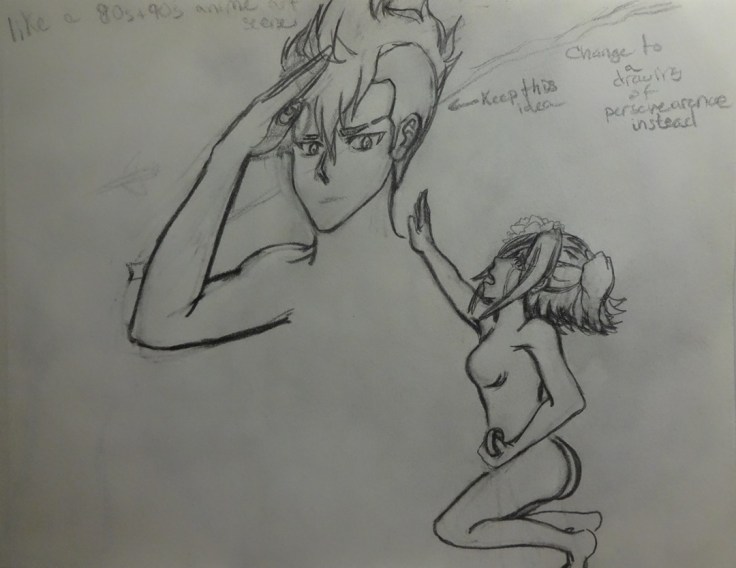
The first is a drawing of Kaname and Messer from Macross Delta. Based on episode 10, but after seeing episode 11 I decided to change things. Especifically for Kaname.
If you haven’t seen the series skip the next part.
(spoilers)
I had hoped that there was more interaction between Messer and Kaname but in the end it all turned out to be one-sided huh? But in the end it at least managed to inspire and light a fire in Kaname (as well as everyone else) to be more assertive and increase one’s ambitions to be better at what they do.
(spoilers END)
Overall I think I will only use watercolors for this piece… we’ll see.
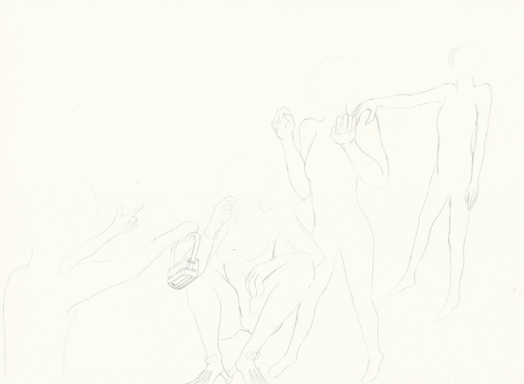
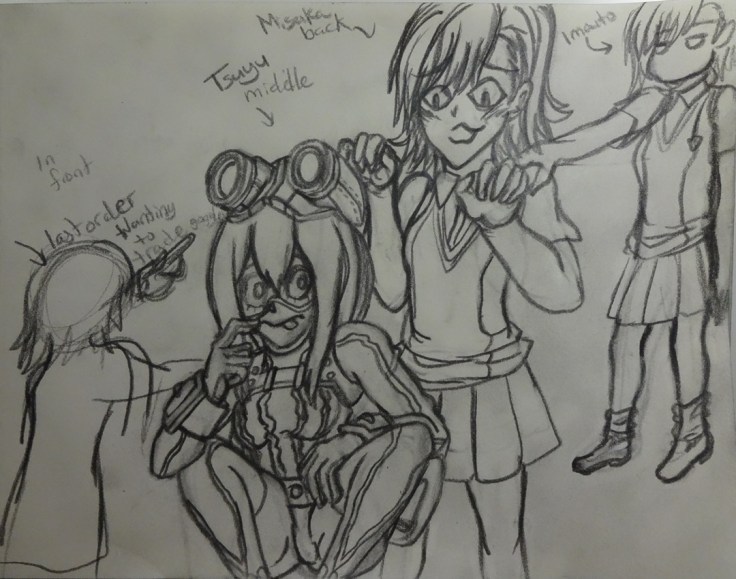
Now for the next one I decided to do a Boku no Hero Academia drawing. Truthfully this series is amazing, easily made it to one of my favorites (if you haven’t read or seen it, please do, it’s an amazing series). Anyway, all the characters are likable and very unique. One of my favorite characters (although to be blunt almost all the characters are) is Tsuyu Asui. It really didn’t take long for an idea to pop into my mind as for what I wanted to draw. If any of you guys have been checking this page and my work for a while then you all might know that I am a big fan of the To Aru series. So of course a crossover drawing becomes logical. It’s a bit rough but here you go.
The idea is there now. Getting an idea and looking for information and references for details takes quite a bit of time, but now that that has been done, hopefully the final drawings go without a hitch.
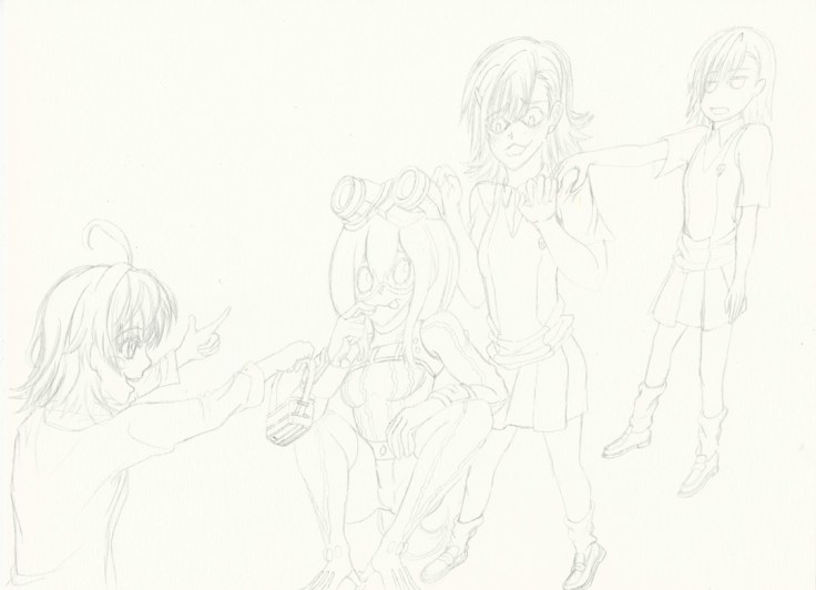
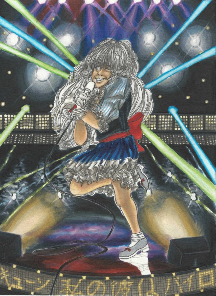
I say final but I really think I have to do a couple of more touches a little later. In the end I ended up using all the ink in some of my markers and need to buy some refills. I will have to put this one on hold for a little while, I’d say it is at least 95% done. All that is left is a couple of more details really. I am considering adding a shadow behind her due to the lights lighting her from the front, but I am still over all undecided. What I find kind of irritating is that from afar the face (or maybe expression better describes it) I drew and wanted people to see changes quite a bit, if you look at it from a closer point then the real expression becomes more noticeable. I’ll have to look at it a bit more later when I have the markers ready to go again. I really want to emphasize movement as well… hopefully when I come back to it I can make it possible. For now I will leave this here, and as of yet unfinished piece.
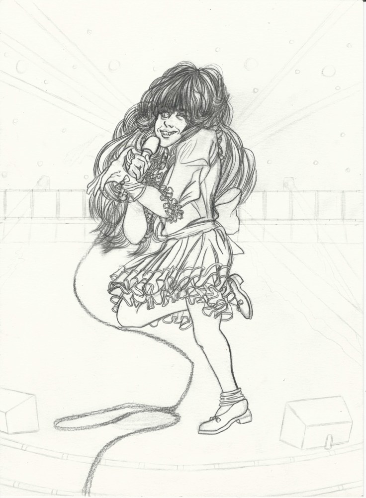
I’ll be posting another update later today. Sorry for not posting on Wednesday, I actually decided to give the drawing a few days so that I could review it with fresh eyes and make a decision on whether the way I left it was ok or whether I would change it a bit later. Results of that will come with the second post, so please look forward to that. For now see what I have as of now.
I actually had most of this done since Friday, except the last two scans but I kind of took the weekend off to think and rest a bit, so sorry for those who were awaiting the latest updates.
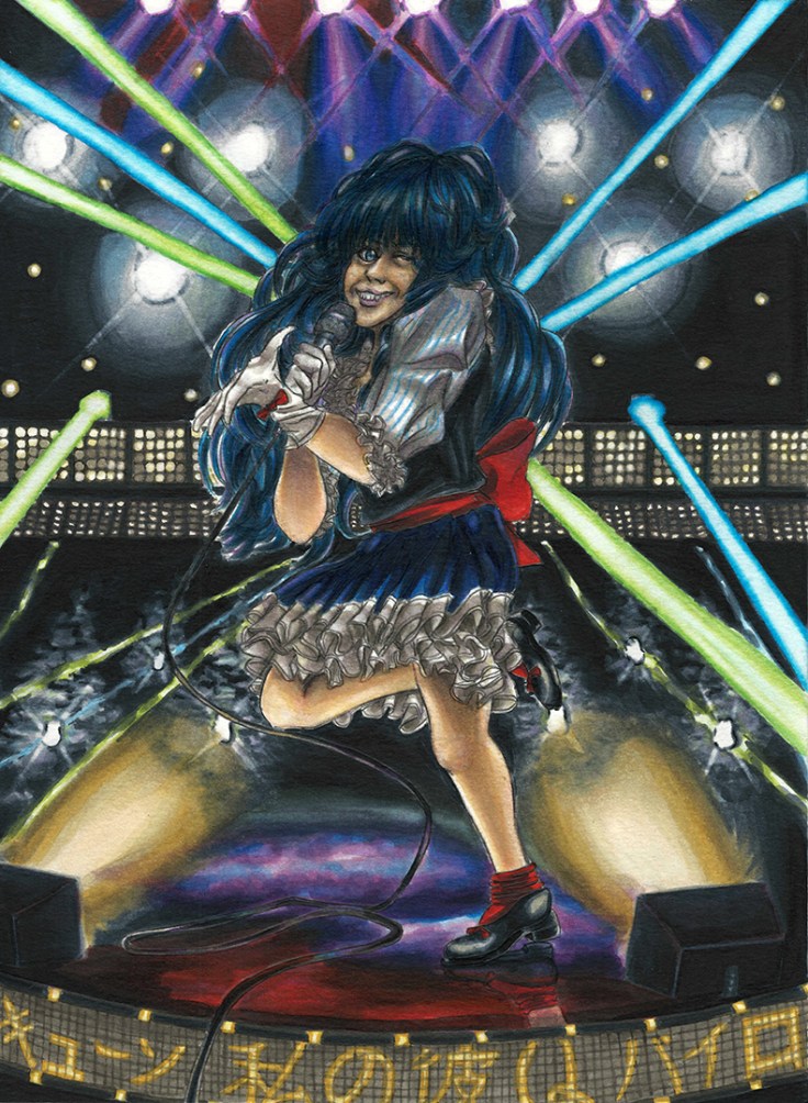
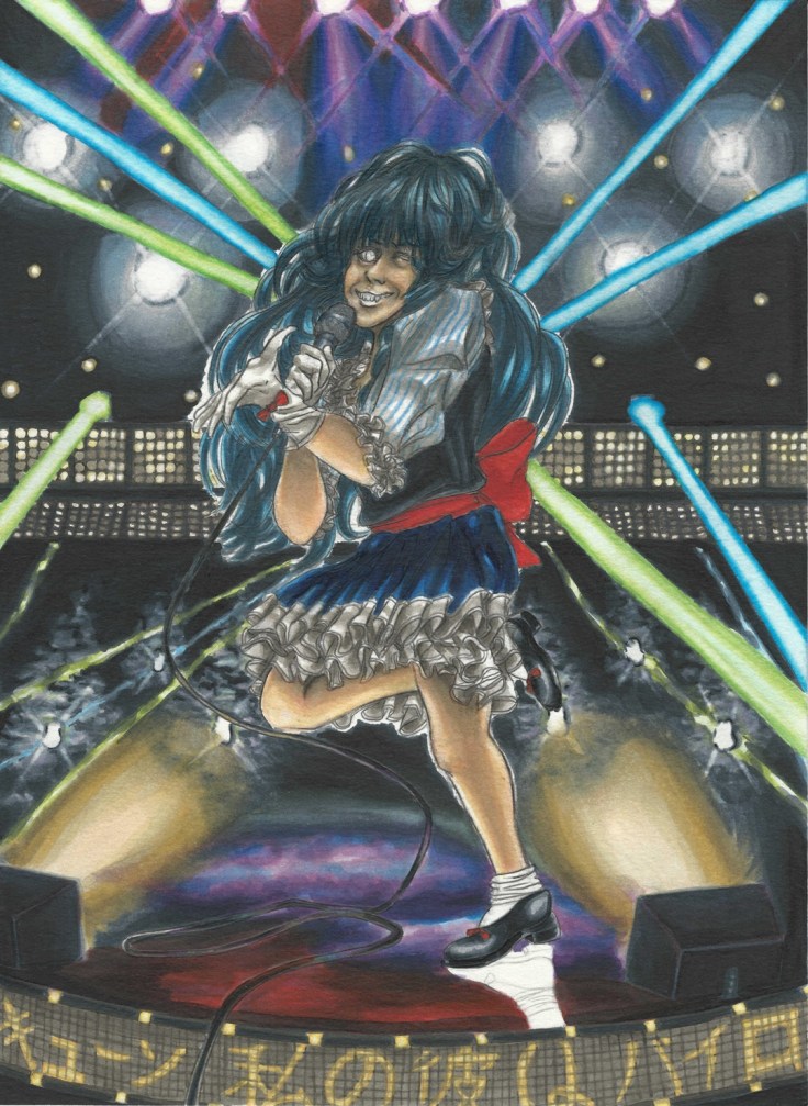
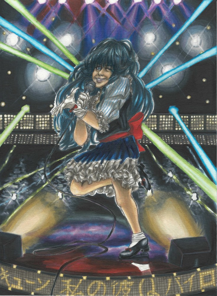
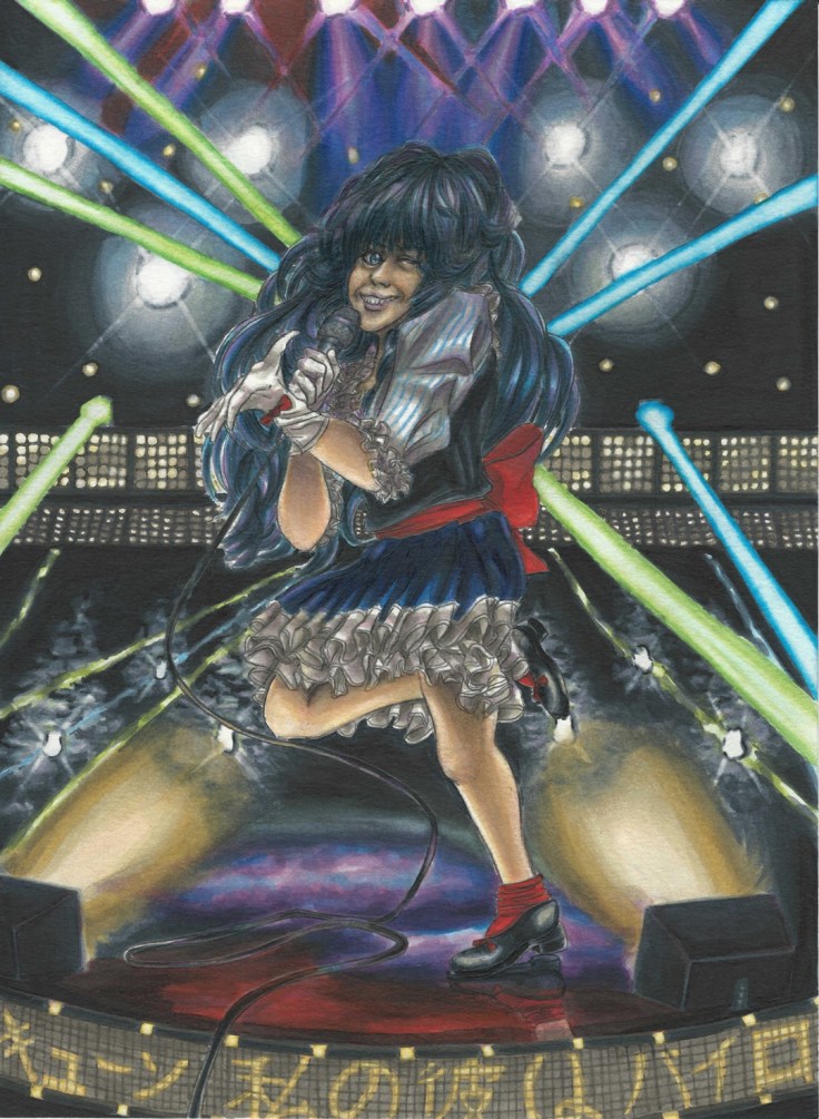
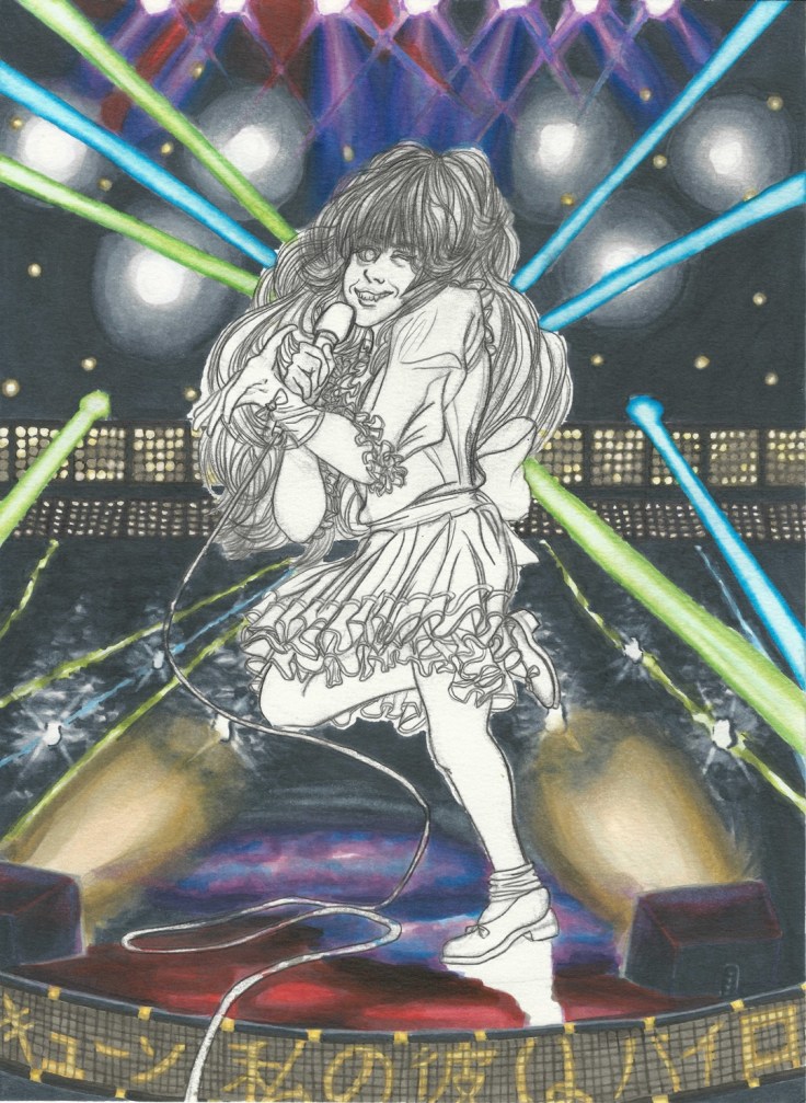
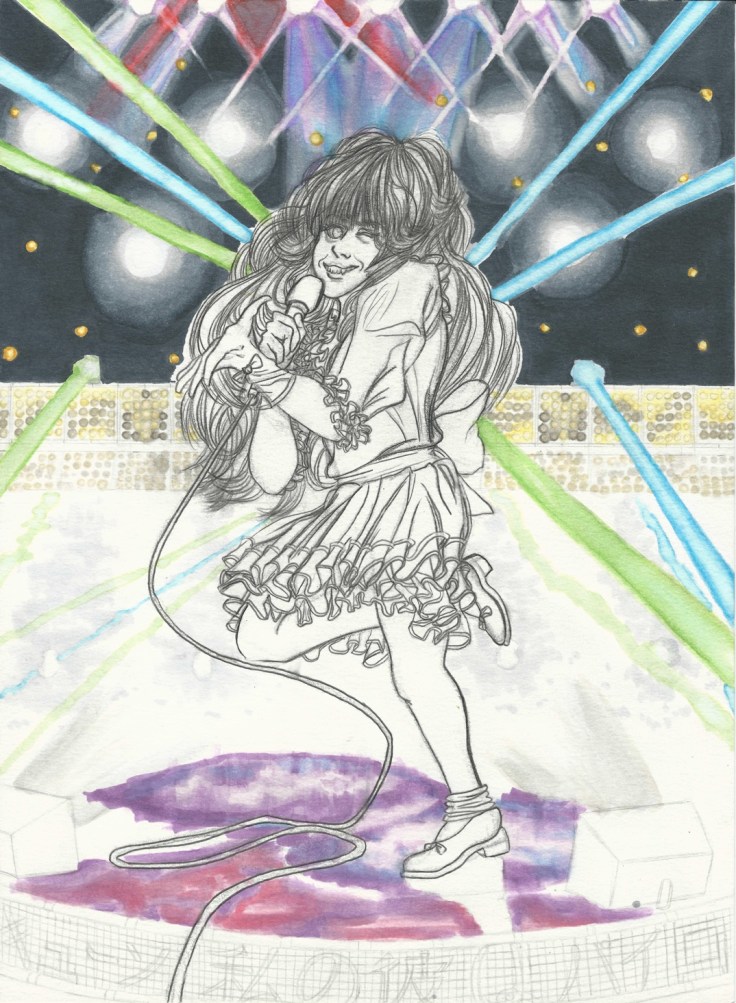
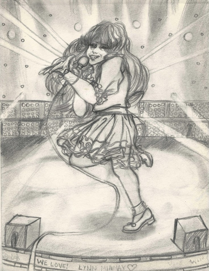
I’m quite surprised I was taking as long as I was to color the background. As expected dealing with darkness is quite tough, especially when not doing a stylistic approach to it. I had to really think before adding any colors and going over and over (repeating many times) till I had the right shades in place and then eventually adding darker areas around the parts that were supposed to have light both from the light sources and the light being reflected on the ground. I really wanted a shiny floor no matter what since I don’t really deal with such backgrounds due to knowing how hard they are but in the end I decided to go at it anyway. Over all despite the amount of time it took and cont less retouches I felt pretty confident on what I managed to bring forth. Now it is time to actually focus on Lynn Minmay herself which I had a hard time deciding on what color scheme her clothes would have. I actually did quite a couple before scrapping them and coloring them over with what she has now.
In the scans she looks quite darker than in real life, and the hair having no color surely doesn’t help things either. But trust me it shouldn’t look too weird once I have everything else in place. I’m hoping on finishing this tomorrow, here’s hoping it goes along well.
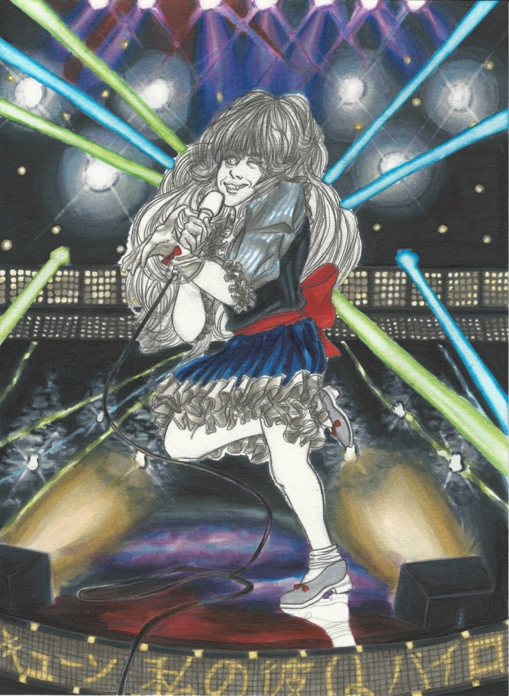
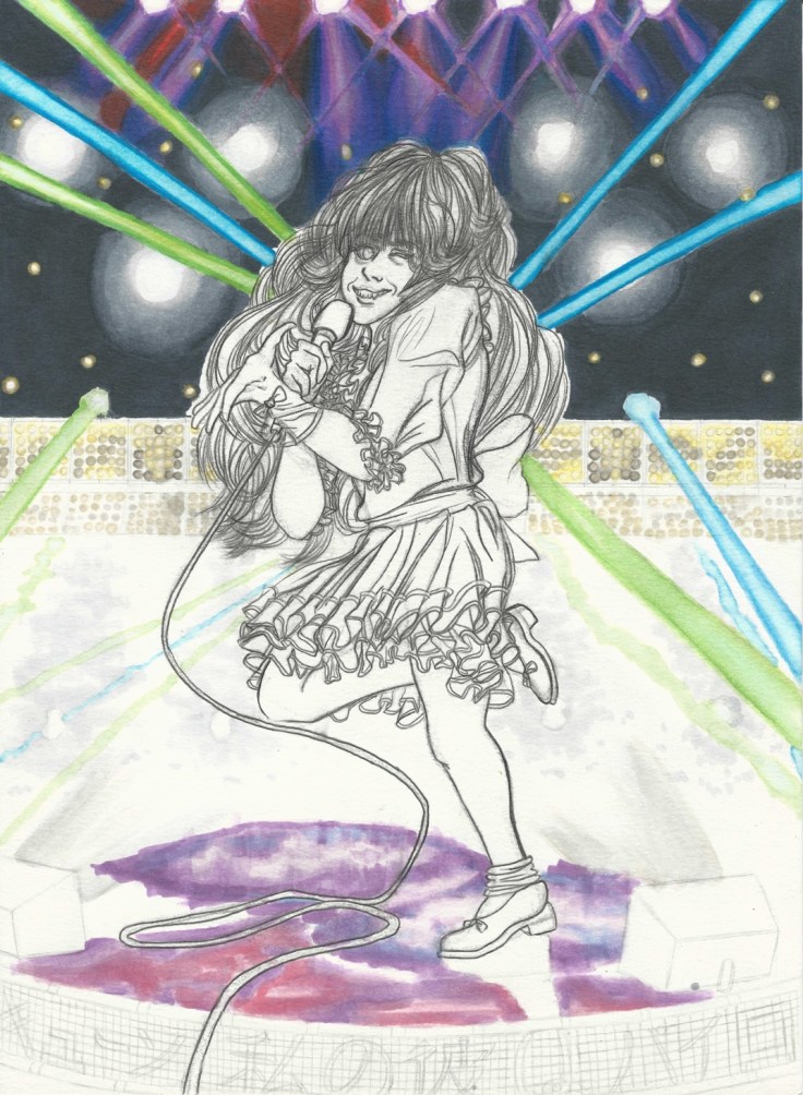
I got quite busy these last few days again, but I did get to advance on this piece. It takes quite a bit of thought process to continue after finishing one area and moving to the next. And doing on area require one to go back to previous sections to make sure they compliment each other color wise. Don’t know how long this one will take but I have been learning quite a bit from it and am no longer afraid to work with darker colors. I used some previously learned techniques which made things easier but had to develop some new ones so that I could work with a dark setting. I’d say the hardest part is making the lights look like lights. I’ve added some more details to make it look better than the last scan shows but you guys will have to wait for that update. The scanning always takes away the real lighting of my work and I have to correct it afterwords so it feels really off when I see the scanned piece on the screen.
In any case I am making progress. Just a bit more and I can have the background done so I can actually start on the main focal point.
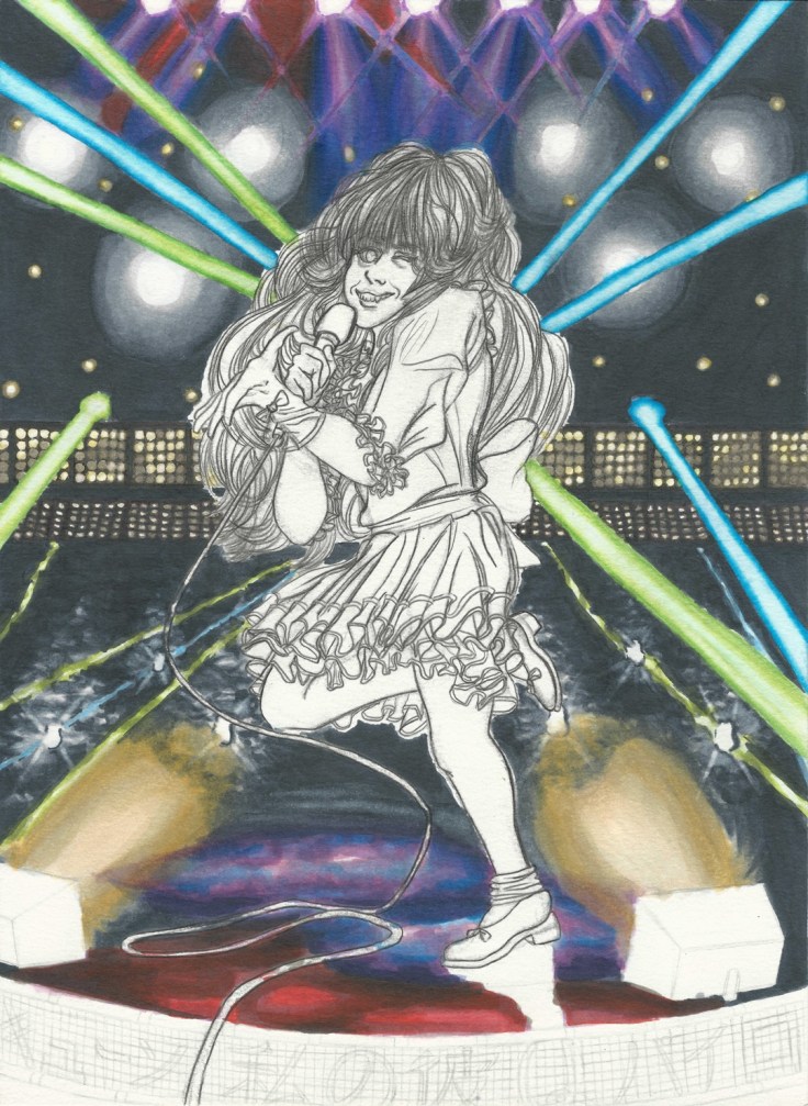
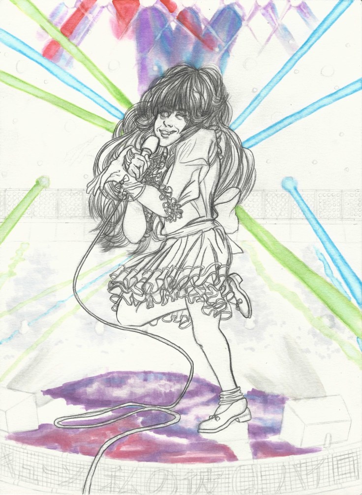
I’m really contemplating on how to go about this piece. I need to stop overthinking it but I feel I can probably come out with a nice piece if I do this right and on top of that learn some new techniques… Anyway this is what I have so far.
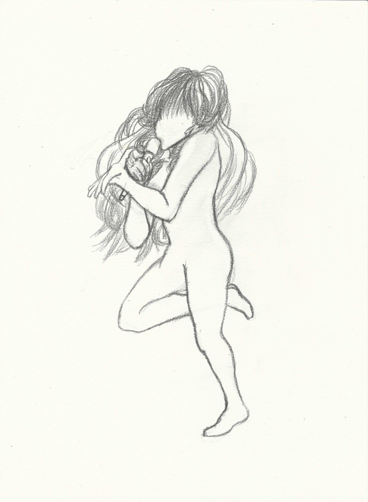
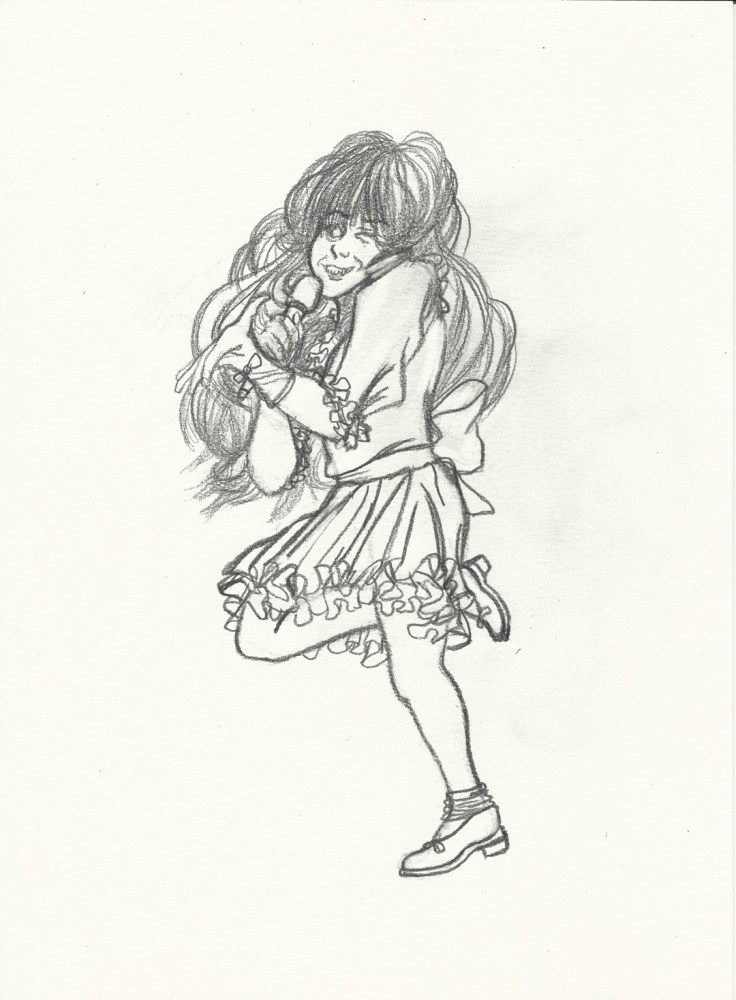
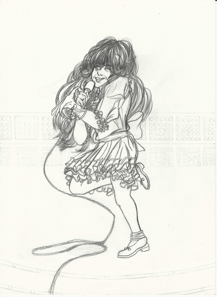
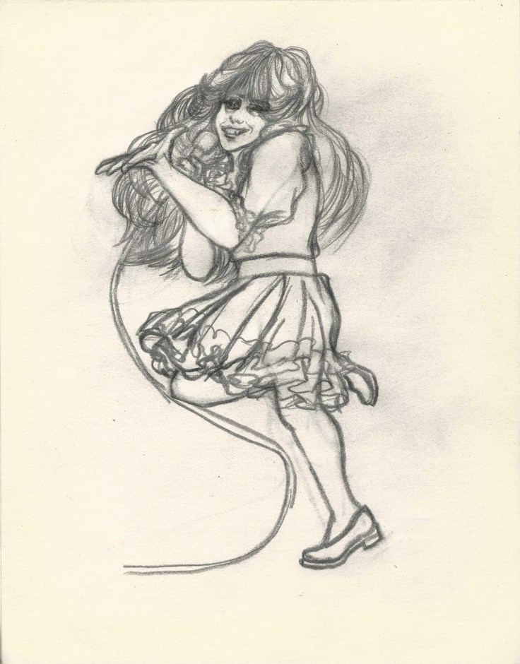
I went back to basics and bought a pencil set so that I can start using H level pencils again. Since they are so light they give me less problems when erasing them and if I do it lightly they don’t leave a mark either. I should be able to get better and cleaner work this way. The drawing is almost done now, I think I will change the background lights and make them smaller so that it appears as though the stage is much bigger. The hair is rather tall and fluffy huh? I was thinking of making it a bit smaller but after modifying it a bit I decided to not alter it too much so that I can make it look as if it was bouncing as she was dancing so that it looked like she was in the middle of movement. After adding that and a couple other details I should be ready to color. Here’s hoping I can pull off what I am imagining.
I had two final classes this week but I still have to do a couple more things until the 27th but over all I should have more time to focus on art (among other activities that will benefit my body and mind). Hmmm. I had a couple of days worth of searching for some more references of Macross and the main idols (Akina Nakamori and Seiko Matsuda) I will be using for this piece. Although I kept working on the piece throughout the week I didn’t really get much progress since I couldn’t decide on the outfit and the background.
Macross is quite interesting isn’t it? It has a very obvious 80s feel to it (it makes sense since it was made in the 80s) and yet is set around this time period. With that in mind I can actually modernize it if I felt like it. Though one can argue that the fall of the Macross on earth and the war that came from it might have stopped the progress of innovation when it comes to music and fashion. I think about things too much…
Anyway I decided to keep with the 80s feel so I set out to look at the concert performances during that time. I mostly focused on Akina Nakamori and after a couple of videos I came up with this:
I wonder if it even makes sense? I want to make this so 80s it brings nostalgia for those who actually lived it or saw the movies and music in the 90s.
Finals are finally done, so I can start having more time to focus on my artwork again full time.
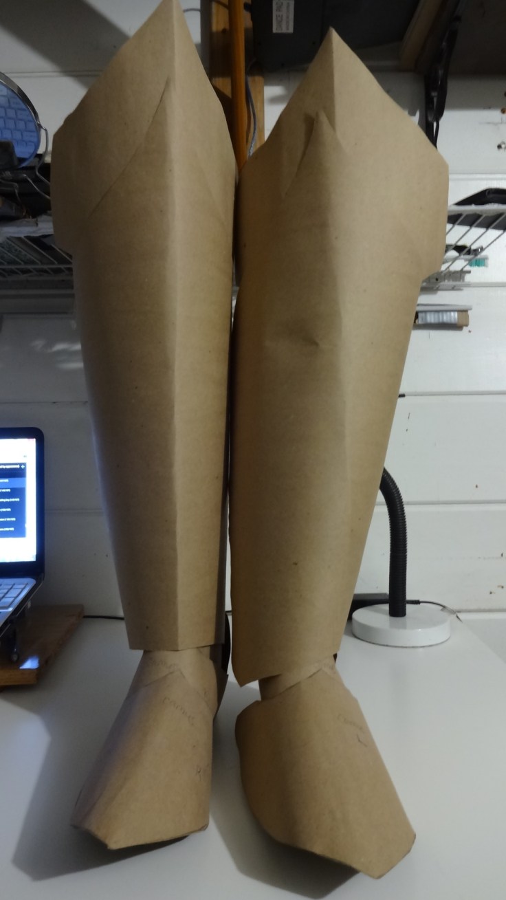
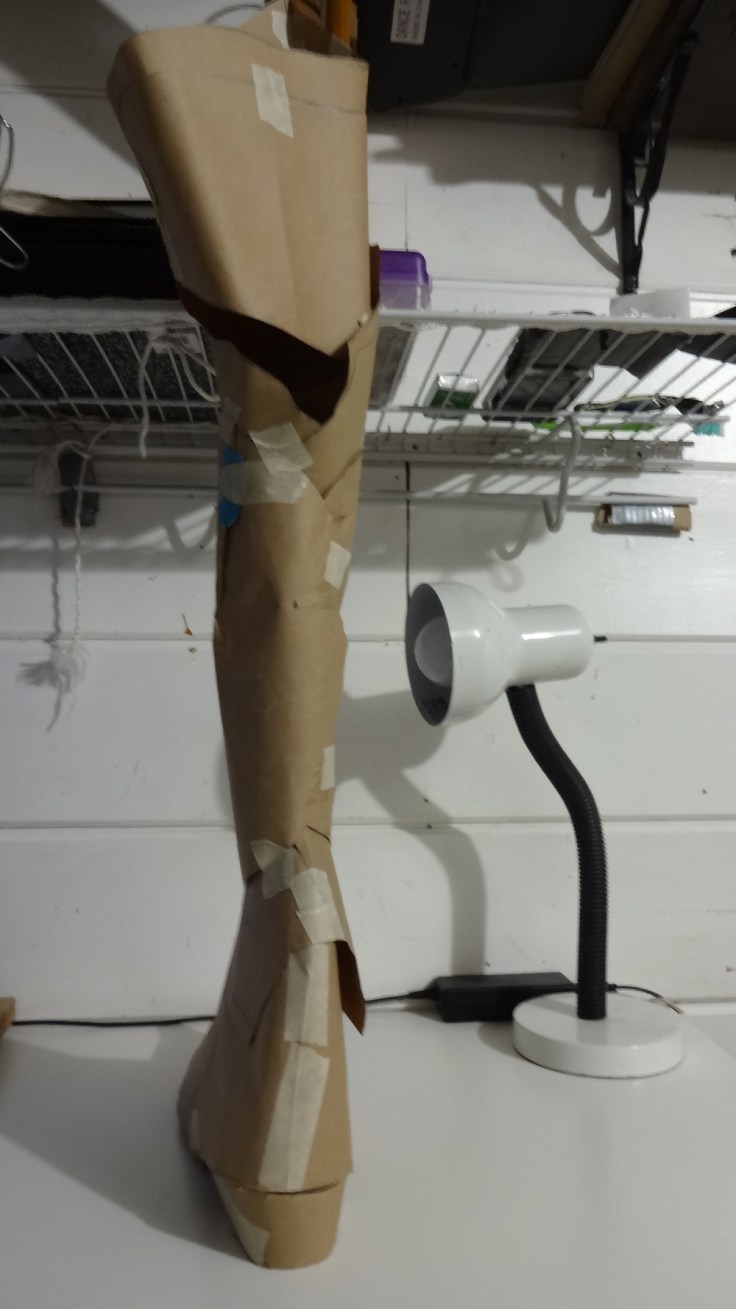
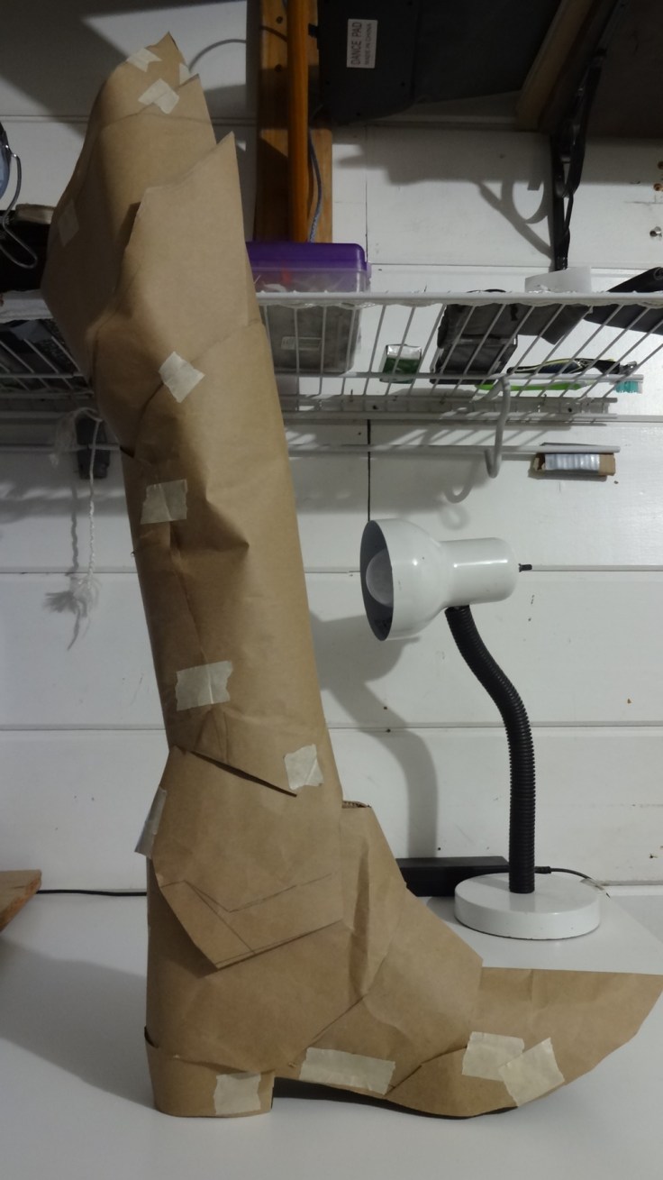
Of course, despite not posting things here, that doesn’t mean that I haven’t been working on work behind the scenes. I have made some progress on the cosplay. here are the boots for Camus.
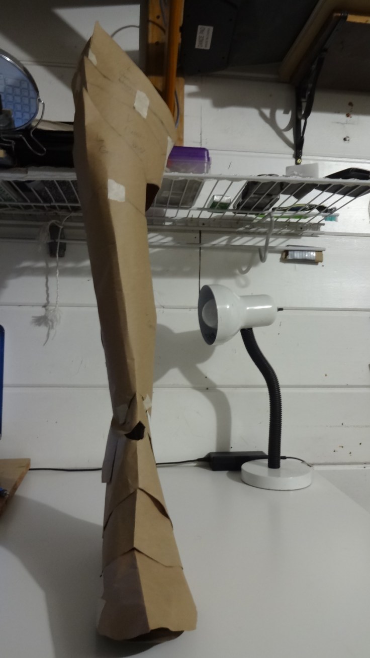
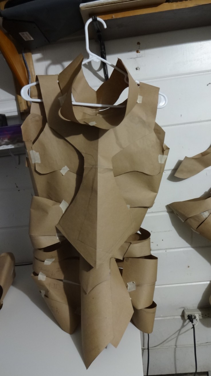
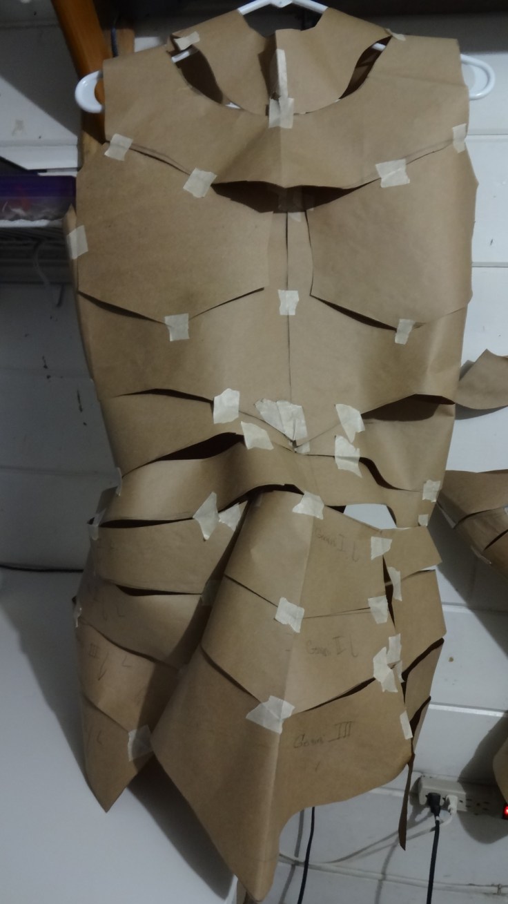
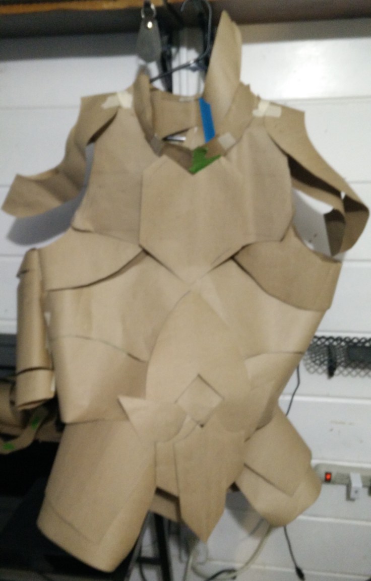
Now, as for the second armor, here it is. This time it is Gemini’s armor.
All that is left to finish is the shoulder plate (which is a bit tough) and the arms.
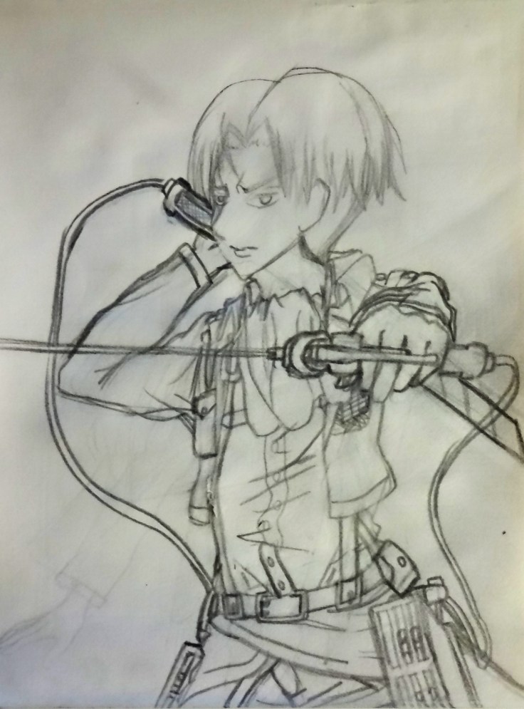
Aside from this, I got a new request for my youtube channel. This time I have to draw Levi Ackerman from Attack on Titan. Here is the rough draft of what I will be working with. It was requested that I use color pencils. It seems like the requester doesn’t have the funds to afford the more pricey art supplies, so I will be using my crayola brand color pencils. This will give a good indication of how much I have improved since the last artworks.
Here it is.
Well, I’m off to work. And since I have more time, I will try to post things more frequently.
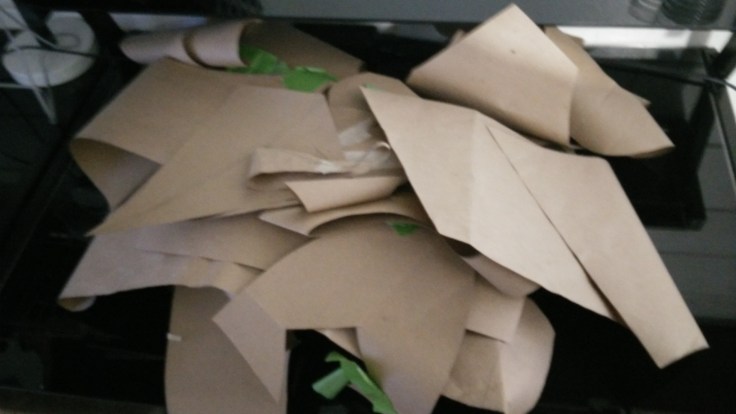
It took me quite some time to finish some work I had to do for school and some other things. But I am finally ready to start work again. I apologize for disappearing again, but the research paper took much longer than I thought. Now that is finally done and I will finally be able to work on some of my artwork, and some other projects such as some armor for a cosplay set me and my group plan to take for next years anime convention.
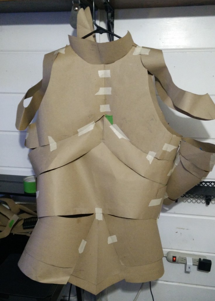
Here’s a sneak peek at what I am currently working on. This is Camus’ armor from Saint Seiya. There are about four more armors I will be working on. So I will not be saying what they are and let you guys take a guess as to what they will be.
I had to take this pile that I had all jumbled up and rebuild it back into the armor. That takes quite a bit of work, but I hope to take the template and finally make the cuts to the foam and build the actual armor. I currently have two armor templates done, next will be to build the next two.
Time spent: 8 hours 59 minutes
Materials used: Sakura 0.7 mechanical pencil, Faber Castell Perfection 7056 pencil eraser, eraser,
Sakura Pigma Micron set Black,
Sakura gellyroll White,
Sakura Moonlight gellyroll: Light green, Dark purple, Blue, Yellow
Reeves Water Colours 18 set: Viridian hue, Phthalo Blue, Ultramarine,
Copic Markers: 0, E00, C1 C3, C5, C7, W1, W3, W5, W7, YR00, Y11, Y17, Y28, V01, G21, G24, G28, BG10, BG78, B0000, B01, B05, B21, B24, B26, B28, B32, B34, B39, B45, B69, B97
Sharpie Oil Based PAINT White Fine Point
And so we continue with the Sailor Senshi series. This time it is the second member to be revealed in the series Sailor Mercury, real name Ami Mizuno. So far, I like her more than Sailor Moon. Though she hasn’t really made a strong impression on me either. On another note, I still don’t quite understand what Sailor Moon’s attacks are based on, most likely they are just random attacks that Naoko Takeuchi thought were cool. But for all other members, it seems like they have an elemental affinity tied to them. For Ami Mizuno it is water, so since the start I wanted to incorporate that. In the end I was thinking about it being either ripples or waves. I never really made up my mind before starting the drawing, but in the end I just combined them together. And surprisingly, it worked quite well together.
In any case, I hope you guys enjoy and learn from this video.