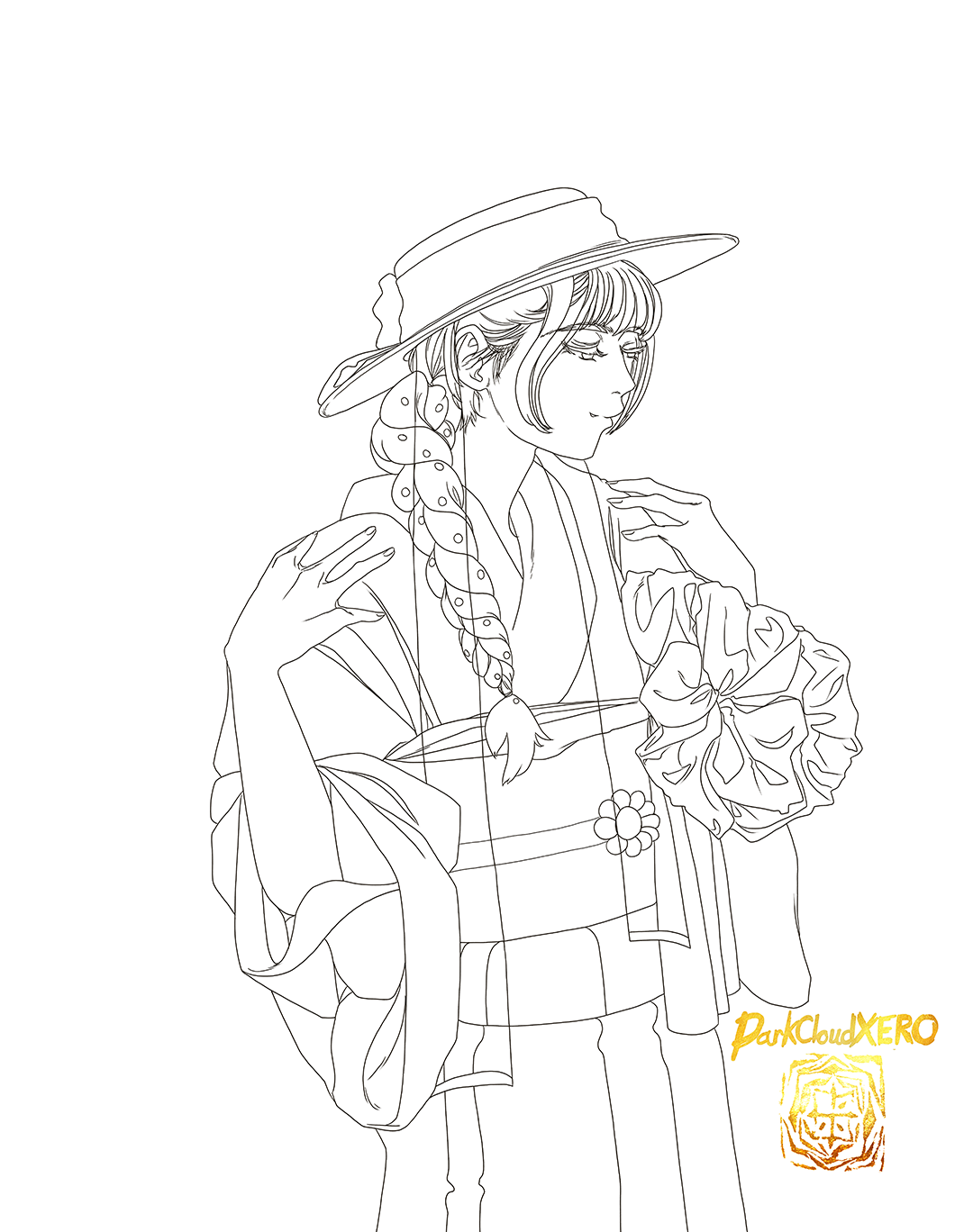
Today’s drawing is of Airi wearing the Kimono from the latest Ray Magazine cover.
I love using Corel Painter for painting, but when it comes to rough drafts, line art and flat colors Clip Studio Paint is the way to go. It’s amazing how the feel of the stylus feels when I change from pencil to pen.
I’m finally uploading the inked version of the third Michiko Nishiwaki drawing. Looking at it now I feel the hatching looks a bit messy. I’ll have to study why that is before October starts.
I’m surprised I haven’t painted Meimi before. I had seen glimpses of her in Haro Pro shows when she was still a new member. But it wasn’t till I stumbled upon this music video that I became a fan:
Although at the time it was only the short edit version.
At first I was surprised to find out that she was no longer in S/mileage which I then found out was called Angerme. Then it was her voice. It’s much deeper and really strong. Seriously, her singing is amazing. Because of her I went back to check out S/mileage and Angerme’s discography. I’ve been missing out. But more about that at some later date.
Lately she’s been doing stage plays which I remember she said she loved and preferred doing. Hopefully she will continue her singing career because she’s definitely great at it, and I just want to hear new songs from her (selfish, I know).
Pictures are from her instagram, fromfrom the Rurouni Kenshin stage play. She portrays Sanjo Tsubame, the Akabeko errand girl.
I would link them to her account, but they have been erased (she seems to like deleting old content every once in a while).
But there is video of the performance (she appears at minute 1:19):
I don’t know which version I should go with, the more muted colors version which is the original or the more saturated version which I edited afterwards.
It’s been a while since I last worked and uploaded one of the three drawings (inked) of Michiko Nishiwaki from the movie My Lucky Stars. Once I learned how inking works, I can just jump in and draw without much thought. Even more so doing it digitally since I can undo any sections that I don’t think quite work. It’s actually quite therapeutic.
The first of those drawings has been inked. I did this digitally using Clip Studio. Now that I have used Clip Studio a bit more, it is quite intuitive.
References used for these drawings were screenshots from the movie “My Lucky Stars”. A movie by Sammo Hung with co actor Jackie Chan as part of a trilogy. The actress depicted is Michiko Nishiwaki who plays a rather memerable role for the finally of the movie.
Assuming I translated it correctly, this was for a January photoshoot. Having drawn a fortune during this shoot, she drew “Daikishi” (Super Good Luck). I really do wish her the best. I’m also really enjoying her Uruma city videos. I hope more cities invite her to be showcased.
It’s been almost a month since I had painted this piece, I can’t believe I have been pushing it back by that much…
The reference comes from Momoko’s final photobook.
The ink painting used can be seen here:
This follows my current practice working with ink brushes, the translucence it contains and the application of paint and how it interacts with it. I have a couple of other pieces that I can use to continue this practice. It’s amazing, but it does have it’s limitations on what can be done (coloring wise). On the other hand, the effects and textures are really unique and interesting.
I finally finished. I guess because there’s so many details it took quite a bit of time. But overal I like the way it turned out. The Holbein Watercolors do exactly what I want them to do, I don’t think I can go back to any other watercolors at this point. And this is using Master’s Touch watercolor paper which isn’t really that good quality (although I highly recommend it since it’s the best paper at the price range). At some point I should try painting on some higher quality paper which I tend to neglect since they are, you know, quite expensive. But I feel confident enough to try it now. Once I again I am using watered down ink for the outlines which works really good when applying color on top of it since it’s also translucent and reacts with the color one applies on top. This leaves it open to apply more color to the outline or ink to make it darker. Although I did add some shadows to give the background some 3dimentinality, I decided to make Miyabi’s colors flat so as to not overwork the painting which I tend to do. Doing so gives the finished painting a much cleaner look that pops out quite nicely (Thank you Little Thunder for showcasing your artwork! I always learn so much looking at it.).
I really love the colors that Miyabi chose for her kimono and her makeup. They really fit well with the background colors. I was planning to add the color variations to the kimono. But as I was playing around with the way Mars Violet interacted with the yellow mixture I used for the Kimono base color, I decided it would look best as a simple color. Hopefully I managed to replicate Miyabi’s beauty through my brush.
We are well into the New Year now, so I will now focus on some winter drawings/paintings before the season ends.
I really loved Miyabi’s New Years photos. She looks really beautiful with her kimono. She mentioned it was a retro look, so I’m guessing this is a Showa era style? It really suits her. She looks so aesthetic with the shrine in the background. I think an 80s/90s anime style would look good but I feel it will also look good in watercolor. Just recently on her Twitter she mentioned that she has been getting nostalgic for Berryz Koubou. She also gave the impression that there might be a reunion of some kind. ・:*+.(( °ω° ))/.:+
Thank you so much for this past year Miyabi, hopefully this year will be great for you.
Since I had some time yesterday, I decided to try out my new calligraphy brush. The model that will be the first to try it out is Momochi, using a photo from her last photobook as reference. I’m surprised at how accurate the brush the brush can be. I really enjoyed the experience. For this painting I decided to do it freehand which can be pretty dicey but it does speed up the process by quite a lot. And sure enough it did, but I did do one mistake. I put the mouth and nose too low so I made the decision to alter that using Photoshop.
Since were are past half way through this month, we are closer to Halloween now. I’ve been re-watching “My Youth Romantic Comedy Is Wrong, As I Expected”. I never got to finish it when it came out. So hopefully this time I actually get to finish it. I’m really enjoying it (currently in season 2). In season 1 episode 8, Yui and Yukino both dressed in cosplay. The costumes used are what I used for reference in this drawing.