Now with all the line art completed I can finally compile them in place. In order to not have the line art clash I added a white backing to help overlay upon their respective layer. With that ready, next comes painting the background and eventually the characters.
I finally get the chance to upload this painting of Sylvia. It’s been waiting for weeks. But because of that I was able to do edits along the way. I tried playing around with various lighting techniques on this one.
I think this might be my first time drawing Law. There are some details I forgot to draw such as the spots on his pants. But at least I managed to draw the main idea.
Here is the final painting, there are two versions. One with lighting and one without. And despite the effort I put into the background, most of it is covered up. Hehe.
In focusing on painting and trying to understand color I started neglecting form and proportions. So it’s time I go back to basics and start drawing again. I’ve notice I find it much easier and natural to do so traditionally. I’ve been feeling a bit off so hopefully I can get back in the groove soon.
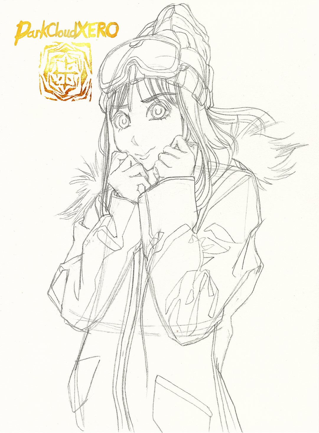
I’m currently working on a Christmas painting but time has been reduced a bit lately. So although I wanted to leave this painting for later I decided to finish it today. There were a few tweaks that I had to do last minute today to fit in more with Rin Shima’s gear. I had added some falling snowflakes but decided to omit it and only left some lit particles on the fire.
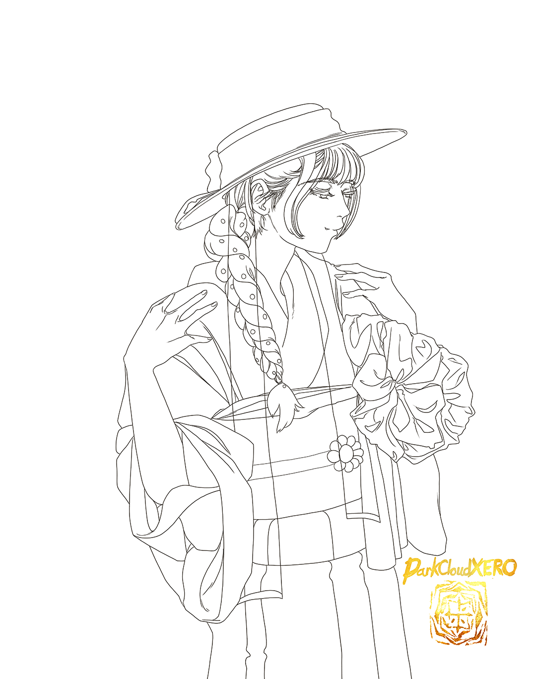
Today’s drawing is of Airi wearing the Kimono from the latest Ray Magazine cover.
I love using Corel Painter for painting, but when it comes to rough drafts, line art and flat colors Clip Studio Paint is the way to go. It’s amazing how the feel of the stylus feels when I change from pencil to pen.
I was fighting this painting till the end. I made so may edits at different times and now I’m not even sure how I feel about it. Did I push it too far? Not far enough? Should I simplify more? perhaps at a later date I will know the answer. But for now I will leave it as is.
I really like Memcho, I hope I did her justice. Either way I want to paint her more in the future.
For those who follow me here you get to see the old version I had ready to go a couple of weeks ago before I began editing it this week:
In this version I was following the line art more closely that I drew for Inktober 2023 Day 16.
I had to modify some of the lineart but for the most part it all worked out. I know the anime uses blue hair, but I quite like the more purple hue she has in the manga illustrations. the outfit and colors I got from a figure of Rin on her Yamaha Vino. It really helped out a lot.


