
Don’t know if I will use this painting as a background later down the line but I just felt like painting a cloud like this. Thinking about it now I didn’t really struggle much like the past attempts.
Hasta la proxima,
-NUBE
"A Hopeless Dream Chaser"
Don’t know if I will use this painting as a background later down the line but I just felt like painting a cloud like this. Thinking about it now I didn’t really struggle much like the past attempts.
Hasta la proxima,
-NUBE

I want someone to run through the field, I just haven’t decided who.
Hasta la proxima,
-NUBE


Although there are still a few days till the end of Autumn, it is also Christmas time that will be coming up. With that in mind, this will be the last painting of the season so that I can start working on both Christmas and winter paintings.
Although I like most of Ranma 1/2’s characters, Shampoo is definitely fight for the top spot (it’s always fluctuating among girl Ranma, Shampoo and Ryoga).
This time I decided to add some backlight with Photoshop. I don’t know which version I prefer more.
Hasta la proxima,
-NUBE.

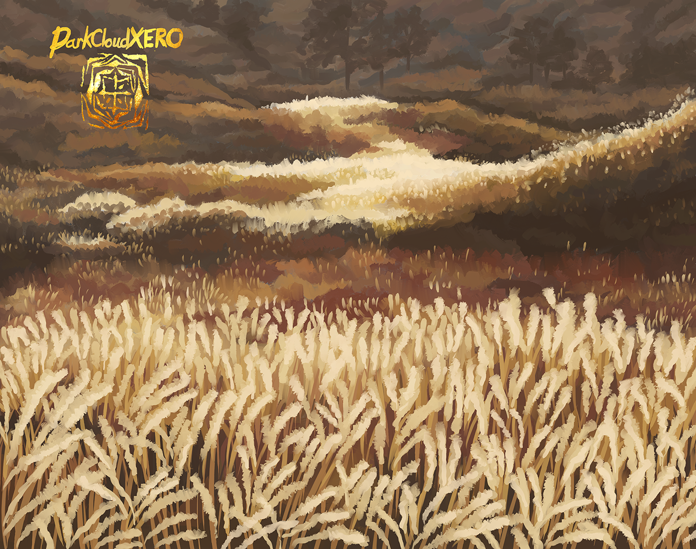
Since we have entered December I will start working on some winter paintings. So I want to speed up the final Autumn painting this year. Here is the background.
Hasta la proxima,
-NUBE.

Line art from inktober 2021 day 3.
I wasn’t too sure what to do with the background, but as I was looking through my screenshot references I came upon a couple of a sunset that I wanted to replicate.
Reference here:

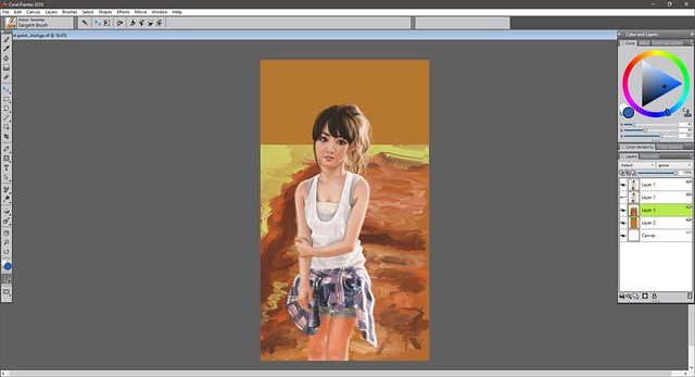
I was wondering whether to change the colors of the outfit from the reference of Kyôko Koizumi:

But I quite liked this color combination so I decided to keep it. As for the color of the sneakers, I was playing around with the idea of various colors like purple but I ended up with this black accent ones.
Hasta la proxima,
-NUBE

I thought it would take me longer to paint it but once I started, the flow just kept going. I need to make more watercolor paintings. It’s strange, I was wondering just how much my digital skills would translate to traditional. But they are quite different. One main thing that it has helped me is with layering. As in putting in the base colors and adding more details on top. I’m no longer second guessing my self anymore. But I guess that is more a matter of getting more experience in general. Only way to get better is to just keep painting and thinking about what each technique and stroke means.
As for why I decided to make this painting. I love Oosama Ranking. It is quite an emotional series. Everytime Bojji and Kage overcome obstacles and keep pushing forward, I feel this massive feeling of pride for believing in Bojji and motivation to keep trying my self. Not a lot of series can do that for me. On top of that, the author plays around with clichés and little by little let’s us in on a great mystery that embarks their family and kingdom. The anime really did a good job of elevating the manga to another level. I of course really recommend this series as well.
Hasta la proxima,
-NUBE
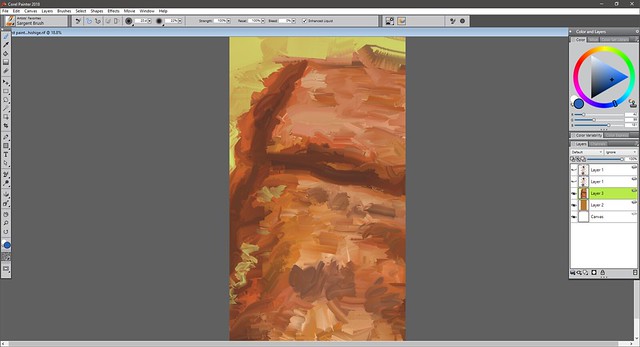
This is the background for another painting in progress. I want to do more pieces that capture the rainy weather we are experiencing where I live and the green foliage that has bloomed because of it.
This has been painted with Corel Painter.

Hasta la proxima,
-NUBE
A painting that I painted last minute. Was a bit busy but I just barely made it. Hope you guys had a great Earth day. Hopefully everyone is still protecting her. I’ve had the idea that Master Asia from G Gundam and Earth chan would pair up nicely (those who have seen G Gundam know why). I don’t blame Master Asia for his decision to execute his plan. I mean, who wouldn’t want to protect her at all costs.
Hasta la proxima,
-NUBE
This is a double feature of sorts. I will be doing two types of painting on this drawing of Goku which has been drawn with ink. I first used watercolors to paint Goku and then I painted him again digitally using Corel Painter 2020. The time between each was very noticeable. The traditional painting took and the digital painting took me only . I really have to think about how I advance after every movement. Meanwhile with digital painting, I seem to have more experience and I can make as many mistakes as I want since I can undo right away. But I guess that doesn’t completely transfer over to traditional. Although I can go as detailed as I want, it might be better if I develop a simpler style like Little Thunders which can be so versatile but not overworked.
This painting has made it clear that I should practice more with watercolors. One other thing I remembered, don’t ink your drawing if you will be using watercolors on it (this is only if the inks aren’t waterproof). Otherwise they will smudge when painting. Instead, go over the lines by pressing hard on them using a pencil (I mean I know this, I don’t know why I didn’t remember). Then erase everything. If done correctly, the lines will be visible even when painting over them. One you are done painting, the line art process can finally be done. This can be done with ink, color pencils or more watercolors.
Hasta la proxima,
-NUBE
There was something very comforting seeing Rei doing some farm work. It gave some really strong Ghibli vibes. I wanted a dreamlike aesthetic so I used really vibrant colors for this painting. Rei looks quite peaceful. In a way, this piece is the opposite of Asuka’s winter painting.
This painting was done using Corel Painter’s Sargent Brush and tapered oil brush.
Hasta la proxima,
-NUBE
Many of the side characters in Captain Tsubasa could’ve been very generic stereotypes but I really do believe almost every single one of the main rivals that Tsubasa encouters are not only very interesting but interesting enough to be main characters in their own series. Truthfully I prefer almost every one of those rival characters to Tsubasa who I find to be really boring (but I guess that is usually the case with most protagonists of shonen series.
In any case, I have said it before and I will say it again. The best character is Hyuga Kojiro who very easily could have been that cool bad character that one loves to hate but is usually very one dimensional for most of the series until they decide to flesh them out. But instead they decided to show just how much of a hard worker Kojiro is and how selfless he is as well right from the start. Aside from his rather combative and harsh personality in the field, he is a person that one could look up to and admire. His life is not easy, as he has to support his family who is struggling financially by both working and taking care of his siblings. He not only does it but he understands the situation and doesn’t hold a grudge against anyone for his predicament. And finally, despite all that going on, he decides to continue doing what he loves and works towards his dream of being a soccer player. He truly is the antithesis of Tsubasa who was born a genius soccer player with a whole family who not only loves him, and has financial security but they also do everything they can to allow Tsubasa to pursue his dream of becoming a pro soccer player. One has everything given to him and the other has to struggle to achieve his goals.
Hasta la proxima,
-NUBE
This painting was finished on August 15.
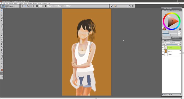
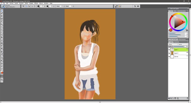
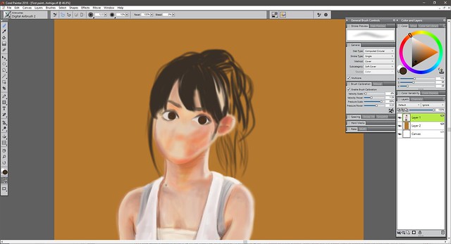
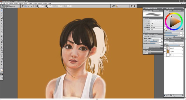
I’ve been wanting to learn how to add color to my pieces so the best way is to study photos and also see why other peoples paintings work by recreating them. Using the eyedropper tool is quite useful but I want to practice and learn how to choose color just by using my eyes and instincts. Doing it traditionally is easier since I’m limited to the colors I have in hand. But digitally I have to really focus and think about it since I have every color imaginable at my disposal so it can get a bit overwhelming and the chance of screwing up is quite a possibility.
At the time of this painting I had invested in upgrading my Corel version up to 2018. So this is the inaugural painting I did for it. Corel and Photoshop are quite different. Photoshop is quite versatile and one can do a lot of things with it quite easily when it comes to editing but I feel that Corel is the better program to paint. Something about it makes painting more intuitive. But I tend to switch from one to the other when creating new paintings regularly. Sometimes I hit a bump and for some reason seem to find it easier to do on the other program. (・∧‐)ゞ
In any case I of course chose Sayumi Michishige as the subject, as you can guess I really love her aesthetic and her photo books are filled with a lot of great pictures to choose from. As stated before I chose colors by eyeballing it and am surprised I wasn’t too far off. If you compare my painting to the photo of course there are a lot of differences but I feel like I managed to capture the essence and you can tell it’s Sayu right? (๑•̀ㅂ•́)و✧

This is the reference picture used from Sayu’s photobook “La”:

Here is the process:


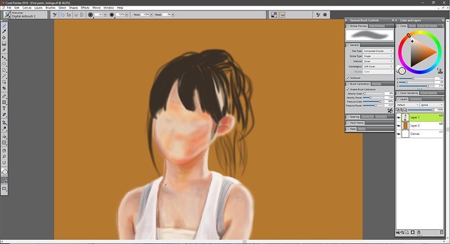
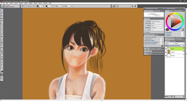


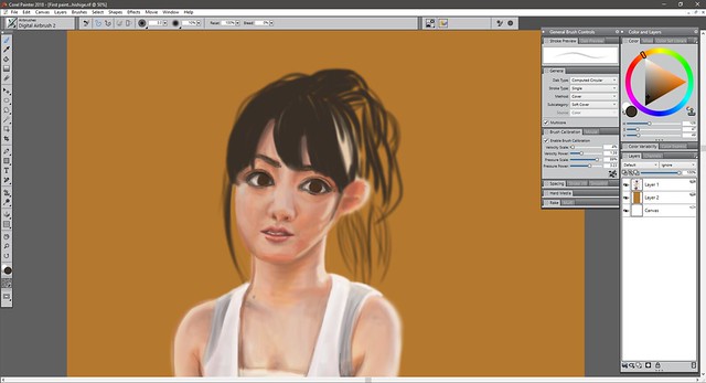


The eyes were too big so I had to resize them.


And that should wrap it up for now. I really loved working on this painting and am glad I was able to get it to this point. It looks realistic but also like a painting which I really like.
Hope you guys like it.
Hasta la proxima,
-NUBE
