Halloween/Fall Artwork; Ghost Girl by the window

I was hoping to do a bit more artwork for the seasons, that way I had a bit more to aim for and to just get into the spirit of the holidays around the year (I feel that if I continue not to do so the years will just continue to feel monotonous and boring). I might do another quick one for Halloween before the actual day. Though Dia de los Muertos is also approaching…

It’ll be fine…

I guess that midterm and the extra work that piled up really did a number. But that’s life I guess.

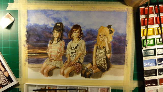
I want to be able to meld reality and anime a bit more, so I want to play around with that a bit more. And this is one of the paintings where I am giving that a shot.

I am wondering if the way I do watercolor paintings look good to others or If I should make them look smoother so that the grain of the paper isn’t as noticeable. I can do that a bit more if I use color pencils to go over the watercolors I already put in. I have used this technique before, but I want to get better with just watercolors first so that I don’t just rely on color pencils to fix my inexperience. Once I get better I will try to combine them again, but hopefully this time correctly.

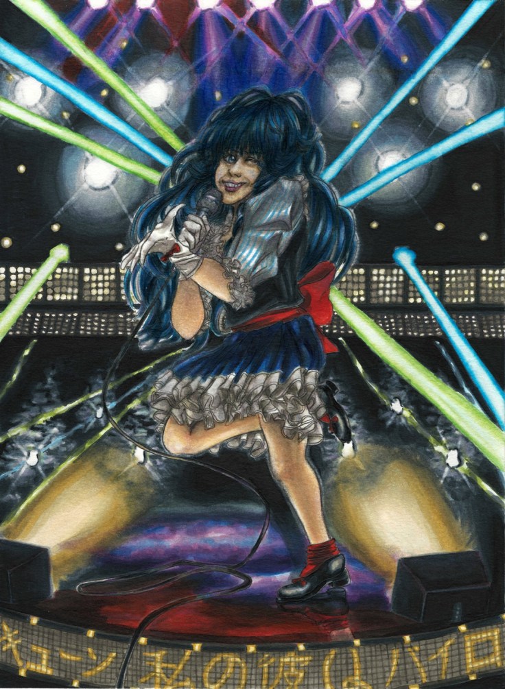
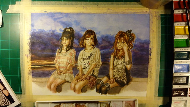
In any case this is the painting in question:

Ghost Girl by the window resize

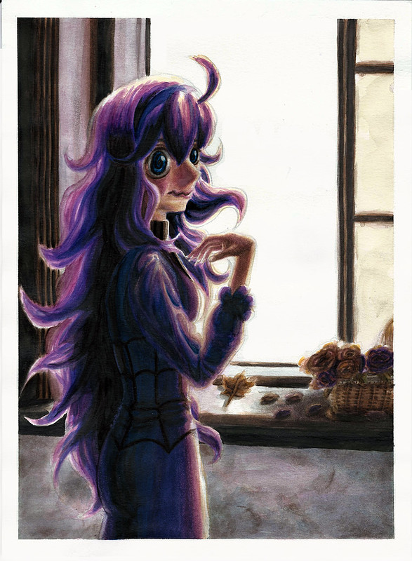
There’s something about the character design of the ghost girl from Pokemon X/Y that I really like. So that is the theme for this year’s halloween painting. I was also looking forward ot seeing if I could make her zig-zag mouth look like it could belong to our world (what do you guys think?).

The painting itself is largely inspired by this picture I used as reference:

Cosplayer: Cherry Neko

ZkFmTE91UWs4eG5nUDNreXZSR2sxQ0w1UzBzdnJJNEliTWRjQWVjM28wQVoyQktCdXVUekF3PT0

One other thing I really wanted to try out was seeing if I could choose the right color schemes despite the reference pictures having different colors. As I’ve mentioned before color is still something I’m struggling with. So this was designed to be a good challenge for me to play around with that. I’m still relying on references but I will learn faster this way, and I will have a better understanding of how colors work as well.

I’m starting to get the hang of watercolors a lot more, to the point that I’m no longer afraid to try new techniques and push ones I’ve used before further. I still get a bit frustated when the sessions go for too long and I can’t quite get it right, but that’s fine (nothing a little rest can’t fix).

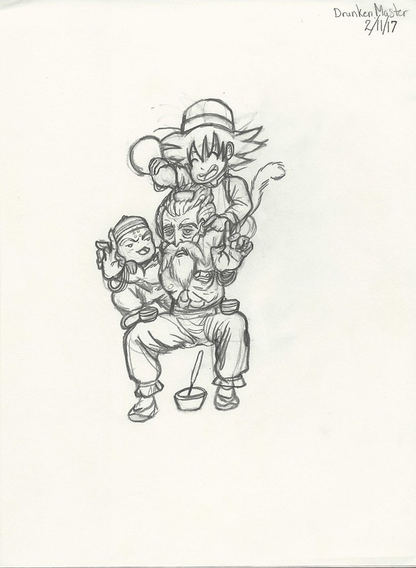
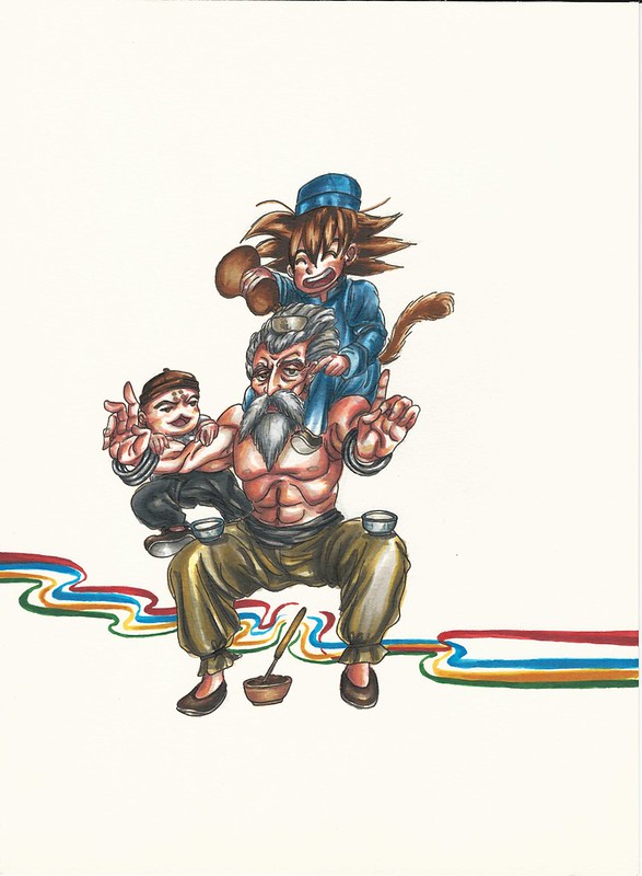
Strangely enough I actually drew this picture various times (four times) and colored it twice. Once with Copic markers and the second one with watercolors which is the one you see above.

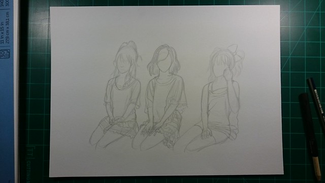
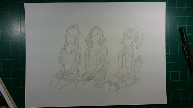
Here is the original sketch/drawing:

https://www.flickr.com/photos/darkcloudxero/37997922582/in/dateposted-public/

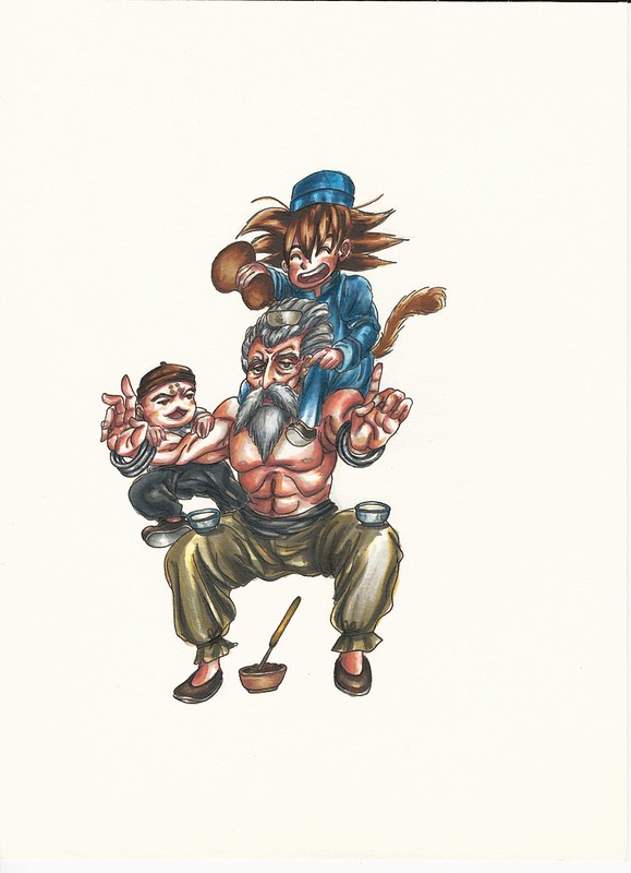
Here is the Copic version done with one of said four drawings:

Ghost girl 2017 I resize

The copic version exists because I wanted to first try out the color schemes that I thought would work. I did this because I didn’t want to use too much time painting only for it to come out wrong. And since Copics are faster to use and dry almost instantly it was a perfect medium to try out the colors. I was almost thinking of just using the Copic version as the final piece, but then I ran out of a couple of colors and buying replacements would be too costly so I just decided to start all over with watercolors. In other words I made this piece twice which is one of the reasons I haven’t posted in a while. But I’m finally done.

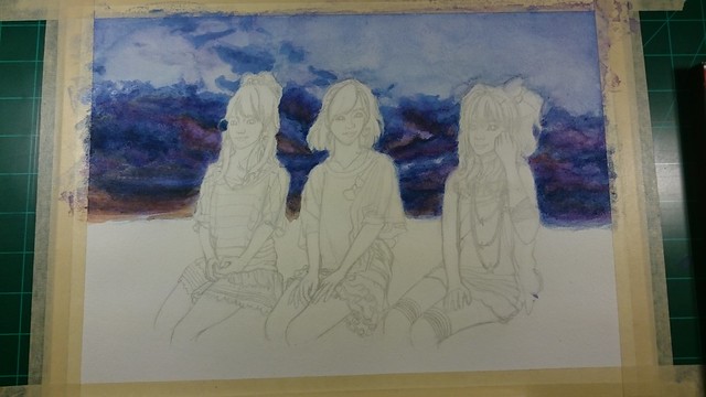
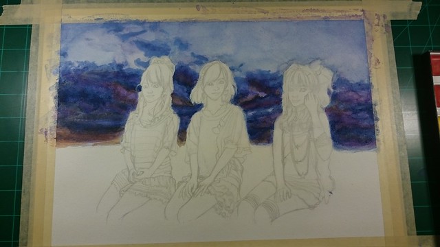
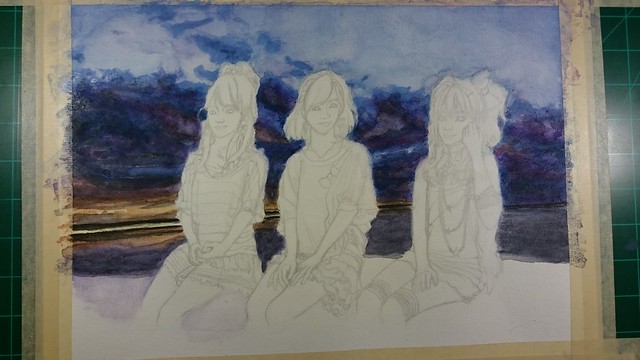
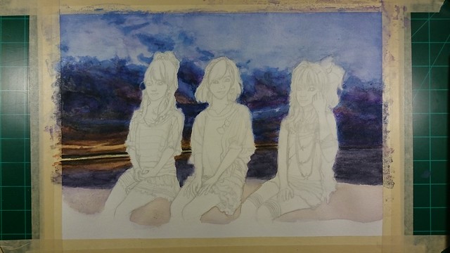
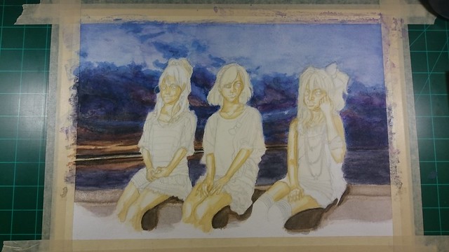
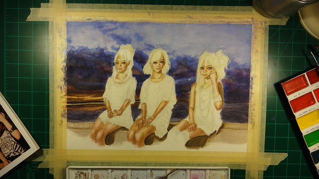
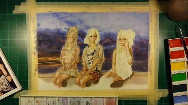
For those that are interested here is the process:

From this angle it look like a good start, but I would later learn that I had made quite a couple of mistakes.

https://www.flickr.com/photos/darkcloudxero/37975118286/in/dateposted-public/

https://www.flickr.com/photos/darkcloudxero/26252727129/in/dateposted-public/

https://www.flickr.com/photos/darkcloudxero/37975115126/in/dateposted-public/

https://www.flickr.com/photos/darkcloudxero/26252725479/in/dateposted-public/

https://www.flickr.com/photos/darkcloudxero/37975112316/in/dateposted-public/

https://www.flickr.com/photos/darkcloudxero/26252724059/in/dateposted-public/

https://www.flickr.com/photos/darkcloudxero/24176567568/in/dateposted-public/

https://www.flickr.com/photos/darkcloudxero/37319671004/in/dateposted-public/

https://www.flickr.com/photos/darkcloudxero/24176565838/in/dateposted-public/

https://www.flickr.com/photos/darkcloudxero/37319668314/in/dateposted-public/

https://www.flickr.com/photos/darkcloudxero/24176563958/in/dateposted-public/

https://www.flickr.com/photos/darkcloudxero/37319665864/in/dateposted-public/

https://www.flickr.com/photos/darkcloudxero/37319664754/in/dateposted-public/

https://www.flickr.com/photos/darkcloudxero/37319663354/in/dateposted-public/

https://www.flickr.com/photos/darkcloudxero/37319661714/in/dateposted-public/

https://www.flickr.com/photos/darkcloudxero/37319659964/in/dateposted-public/

https://www.flickr.com/photos/darkcloudxero/37319658714/in/dateposted-public/

https://www.flickr.com/photos/darkcloudxero/37319657424/in/dateposted-public/

https://www.flickr.com/photos/darkcloudxero/37319656314/in/dateposted-public/

https://www.flickr.com/photos/darkcloudxero/37975099496/in/dateposted-public/

https://www.flickr.com/photos/darkcloudxero/37975099066/in/dateposted-public/

https://www.flickr.com/photos/darkcloudxero/37975098526/in/dateposted-public/

https://www.flickr.com/photos/darkcloudxero/37975097926/in/dateposted-public/

https://www.flickr.com/photos/darkcloudxero/37319650324/in/dateposted-public/

https://www.flickr.com/photos/darkcloudxero/37975096866/in/dateposted-public/

https://www.flickr.com/photos/darkcloudxero/37319648004/in/dateposted-public/

https://www.flickr.com/photos/darkcloudxero/37975095856/in/dateposted-public/

https://www.flickr.com/photos/darkcloudxero/37319644924/in/dateposted-public/

https://www.flickr.com/photos/darkcloudxero/37975094196/in/dateposted-public/

https://www.flickr.com/photos/darkcloudxero/37319641914/in/dateposted-public/

https://www.flickr.com/photos/darkcloudxero/37975092656/in/dateposted-public/

https://www.flickr.com/photos/darkcloudxero/26252707219/in/dateposted-public/

https://www.flickr.com/photos/darkcloudxero/37975090236/in/dateposted-public/

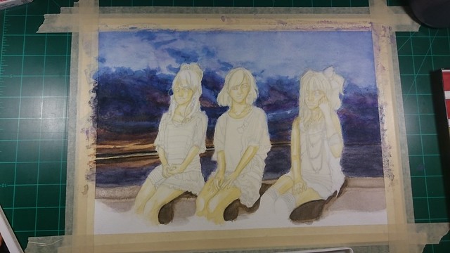
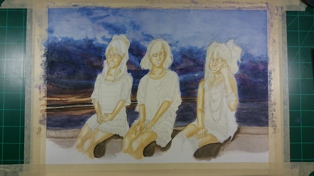
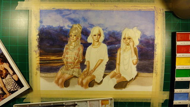
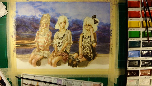
Thinking I was pretty close to the end I noticed that the proportions were quite off. The head was much too big for the body, the shoulders were too small and so were the hips.

https://www.flickr.com/photos/darkcloudxero/38029011271/in/dateposted-public/

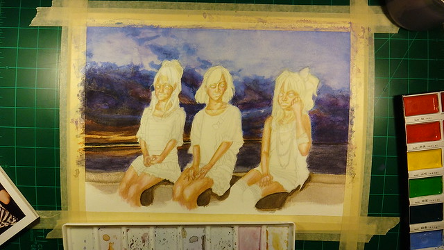
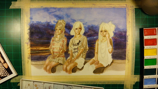
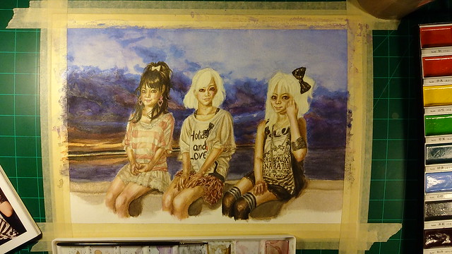
On top of that, after taking a break from painting when I came back I decided I needed to make even more changes to it.

https://www.flickr.com/photos/darkcloudxero/37975444346/in/dateposted-public/

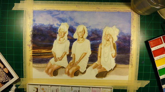
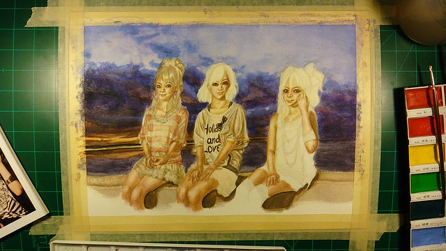
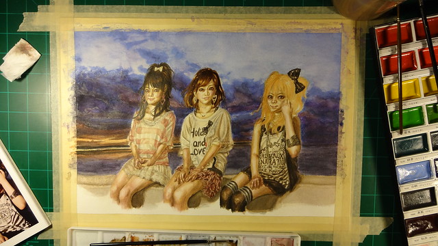
And this was the final version I decided to go with:

Ghost Girl by the window resize

Well that’s it for today. Hopefully I can get another piece out before Halloween (though it will be simple if it is).

Hasta la proxima,

-NUBE


Updates – Practicing with watercolor, broken camera, new paints and plans


After thinking all this year and trying to learn a much as I can about colors, it was now time to actually put it into action. The best way to learn is to learn from others. So that is what I am currently doing right now. One of the things I really want to be able to do is realistic paintings. This requires a good understanding of applying paints and mixing colors. I’ve mainly been watching three youtubers;

The Mind of Watercolor

This channel is great because he teaches a lot of tehnical techniques and explains them in great clarity. On top of that he is very fun to listen to and his videos are very entertaining.

Lioba Brückner

This artist has a very beautiful style that I really want to learn. I’ve been watching her videos and learned quite a lot.

Laovaan 

Actually saw his videos first, and through his videos I found the two channels above on the reccomended list on the side of youtube.

Anyway, years ago after I graduated from high school I bought some photobooks of Platinum Era Morning Musume with the idea of one day being good enough to paint them. Well, after taking a year (this year) to learn I felt it was finally time to give it a try. I was actually a bit aprehensive to start. Heck, I would even say I was actually a bit scared? But it is finally time to make my art finally grow and gain more experience.

One other thing I want to learn is dealing with dark colors, so I chose this photo (the one on the bottom):

5cfee3a9jw1dk56dbkpa0j edit

Maybe it was a bit reckless of me to choose one with three people instead of just one, but I wish to be able to do a background and deal with multiple focal points. One problem with my artwork is that I have been adding too much details to areas that are not the focal point. The problem with doing that is that one, the focal point is not clear, but more importantly, it just doesn’t look good. When I finally figured that out, I decided to pay attention to what I see and really think about what can bee seen on the sides of the focal point. What I mean is that I look at an object (whatever it is) and try to pay attention to the surroundings and learn just how much detail I am actually able to see when I focus on one point. Turns out, not much. I can see the outlines and main figures, but not any really fine details. So I’ll have to keep that in mind from now on.

Using photos as references can also be problematic since they can see things very differently than a human. So in that sense I will have to choose what requires details and what doesn’t. And then I have to learn just how much details are enough to convey the athmosphere while making it all meld well together.

I was also afraid of using the colors I saw because I had never used them before. Such as when I see yellows, pinks, browns, reds and blues etc (on skin colors). I tend to go with very generic colors instead due to my inexperience and fear of ruining what I have at that certain point. That in turn makes very flat artwork that doesn’t really exist in a realistic sense. It may look good with anime/manga characters but once I apply such colors to real life people, it just doesn’t look right.

One other thing to mention is that due to that fear I also end up making very muddled artwork that just ends up looking dirty. Copic Markers are great, but they do have their limitations and one has to know them otherwise one can mix colors that don’t combine well or one can also over work the colors to the point that they make very dirty colors. This of course does no good to the final picture. One good example of this is the Macross artwork I did a while back;

Human Culture’s Songstress
Print now available.

When you are working with something that requires alot of concentration, detail, colors and experience. It is easy to understand if one messes it up. For one I am assuming the colors and ignoring the ones I see in the actual reference pictures (as can be seen here);

https://www.flickr.com/photos/darkcloudxero/36830534054/in/dateposted-public/

https://www.flickr.com/photos/darkcloudxero/36830533774/in/dateposted-public/

https://www.flickr.com/photos/darkcloudxero/36830532954/in/dateposted-public/

https://www.flickr.com/photos/darkcloudxero/37492201346/in/dateposted-public/

After learning what not to do, I decided to actually give it a try and paint what I see instead what I think it should be.

With all that said this is the finished piece:

Rockies Memories resize

And here is the process of how I drew and painted this new piece.

DSC_0018

DSC_0019

DSC_0020

DSC_0021

DSC_0028

DSC_0029

DSC_0030

DSC_0031

DSC_0032

DSC_0033

DSC_0034

DSC_0035

DSC_0036

DSC_0037

DSC_0038

DSC_0039

DSC03816

DSC03817

DSC03818

DSC03819

DSC03820

DSC03821

DSC03822

DSC03823

DSC03824

DSC03825

DSC03826

DSC03827

DSC03828

DSC03829

DSC03830

DSC03831

DSC03832

DSC03833

DSC04012

DSC04013

DSC04014

DSC04015

DSC04016

DSC04017

DSC04018

DSC04019

DSC04020

DSC04021

DSC04022

DSC04023

DSC04024

DSC04025

DSC04026

DSC04027

DSC04028

DSC04029

DSC04035

Let’s talk about the broken Camera.

Before I started recording this watercolor piece I had dropped my camera which sadly cracked my lens. That is noticeable on the first videos I recorded. So I had two options, buy a new camera or try and fix it. Hopoing I had not damaged the  sensor I ordered a replecement lens. It took a while to arrive, so half of my recordings have that crack. When it arrived I was debating whether I should finish painting this piece first or if I should fix it before continuing. One concern was that if I messed it up and couldn’t fix it, I could very well end up with the camera in even worse condition.

After some thought I just decided to go for it. And that took a bit of time to get done, but since I have some experience from fixing some of my other electronics it didn’t take long for me to figure it out. It did take me three times to hook up the ribbon cables (which gave me problems that of course freaked me out a bit). Luckily it was all working well when I properly hooked them up and the rest of the videos did not have that crack.

As for the paints.

I decided to use some of the money I made from NanDesuKan and buy some paints that I have been interested for a couple of years. (I’ll talk a bit more on some of these things later.) Those paints are Nicker Poster Color. The way they can cover a whole area completely opaque but can also be thinned out really caught my attention. And the idea that I can paint on top of what I have already painted while still being completly opaque. I still haven’t tried them out yet, but if they work like I think they do it will be my dream medium.

Plans.

Fall is here, and October is here. So that means that I should make the effort to make some pieces with those themes. Since I am in October, I should make some Halloween themed paintings. I actually have one that is already drawn out since last year. I was planning on finishing it for last years Halloween, but decided to learn how to use colors first then come back to it so that I could do a much better job. Of course I could wait to get better, but I feel this could be a good learning experience now that I know a bit more. Hopefully I won’t mess it up, but I have to not be afraid to try new painting techniques.

Aside from that I do want to make maybe two more new ones. I just haven’t decided what character to choose or any ideas of what to do.

But those are my plans, I will have a midterm soon so I hope I won’t hit a snag.

That’s it for now.

Hasta la proxima,

-Nube

Hidden Turtle in Monkey’s Eyes


I don’t know if I have mentioned this before, but I am a big Martial Arts movie fan. More specifically Hong Kong Kung Fu movies from the 80s and 90s. Jackie Chan movies being my favorites. So I wanted to try out making an homage poster like artwork. Now one of the other things I really love is the original Dragon Ball (when he was a kid, I say this because people think I mean Dragon Ball Z which was just ok). I want to talk about these two loves of mine a bit more, but I will have to wait on that because I am planning on covering these topics on future videos.

With that out of the way Inspiration came from the gag character Jacky Chun and my love for old Hong Kong films. I chose one of the first movies where sparks of what Jackie Chan would later present to the world, Drunken Master. A 1978 classic Martial Arts film. And since Dragon Ball has many martial arts influences including Drunken Master it would fit perfectly.

There are many poster variations but I ended up picking this one (which I feel might be the original poster).

drunken-master-poster

I really like these old posters where they hand paint them and have really interesting themes and expressions.

This is the rough draft that I originally made while at an anime convention.

Drunken Master rough draft resize

These two are the basis of what I am working with, and next is the process. First are the pictures I took with my phone.

https://www.flickr.com/photos/darkcloudxero/37311149092/in/dateposted-public/

I used Copic Markers for coloring by the way.

https://www.flickr.com/photos/darkcloudxero/37311148792/in/dateposted-public/

https://www.flickr.com/photos/darkcloudxero/37311148482/in/dateposted-public/

https://www.flickr.com/photos/darkcloudxero/37311148292/in/dateposted-public/

https://www.flickr.com/photos/darkcloudxero/37311147582/in/dateposted-public/

https://www.flickr.com/photos/darkcloudxero/37293944066/in/dateposted-public/

https://www.flickr.com/photos/darkcloudxero/37311146852/in/dateposted-public/

https://www.flickr.com/photos/darkcloudxero/37311146422/in/dateposted-public/

https://www.flickr.com/photos/darkcloudxero/37311145752/in/dateposted-public/

https://www.flickr.com/photos/darkcloudxero/37293943226/in/dateposted-public/

https://www.flickr.com/photos/darkcloudxero/37340990021/in/dateposted-public/

https://www.flickr.com/photos/darkcloudxero/37293942896/in/dateposted-public/

https://www.flickr.com/photos/darkcloudxero/37340989371/in/dateposted-public/

https://www.flickr.com/photos/darkcloudxero/37340989051/in/dateposted-public/

https://www.flickr.com/photos/darkcloudxero/37293940916/in/dateposted-public/

https://www.flickr.com/photos/darkcloudxero/37340988661/in/dateposted-public/

https://www.flickr.com/photos/darkcloudxero/37293940466/in/dateposted-public/

https://www.flickr.com/photos/darkcloudxero/37340988351/in/dateposted-public/

https://www.flickr.com/photos/darkcloudxero/37293939806/in/dateposted-public/

https://www.flickr.com/photos/darkcloudxero/37340988011/in/dateposted-public/

https://www.flickr.com/photos/darkcloudxero/36631801324/in/dateposted-public/

https://www.flickr.com/photos/darkcloudxero/36631801324/in/dateposted-public/

https://www.flickr.com/photos/darkcloudxero/37340987681/in/dateposted-public/

https://www.flickr.com/photos/darkcloudxero/36631800874/in/dateposted-public/

https://www.flickr.com/photos/darkcloudxero/37340987411/in/dateposted-public/

https://www.flickr.com/photos/darkcloudxero/37340987081/in/dateposted-public/

https://www.flickr.com/photos/darkcloudxero/37311141932/in/dateposted-public/

https://www.flickr.com/photos/darkcloudxero/37340986821/in/dateposted-public/

https://www.flickr.com/photos/darkcloudxero/37340986821/in/dateposted-public/

https://www.flickr.com/photos/darkcloudxero/37311141632/in/dateposted-public/

The title of the movie poster is done with a brush, so I wanted to do it traditonally. I measured the center and spaced out three spaces for the characters.

https://www.flickr.com/photos/darkcloudxero/37340986531/in/dateposted-public/

I also tried to emulate brush strokes for the characters.

https://www.flickr.com/photos/darkcloudxero/37311141462/in/dateposted-public/

https://www.flickr.com/photos/darkcloudxero/37340986281/in/dateposted-public/

And now some scans of the process.

Drunken Jackie Chun I resize

Drunken Jackie Chun II resize

Drunken Jackie Chun III resize

Drunken Jackie Chun IV resize

Drunken Jackie Chun V cropped resize

After painting on the title I was contemplating painting on the rest of the text. And well, I tried but soon realized to instead do it digitally.

Drunken Jackie Chun VI resize

I decided to make the text digitally because it would be alot cleaner, the text would be level and wouldn’t be crooked. On top of that, I was trying to have it ready for Nan Desu Kan.

Here is the original poster again:

drunken-master-poster

And here is my finished version:

Hidden Turtle in Monkey's Eyes rough background resize 1080

I tried to emulate as close as I could all the text around the poster (as well as the background texture), I don’t know Chinese (though I did study a bit of it for a semester once, I obviously am nowhere near at the level where I can say I know a little or any really, just a couple of words and phrases) so I had to guess what each sections of the text would mean. For some of them I just added whatever I thought I could cram with references to me and my work.

Here is what each of the characters I typed means (I used Google translate to come up with the characters so it most likely has a lot of typos and misspelled words and phrases):

Hidden Turtle in Monkey's Eyes Meaning of Characters

That concludes the process for this Dragon Ball piece. Hope you enjoyed it and that it helped you on your art journey if even a little.

Hasta la proxima,

-Nube

Current state and future plans 10/17/16

So about a week ago I mentioned that I would be entering an art contest… I didn’t. So… I did end up working on it all week, but add to that a whole lot of other things that for some reason all piled up together all that week, and I was completely stressed out. What’s strange is that it did bring back some memories of back when I was in high school. Back then I was always stressed out beyond belief. Having said all that I did manage to take care of all things or at the very least have them prepared so that I could finish it later. As for the contest itself, by the time I had something presentable that I wouldn’t feel too bad showcasing I only had one minute left. And to make things more annoying I couldn’t find the notebook with my passwords, although that wouldn’t have helped at all since I hadn’t created an account yet… I was so focused on getting so many things done on top of the picture for the contest that I forgot to do something so basic…

Had this been open to traditional techniques I would have been ok, but I had to use Corel Painter. That quickly became a problem seeing as I’m just barely getting used to Photoshop. So on top of thinking about what to draw and how to do it, I also had to learn how to use Corel at the same time. And that is time consuming. Despite all my efforts, I ran out of time by only a minute… It sucks, but I did pick up some new abilities and am now at least somewhat ready for the next contest.

For this contest the theme was “first day of school”. Going by the description I feel they wanted something that evoked feelings of going back to school (whatever that may have been for the artist). As for me, as I explained before I was really stressed out throughout most of my high school life due to the high amounts of schoolwork (among other things), but like most high schoolers I did at some point or another have a crush. And that alone helped ease the stress and give a reason to go to class and sometimes even look forward to it.

It’s funny, when I was in high school or younger I would probably be to embarrassed to even admit this.

That being said, this is what I came up with:

https://www.flickr.com/photos/darkcloudxero/30281173202/in/dateposted-public/


I had about an hour left when I got to this point, but if I was serious about actually having a chance of winning I had give it a background. And that is what I struggled with before I eventually got to this point:

https://www.flickr.com/photos/darkcloudxero/30311670511/in/dateposted-public/


Seeing as I was running out of time I used a cloning technique that Corel’s “Master Painters” use by using a picture/photo and turning it into brush strokes that change it’s look and feel depending on what brush and medium you use. But as you can see it still needs a lot of work. I actually decided to use this technique when I only had 10 minutes left and I knew i wouldn’t be able to make a background from scratch. At this point I would change a couple of colors to make it all match and maybe add some more details here and there.

Well that didn’t end up happening, but although I won’t be able to submit this to the art contest I do like what I have so far. It has the potential to become even better after some more work. But I do want to make some artwork for Halloween though. So I’ll probably let this one rest for a bit. Plus I’m still working on that Honedge.

Back to where the contest was being held, DrawCrowd seems to be somewhat new for artist to showcase artwork. And so far I’m really liking it. I really allows for people to see your work even if you happen to be  new to the site unlike Deviantart. With that being said I’ll probably start letting DeviantArt go and focus on Pixiv and DrawCrowd.

Last week I went to go collect some pictures of the fall scenery around my neighborhood before the leafs fall off completely. I took a good number of them. I will upload them to a separate Flickr account that will be filled with my photos that can be used for reference or whatever projects people feel like using them for. I guess I only ask that people say where they got the photo from, but in the end that will end up being the decision of the user/artist. But I don’t want to just dump pile them in there, I want to categorize them so that they are easy for people to find what they are looking for. My main goal is to someday have people collaborate in making this Flickr grow by providing photos of interesting and useful places, objects ect. that can be used freely by everybody that happens to stumble upon them. That’s the main goal I have for it, but for now I will start by just adding my collection. Hopefully that becomes useful to at least some of you.

That should be all for now, I really want to start working on the next piece for Halloween.

Hasta la próxima,

-Nube

Create a website or blog at WordPress.com

Up ↑