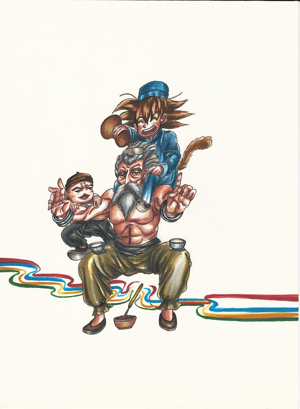
I’m back, some updates (liked by Miyabi) and a quick drawing of Goku celebrating

I think I mentioned this before but I have been quite busy lately with my other job and building my desk PC which took me 4 weeks to complete. Had I had a bit more time to work on it I think I could have completed it in two weeks but such is life. Now I have more workspace since I added about 6 inches on the contour of the desk (minus the front side) so that I could clamp my three monitors thus giving me all of my original (about) 4 x 3 feet to use with all of my supplies that I would use as I work. I actually just made the finishing touches yesterday so I wasn’t really even able to use the desk till today. So far I’m really happy with the way it is all set up and because I made the outside contours on the sides so that I could clamp down my monitors I can now fully see all of the screen on both sides as I work on my XP-Pen which I of course left on the center. I’ll show some pics of it and the setup at some other time.

Way back in, whoa, May 28th (it’s been that long after all huh) I uploaded my painting celebrating Buono! To my surprise on June 8th I actually got a like from Natsuyaki Miyabi! Man it feels nice to know that the person you decided to make a painting of has seen your work. But to also get their approval of it is quite nice. I’m really glad my feelings of appreciation for her work has reached her.
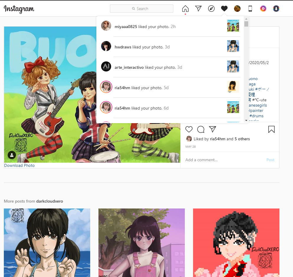
Here is the painting just in case you missed it. And here is a link to the original post.

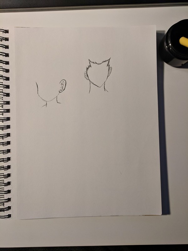
While I was getting some supplies for my desk PC I stopped by a nearby dollar store and came across some small vials with cork caps. I got a set of two of the 6 packs so that I could store some pre mixed inks and watercolors that I could use when working with linework/outlines. For today I made a set of ink that got lighter and lighter for when I want to use different levels of black to gray inks. I have my diluted ink that is still quite dark in my original container and a set of 5 vials containing the newly created ink. I also made a reference sheet to show me the intesity of the ink within each vial and a date of when they were created just in case one of them runs out and I have to create a new batch which of course might not be the same as the previous one. Since it was running a bit late when I was completely done getting my worspace ready I decided to make a quick drawing. Since it was all about testing the desk I of course decided to go traditional (plus I also got to try out my inks, although I only used my base ink for this drawing). I’ll try to see if I could make a quick drawing every weekday for the rest of the summer on top of whatever new paintings I decide to work on. I already have an idea of the first piece I will be working on (hopefully starting tomorrow).

Here is that Goku drawing I did. Maybe I should have made some lines to express movement but overall I’m quite pleased with the results (was a bit scared that I wouldn’t be able to draw as I liked since I hadn’t done it in about 4 weeks).

Hasta la proxima,

-NUBE

Goku’s Winter Visit

I really wanted to draw Goku in his snow outfit from the muscle tower arc. When I was getting reference pictures from the anime I noticed the Suno seemed to have a crush on Goku. Later when I compared the same arc in the manga, the whole subplot was completely absent. In any case I decided to make a piece of Goku and Suno. I wanted to make it seem like it was a scene from the anime. I wasn’t too sure how I would pose Goku and Suno so I first started by painting the background. I really like the way it came out. After that I decided on having Suno looking at Goku as they built a snowman. Lastly I decided to add some snowflakes.

Hasta la proxima,

-NUBE

Bulma’s Delivery Service

This is a painting for the drawing I did for inktober of this year (day 30). I wanted to do a parody of Kiki’s Delivery Service with Bulma as Kiki. Most of it uses the same style and colors but I incorporated elements from Dragon ball. Such changes are substituting Jiji for Tama, changing the font to Capsule Corp in the window reflection, using a mitsubishi car transporting Muten Roshi and Goku and Lunch as the woman walking in the street. Colors aren’t quite the same but look similar enough. I quite like how it turned out.

What do you guys think?

Hasta la proxima,

-NUBE

Inktober 2019 30 Bulmas Delivery Service

Were about to enter Halloween so I wanted to make some witch oriented piece. I had another idea (which will be done at a later date) but I decided to make Bulma into a little witch. Then I eventually decided to combine Kiki’s Delivery Service with Bulma.

Hasta la proxima,

-NUBE

Inktober 2019 07 Goku and Bulma

Wanted to do a piece that represents the Fall season. As my subjects I chose Goku and Bulma. Bulma is sporting her jacket from the first chapters of the series and I decided to have Goku use the same sweater that Suno (I just figured out that her name is pretty much just snow) wore in the Muscle Tower saga.

Hasta la proxima,

-NUBE

Goku vs Broly

About a week ago or so I got to see the Dragon Ball Super: Broly movie in the theater. Out of all the Dragon Ball movies I have seen so far it is definitely my favorite. I didn’t really care much for Broly before (I mean sure he was strong and had cool powers but

┐( ̄ー ̄)┌ )

but I did like the way everything was connected with all the events up to this point. To think that someone stuck in one planet could have so much power to not only keep up with Super Saiyan blue but to far surpass it. Who knows how Broly would fare against ultra instinct but I’m guessing that they are setting things up to have Goku power up even further with Broly.

I liked that most of the fight with Broly was martial arts based, really hope they bring the focus on that again in the future. One other thing to note is that the artwork and painting was much better than not only the anime but also the last movies. The only complaint I have is the cg section which just didn’t look good and was really out of place when it happened. It was only for one section of the fight but it does make me wonder why they decided to so in the first place.

Final painting:

references:

drawing process:

digital process:

Hasta la proxima,

-NUBE


Goku New Years in Mexico

I started working on this piece right after Christmas and leading up to New Years. But I knew I wouldn’t have been able to finish it so I decided to stop on the 31st so that I could restart after New Years. It took me a couple of days but not as long as I thought it would. This time I wanted to try and emulate the painting style of the original anime. I did try to use the colors from the anime itself but found out that the values and colors didn’t work together so I did have to account for that and adjust accordingly. This process was a real pain in the … before but I have gotten quite used to it. I think I’m starting to understand color a lot more now. I was really worried because color seemed like such a hard concept for me (it still is) but by brute forcing myself to understanding it. I did this by painting and painting even if I didn’t know why something worked… even though there were so many failures that really made me feel inadequate… all the effort is finally starting to show the progress.

The line work itself did give me a couple of headaches since I couldn’t figure out how dark or translucent it should be so I did have to fiddle with that a good number of times. The artwork looked fine to me but I felt that making it a bit blurrier(?) or having it have a layer of light pollution(?) would make it look more like how I remember watching the anime. sometimes having that grain in the quality of the anime gives it more character and look more appealing (but the more I think about it the more it sounds like nostalgia talking huh?).

Anyway I wanted Goku to be in Mexico for this year eating traditional Mexican foods that some of us would eat during this time of the year. So I had him eating tamales, tacos, elotes, and buñuelos. Thinking back I should have given Goku a bigger table and also add some chocolate abuelita (a brand of Mexican hot chocolate) or something. I also was envisioning some fireworks in the background but since I finished this after new years I decided against it. The cathedral in the background is based on one in Durango, Mexico.

Here is the piece (I decided to have two versions):

Tv quality –

HD quality –

here are the references:

and here is the process:

I had fun working on it, though I wonder how long it would take me to do it traditionally and if it would look better?

Hasta la proxima,

-NUBE
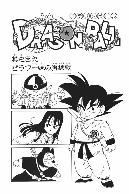
Inktober 2018 #17 Swollen Goku Bulma

Short update. Did this one rather quickly. It doesn’t look bad, but it could obviously be done much better. Some lines were in excess and give a messy look on Bulmas hair among other details. Really enjoyed working on it though.

IMG_20181017_230455

References used:

Screenshot_1

Screenshot_2

Screenshot_3

Screenshot_4

Screenshot_5

The process:

IMG_20181017_213856

IMG_20181017_214126

IMG_20181017_214658

IMG_20181017_215442

IMG_20181017_215812

IMG_20181017_220136

IMG_20181017_220407

IMG_20181017_220944

IMG_20181017_221652

IMG_20181017_223214

IMG_20181017_224735

IMG_20181017_230004

IMG_20181017_230455

Hasta la proxima,

-NUBE

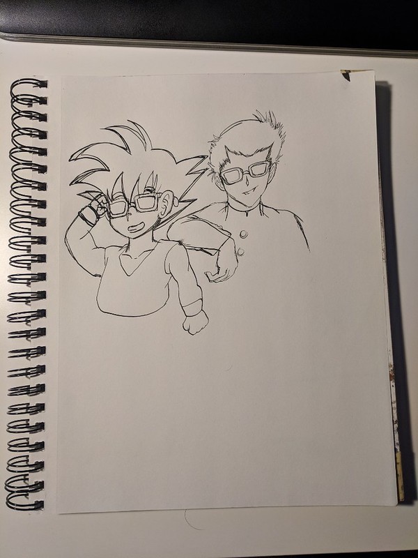
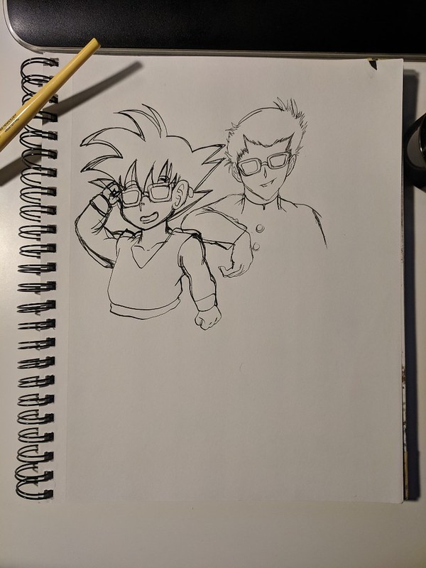
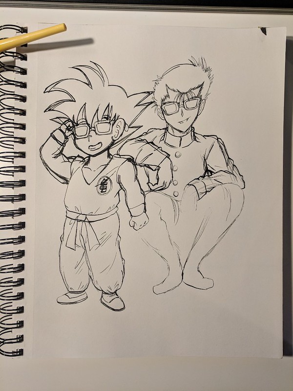
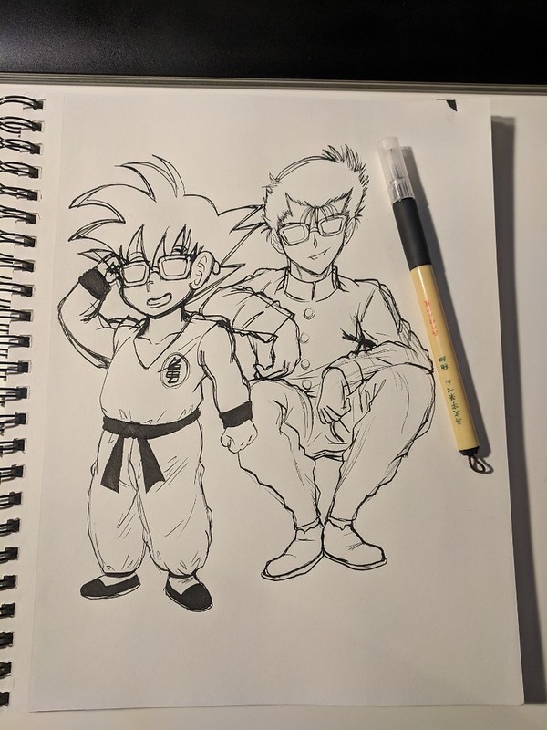
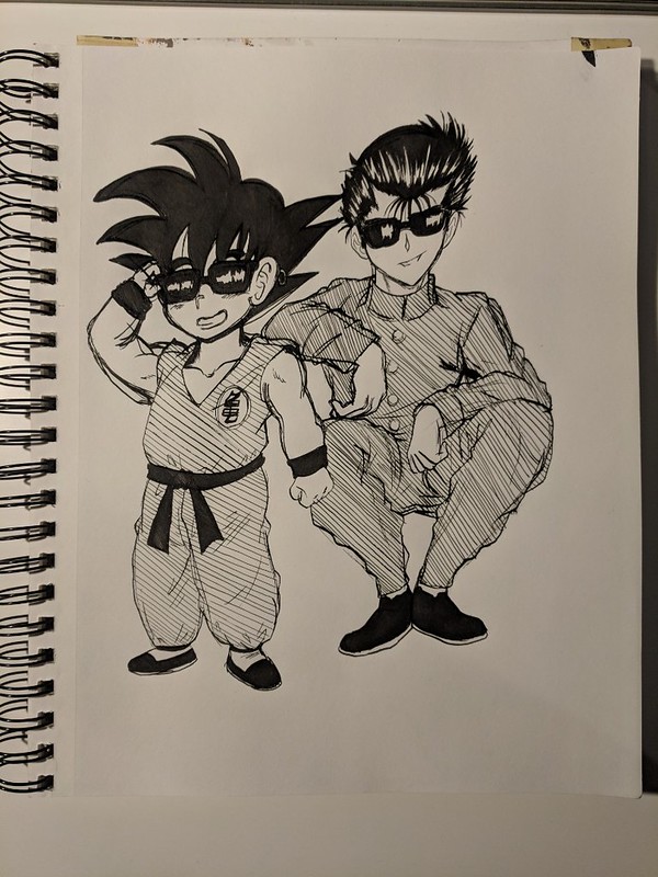
Inktober 2018 #3 – Kid Goku and Yusuke

I’ve had this idea of making a piece with Goku and Yusuke both wearing sunglasses. So I thought I should give that a try. Of course doing it for inktober would have it’s challenges since I would have to navigate through any mistakes I make along the way.

This is how I ended it. I forgot to add Goku’s tail…


IMG_20181003_221345

Reference pictures used:


A_Second_Helping_of_Pilaf


6300a11862e41cd0d1eccbaff2eefc50

And here is the process for those who are interested:

IMG_20181003_133321

From what I’ve learned, I can overcome mistakes by making light marks for my ideas and darker thicker lines for what the actual drawing will be.


IMG_20181003_133721


IMG_20181003_134247

And it was at this point that I was getting a bit scared. I had so many unnecessary lines and Goku’s right arm was just wrong. I almost wanted to just start a new one. But decided against it and see if I could save it. Also I accidentally hit my pen and it fell on the right corner of the paper. So far that is three mistakes in a row.


IMG_20181003_184625

So despite looking quite dirty, I decided to fix all the mistakes.

IMG_20181003_185428

IMG_20181003_185836


IMG_20181003_195720

Once again I was careless and rested my hand on Yusuke’s uniform, luckily this time it wasn’t too bad.

IMG_20181003_200641


IMG_20181003_205459

With the outline done, it is time to ink the darker areas and see if it can fix my mistakes.

IMG_20181003_210109


IMG_20181003_210753

IMG_20181003_214528

IMG_20181003_215302

IMG_20181003_220140

And just to finish it, I added some hatching on certain areas to make a shading effect which not only made it look better but it also helped mask even more mistakes.


IMG_20181003_221345

That should be all for now.

Hasta la proxima,

-NUBE
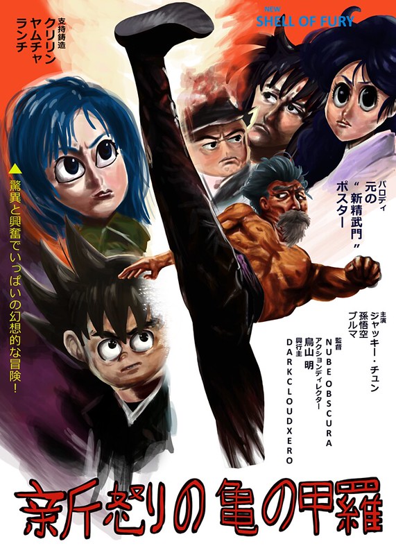
Shin Shell of Fury POSTER parody of “New Fist of Fury”

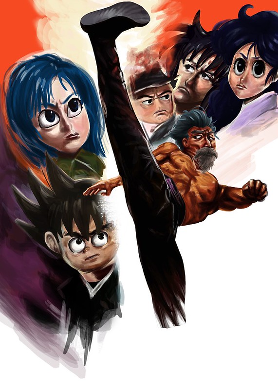
I have already done one parody poster before, so I wanted to do another one. This time I wanted to give it a try doing it digitally.

This is the poster in question. This was back in the day when Jackie Chan was marketed as the new Bruce Lee, this movie is a continuation of the original Fist of Fury. The poster is quite amazing, but it was a bit scary as a project since it had so many parts to it. Lacking the experience at the time it took quite a bit of time, but I learned a lot.

Jackie chan new fist of fury

This is the poster finished on July 23.

Shin Shell of Fury POSTER resize

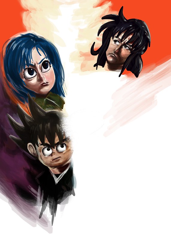
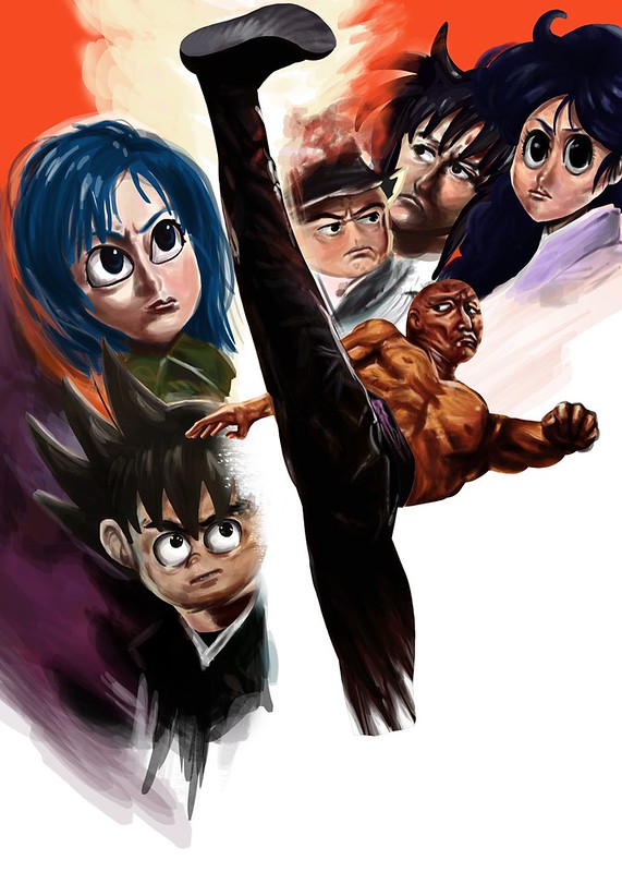
And here is the process. I tried to get as much as the background as I could. For this pieces I used the actual colors from the poster by using the eyedropper tool in Photoshop.

Shin Shell of Fury I resize

One thing to note is that I actually made a round figure for the faces but erased around the hair for a reason I don’t quite remember.

Shin Shell of Fury II resize

Shin Shell of Fury III resize


Shin Shell of Fury IV resize


Shin Shell of Fury V resize


Shin Shell of Fury VI resize

Shin Shell of Fury VII resize


Shin Shell of Fury VIII resize


Shin Shell of Fury IX resize

Shin Shell of Fury X resize


Shin Shell of Fury XI resize


Shin Shell of Fury XII resize


Shin Shell of Fury XIII resize

After this I added the text to make it like the original poster.

In any case that should be all, what do you guys think?

Hasta la proxima,

-NUBE

Some of the artwork I’ve been practicing 3-31-18

As mentioned before I said I was going to be uploading some artwork that I’ve been working on as a bit of practice so here it is (sorry about the delay, like usual the workload has been a bit of a pain but I’m pushing forward – luckily this semester is almost finally over… though construction work seems to be looking to increase).

I got a Samsung tablet for my self at the end of last year and didn’t really use it all that much, but while in a dollar store I saw a tablet stylus and decided to try it out. I was surprised at the accuracy I could get with such a clunky pen, so I ended up purchasing an app to do some art on the tablet. Sadly the tablet is not that powerful so it stuttered way too much while I was working on it and it even crashed plenty of times but it did get me interested on the possibilities of drawing/painting digitally directly. Though one can get used to looking up at the monitor using a normal drawing tablet, there is no comparison to actually looking at what you are drawing/painting. Now I’m really craving a drawing monitor…

Anyway here are two tries I made while waiting for my class start;

First try:

https://www.flickr.com/photos/darkcloudxero/41103228712/in/dateposted-public/

Second try:

https://www.flickr.com/photos/darkcloudxero/41103228612/in/dateposted-public/

On the traditional side of things I wanted to make some quick practice sketches with a pen. And not surprisingly the ink really made it standout and look cleaner than when using a pencil.

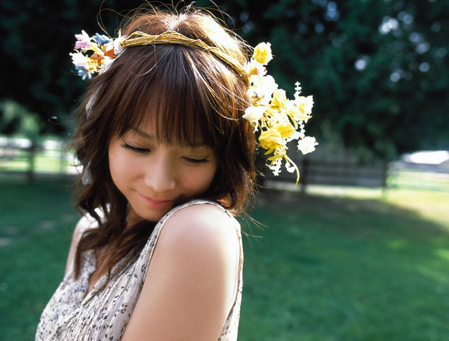
I wanted to try a conversion from a real person to an anime version so I decided on using this reference picture of Eri Kamei to try it out:

kamei024

I decided to only do the main lines to test out how it all looks.

This time I used a pen from the brand LePen, I want to test out how a lighter pen combines with color so I used their Dark Grey color which leaves a much lighter mark that I hope combines much better when I add watercolor and copics to it.

https://www.flickr.com/photos/darkcloudxero/27273111068/in/dateposted-public/

After I did the outline I wanted to see what would happen if I added more detail and darker lines, but my skill are still… anyway I’ll figure it out by doing some more when I have the chance. For the thicker lines I used one of those ink pens from Hobby Lobby that are meant for calligraphy. Did not end up how I wanted it…

https://www.flickr.com/photos/darkcloudxero/39337424070/in/dateposted-public/

But despite all this it does give me a good opportunity to try out if I can conceal mistakes using my Knicker Poster Color white, it does work but I have to gauge the right amount so as to make it thick enough to cover but not thick enough to make a mess. What I do know is that the thinner lines looked much better, I’ll have to figure out how to ink and shadow properly.

https://www.flickr.com/photos/darkcloudxero/27273110408/in/dateposted-public/

Next is Yuri Kim from Fearies Landing, here is the reference picture:

https://www.flickr.com/photos/darkcloudxero/40251652515/in/dateposted-public/

Here is the main outline.

https://www.flickr.com/photos/darkcloudxero/26274808197/in/dateposted-public/

I inked some sections and added some details but not much since I didn’t want to use too much time on it. I’ll practice some shading techniques on a blank paper to figure out what kind I should use and at what time.

https://www.flickr.com/photos/darkcloudxero/26274808087/in/dateposted-public/

Currently I’m trying to make a new finished piece, but I’ll leave that for another time.

Hasta la proxima,

-NUBE
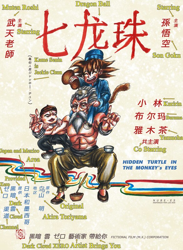
Hidden Turtle in Monkey’s Eyes


I don’t know if I have mentioned this before, but I am a big Martial Arts movie fan. More specifically Hong Kong Kung Fu movies from the 80s and 90s. Jackie Chan movies being my favorites. So I wanted to try out making an homage poster like artwork. Now one of the other things I really love is the original Dragon Ball (when he was a kid, I say this because people think I mean Dragon Ball Z which was just ok). I want to talk about these two loves of mine a bit more, but I will have to wait on that because I am planning on covering these topics on future videos.

With that out of the way Inspiration came from the gag character Jacky Chun and my love for old Hong Kong films. I chose one of the first movies where sparks of what Jackie Chan would later present to the world, Drunken Master. A 1978 classic Martial Arts film. And since Dragon Ball has many martial arts influences including Drunken Master it would fit perfectly.

There are many poster variations but I ended up picking this one (which I feel might be the original poster).

drunken-master-poster

I really like these old posters where they hand paint them and have really interesting themes and expressions.

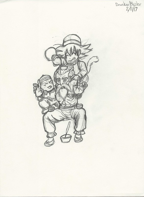
This is the rough draft that I originally made while at an anime convention.

Drunken Master rough draft resize

These two are the basis of what I am working with, and next is the process. First are the pictures I took with my phone.

https://www.flickr.com/photos/darkcloudxero/37311149092/in/dateposted-public/

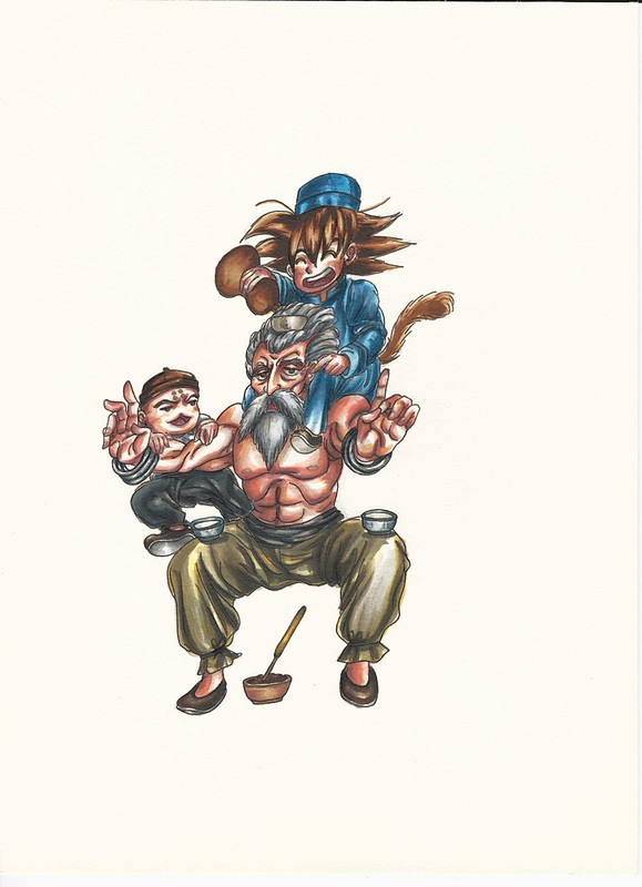
I used Copic Markers for coloring by the way.

https://www.flickr.com/photos/darkcloudxero/37311148792/in/dateposted-public/

https://www.flickr.com/photos/darkcloudxero/37311148482/in/dateposted-public/

https://www.flickr.com/photos/darkcloudxero/37311148292/in/dateposted-public/

https://www.flickr.com/photos/darkcloudxero/37311147582/in/dateposted-public/

https://www.flickr.com/photos/darkcloudxero/37293944066/in/dateposted-public/

https://www.flickr.com/photos/darkcloudxero/37311146852/in/dateposted-public/

https://www.flickr.com/photos/darkcloudxero/37311146422/in/dateposted-public/

https://www.flickr.com/photos/darkcloudxero/37311145752/in/dateposted-public/

https://www.flickr.com/photos/darkcloudxero/37293943226/in/dateposted-public/

https://www.flickr.com/photos/darkcloudxero/37340990021/in/dateposted-public/

https://www.flickr.com/photos/darkcloudxero/37293942896/in/dateposted-public/

https://www.flickr.com/photos/darkcloudxero/37340989371/in/dateposted-public/

https://www.flickr.com/photos/darkcloudxero/37340989051/in/dateposted-public/

https://www.flickr.com/photos/darkcloudxero/37293940916/in/dateposted-public/

https://www.flickr.com/photos/darkcloudxero/37340988661/in/dateposted-public/

https://www.flickr.com/photos/darkcloudxero/37293940466/in/dateposted-public/

https://www.flickr.com/photos/darkcloudxero/37340988351/in/dateposted-public/

https://www.flickr.com/photos/darkcloudxero/37293939806/in/dateposted-public/

https://www.flickr.com/photos/darkcloudxero/37340988011/in/dateposted-public/

https://www.flickr.com/photos/darkcloudxero/36631801324/in/dateposted-public/

https://www.flickr.com/photos/darkcloudxero/36631801324/in/dateposted-public/

https://www.flickr.com/photos/darkcloudxero/37340987681/in/dateposted-public/

https://www.flickr.com/photos/darkcloudxero/36631800874/in/dateposted-public/

https://www.flickr.com/photos/darkcloudxero/37340987411/in/dateposted-public/

https://www.flickr.com/photos/darkcloudxero/37340987081/in/dateposted-public/

https://www.flickr.com/photos/darkcloudxero/37311141932/in/dateposted-public/

https://www.flickr.com/photos/darkcloudxero/37340986821/in/dateposted-public/

https://www.flickr.com/photos/darkcloudxero/37340986821/in/dateposted-public/

https://www.flickr.com/photos/darkcloudxero/37311141632/in/dateposted-public/

The title of the movie poster is done with a brush, so I wanted to do it traditonally. I measured the center and spaced out three spaces for the characters.

https://www.flickr.com/photos/darkcloudxero/37340986531/in/dateposted-public/

I also tried to emulate brush strokes for the characters.

https://www.flickr.com/photos/darkcloudxero/37311141462/in/dateposted-public/

https://www.flickr.com/photos/darkcloudxero/37340986281/in/dateposted-public/

And now some scans of the process.

Drunken Jackie Chun I resize

Drunken Jackie Chun II resize

Drunken Jackie Chun III resize

Drunken Jackie Chun IV resize

Drunken Jackie Chun V cropped resize

After painting on the title I was contemplating painting on the rest of the text. And well, I tried but soon realized to instead do it digitally.

Drunken Jackie Chun VI resize

I decided to make the text digitally because it would be alot cleaner, the text would be level and wouldn’t be crooked. On top of that, I was trying to have it ready for Nan Desu Kan.

Here is the original poster again:

drunken-master-poster

And here is my finished version:

Hidden Turtle in Monkey's Eyes rough background resize 1080

I tried to emulate as close as I could all the text around the poster (as well as the background texture), I don’t know Chinese (though I did study a bit of it for a semester once, I obviously am nowhere near at the level where I can say I know a little or any really, just a couple of words and phrases) so I had to guess what each sections of the text would mean. For some of them I just added whatever I thought I could cram with references to me and my work.

Here is what each of the characters I typed means (I used Google translate to come up with the characters so it most likely has a lot of typos and misspelled words and phrases):

Hidden Turtle in Monkey's Eyes Meaning of Characters

That concludes the process for this Dragon Ball piece. Hope you enjoyed it and that it helped you on your art journey if even a little.

Hasta la proxima,

-Nube

Create a website or blog at WordPress.com

Up ↑