
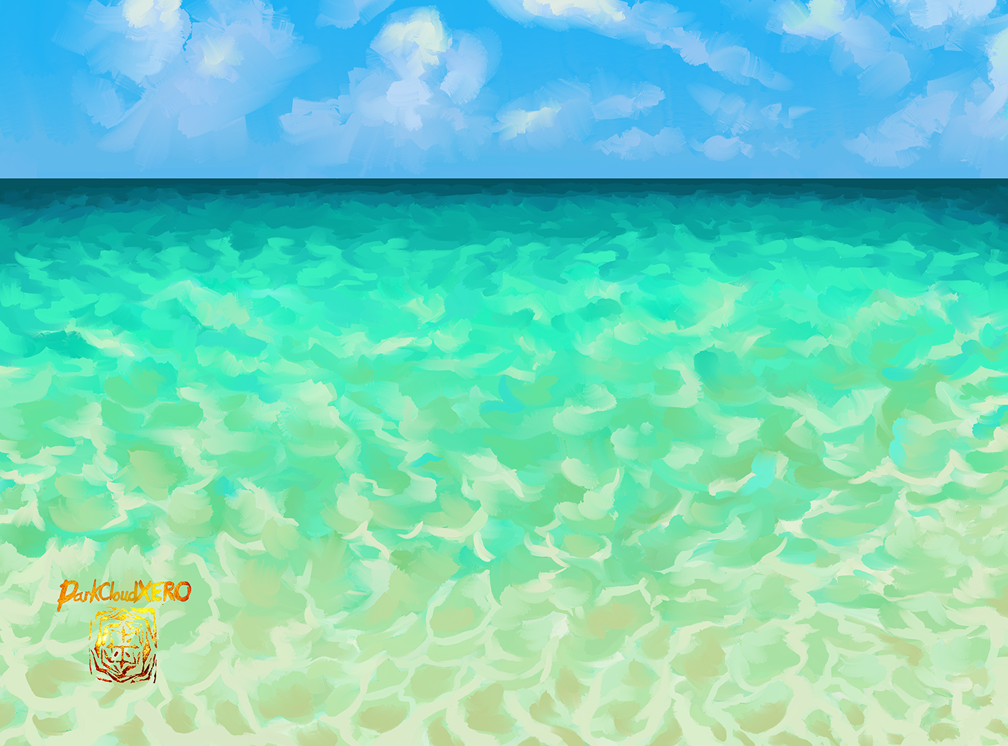
Don’t know if I will use this painting as a background later down the line but I just felt like painting a cloud like this. Thinking about it now I didn’t really struggle much like the past attempts.
Hasta la proxima,
-NUBE
"A Hopeless Dream Chaser"
Don’t know if I will use this painting as a background later down the line but I just felt like painting a cloud like this. Thinking about it now I didn’t really struggle much like the past attempts.
Hasta la proxima,
-NUBE

The room of the big sister from a certain animation on Youtube.
Hasta la proxima,
-NUBE

In the rough draft I had a simpler brick layout but after looking at some reference photos I decided to redo it all again before converting it to color. Choosing what the contents of the gachapons actually took me a while to decide on.
Hasta la proxima,
-NUBE

Today was a day… Don’t feel like writing much today.
Hasta la proxima,
-NUBE

I love Spring, I love rain and I love raindrops on windows. But man does it take a long time to paint every single of them. I believe the last time I painted them was for my Momochi study I did years back. Hopefully I get to do some more before Spring ends.
Hasta la proxima,
-NUBE


It’s about to get even colder where I live so I wanted to paint something to reflect that. Looking at some references I remembered a painting I made back in 2021 that I wanted to eventually get back to and give it another try. So I decided to RE:do my Airi painting of her in a jacket. I also decided to try out a couple of new brushes aside from the sargent brush. I’m glad I did so because some of them fought me less when I was spreading paint and mixing. My plan is to continue practicing until I understand them better. This time around I was also more confident in giving her mitts a try.
Hasta la proxima,
-NUBE.

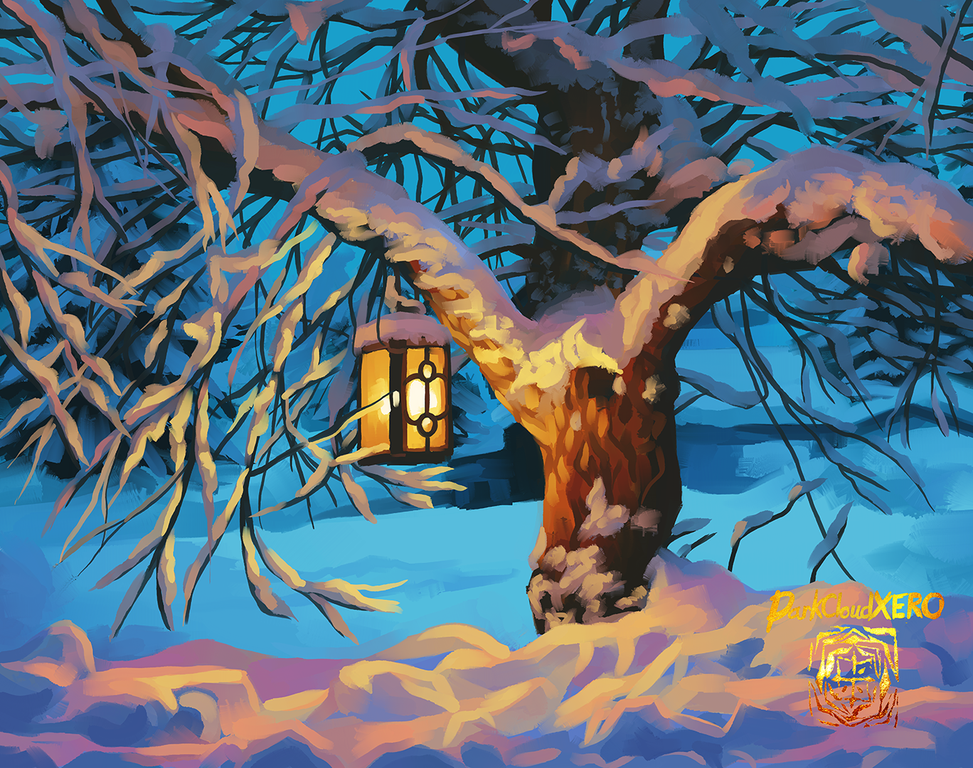
I saw this beautiful photo of a lantern lighting up a tree and snow that I wanted to try and paint. Perhaps in the future I might use it as a background but who knows.
Hasta la proxima,
-NUBE.

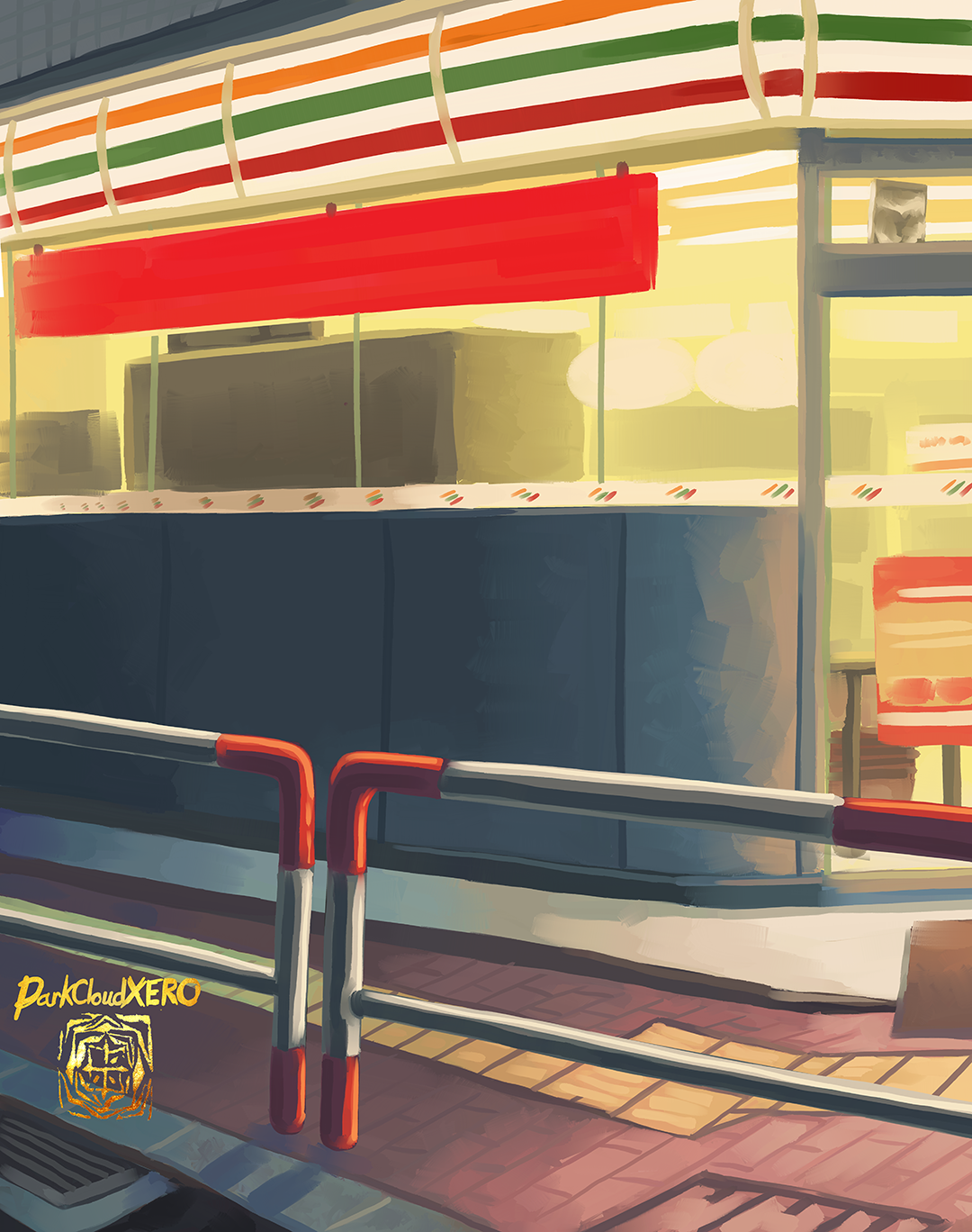
I had to do a composite of two locations for this background. I’m always glad that Google street view exists.
Hasta la proxima,
-NUBE

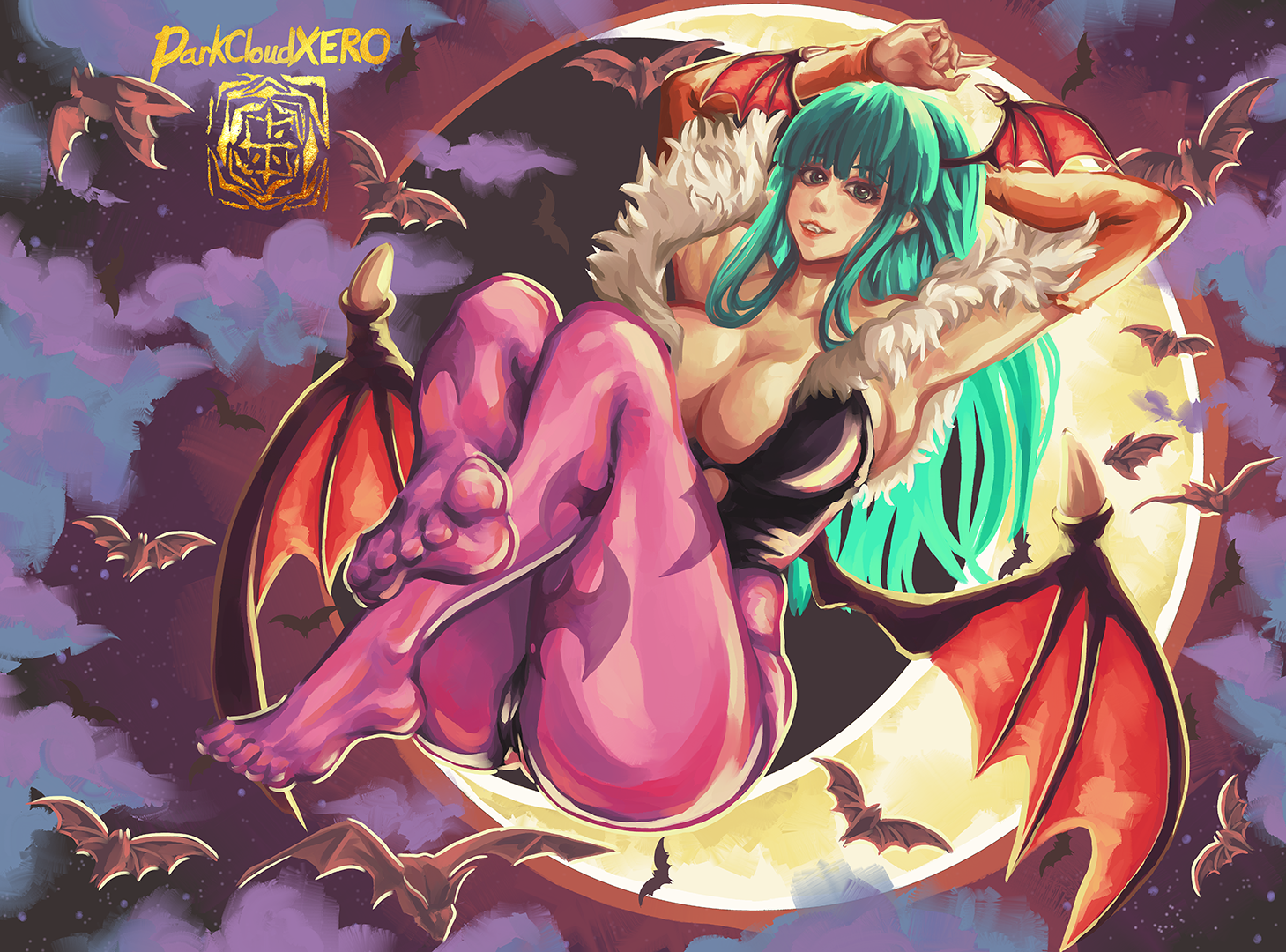
I was planning to do some new paintings for this Halloween but time didn’t permit that sadly this year. But I did get a chance to at least RE:do Morrigan. Hopefully things will work out better next year.
Happy Halloween.
Hasta la proxima,
-NUBE

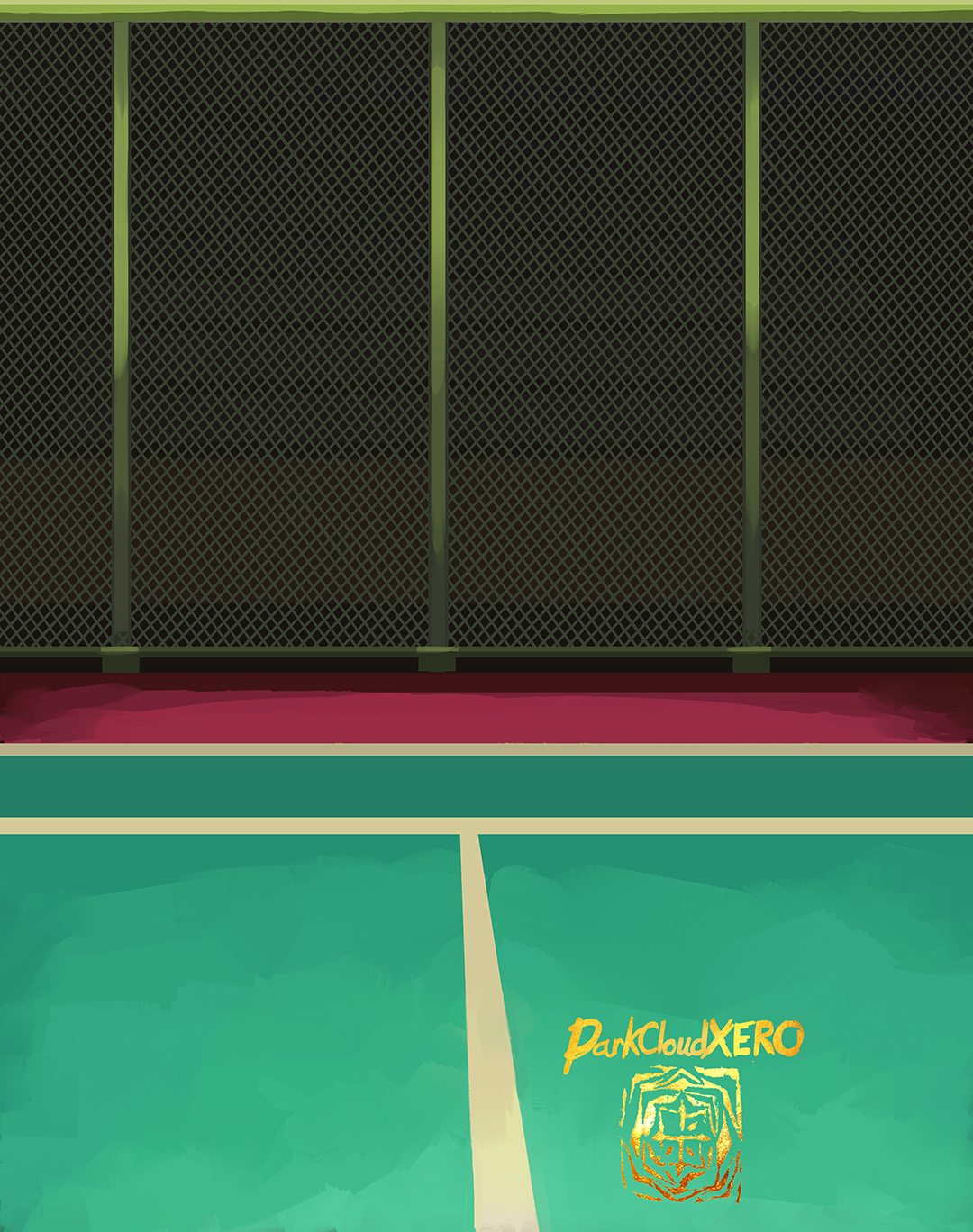
Today’s upload is a tennis background. I will edit it as needed once I add in the focal points.
Hasta la proxima,
-NUBE

Finally got around to RE:do a painting that I was supposed to have worked on this summer. I’m almost done with the update, but I have to add to it finally.
Hasta la proxima,
-NUBE

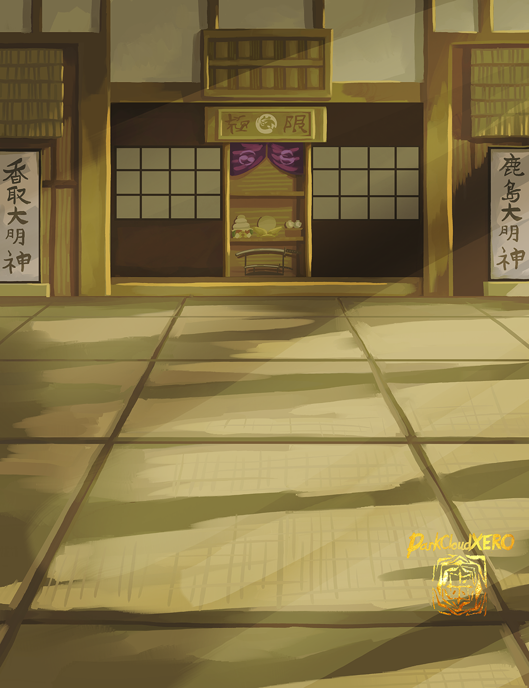
For today’s update, it is a RE:do of a dojo background. Last time it was a bit flat so I wanted to play with the lighting and shadows as well as detailing certain areas more.
Hasta la proxima,
-NUBE
