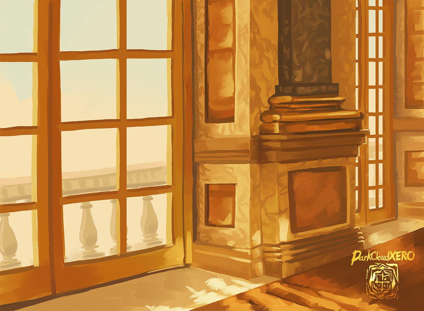
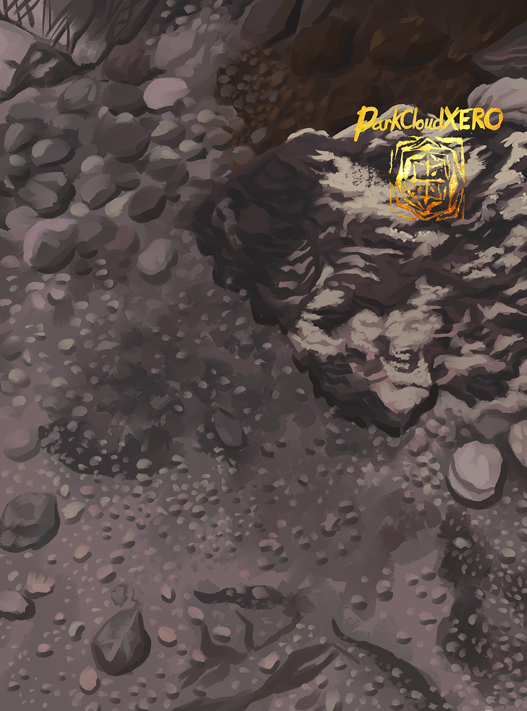
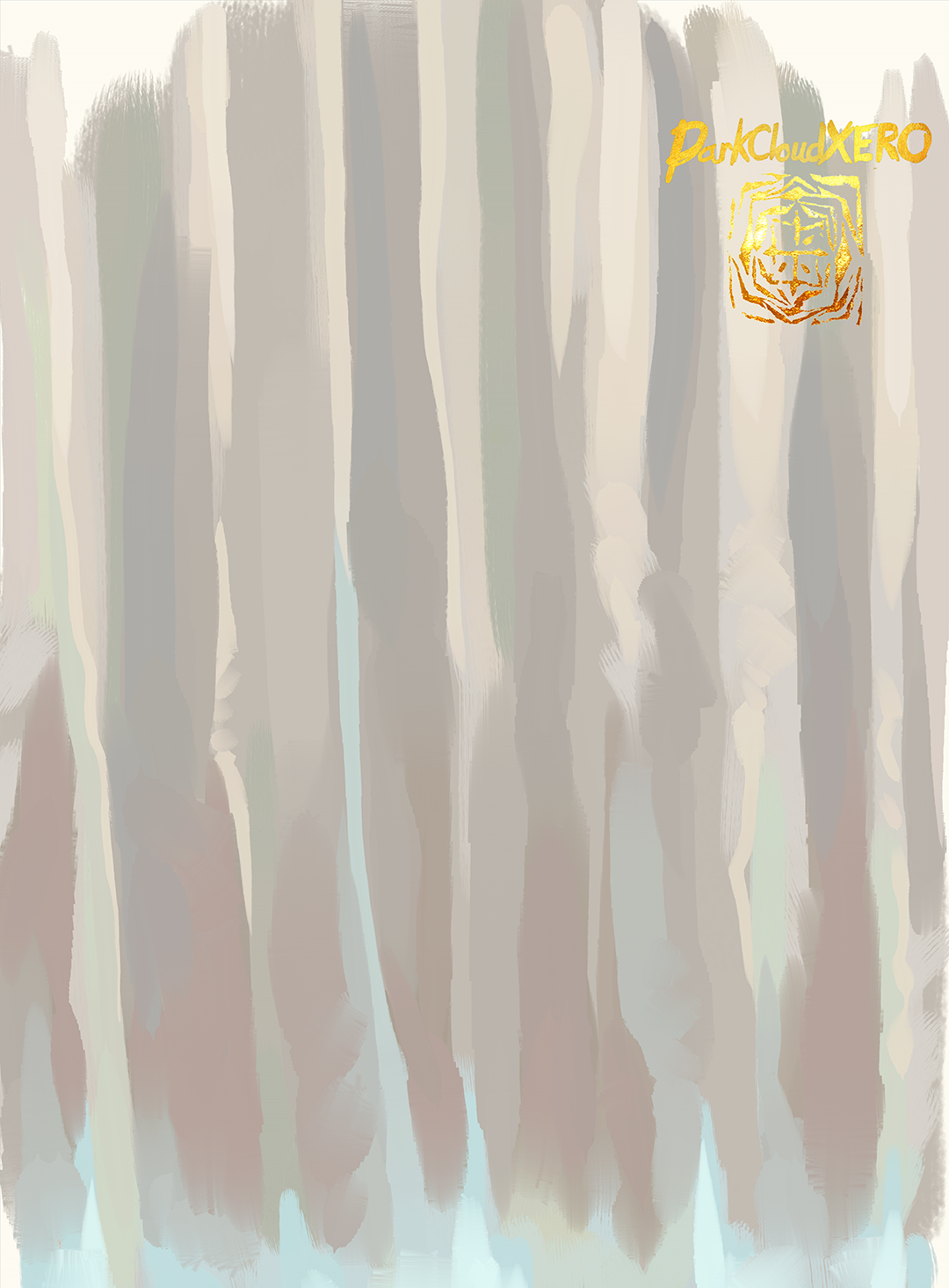
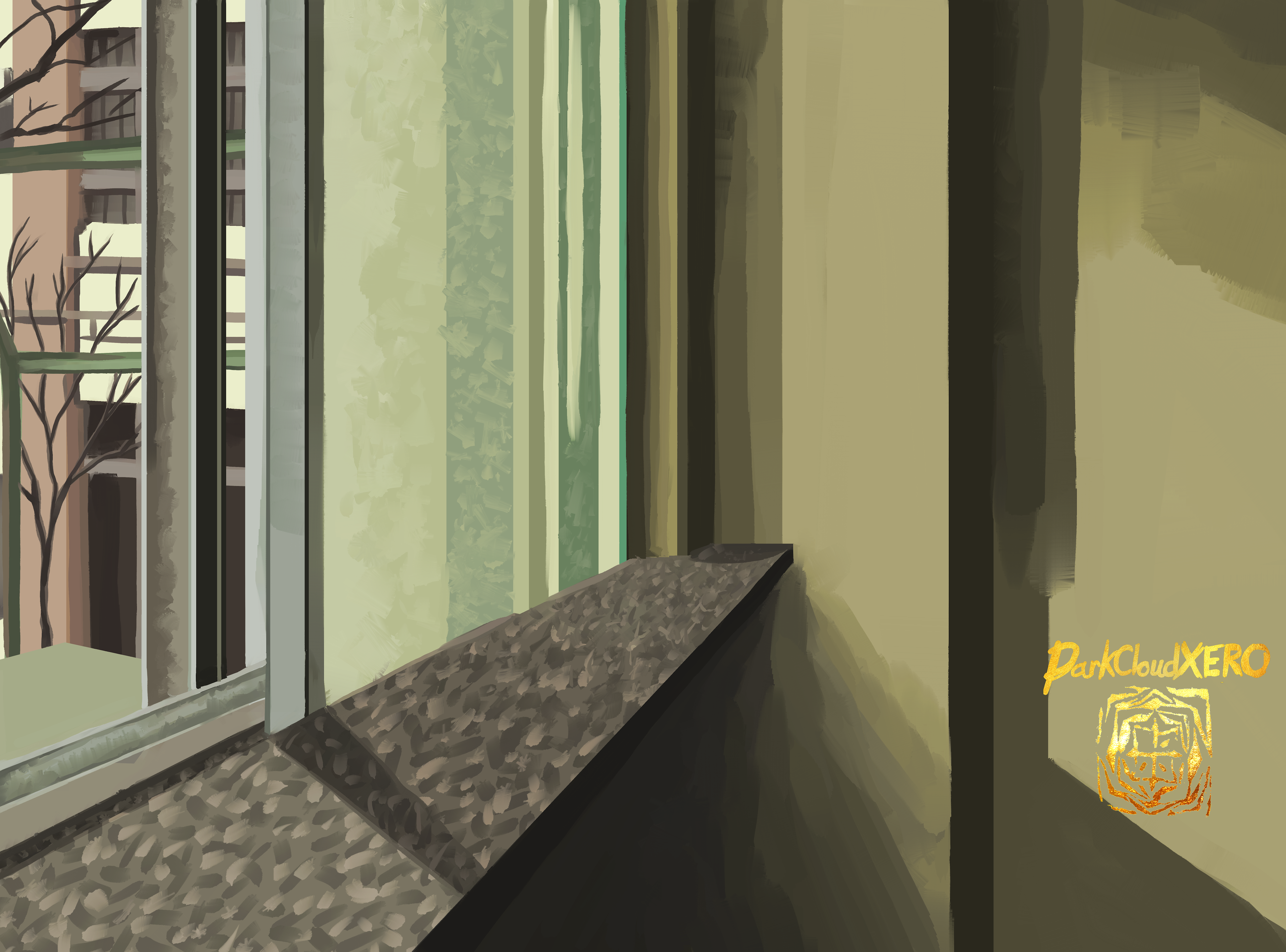
Been wanting to paint this for quite a bit now. This week has been quite rainy and tomorrow it will apparently be raining all day so it also fits the occasion. The background itself wont be finished till I add the main subject though.
This will be the background for one of my recent favorite characters. Although that series has a lot of characters that I like. Because of the amount of details this felt a bit daunting when I first started working on it. But not much one can do except just do it. Having said that, after I finished working on it I decided to buy some transparent rulers to make long straight lines easier and more uniform. I don’t know why I was so hardheaded and didn’t do so earlier.
The background it self made me appreciate Google Maps so much more. I forgot that I could just use it to get background locations from different vantage points and modify my location to get a more aesthetic shot on the fly. I’m so glad I’m living now.
This background is to recreate a scene that I really like from an anime that I just started watching. But just copying the scene would be no good, so I decided to at least change the vantage point. With that said, I have seen landscape paintings that are done in a cube or in a cross section. I really like the aesthetics of it, so I decided to give it a try for this one. It was actually pretty fun to paint.
Curtain Background for a future piece. Despite being quite simple, I liked using the variation of colors to simulate shadows and color bouncing off the surroundings.
I can’t believe that this painting has been waiting for weeks now. Seems it’s been ready to go since January 4th. I tried making the straight line by hand but of course they were really off. So I used the rectangle tool to guide me for the hard lines and softened areas as needed. Looking at it now, I would probably play with the colors a bit. But I might come back to it at a later date. Overall though I like it.
Background for a current painting. I almost have the feel I want, but I can’t really finish the background until I add in the subjects and make everything cohesive.
The latest piece that I’m currently working on. It’s the castle at a certain amusement park. I was wondering how I would deal with so many details. But once I got into the groove it wasn’t too bad. It’s obviously not one to one to the reference photo, but I feel I capture the essence. Detailed, but not so much that it will overtake the actual subject.
Here is another background. I have the main painting completely done but I want to do some touch ups before I upload it. This background is rough and out of focus on purpose.
Last week I saw a video about the new updates to Krita. And I wanted to check it out. It’s strange how there is a bit of a learning curve when using different programs. It actually feels much better than the last time I used it a couple of years ago. Although at that time I was barely getting into digital painting. Having said that, it still feels a bit clunky. I wonder if I modify some settings it can be made to react the way I want. There are so many settings that I can edit which I like. I’m really glad that programs like these exist for free. These projects are really worth supporting.
As for this background, it is not my design. It is from a quilt it seems like from a reference photo that I’m using to test out Krita. This background helps me test out the tools and the subject will help me test out the brushes.
This will be the background for a painting that I plan to upload in February. It’s based on a scene from a movie I really like. Playing around with the subtle color changes in the snow and the details and lack of them on the trees was somewhat challenging. I wanted a rough idea to be represented, but at times it just looked like a bunch of scribbles.